Standout Features:
- Sophisticated asymmetrical layout with strategic white space
- Informative "service cards" featuring custom icons
- Disciplined typography with a functional accent color
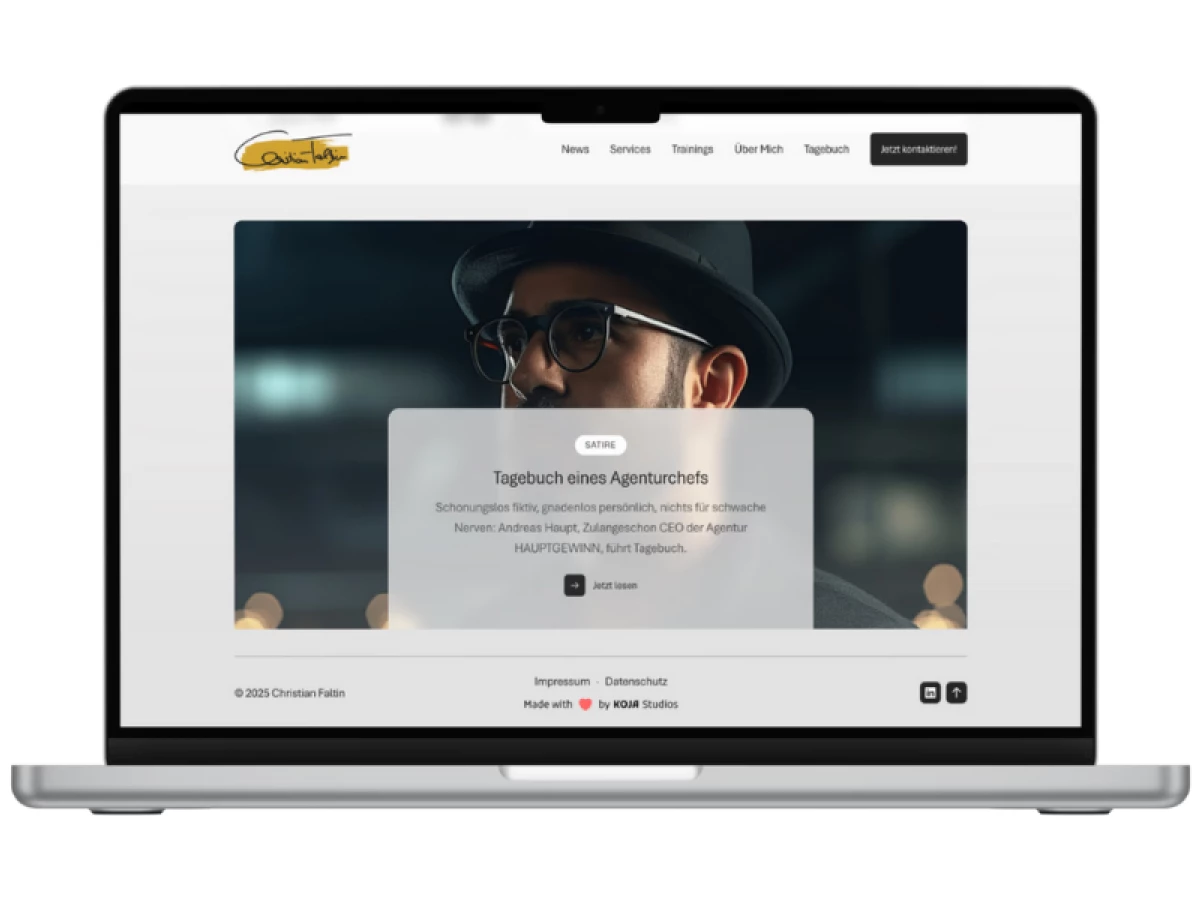
For Christian Faltin, a strategic PR consultant with decades of high-level experience, a website must convey confidence and modern relevance. KOJA Studios designed his site with this in mind.
The minimalist aesthetic is both sophisticated and functional, creating a clean environment where expertise and reliability are paramount for its B2B audience. The importance of this thoughtful design cannot be overstated, as half of consumers report that a website's design is crucial to how they perceive a business's brand.
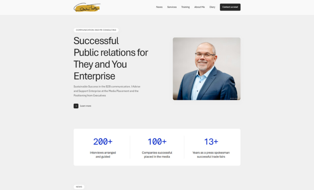
The site is built on an asymmetrical grid, with content and images balanced in an off-center layout. Ample and consistent white space on a light grey background is a key element. This use of negative space is a hallmark of high-end design, allowing each component to command attention and reinforcing the site's clean identity.
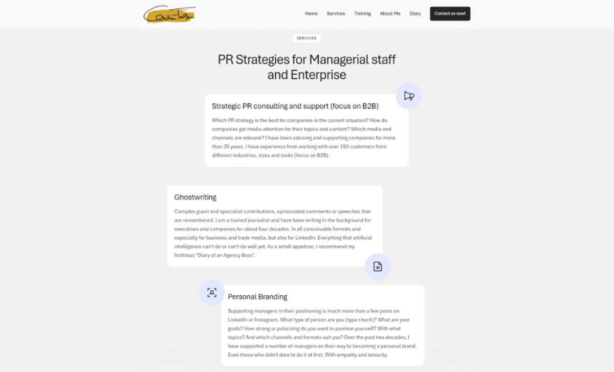
Informative "service cards" are a key feature. These lightly shaded containers with soft corners each have a custom line-art icon in their corners. The icon's container has a delicate blue-lavender color. This transforms potentially dry text into an approachable and engaging interface for users.
A disciplined typographic system uses a clean sans-serif, with bold headings and lighter body copy for readability. The color palette is very minimal. Cobalt blue is strategically applied only to accent key data points like "200+" and icons, directing attention while providing immediate credibility and building a strong case for the consultant's expertise.
The design for this professional service consultancy highlights how modular elements with custom iconography can make complex offerings digestible and engaging. This user-centric approach to presenting information improves navigability and reflects the consultant's own ability to simplify and bring clarity to challenging business problems.