County College of Morris (CCM) partnered with eDesign Interactive to redesign its digital presence in support of a diverse learning community in Randolph, NJ. The new site emphasizes clarity, career pathways, accessibility, and user engagement, aligning the experience with how prospective students explore education online.
Industry Insight: With 75% of users judging a company’s credibility based on web design, CCM’s modern and visually cohesive site builds instant trust and institutional authority.
County College of Morris: Key Findings
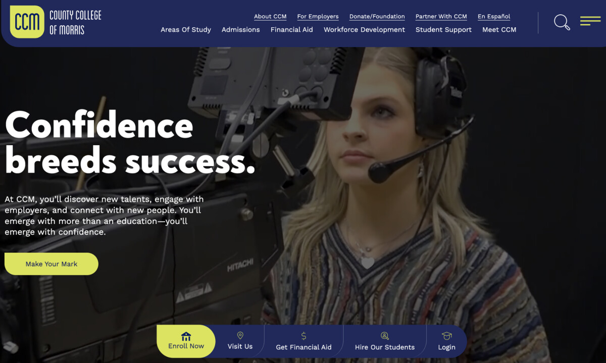
Video-Driven Hero Sets the Emotional Tone
The homepage opens with a full-width hero video featuring students across different fields, immediately immersing visitors in the lived experience of CCM’s community. The motion is intentional rather than decorative, helping humanize the institution and signal real-world, career-oriented learning from the first interaction.
A darkened overlay paired with large white sans-serif headlines keeps messaging legible over movement, while the lime-yellow CTA anchors the visual hierarchy and guides users forward.
By highlighting real students and authentic moments, the hero creates an emotional bridge between information and aspiration. In fact, 91% of consumers say video quality directly impacts their trust in a brand.
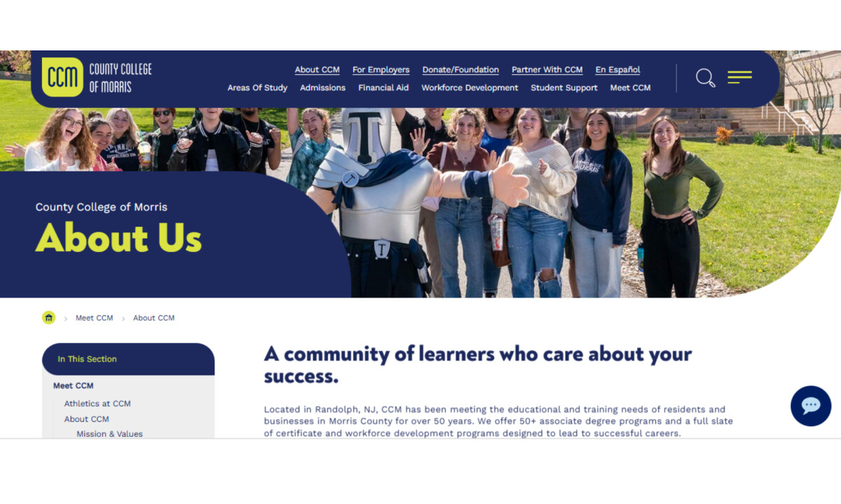
Career-Pathway Navigation Reflects User Logic
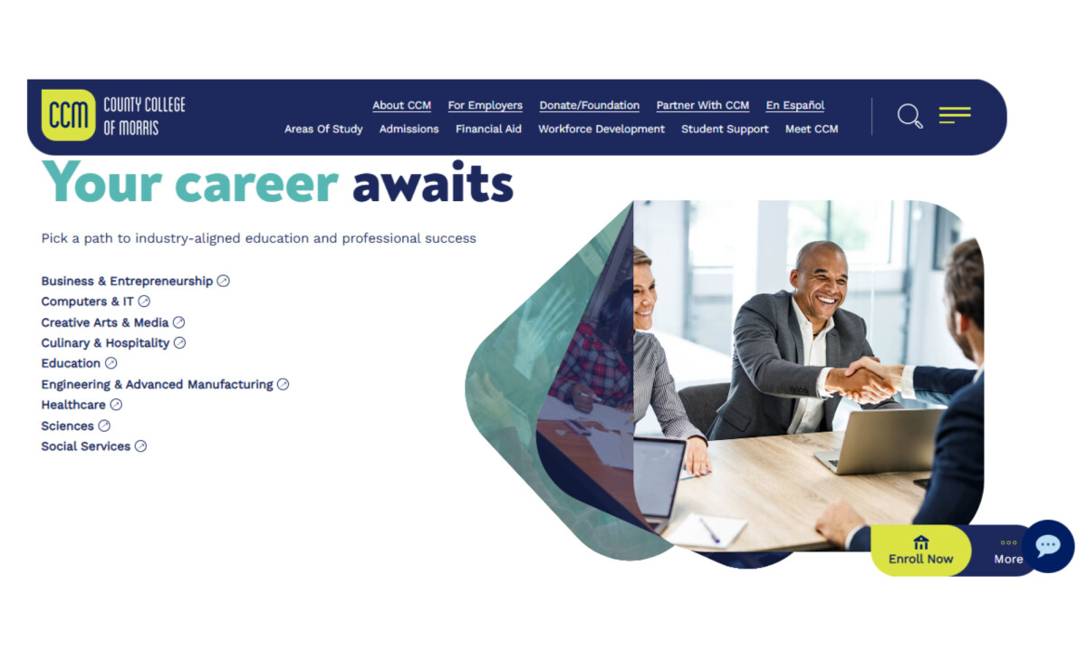
Academic programs are organized around career pathways instead of departmental structure, aligning with how prospective students think about education. The left-hand list presents fields of study in a clear, scannable format, making exploration feel direct and outcome-focused.
Generous spacing, simple typography, and restrained icon cues reduce friction and support quick comparison. This pathway-first framing reinforces CCM’s emphasis on career readiness while keeping the experience intuitive for first-time visitors.
Modular Design with Rounded Geometry Enhances Usability
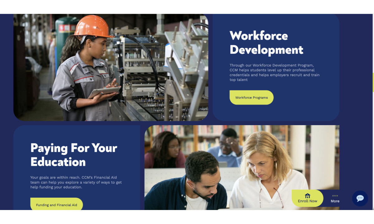
Content is delivered through rounded rectangular modules arranged with consistent margins and ample breathing room. Alternating between dark navy and light backgrounds, these design elements frequently include supportive imagery and brief, actionable copy.
The emphasis on imagery reflects user expectations, as 40% of consumers appreciate websites that incorporate photos or images.
Combined with soft shapes and predictable layout patterns, this approach gives the site a friendly, approachable tone without sacrificing professionalism, while the modular system supports CMS scalability and enables a seamless visual experience across the platform’s vast content ecosystem.
Explore more education website designs that use modular UX strategies to improve usability, scale content, and deepen user trust.
High‑Visibility Data Reinforces Trust and Scale
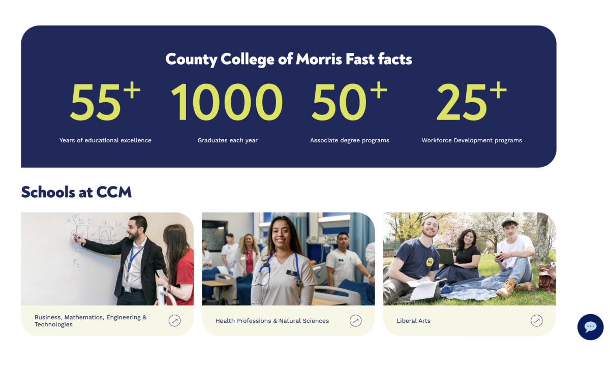
Key metrics such as annual graduates, number of programs, and historical milestones are presented in oversized lime-yellow numerals set against deep navy backgrounds. Supporting text remains understated, allowing the numbers to carry visual weight.
This treatment gives prominence to institutional achievements in a digestible, dynamic way. The design borrows from dashboard UI principles, turning data into a trust-building design element that appeals to both prospective students and community stakeholders.
Impact & Results
- Generated 6,000+ visits on launch day, reflecting immediate community engagement.
- Streamlined 4,000+ pages into a clearer, career-focused content structure.
- Improved usability through simplified navigation, mobile optimization, and accessibility enhancements.
- Increased internal efficiency with a new employee intranet and improved content governance.
- Strengthened CCM’s digital brand as a modern, student-centered institution.
Discover how top web design companies create intuitive, user‑focused experiences that strengthen brand presence and engagement online.
What Brands & Agencies Can Learn from County College of Morris
eDesign Interactive’s redesign of the CCM website offers a roadmap for organizations looking to modernize large-scale digital platforms while preserving clarity, community, and purpose:
1. Design Navigation Around Real Goals
By organizing programs around outcomes rather than departments, the site improves clarity and conversion. Any institution with complex offerings can benefit from this logic-driven structure.
2. Build Systems That Scale
Using modular content blocks allows for visual consistency and simplified updates across thousands of pages, which is essential for large institutions, nonprofits, or brands with evolving service lines.
3. Balance Emotion with Evidence
The combination of immersive student visuals and cleanly presented statistics creates an experience that resonates emotionally while reinforcing credibility.
About DesignRush Featured Designs
At DesignRush, we review hundreds of agency projects each month. The featured designs stand out for creativity, relevance, and execution.
Many go on to earn Monthly Design Awards, gaining visibility among leading agencies, brands, and creative professionals.
See more creative projects across categories:
- Best Website Designs
- Best App Designs
- Best Logo Designs
- Best Print Designs
- Best Packaging Designs
- Best Video Designs
For a full list of design agencies and related services, see our Agency Directory.