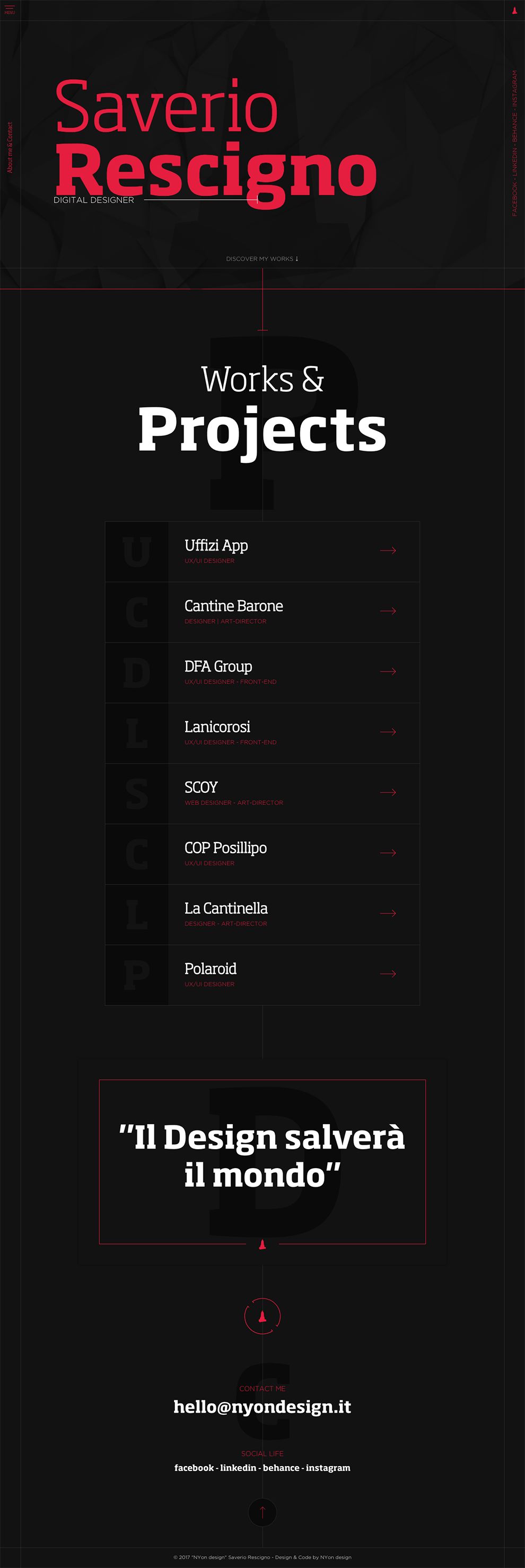
With a dynamically dark presentation, NYon Design's website design draws you in, enticing your sense of curiosity and making you want to know more about the company itself.
Utilizing a powerful black backdrop, the homepage makes use of a savage red font that pops off the page at you as you enter the website.
A creative layered dynamic presents the owner of the company as well as his title. The combination of white against red in dual fonts divides the attention between them in an interesting fashion.
NYon Design offers two different options for a menu for you to utilize. The first takes the most creative route to presenting a random list of pages.
Written in a red capitalized font, the company rotates the presentation of the words to match the line of the page depending on the edge. It’s fun, it’s interesting, and it forces you to explore the entirety of the page.
The second menu takes a much simpler and more traditional approach with the use of a hamburger icon in the upper left corner.
Page titles are kept in a line down the left side of the page and made easily visible in white. Light up the page titles in red by moving your mouse over the words for a fun way to decide if you want to visit or not while activating a fun accent line as well.
This secondary menu presents different page options than the first menu by linking you to various projects NYon Designs has worked on.

With a dynamic portfolio to share, NYon Design puts their best foot forward in the design set-up of their project pages.
You’re instantly greeted by a dual table that presents an optimal image from the project in combination with a dark text box listing the client worked with.
Directly beneath the table, the company puts together a horizontal list in a red and white font to list the specifications of the project to keep you in the loop. The remainder of the page puts together a stunning display of text boxes and sample imagery for you to peruse.
Understanding the importance of making a strong impact on users, NYon puts together a powerfully simple platform that places all the emphasis on the portfolio. The approach creates a highly effective website that draws users in and keeps them engaged.