Team Behind the Design
Create Health’s work sits at the intersection of science, humanity, and creativity. The website reflects this by combining high-impact visuals with a calm, intentional interface that guides users through complex healthcare narratives.
DCOED built a digital system that makes Create Health’s thinking feel accessible, modern, and deeply strategic.
Web Design Analysis
A high performing healthcare site needs to balance clarity, credibility, and emotional resonance.
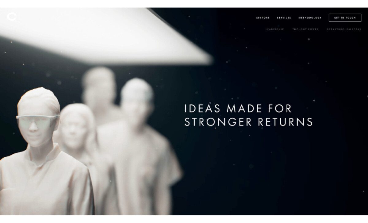
As I moved through Create Health, I noticed how each element works together to make complex ideas feel accessible while still projecting authority and creative depth.
- Content System and Brand Voice: I appreciate how the messaging stays focused and intentional. The short value statements communicate confidence without overwhelming the reader, and I find that this helps Create Health speak with authority in a space where clarity really matters.
- Layout and Structure: The spacious sections and thoughtful contrast make the page feel calm and easy to digest. As I followed the flow, it became clear that the structure guides users naturally, helping them understand the agency’s capabilities with minimal effort.
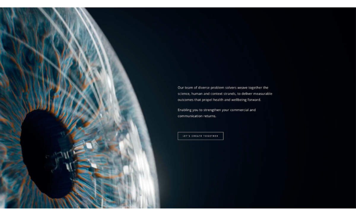
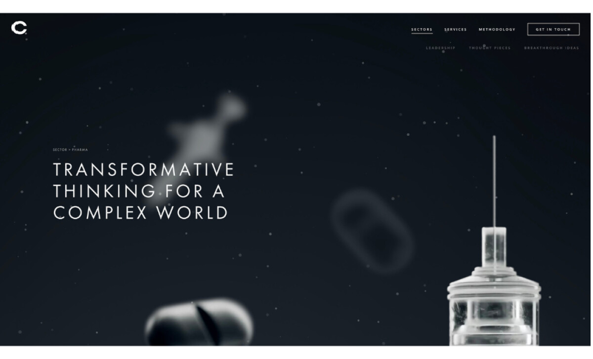
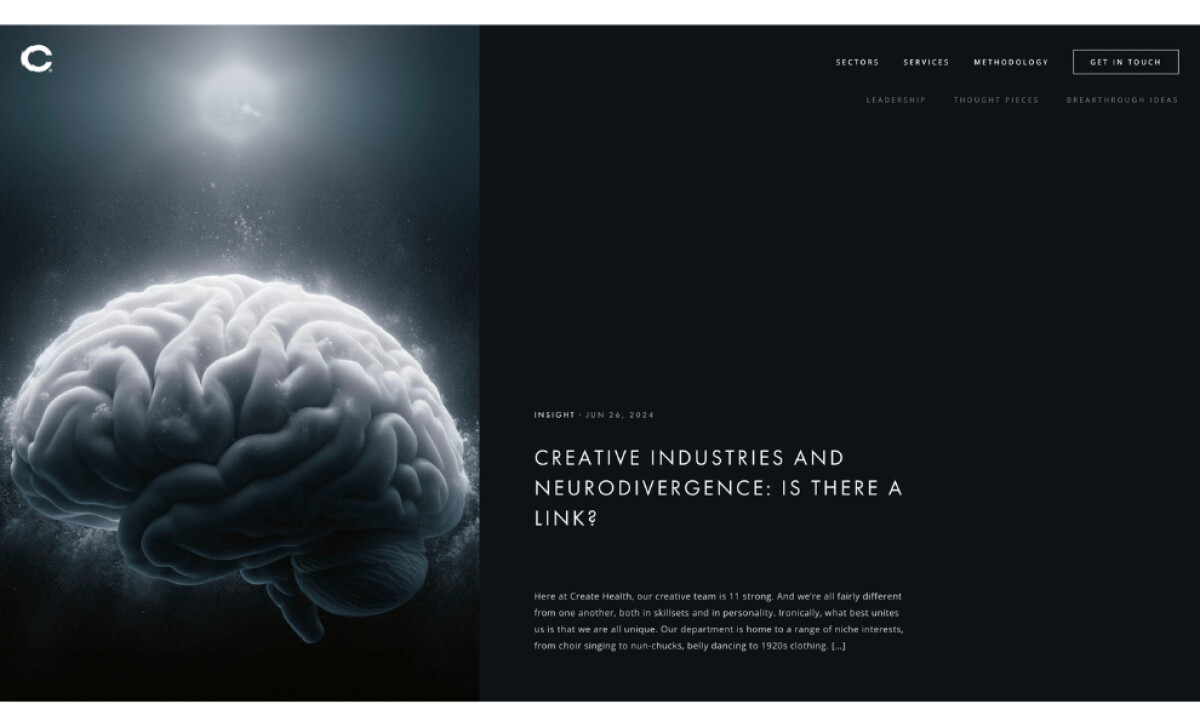
- Visual Identity: The dark palette paired with glowing highlights creates a sense of innovation that drew me in immediately. The scientific textures add depth and reinforce the agency’s commitment to creativity in healthcare, which gives the site a distinct visual personality.
- Usability and Experience: The smooth interactions make the site feel polished and trustworthy. I found that the intuitive navigation and subtle motion help simplify complex content, making the overall experience feel premium and thoughtfully crafted.
What Brands & Agencies Can Learn from Create Health
DCOED’s redesign for Create Health shows how a healthcare agency can present complex thinking in a way that feels clear, modern, and emotionally grounded. The site communicates expertise without losing its sense of humanity.
1. Use Space to Clarify Complex Ideas
The generous spacing and calm layout make scientific and strategic content easier to absorb. This approach helps visitors understand depth without feeling overwhelmed.
2. Build a Visual Tone That Matches the Discipline
The dark palette and subtle scientific textures create a focused atmosphere that supports the agency’s narrative about creativity in healthcare. The visuals set expectations before any copy is read.
3. Let Structure Guide the Story
The clean hierarchy and clear messaging walk users through capabilities with intention. By shaping content into simple paths, the site makes it easy for decision makers to grasp the agency’s value quickly.
About DesignRush Featured Designs
At DesignRush, we review hundreds of agency projects each month. The featured designs stand out for creativity, relevance, and execution.
Many go on to be recognized as winners of our Monthly Design Awards.
Explore more here:
- Best Website Designs
- Best App Designs
- Best Logo Designs
- Best Print Designs
- Best Packaging Designs
- Best Video Designs
For a full list of design agencies and related services, see our Agency Directory.