GE, a global leader in innovation for over 130 years, has split into three independent companies: GE Aerospace, GE Vernova, and GE Healthcare. This bold move required a reimagining of their online presence to reflect the distinct identities and focuses of each new entity. GE's suite of websites successfully navigates this transition, showcasing a cohesive yet individualized approach to brand storytelling and user experience.
Key Insights for Brands:
- Ensure consistent branding across all digital platforms to build trust and aid user recognition
- Tailor the visual languages of your sub-brands and product lines to resonate more with your target audiences
- Use clear and intuitive information architecture to enhance user experience and engagement
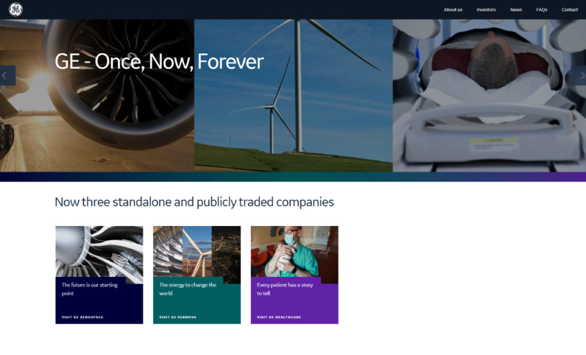
GE Effectively Directs Users With a Streamlined Design and Clear Brand Differentiation
General Electric (GE) was once a sprawling conglomerate with diverse businesses — including aviation, energy, and healthcare. To streamline operations and allow each business to flourish, GE underwent a significant restructuring, separating into independent companies. These individual entities, while independent, are collectively known as the "GE Companies."
Now, the GE website is a central portal directing users to the three independent companies. Instead of overwhelming visitors with information about all aspects of the business, GE’s website design prioritizes clarity and direction by immediately redirecting users with the appropriate images and CTAs.
Additionally, the website employs a minimalist design, featuring a clean layout, ample white space, and concise messaging. This streamlined approach and consistent visual branding ensure that users can quickly understand the new structure of GE and easily navigate through the relevant company websites.
Furthermore, GE’s website effectively differentiates the three businesses through the strategic use of color — a tactic often employed by top professional web design agencies to create visual separation. Each company has a distinct color palette: a deep dark blue for GE Aerospace, a dark cyan for GE Vernova, and a bright purple for GE Healthcare, creating a clear visual distinction between the three entities.
This cohesive online ecosystem communicates the distinct identities and missions of the three new websites while maintaining a consistent brand experience. Let's explore how each website uses visual language, messaging, and strategic content placement to engage its target audience.
GE Aerospace's Visual Language Humanizes Its Mission of Flight and Innovation
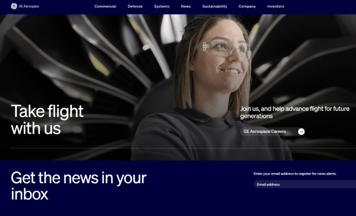
GE Aerospace, a leader in aviation technology, propels the future of flight with its innovative jet engines, aircraft systems, and services. The GE Aerospace website uses powerful visual language to communicate its mission and expertise. Large, high-quality images dominate the website, showcasing the scale and complexity of aircraft technology.
These images often feature engineers in front of jet engines or interacting with aircraft systems, humanizing the technology and innovation behind the brand. This visual approach creates a sense of connection and trust, emphasizing the company's dedication to pushing the boundaries of flight.
GE Vernova Powers a Sustainable Message With Motion Graphics and Strategic Content Placement
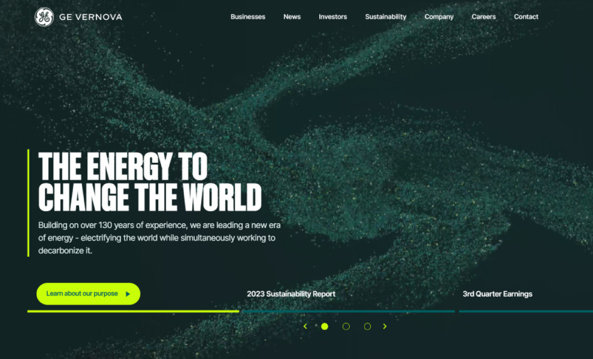
GE Vernova is dedicated to electrifying the world with sustainable energy solutions. The GE Vernova website communicates this mission through visuals, messaging, and strategic content placement.
The hero section immediately captures attention with motion graphics of fast-flowing particles, representing energy and the decarbonization of the world. This dynamic visual sets the tone for the website and reinforces the company's commitment to a cleaner energy future.
GE Vernova’s website further emphasizes its commitment to the environment by prioritizing content related to sustainability. A downloadable sustainability report is prominently featured in the hero section carousel, and a statistics section on the homepage highlights the company's impact on global electricity generation.
GE Vernova reinforces its commitment to environmental responsibility by leveraging color psychology effectively. The design utilizes green motifs and neon green accents, often associated with nature, growth, and renewal. These vibrant colors draw attention to key information, such as calls to action and key statistics, ensuring visitors don't miss the company's sustainability focus.
GE Healthcare Shows Cutting-Edge Technology Through Imagery and Content Prioritization
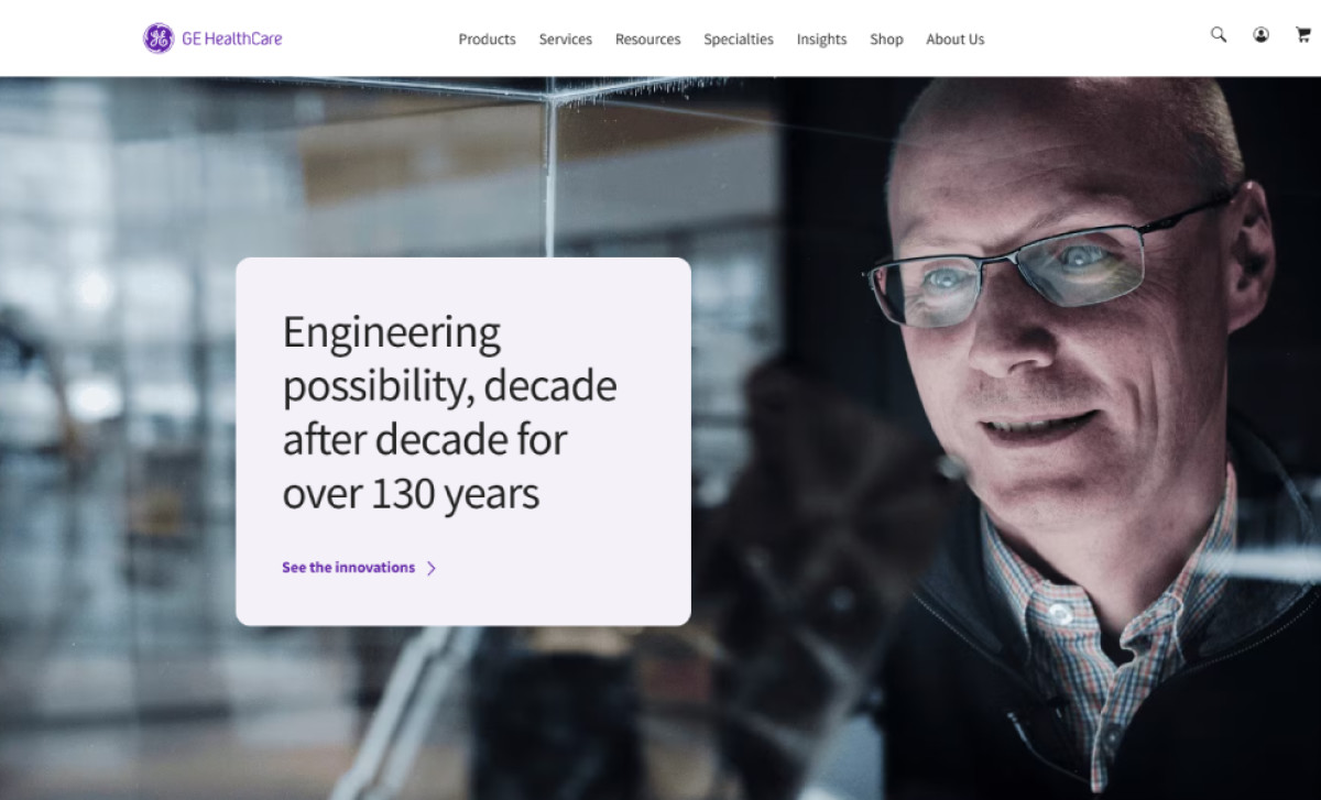
GE Healthcare provides transformative medical technologies and services, enabling more precise diagnoses, improved treatments, and healthier outcomes. The GE Healthcare website employs a smart design strategy to communicate its focus on cutting-edge technology and patient care.
Upon landing on the page, visitors are immediately presented with a compelling narrative highlighting the company's rich history of innovation, its latest advancements in medical technology, and insightful articles that delve into the future of healthcare. This strategic content prioritization effectively showcases GE Healthcare's expertise and commitment to advancing the field of medicine.
The website's visual language further strengthens this message. Images of scientists, lab workers, and healthcare personnel actively engaged in their work — rather than static portraits — create a sense of dynamism and progress.
On the other hand, its vibrant purple color palette, unique to GE Healthcare, adds a touch of sophistication and reinforces the brand's commitment to innovation.
In conclusion, GE's suite of websites demonstrates how effective design can support a major brand transformation. GE has created a cohesive yet distinct online presence for its three independent companies by combining a unified design system with individualized visual languages. The result is a compelling digital experience that informs, engages, and inspires, ultimately securing its place among the best web designs.