Team Behind the Design
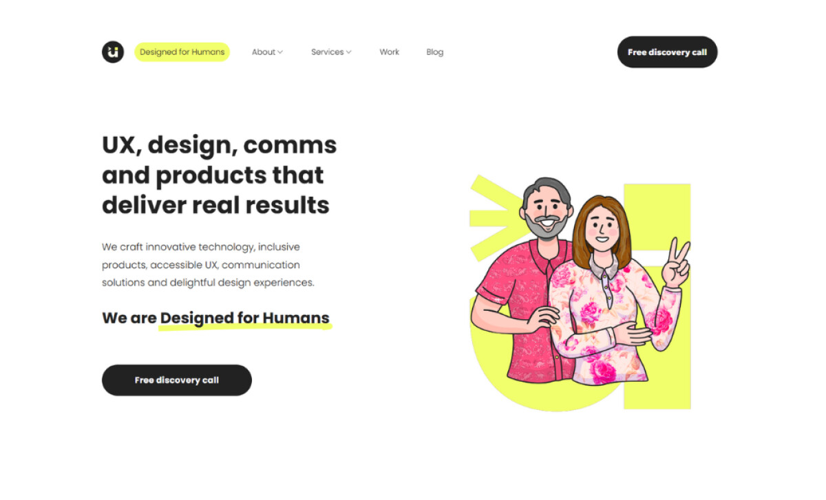
Designed for Humans is a creative technology and digital communication studio focused on UX, innovation, accessibility, and human-centered design. Acting as both client and creator, the team set out to build a website that authentically embodies who they are: a values-driven practice committed to sustainability, clarity, and meaningful design.
From illustration style to color palette to page structure, every design choice was shaped by accessibility, ethical design principles, and a conscious effort to reduce visual clutter without losing creative personality.
Website Design Analysis
Portfolio websites need to communicate expertise through both aesthetics and experience.
Designed for Humans achieves this by balancing clarity, personality, and movement in a way that feels welcoming and intentionally crafted.
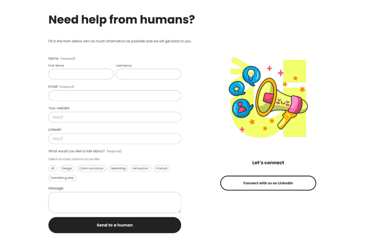
- Visual Identity and Emotional Tone: I like how the bright color palette, rounded shapes, and playful illustrations deliver an instant sense of warmth. The visuals communicate creativity and approachability, helping the studio feel human-first rather than overly technical or corporate.
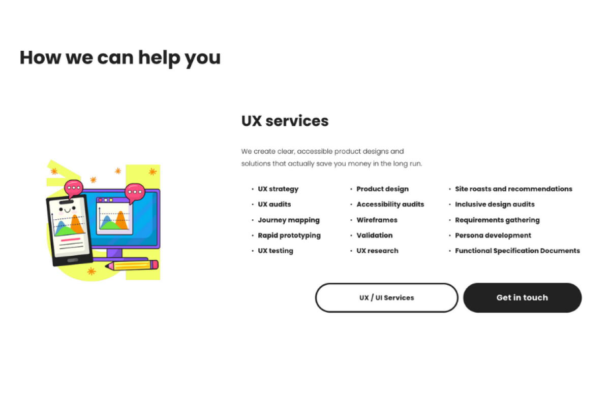
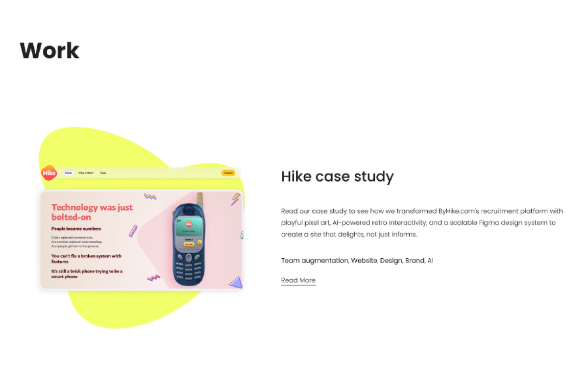
- Layout Structure and Readability: The layout is clean, structured, and easy to navigate. Wide spacing, strong hierarchy, and simple content blocks make it effortless to understand what the studio does, how they work, and what sets them apart.
- Motion and Scroll-Based Interactions: One of the elements I appreciate most is the subtle motion layered throughout the site. Illustrations gently pan upward, text shifts slightly as you scroll, and elements animate into view with smooth transitions.
- Accessibility and Ethical Design Choices: Even with bold visuals, the site maintains strong accessibility foundations. High contrast, predictable navigation, and thoughtful content structure make the experience inclusive.
What Brands and Agencies Can Learn from the Designed for Humans Website
Here’s what Designed for Humans website design shows about building a joyful, accessible, and values-driven portfolio site.
1. Lead With Emotion While Staying Functional
The bright palette, soft shapes, and playful illustrations create immediate warmth, but the structure never loses clarity. This balance shows how studios can express personality without compromising readability or focus.
2. Let Motion Support Meaning, Not Distract From It
The site uses subtle scroll interactions and gentle animations to guide attention and introduce rhythm. These micro-movements add character while reinforcing usability, demonstrating how motion can enhance storytelling when used with intention.
3. Build Accessibility Into the Foundations
High contrast, predictable navigation, and clean content hierarchy make the site inclusive from the ground up. It’s a reminder that accessibility doesn’t limit creativity. When done well, it strengthens communication, expands reach, and elevates the overall experience.
About DesignRush Featured Designs
At DesignRush, we review hundreds of agency projects each month. The featured designs stand out for creativity, relevance, and execution.
Only the most compelling work progresses to our Monthly Design Awards, recognizing excellence across the industry.
See more creative projects across categories:
- Best Website Designs
- Best App Designs
- Best Logo Designs
- Best Print Designs
- Best Packaging Designs
- Best Video Designs
For a full list of design agencies and related services, see our Agency Directory.