Standout Features:
- Robust navigation structuring extensive information
- Systematic yet vibrant color palette
- Student-focused and institutional photography
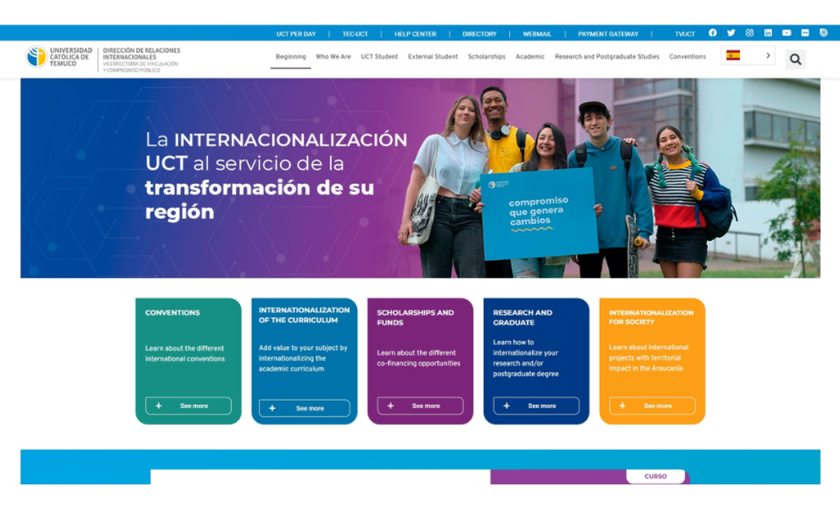
The International Relations office at Universidad Católica de Temuco acts as a vital central hub for all the university's global connections and activities. So, they decided to work with designer Joanna Gonzalez to create a website that could manage a large volume of diverse information, while still making everything feel accessible and visually engaging.
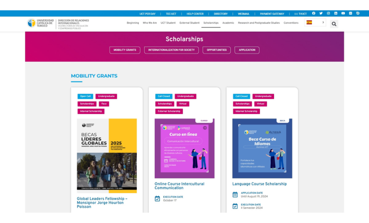
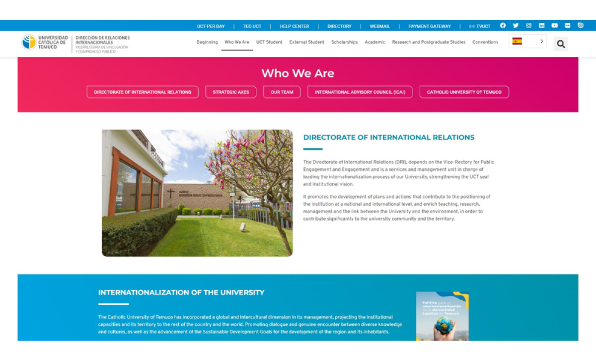
First off, the site's information structure is really comprehensive, which is a key strength for a university department like this. Employing multiple navigation levels (like a main header and secondary section menus) helps organize the extensive content on programs, research, etc., logically. This solid structure is what gives clear paths for various users.
The site uses a broad range of colors systematically, not just relying on the standard UCT blue color. Vibrant hues of teal, purple, and orange appear practically within content blocks, banners, and category tags to visually group info and separate different sections clearly for the user. These accent colors give a youthful pop of fun to the site too.
Lastly, the photos here do a good job blending personality with institutional credibility too. You see welcoming pictures of diverse students, then, professional shots focusing on modern campus buildings highlighting the university's resources and physical stature. This balance works to be relatable for students yet professional for other audiences.
This education website's high usability stems directly from its core focus on delivering information in a way that’s organized, highly legible, yet still fun. The university and the designer went through great lengths to make everything feel straightforward and relatively painless to find specific information, even within such a large and complex site.


-preview.jpg)
