Standout Features:
- Clear and concise information
- Visually guided user journey
- Restrained color palette and fonts
Grant Navigator is a platform designed to help users identify and access funding opportunities. In collaboration with Selleo, the organization sought to enhance the site's usability and visual appeal to meet the needs of its diverse audience.
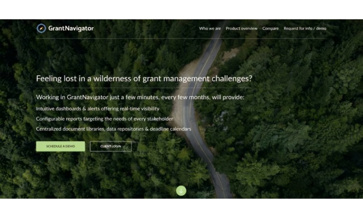
Recognizing that grant information can be overwhelming, the designers focused on presenting information clearly and concisely. Critical details about each grant are presented in a digestible format, utilizing bullet points and bold text to highlight crucial information. This ensures that users can grasp the essence of each opportunity without getting bogged down in lengthy text.
The website also incorporates subtle visual cues to guide users through the grant application process. Icons help users navigate different sections and identify relevant resources. This visual hierarchy makes it easier for users to complete tasks and find the information they need for their grant applications.
In addition, the site uses a restrained color palette featuring shades of green with accents of white and black. The choice of green evokes feelings of growth, renewal, and stability, aligning with helping users achieve their grant-related objectives.
The font selection also complements the overall aesthetic. Specifically, it uses a sans-serif font with clear lines and good legibility, ensuring the text is easily read on various devices and screen sizes.


