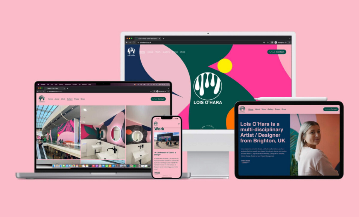
Lois O’Hara’s website, designed by Podium Design, brings her signature blend of movement, optimism, and bold color into the digital space. O’Hara’s creative identity is built around fluidity and joy, and this website design captures that same energy. Using non-traditional layouts and immersive visuals, this platform offers visitors a digital reflection of their artistic world.
Key Insights for Brands
- Use color to express brand energy and build emotional engagement
- Break from rigid grids to reflect creativity and individuality
- Let visuals carry the story, especially in portfolio or lifestyle sites
Bold Colors and Visual Movement Showcase Brand Personality
Lois O’Hara’s website immediately grabs attention through vibrant elements. Given that users form first impressions of design in just 50 milliseconds, the site leverages color and motion to reinforce the brand’s identity and keep users emotionally connected from the start.
Full-screen visuals, animated brush strokes, and a striking pink background set the tone from the very first scroll. This dynamic presentation reflects the artist’s bold and expressive style without relying on heavy text or traditional layout structures.
Bright pinks, sea greens, and warm ochres create a joyful and emotionally engaging atmosphere. These bold tones are balanced with ample white space, making the design feel energetic without overwhelming the user.
Check out more examples of colorful website designs to spark your creativity.
Combined with engaging accents and subtle movements, the site delivers a visually immersive experience that stays true to the spirit of Lois O’Hara’s work.
Fluid Layouts Reflect the Artist’s Creative Freedom
The website moves away from strict grid structures in favor of a more unconventional, artistic layout.
Images stretch past standard columns, text elements float with generous spacing, and visual compositions vary from section to section. This lack of rigid alignment reinforces the sense of creative spontaneity seen in Lois’s work.
Rather than enforcing order, the layout adopts an irregular rhythm, mirroring the organic lines and brushwork for which the artist is known. Each scroll introduces a new arrangement that keeps the experience fresh yet still navigable.
The balance between playfulness and usability is carefully maintained, so visitors can explore without confusion.
This approach is especially effective for portfolio and personal brand websites, where the goal is not only to inform but also to express personality. By loosening the constraints of traditional grids, Podium Design captures the individuality of the artist while offering an experience that feels bespoke and memorable.
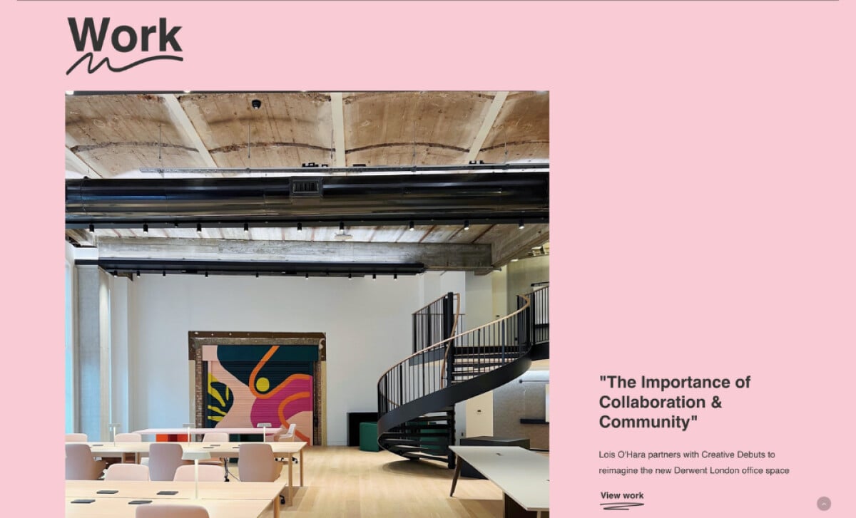
High-Contrast Visuals Enrich the Browsing Experience
Professional web designers know that lengthy copy isn’t always needed to make an impact, and the Lois O’Hara website proves it.
From the homepage to the project pages, high-contrast imagery does most of the storytelling. Visitors are drawn into each composition through rich color, scale, and fluid form before reading a single line of text.
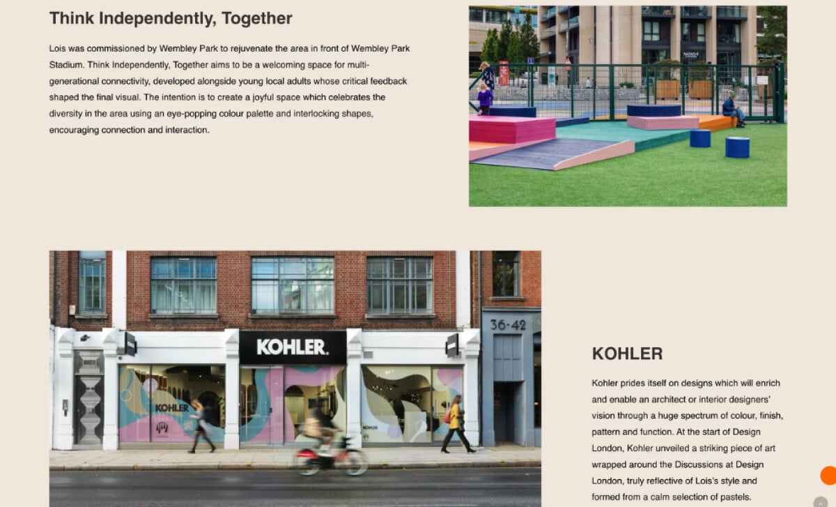
Every section feels like an extension of her artwork. Close-up photos of murals, product collaborations, and public installations are given room to breathe, while minimal labels and short captions provide just enough context.
The absence of heavy text invites exploration and lets viewers interpret the work intuitively. This design approach makes sense for a portfolio rooted in visual impact.
In creative industries where emotion and aesthetic drive engagement, visuals support clarity and build an immediate connection between the brand and its audience.
In fact, a 2024 study found that visual elements strongly influence user experience and interaction; something O’Hara’s site capitalizes on by making every visual count.
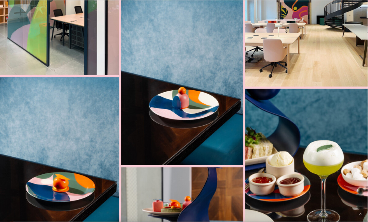
Panel-Style Content Presentation Enhances Visual Flow
Rather than scrolling through a continuous page or clicking through traditional sections, visitors are taken through content in stacked, gallery-style segments. It’s almost like flipping through the pages of a creative magazine. This technique encourages deeper engagement with each piece of work.
The panel approach also provides a consistent visual structure across all site pages, tying together Portfolio, About, and Contact sections into one cohesive experience. Each panel is filled with bright blocks, clear typography, and highlights that echo Lois’s signature artistic style.
Podium Design’s work proves that when layout and content structure are as intentional as the visual elements themselves, a portfolio site becomes a beautiful representation of the artist.
These layered, immersive design decisions are what make the Lois O’Hara site a standout recipient of the Best Design Awards.