Standout Features:
- Clean, modern sans-serif typography with clear hierarchy
- Dark background interface with strategic bright teal green accents
- Structured layout with balanced visual flow
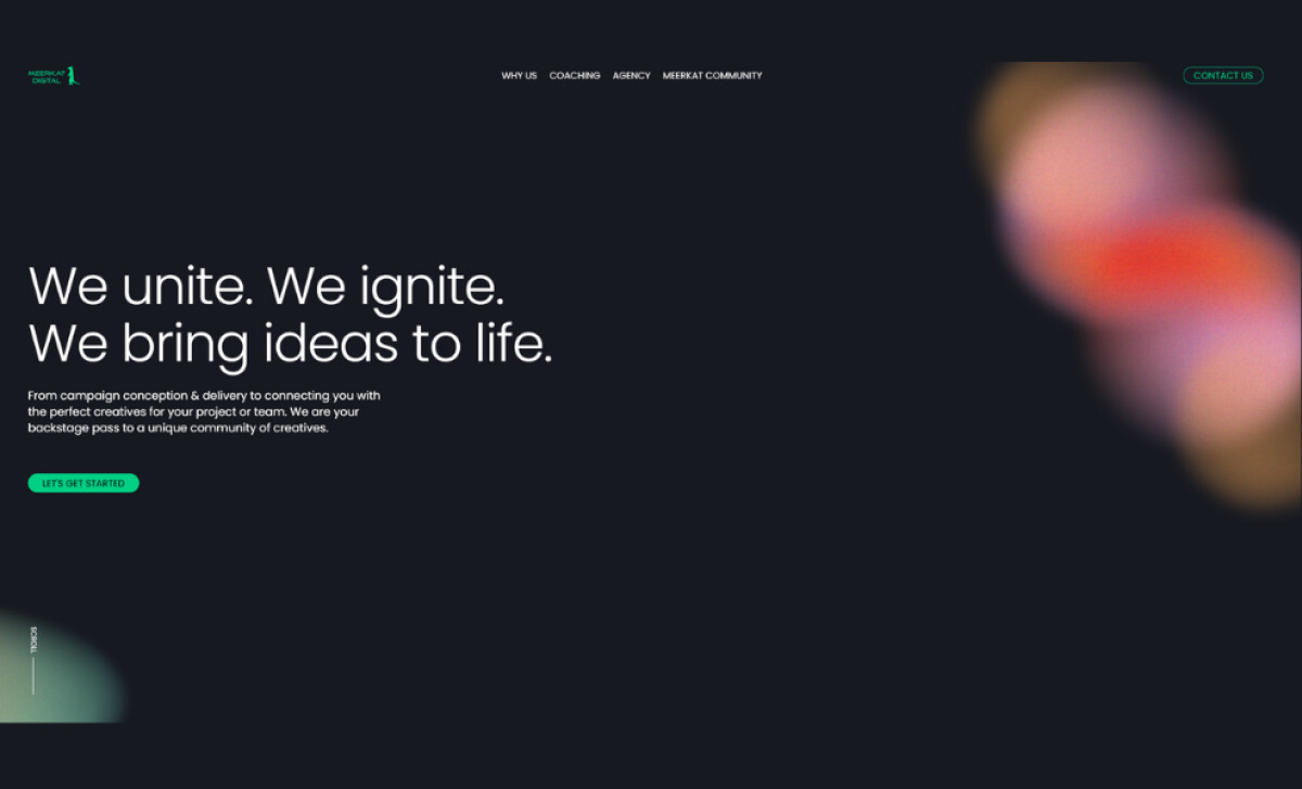
Meerkat Digital’s website, with design attributed to Vincent Reynaud, showcases a firm that brings creative ideas to life. From campaign strategy to connecting clients with talent, the agency required a site that conveyed professionalism.
The typography features a modern, rounded sans-serif with thin line weights. Headlines are large and bold, with generous spacing that contributes to a breathable layout. Smaller body text is clear, with comfortable line spacing. This focus on clarity and hierarchy is well-suited to a professional service website.
A foundational deep charcoal-black background allows white and light gray text to achieve high contrast. Vibrant teal green is used sparingly for accents on important elements like the logo and CTA buttons. This dark mode styling with a pop of color helps guide user interaction.
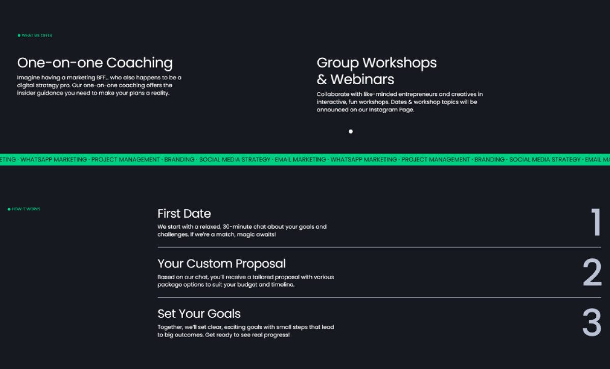
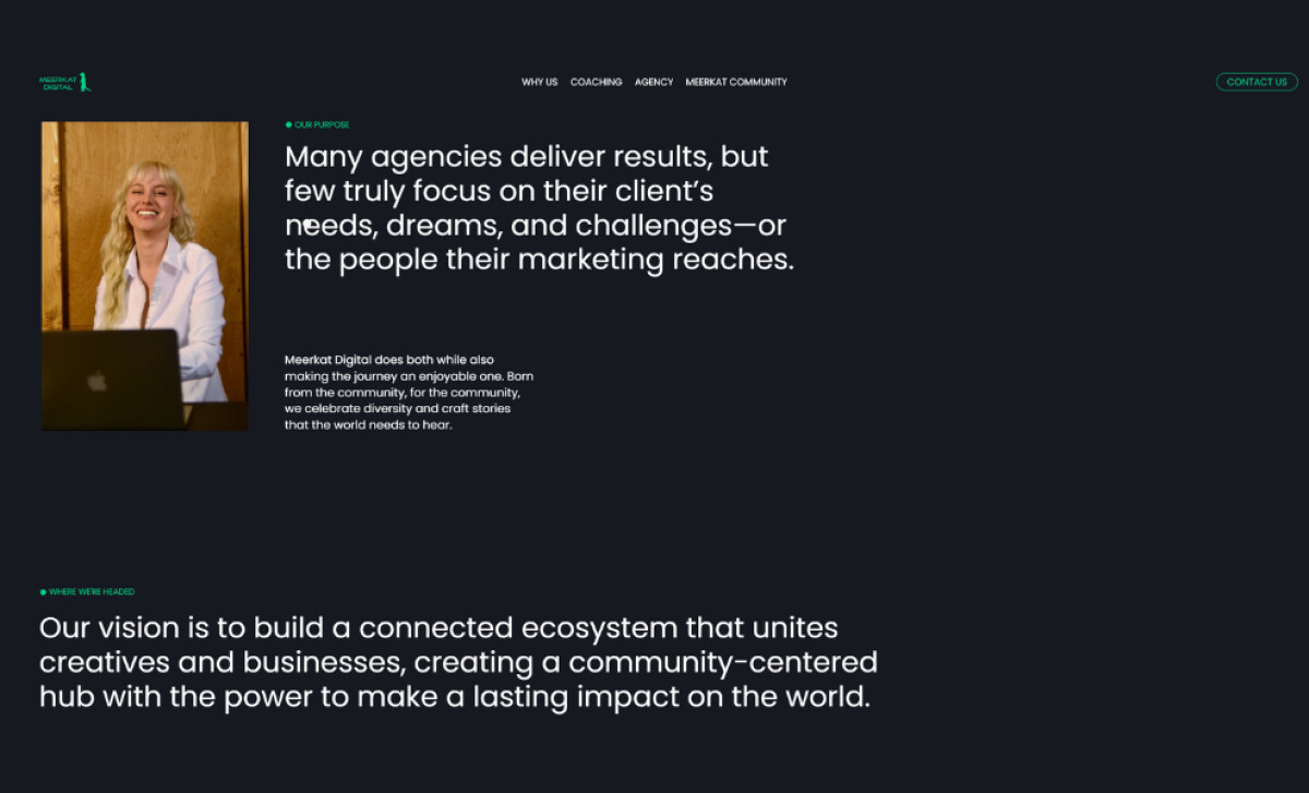
Content is arranged in a balanced grid with clear sections separated by ample negative space. Thoughtfully placed images, such as candid photos of smiling team members, add a friendly, humanized touch alongside text blocks.
This is especially effective because users engage more readily with photos of real people, finding them a faster way to connect with and get an overview of a team compared to reading extensive text.
For professional service firms aiming to connect with a creative community, balancing a polished, high-tech look with humanizing elements like authentic team photography is key. Meerkat Digital’s site showcases how a structured layout and intuitive design can make niche offerings still accessible and engaging.