The Siegal + Gale Web Design Showcases The Firm’s Dedication To Individuality And Creativity
Siegal + Gale is a world-renowned brand strategy and design firm. They put a focus on creativity and individuality to help their customers reach their fullest potential.
Founded in 1969 by Alan Siegel and Robert Gale, this creative firm serves a wide range of clients — from nonprofit organizations to corporate entities and more.
At first, the firm worked on establishing and evolving brand identities. Notable clients included Uniroyal, the NBA and MasterCard. But as the years went on, the scope and capabilities of the brand evolved.
Today, they are one of the most successful creative firms in use, with capabilities and a client list that turns heads. Because of this, they need to be able to show off their talents everywhere they can — that includes in their website design.
You can’t very well be known for your innovation and creativity if you’ve got a website design that falls flat.
So the team put their heads together to create a website design that was sleek, sophisticated and engaging. The second you enter their site, you know you’re working with professionals.

Siegal + Gale’s Website Stuns With Simplicity And Sophistication
With an emphasis on digital design and simplifying user experiences, it is no wonder Siegel and Gale fondly describe themselves as the “simplicity company.”
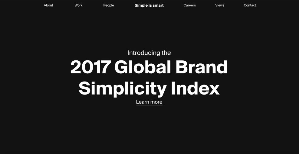
Their website design utilizes a heavy off-white negative space combined with a contrasting black serif font -- both bolded and normal -- while also initiating various light gray animations behind the copy.
Keeping the focus down the center of the site, words are centered and spaced in an even fashion to divide the important aspects of the page.
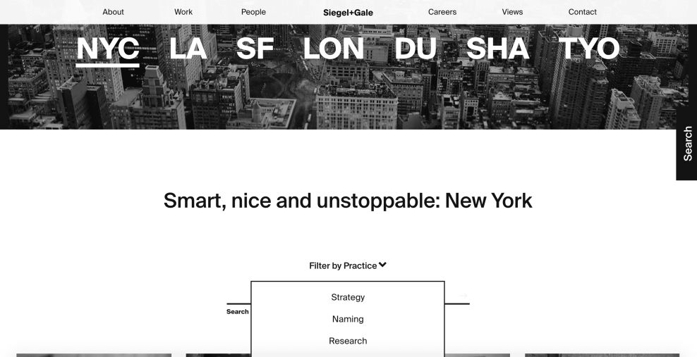
Scrolling down the About page, potential clients will find a splash of color added to the page as a way to illuminate the names of past clients Siegel and Gale has worked with.
These design elements are subtle, but rich with sophistication and excellence. This website doesn't need all the bells and whistles to be the best. And it's this minimal nature and these subtle effects that add an overall excellence that's creative, individual and exquisite.
Images are big and bold; copy is minimal and strong; the menu bar is clear and focused. This minimalism is powerful, and shows prospective clients that the brand knows what's on trend and can deliver that.

The Siegal + Gale Online Platform Brings Branding To Life Through Dynamic Design Elements
Refresh the page a few times, or just wait. You'll start to see subtle movement that will pull your eyes to the screen. And there’s no telling what kind of geometric animation will pop up!
On their homepage and across the site, the Siegal + Gale logo that sits at the top of the screen gades in and out. In its place, there are helpful and creative sayings that further push the brand's mission and goals.
But it's not just on the main page that you'll see movement and dynamic elements.
Combining blog articles and news articles into one dynamic platform, Siegel and Gale brings together a variety of intriguing reading materials for potential clients to work their way through. With the use of a neutral negative space, articles pop from their dynamic images.
Articles are titled in a bold font, while the article blurbs are presented in a normal font. The combination draws the reader’s eyes downward through each bit of information about the article. Beneath the blurb, potential clients are able to find the tags used to break down content type. The brilliant use of tags creates an easy way to find a large number of articles within a specific content area quickly.
Additionally, the blog area utilizes a plugin form as a call-to-action prompt for potential clients to keep tabs on Siegel and Gale through their digital newsletter.
From the blog, to the contact page, there's an element of depth that steals the show. Typography pops, images inspire and copy informs. The way these different elements play off of one another is simply inspiring.
The Team At Siegal + Gale Know What They’re Doing, And Their Web Design Proves It.
From the dynamic elements to the clean layout, this website design shines. There is real individuality and creativity in this website design on every page -- even the contact page!
Initiating a highly-contrasting design, the contact page quickly catches the attention of site visitors. Utilizing a stark black header lined with a flat white page, potential clients’ eyes can navigate easily down the page. The page header uses a bold white font in the black header to make the words “talk to us” stand out. While there is no physical button to push, the assertive wording creates a strong mindset to reach out to Siegel + Gale as potential clients move down the page to the simple plugin form for them to fill in.
This website is sleek, sophisticated and powerful. It's dark and moody, playing with a black and white color scheme and using vivid imagery to stand out in a way that is immediately enigmatic and intriguing.
All in all, Siegel + Gale's highly effective website design showcases their services to clients through a clear, beautiful presentation. If you're in need of some work, Siegal + Gale have got your back.