Standout Features:
- Imposing logo display over images
- Portfolio showcased in a grid-style layout
- Content blocks with seamless transitions
Brought to life by three creative minds, Maïra, Ludovic, and Grégoire, Mu Architecture started designing institutions and housing buildings in 2009. Since then, they have been invited to various events and awarded by prestigious organizations.
To solidify their online presence, they partnered with Be Dandy, a design and branding agency based in Paris. This collaboration resulted in a sleek yet information-thick website design.
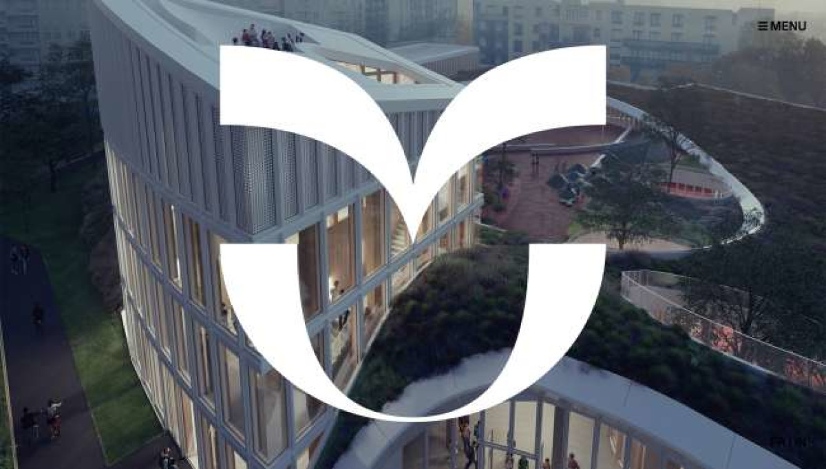
The website opens to alternating images in a full-screen view with an imposing brand logo overlay. This image display is a great way to lure in visitors (first-time users, especially) and mesmerize them with the company’s work.
Scrolling down, visitors are in for a quick treat of a short but sweet copy. This section displays three different content blocks with colored backgrounds that discuss the brand’s vision. This bit adds anticipation for the viewers as they navigate through the page.
Taking the icing on the cake is the portfolio layout. The agency took advantage of the company’s high-resolution assets and displayed them grid-style, allowing the visitors to browse freely.
-preview.jpg)
-preview.jpg)

