This website is an absolute winner right from the start.
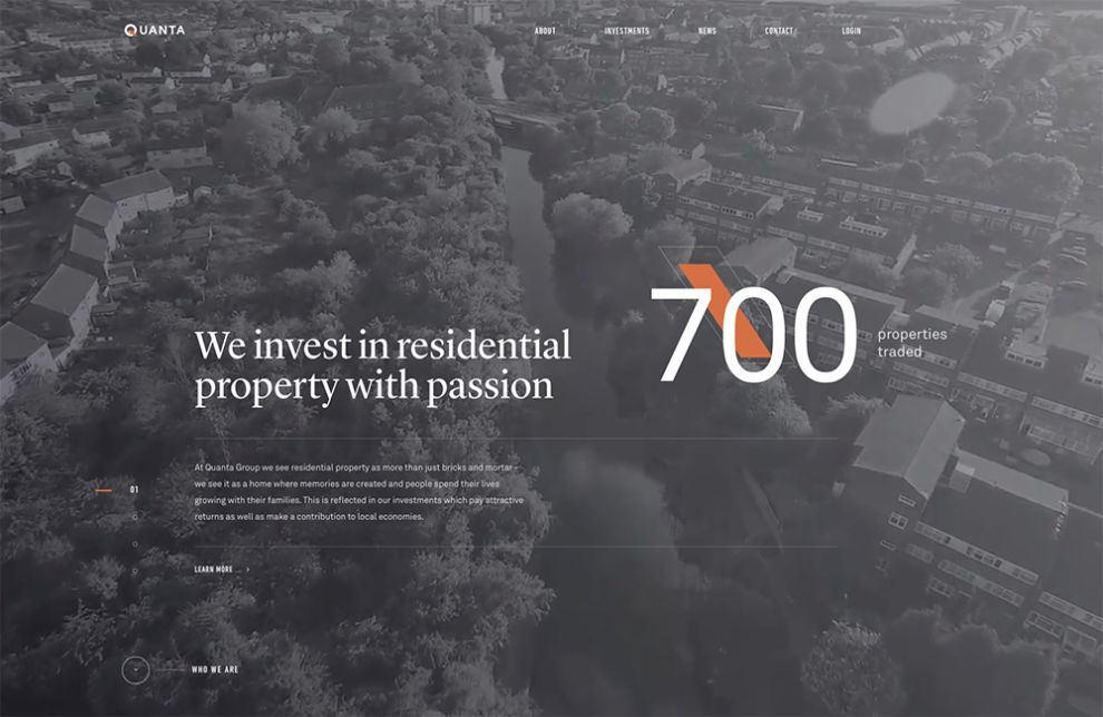
The full-screen video and big headline are excellent teasers that make users want know more about Quanta Group, particularly what makes them different.
Bullet points follow, briefly explaining their numbers and accomplishments for the user to scroll through. The user can also go straight to the section they are seeking, like "About," "News," or "Contact."
Design-wise, the website is very minimalistic and creative. There is a smart use of black and white photography for the background that lets the user focus on the white and orange messaging and details like the little call to action animations or menu links.
Throughout the website, Quanta Group easily merges corporate and cool. In fact, there's nothing plain or stiff about their design.
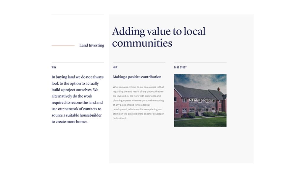
The parallelogram-inspired logo plays beautifully within the headings, and information is displayed in clear hierarchy beneath the typography. While Quanta Group maintains a minimalist aesthetic, they keep a perfect contrast between the thin lines and light gray bolor blocks, orange and navy blue fonts, and serif and sans serif fonts. All of these details add depth to the site.
At the bottom of the page, a button takes users to their Case Study details. This area includes a full-width image gallery, complete with corresponding information that encourages users to click through the slides.

The moving typography and micro-movement of the elements enrich the overall look greatly. The page is so airy, well-organized, and easy on the eyes. It's responsiveness makes it incredibly user friendly on all platforms as well -- no matter how the browser window is stretched, all content rearranges quickly, keeping the site's charm intact.
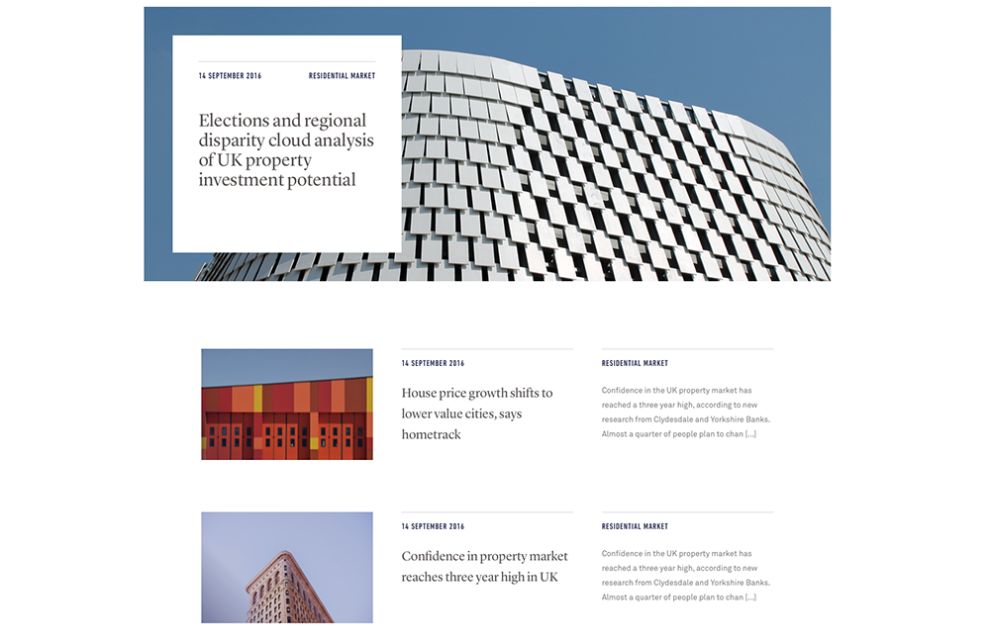
This page differentiates itself from the rest of the subpages with its lighter banner and unique layout, which helps the user associate this section with news
Elements from the rest of the site are carried over, including animated orange line treatments in the banner. In addition, the image of the building in the banner changes angles and gives users the ability to move the angle of the building with your mouse, which adds that unique touch to the site. The flow of the page is different from traditional news landing pages. It has full-width articles and scattered, enlarged featured posts that break up the page as the user scrolls. Featured articles also employ a subtle parallax effect within the image frame. These subtle movements, along with the animation from the regular articles, highlighted background hovers, and image hover call to action really draws attention to the articles without overwhelming the user.
Quanta Group is a professional website design in the Architecture, Banking & Finance and Real Estate industries.


-preview.jpg)