Team Behind the Design
Agency:Websites 360
Client: Oliver’s Village
Category: Website Design (Non-profit)
Location: Benoni, South Africa
Project Brief: Redesign Oliver’s Village’s website to deliver stronger storytelling, improved usability, and donor engagement.
Web Design Analysis
Related Articles:
When I review a website, I often focus on interface clarity, user experience, creativity, and performance.
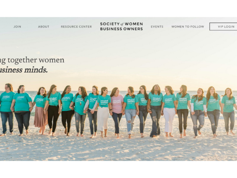
The Oliver’s Village platform, designed by Websites 360, reflects a thoughtful blend of storytelling and functionality that strengthens the non-profit website's digital presence.
- User Experience (UX) Design: I like how the navigation stays simple and intuitive. Clear menu labels and a visible donation button help visitors act quickly.
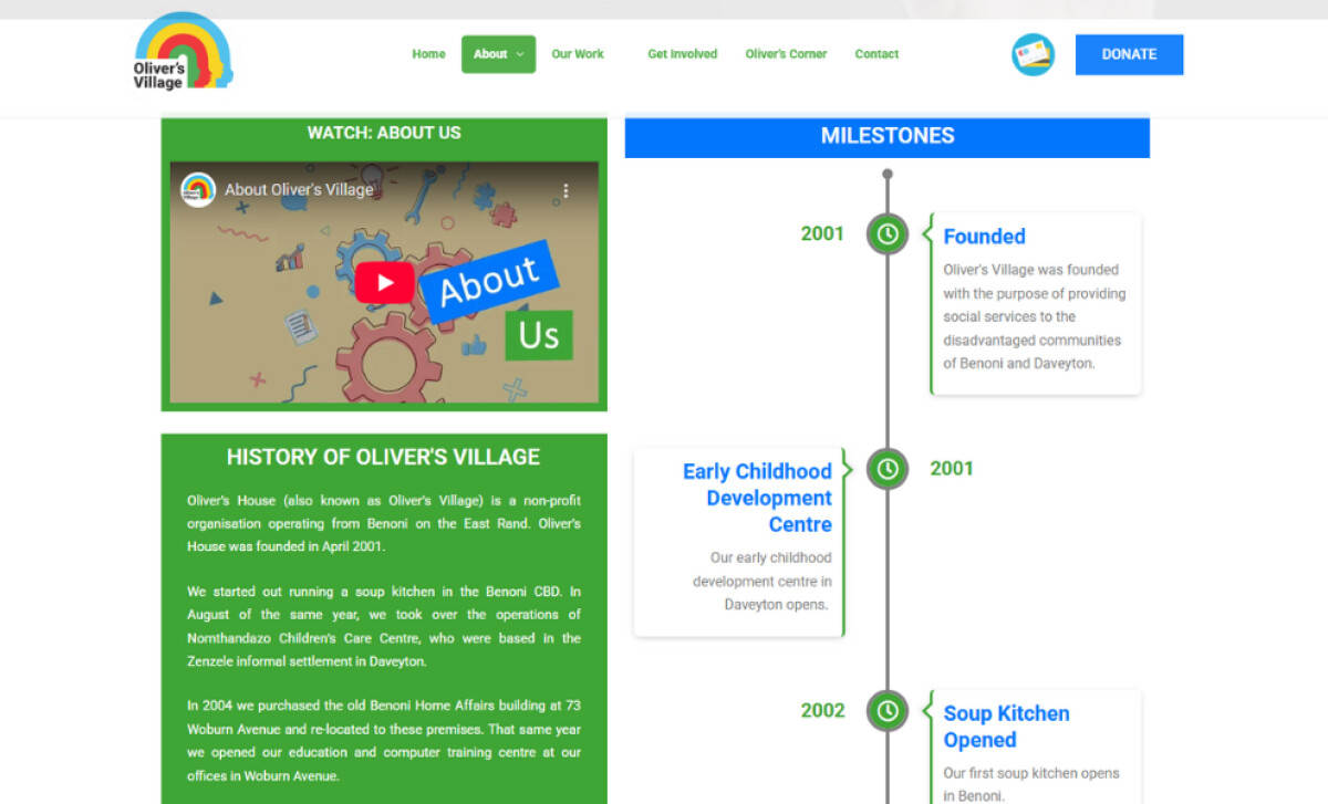
- Brand Storytelling: The embedded video on the About page adds warmth and personality, making the non-profit’s mission more relatable.
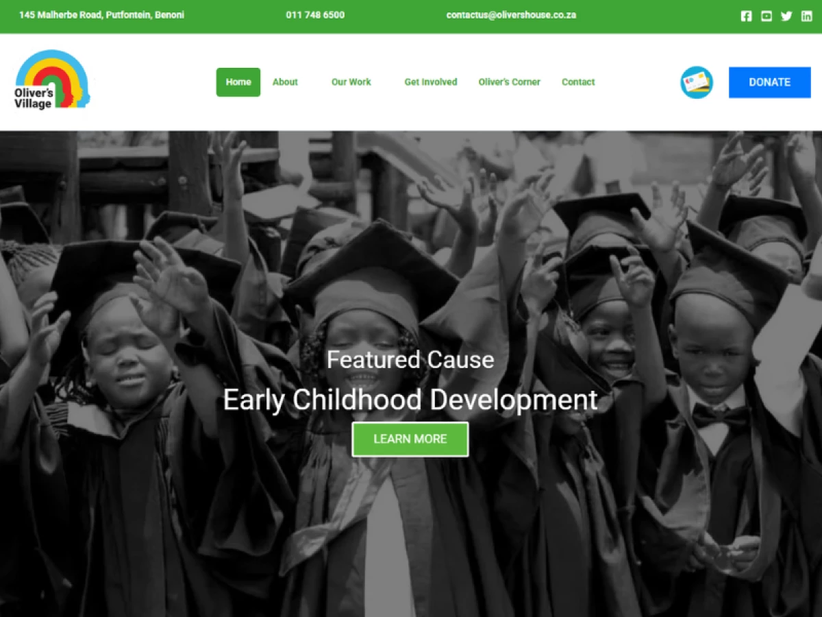
- Visual Hierarchy: The use of hero slides with impactful images highlights key causes immediately, guiding users toward engagement.
- Performance & Engagement: The site balances visuals and text well. Sections like “Milestones” and “Our Work” provide quick, scannable impact metrics that donors and partners value.
Get connected with the right web design agency for your project.
GET STARTED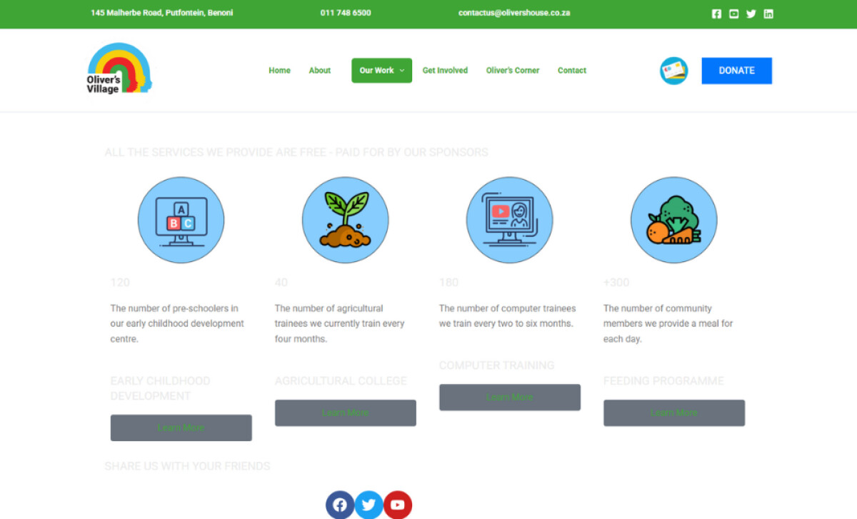
About DesignRush Featured Designs
At DesignRush, we review hundreds of agency projects every month. The featured works represent some of the most compelling examples, standing out for their creativity, clarity, and execution.
The very best advance to become Monthly Design Awards winners, gaining recognition across the industry.
Browse standout work in non-profit website designs and beyond:
- Best Website Designs
- Best App Designs
- Best Logo Designs
- Best Print Designs
- Best Packaging Designs
- Best Video Designs
For a full list of design agencies and related services, see our Agency Directory.
Get a chance to become the next Design Awards winner.
SUBMIT YOUR DESIGN