Standout Features:
- Sophisticated and muted color palette
- Elegant serif typography with clear hierarchy
- Balanced layout and clean visual composition
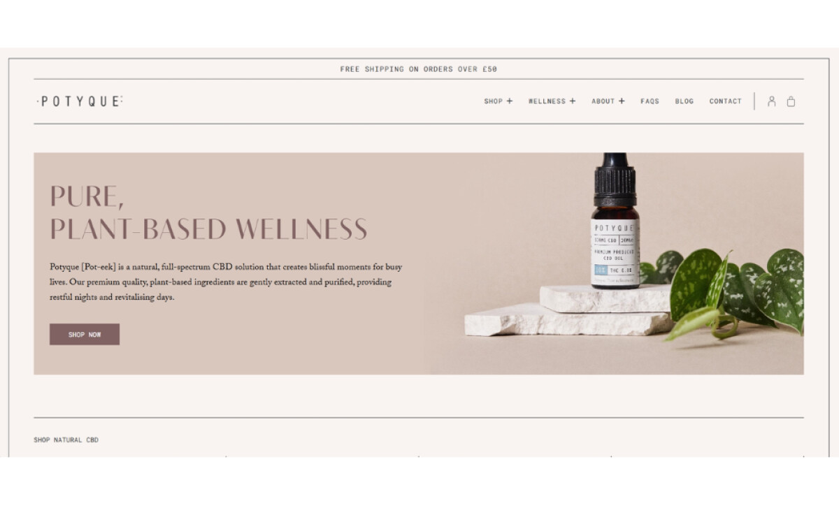
If you're looking for high-quality, natural CBD products, Potyque is a brand that started from a personal wellness journey. Brand Folk designed its eCommerce website to reflect this focus on purity and holistic self-care, while offering a calming and trustworthy experience as you explore its plant-based solutions.
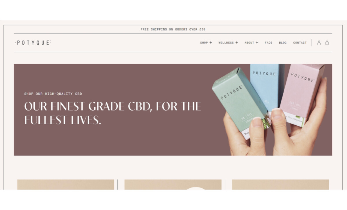
What makes this website so soothing is its beautiful color scheme. It uses soft, earthy colors like warm beige, dusty mauve, and a gentle pastel blue with lots of clean white. Given that color can influence up to 90% of initial product assessments, these shades are expertly chosen to make visitors feel calm and think of natural purity.
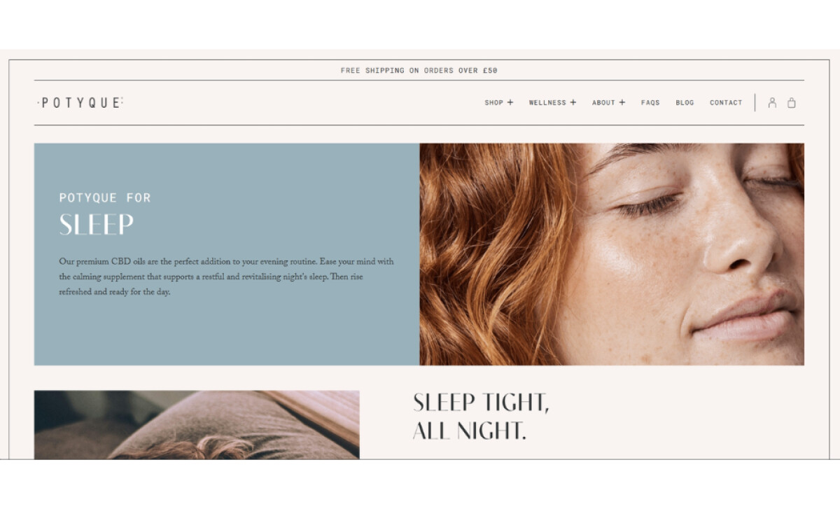
The way words are presented on the site is also very elegant. It uses a refined serif font that feels classic yet easy to read. Headlines like ‘Plant-based Wellness’ have a slightly artistic touch, while the main body text is simpler. This makes it easy to scan and find what you need.
The layout of the Potyque website is very clean and balanced. It uses a grid structure, with text blocks nicely paired with high-quality photos of products and lifestyle scenes. Lots of white space keeps it from feeling cluttered, so you can easily focus on each section as you scroll.
Brand Folk’s design is a testament to thoughtful eCommerce presentation. The soothing color scheme, refined serif text, and well-composed layout all contribute to a sense of natural quality and calm. This helps consumers connect with Potyque’s core promise of pure, plant-based revitalization.


-preview.jpg)