Prada Men’s Collection Web Page Is a Perfect Example of Minimalistic eCommerce Design
When it comes to Prada, be it brand in general or something as specific as their men’s collection web page, classic is classy. And that’s a fact. But what do we mean by that?
Prada doesn’t require outlandish design somersaults to be noticeable. More often than not, your typical monochromatic, black-and-white color combination does the job with flying colors (pun intended).
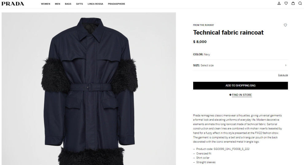
Just like their fall/winter clothing line, the aforementioned web page sells you modish simplicity, polished to perfection. Besides looking trendy, the straightforward design and lack of coloration reduce eye strain and create a higher contrast ratio.
Good web design companies create engaging and attractive sites like this. It's no surprise that visitors dive into the pool of sophistication right upon landing on the Prada Men's collection page, where every element/piece stands out effortlessly.
If Jeff Goldbloom looks so good in Prada, you can bet the men’s collection web page looks terrific with Jeff Goldbloom in it!
You may also look into branding agencies that specialize in ensuring harmonious branding from your products and packaging to digital assets and website.

Prada Men’s Collection Web Page Uses Clever, Interactive Imagery to Breathe Life Into its Products
To make the website more dynamic, the designers energized the offering by including a clever hover feature to showcase each product in all its glory. Besides glorifying the various pieces of attire, these captivating images also work to inspire men as to how to style themselves.
The interactive feature makes the whole page look like a high-end fashion magazine, while scrolling down, checking each image calls to mind your typical strut down the catwalk.
Intentional or not, the layout shares much with one more visual content-heavy design solution – Instagram! While the design hierarchy evokes the famous platform’s feed, clicking on each product reveals more than an abundance of hashtags.
In fact, every single one sports a slew of customization options to ensure personal preference satisfaction and, by extension, superb user experience.

Prada Men’s Collection Web Page Uses On-Point, Customer-Centric Elements to Drive Sales
The website is dedicated to its product line; however, its clean, cohesive and straightforward design is custom-tailored to address users’ every whim.
Clear CTAs are always apparent, the menu bar is sticky, and the convenient chatbot is present when questions start forming in prospective shoppers’ minds.
Men’s collection single-page design streamlines navigation and encourages buyers to complete their journey easily and excitedly. The contrasting colors create excitement and draw eyes to these products and the website areas with the helpful information buyers need on their journey.
This web page is itching for our Best Website Design award as it personifies Prada’s promise: “Pragmatism mixed with elegance.”


