Bilberrry helped Partners for Public Good (PPG) develop a custom website that supports the organization’s vision: scale their programs, launch their own brand, and create a home for their flagship initiative, the Procurement Excellence Network (PEN). The outcome is a flexible, multisite framework that displays the impact of their work while leaving ample room for future growth.
Key Insights for Brands:
- Modular site frameworks help nonprofits grow without losing consistency
- Color-coded subsite architecture simplifies multi-program branding
- Topic-tagged communities and profile badges encourage engagement
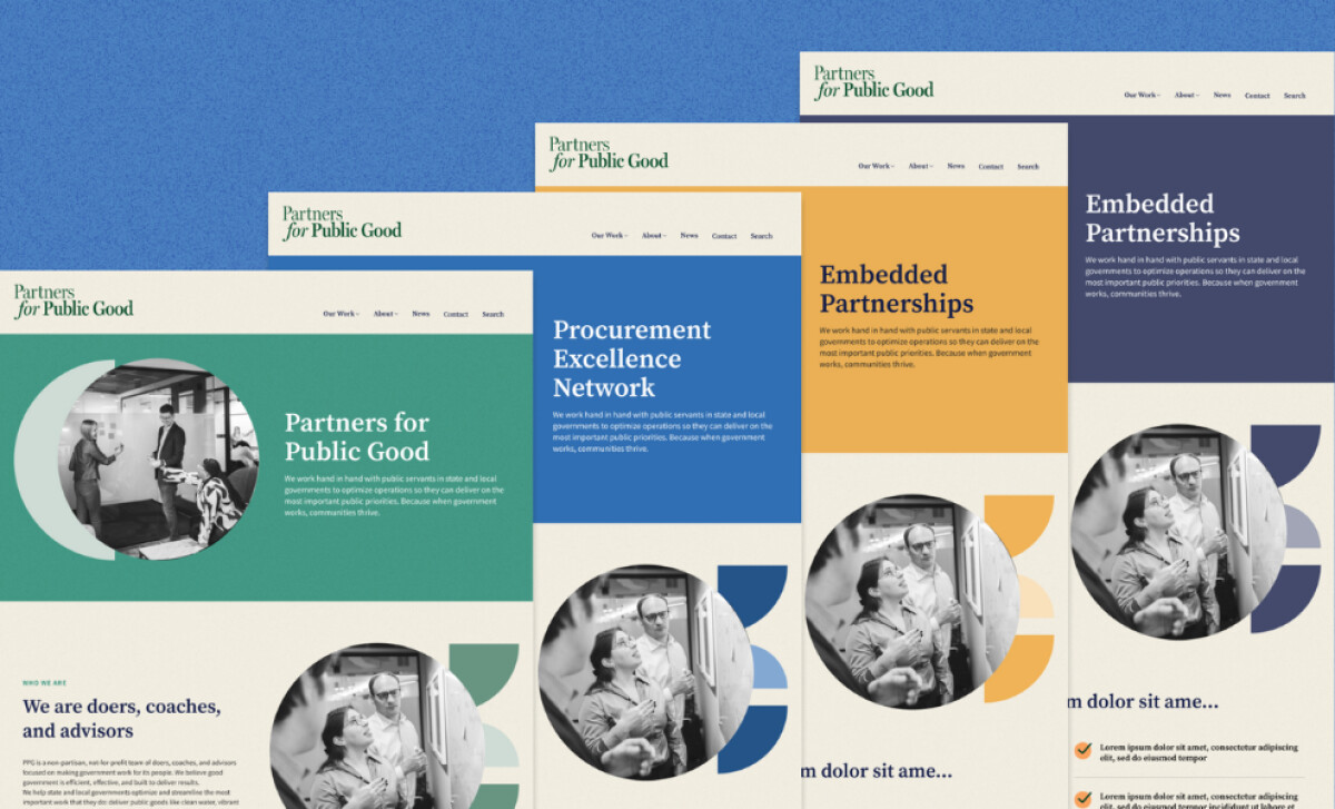
Modular Design System Supports Long-Term Growth
Bilberrry’s challenge was to help Partners for Public Good scale while keeping its message coherent.
The team created a multisite strategy with a modular design system, one that lets new initiatives begin with a single landing page and grow into full sites over time. This system ensures the Procurement Excellence Network (PEN) stays recognizable while allowing room for future projects with equal clarity.
The visual separation between programs is subtle but effective. Color is used not just for aesthetics, but to signal hierarchy and differentiate between content areas.
From the navy blue of PEN to the rich green of the core PPG site, each palette anchors the user in a distinct part of the organization. Blue is particularly a good choice, considering more than half of consumers think it’s the most trusted brand color, according to an Adobe study.
This strategy is especially useful for nonprofits juggling multiple initiatives. Instead of starting over with each launch, they can build on the same framework. It saves time, budget, and user familiarity.
Community Features Reinforce Connection and Learning
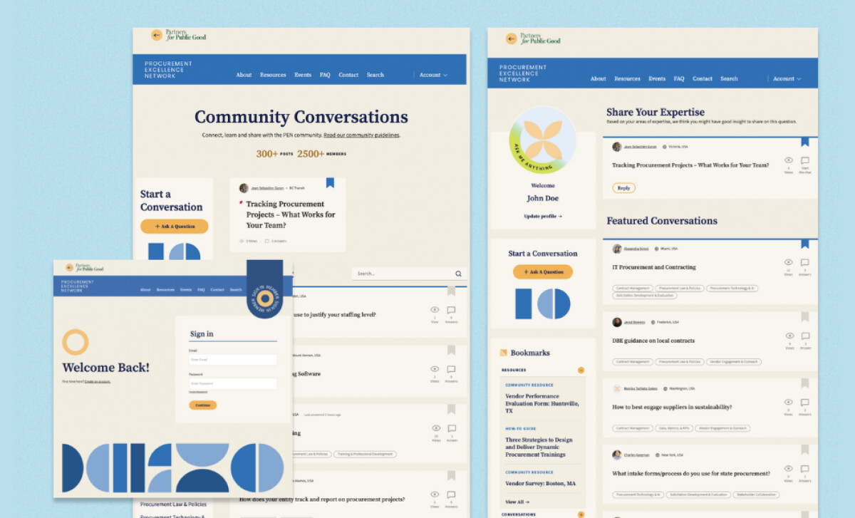
One of the site’s most impressive features is the reimagined member area for PEN. Designed to boost participation, the platform now feels more like a curated space for peers to connect and less like a static portal.
Profile badges, content bookmarks, and an “Ask Me Anything” banner encourage both learning and contribution. Conversations are easier to follow, too. Threads are now browsable by topic or tag, making it simple to find relevant discussions.
This content structure helps skilled web designers create a sense of momentum. Members can jump into peer-led conversations, discover tools, or contribute expertise without getting lost.
By improving how people interact with the platform, the site creates a space that feels just as dynamic as the community it serves. This is what it looks like when functionality supports, not stifles, engagement.
Check out more noteworthy examples of nonprofit website designs.
Typography and Layout Build Authority Without Losing Warmth

From the outset, the site’s tone is confident yet accessible. That balance is achieved through considered typography: a classic serif headline font paired with a clean sans-serif for body text.
This mix lends credibility without feeling rigid, which is important for a nonprofit working closely with both governments and communities.
Layout plays a major role as well. Bilberrry used vertical stacking, white space, and intentional visual breaks to guide the user. Nothing is rushed; each section feels measured, with generous spacing that adds both clarity and breathing room.
It also avoids a common pitfall: 91% of websites (particularly eCommerce pages) don’t clearly highlight the user’s current scope in the main navigation. Here, the design ensures orientation is never lost.
These typographic and layout decisions might not seem flashy, but they’re essential. They create trust, lend professionalism, and help users digest complex ideas: a mark of thoughtful, user-first web design.
Geometric Graphic Style Unifies the Ecosystem
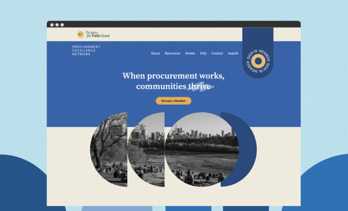
Whether it’s the homepage or a sub-program like Embedded Partnerships, one graphic element stands out: the repeating use of geometric circle-based shapes.
These forms reference collaboration and systems thinking, and they show up in hero banners, community forums, and mobile transitions. The consistency is what ties the ecosystem together.
Each circle motif is cropped, mirrored, or multiplied in various ways, offering variation without compromising its identity. It gives the entire experience a distinct graphic signature.
That kind of visual cohesion is a stellar quality of impeccable web designs. Even as the site grows and evolves, this visual language ensures continuity – one that’s memorable, flexible, and unmistakably PPG.
Bilberrry’s approach gives the nonprofit room to grow without ever losing its focus, making the Partners for Public Good website a good reminder that great design is about creating scalable systems that people actually want to use and look at.


-preview.jpg)