Standout Features:
- Clean color combination
- Single-page web design
- Extensive positive space
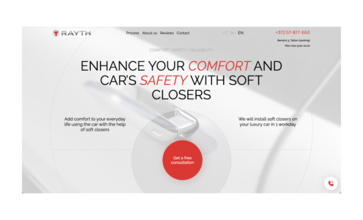
RedSquirrel’s website design for RAYTH combines clean colors, simple geometric outlines, legible typography, and an attention-grabbing red to add contrast.
This single-page web design relies on the fixed navigation bar on top to help browsers through sections quickly. The layout builds an easy-to-follow and coherent brand story, showcasing essential details about the client, such as their process, reviews, and past works.
While the case studies are presented in a vertical scrollable photo gallery, there’s also a video showreel to deliver some action to the users. Many intriguing visuals, custom graphs, and charts rely on the red accent color to highlight all the significant business aspects and buttons.
With extensive positive space, these red markers are easy to spot and immediately grab attention.