Team Behind the Design
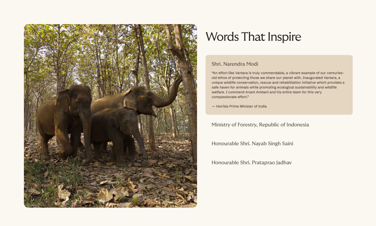
Vantara is a large-scale animal rescue, conservation, and rehabilitation center established by Reliance Industries and Reliance Foundation under the leadership of Anant Ambani.
Clay created the website to convey the scale and purpose of the initiative through documentary-style storytelling, earthy minimalism, and an interaction system designed to feel both educational and serene.
Web Design Analysis
For a project of this scale, I paid close attention to how visuals, structure, and interaction support the emotional and educational goals of the experience.
Clay’s approach for Vantara brings together narrative-led visuals and a clear information structure that helps the content feel steady and easy to follow.
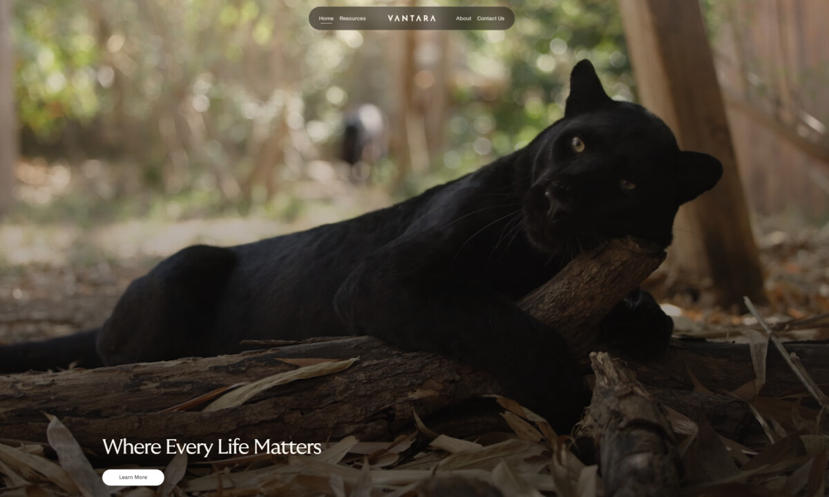
- Branding & Visual Storytelling: The full-screen wildlife hero instantly sets an emotional tone. I like how the slow-motion footage and serif typography create a gentle, almost sacred atmosphere that aligns with Vantara’s mission of protection and care.
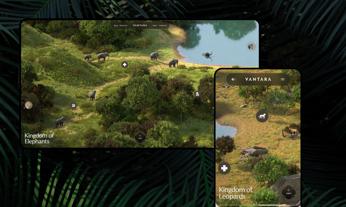
- UX & Exploratory Interaction: The illustrated 360° habitat maps invite users to explore rather than passively scroll. I appreciate how each circular marker reveals species details in a way that feels intuitive and naturally educational.
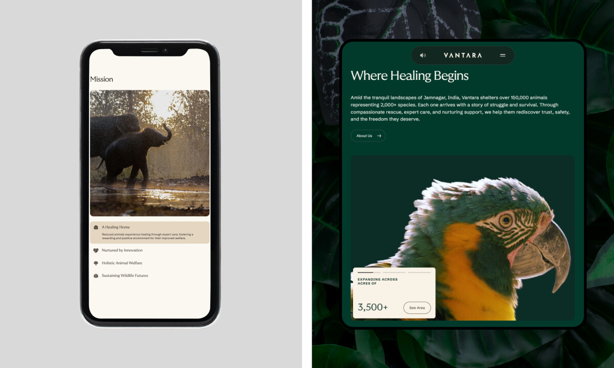
- Visual Craft & Structure: The modular card system keeps dense information readable. I find the consistency of spacing, rounded geometry, and earthy tones especially effective for maintaining clarity across long pages.
- Performance & Immersion: Despite the cinematic video, large portraits, and interactive maps, the experience stays smooth. This balance matters because it keeps the emotional storytelling intact without compromising usability.
What Brands & Agencies Can Learn from Vantara
Here are a few lessons from how this project approaches conservation-focused website design:
1. Use Cinematic Storytelling to Build Emotional Connection
High-quality wildlife footage and expressive photography can help audiences feel the mission before they read a single sentence. This approach often strengthens brand trust and emotional engagement.
2. Turn Complex Information into a Clear, Modular System
Modular cards and structured sections make dense material easier to explore. This helps organizations present large volumes of scientific or educational content without overwhelming users.
3. Create Interactive Moments That Support Learning
Features like illustrated habitat maps can transform a website into an exploratory tool. When interaction reinforces education, users spend more time engaging with the mission and understanding the work behind it.
About DesignRush Featured Designs
At DesignRush, we review hundreds of digital projects each month, spotlighting work that merges creativity with technical precision. The featured designs stand out for concept strength, usability, and execution quality.
Only the most compelling projects advance to become Monthly Design Awards winners, recognized across global creative industries.
See more creative projects across categories:
- Best Website Designs
- Best App Designs
- Best Logo Designs
- Best Print Designs
- Best Packaging Designs
- Best Video Designs
For a full list of design agencies and related services, see our Agency Directory.