Standout Features:
- A simple design
- Cute & appealing educational side
- Visual elements highlighted with black outlines
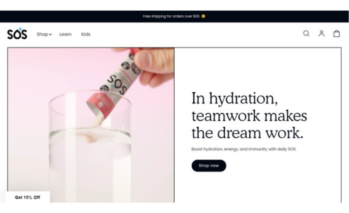
SOS is an electrolyte drinks and powders retailer that aims to take the chore of drinking enough water and turn it into a fun activity. Hello Design ensured the brand's message came across in mint condition with its fresh web design for the company.
This website has a lot to say, but the clean, straightforward design helps it eliminate any confusion. The design interchanges between framed content (mostly visuals) outlined by thick black squares and clever product placement.
This in-and-out-the-box thinking helps the user differentiate personal experiences and the results from the sales-focused part. The latter is always presented outside the borders, alluding to the energetic possibilities after having SOS' electrolytes.
Rather than a typical "About us" section, the design encompasses a "Learn" path reserved for introducing the company but primarily for educating the broader public on the benefits of these products.