- Agency: Big Red Jelly
- Client: Taco Culture
- Category: Web Design — Restaurant & Hospitality
- Project Brief: To launch a Mexico City style taqueria in American Fork, Utah, with a brand site that could build anticipation, capture contacts, and establish a distinct identity before the doors ever opened. Taco Culture set out to avoid the typical "coming soon" placeholder and instead deliver a site that felt like stepping into the restaurant itself, carrying the same energy, voice, and cultural specificity that would later define the in-person experience.
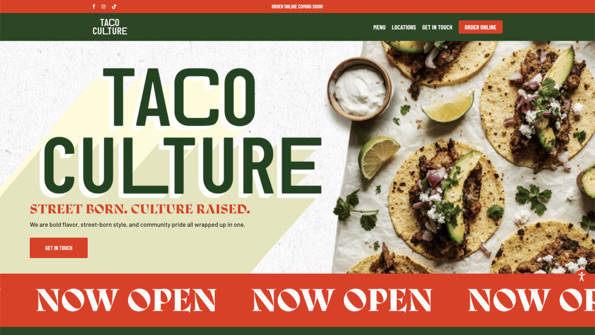
Taco Culture is a restaurant website built on a simple idea: a launch page should feel like a destination, not a waiting room.
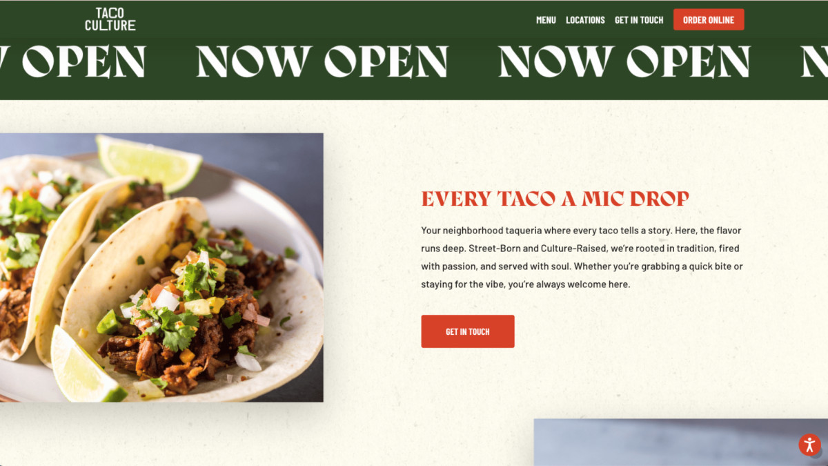
What begins as a single scrolling experience develops into a layered brand story, where bold typography, warm earthy tones, and street-culture references work together to communicate authenticity before a single taco is served. The site reads closer to a printed zine than a standard hospitality landing page, inviting visitors to slow down and absorb the world rather than scan and bounce.
The experience unfolds across distinct sections such as the hero, brand promise, and origin story, with a scrolling "Now Open" marquee that adds rhythm and urgency.
Each block introduces new copy, new imagery, and new texture, gradually building the brand voice while keeping the path to contact clear. Sections are presented with intentional spacing and lived-in photography, giving the interface a tactile quality that mirrors the feel of a neighborhood taqueria.
Engagement is managed through a balance of personality and function. Repeating calls to action guide visitors toward the contact form without feeling pushy, while voice-driven headers like "Every Taco A Mic Drop" and "We Roll Deep In Flavor" keep the tone consistent.
Interactions feel deliberate, with smooth transitions and clear hierarchy that support both first-time visitors and returning fans.
The interface focuses on clarity and character. Navigation stays minimal, typography carries the weight of the brand, and the layout remains readable as more sections are introduced. Each design decision supports the main goal of making the site feel like an extension of the restaurant rather than a marketing asset.
Taco Culture is structured to support ongoing growth. New menu pages, location details, and online ordering can be introduced without disrupting the existing system, allowing the site to expand alongside the business while maintaining its core identity.
Impact and Results
- Launched the brand with a contact list already built ahead of the April 2026 grand opening.
- Established a visual identity strong enough to anchor social channels across Facebook, Instagram, and TikTok.
- Improved early customer engagement through voice-driven copy and clear calls to action.
- Maintained a design system that supports readability while reinforcing the Mexico City street-culture theme.
- Built a foundation that allows future content, menu, and ordering features without redesigning the core.