Project Fire Buddies brings heart to the screen. The nonprofit connects children battling critical illnesses with local firefighters, and its new UI showcases that mission with emotion and clarity.
To create a platform that could inspire action at first glance, Project Fire Buddies teamed up with Digital Silk. The goal: design a site that feels human, urgent, and unforgettable.
Bold visuals, impactful messaging, and intuitive navigation work together to draw visitors in and guide them toward getting involved.
Front-and-center calls to “Join the Fight” and “Donate” also make the next step impossible to miss.
Industry Insight: An NLM study found that three-quarters of users judge an organization’s credibility based on its website design.
Through heartfelt storytelling with action-focused UX, Project Fire Buddies builds trust while turning visitors into actual supporters.
Let’s explore the design in fuller detail.
Key Findings for Brands:
- Emotionally driven imagery and clear CTAs boost donor engagement
- Streamlined action cards make it easier for users to take immediate action
- Prominent impact metrics promote transparency and drive higher conversion rates
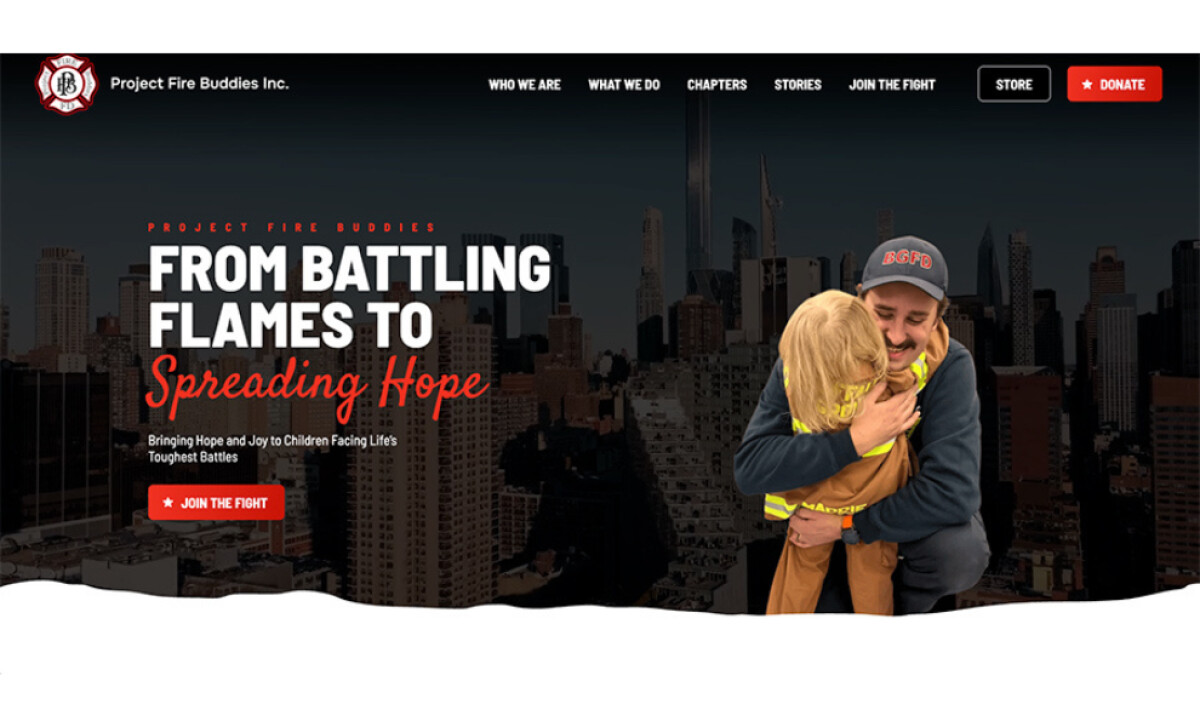
Hero Banner Inspires Action Through Emotional Storytelling
The homepage opens with a powerful visual: a firefighter kneeling to hug a young child, framed against a bold city skyline.
The tagline “From Battling Flames to Spreading Hope” instantly sets the tone. It’s a promise that resonates well beyond the page.
Looking closer, the design uses textured overlays to spotlight two actions: “Join the Fight” and “Donate.”
There’s nothing accidental about the hierarchy here. It’s less “pushy” than persuasive, and it effectively invites visitors to take part in something meaningful.
Moreover, research shows that the way colors align with a brand’s identity strongly shapes how audiences perceive it. Project Fire Buddies’ use of vibrant reds and neutral tones sparks empathy while gaining trust.
Here, you’re not being asked to click buttons or visit pages. You're being invited into a story.
Action Cards Simplify Volunteer and Donation Pathways
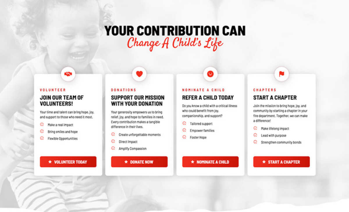
Scrolling further down, the design hands visitors four beautifully structured action cards. Each represents a path to contribute:
- Volunteer: Join the team bringing smiles and hope
- Donate: Fuel experiences and resources for families in need
- Nominate a Child: Connect a child to the program
- Start a Chapter: Grow the movement in your own community
Every card uses consistent typography, subtle icons, and direct CTAs, all creating a frictionless experience.
This simplicity reflects an important UX principle. When users face fewer choices, they’re more likely to act.
The effect may be subtle, but it’s powerful.
No matter who you are (a first-time visitor, firefighter, or donor), you know exactly where to begin!
Clear Metrics Show Impact and Strengthen Credibility
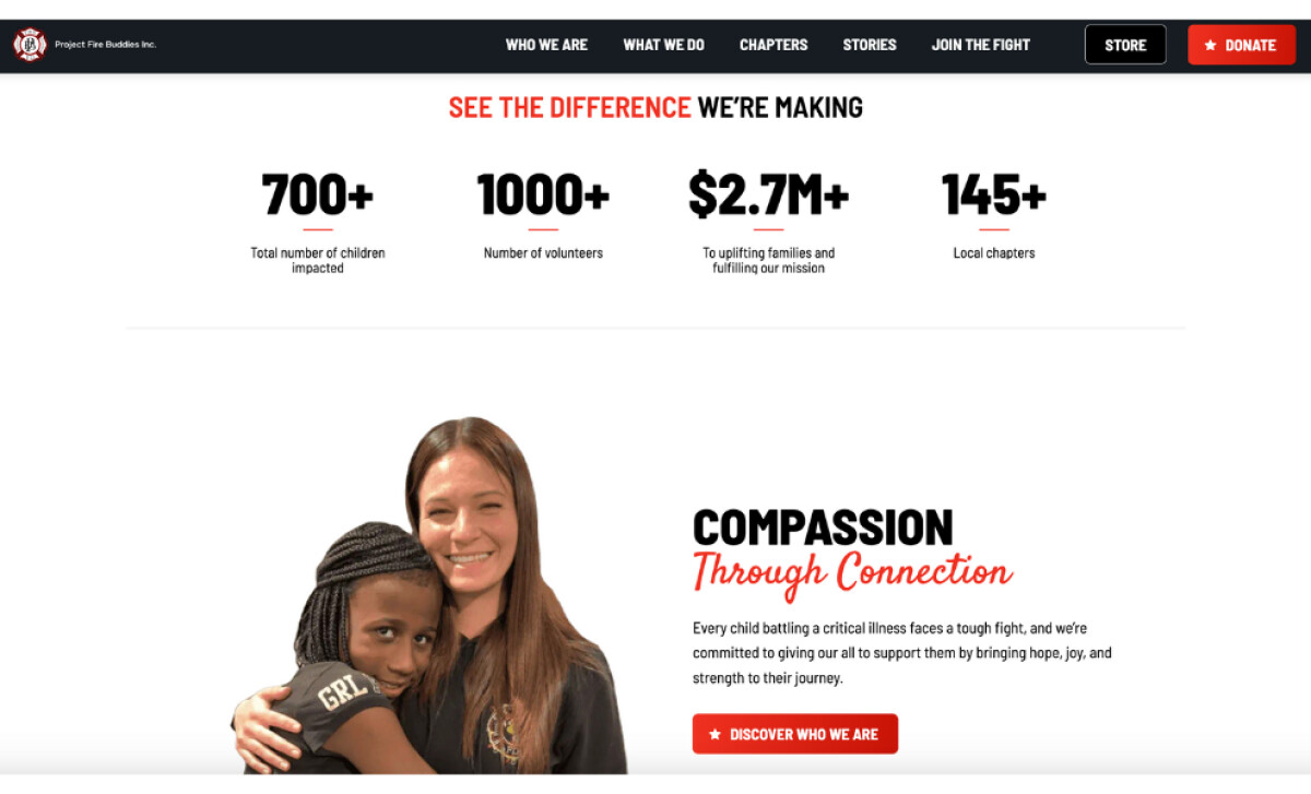
A well-accomplished organization doesn’t hide its numbers. It celebrates them. A dedicated data visualization bar highlights Project Fire Buddies’ reach and makes the impact instantly clear.
The design keeps the experience clean and focused by:
- Using a minimalist approach that avoids clutter and keeps attention on what matters
- Highlighting key figures through varied font weights
Given that 70% of users judge a site’s quality based on its navigation and layout, displaying these metrics front and center makes the information effortless to find.
Plus, the stats are proof that the mission works. And with the placement, visitors aren’t left wondering if their contributions matter. They can immediately see the difference.
Event Carousel Connects Communities Beyond the Screen

What sets this site apart is how well it brings the community together.
Integrating event visibility into the design, Project Fire Buddies strengthens its ecosystem and turns passive visitors into active participants.
The “Latest Events” carousel highlights:
- Local fundraisers
- Movie nights
- Chapter-led initiatives
And more. It’s a truly effective way to invite supporters to connect outside digital.
With this feature, the website has become a rally point where local chapters, national supporters, and first-time donors all meet the mission.
It’s a great example of how professional nonprofit web designers can turn community engagement into a seamless digital experience.
What Agencies Can Learn from Project Fire Buddies
Nonprofit websites often struggle to do two things at once: move hearts and move people to act.
Too many lean hard on emotion but fall short on usability. Others are clean and functional but lack the warmth that inspires giving.
Project Fire Buddies achieves both.
Here’s what creative teams can take away from this design:
- Strong visuals drive action when paired with emotional messaging and clear CTAs
- Simplified decision pathways (like cohesive action cards) help users commit faster and with confidence
- Prominent data visualization can convert visitors by showcasing tangible numbers upfront
- Integrated community features strengthen long-term engagement and donor loyalty
When brand storytelling, UX strategy, and community-building tools merge, nonprofit websites can go from simple awareness platforms into engines for participation and growth.
Every detail on Project Fire Buddies’ website is designed to turn visitors into active supporters. That, while keeping the heart of the mission front and center.
If you’re looking for agencies that can create the same kind of impact, explore our Agency Directory to find the best partners in:
Our design experts also recognize the most innovative design projects across the globe. Visit our Awards section to see the best & latest in website design.