Standout Features:
- Modern typography contrasted by soft lime-green highlights
- Oversized imagery with distinctive graphic layering
- Modular grid layout with a clear icon system
Why Not? Consulting aims to be a leading partner for companies needing recycling solutions. With its bold structure and modern UI, Dope Design's website for the firm communicates trust and is tailored for a B2B audience seeking both expertise and approachability.
The professional service website’s core typography uses a geometric sans-serif for headlines, paired with a lighter version for text. Headlines are impactful due to their size and careful line breaks. A distinctive neon lime-green dot punctuates most headers. This creates a strong visual hierarchy and a contemporary, innovative feel.
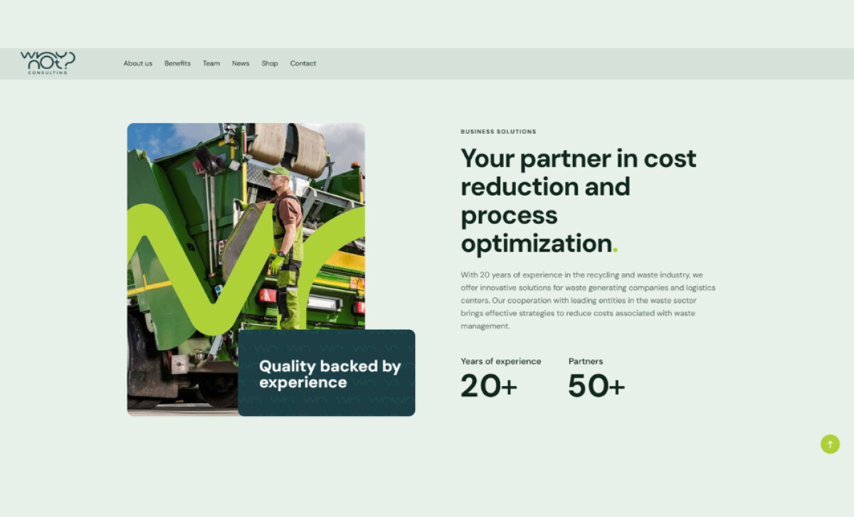
Engaging, human-centric images of professionals and equipment are prominent. Over these, a signature curved green line (the first half of the Why Not? Logo) serves as a dynamic graphic layer. This technique keeps the interface visually active and memorable, while the positive imagery supports a message of trust.
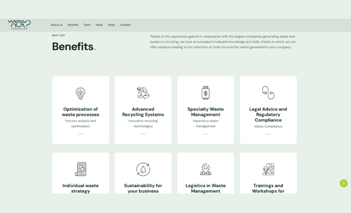
To illustrate its modern UI, services are detailed in the "Benefits" section using a grid of rounded rectangular cards. Each contains a minimalist line icon (e.g., recycling symbols), a clear title, and concise text, with a pale green background. This iconographic system makes complex services easily digestible and visually appealing.
A key takeaway from the Why Not? Consulting website is the strategic use of subtle brand elements, like the green dot and curved line, to create a memorable and cohesive visual identity. This aligns with research showing that thoughtful, balanced design across all brand interactions builds a stronger identity and perceived credibility.