
Menstruation has long been stigmatized and hidden from view, limiting creative branding opportunities. Today, branding agencies are breaking taboos with strong identities, striking visuals, and clear messaging that normalize period and feminine care and empower women by modernizing this natural experience.
Curious to see how it's done? Explore our list of standout examples of transformative menstrual product branding.
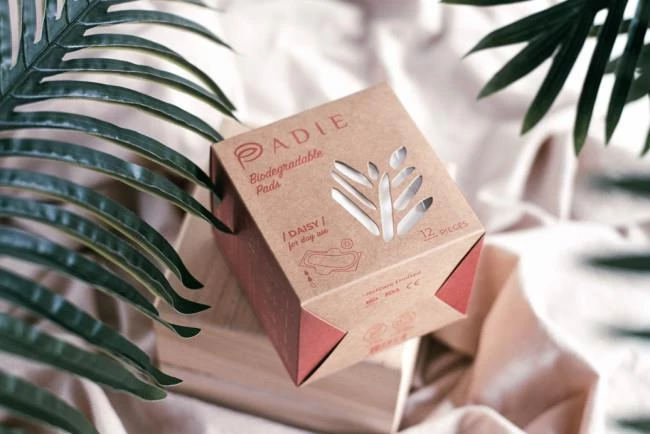
1. Padie by Vinc Design
Standout Features:
- Eco-friendly packaging
- Nature-inspired visuals
- Comprehensive product labeling
Women's care and environmental protection are two meaningful causes that Padie strongly advocates. Their tagline "For Her, For Earth," emphasizes their commitment to sustainability with biodegradable and compostable products.
Agency Vinc Design stayed in touch with the brand's organic character through the visuals. The logo embodies two iconic elements: the letter P in Padie, shaped like a woman’s intimate body part, encircling a leaf. This captures both femininity and eco-consciousness in one illustration.
Padie’s product packaging balances aesthetics and functionality. Made from organic, raw materials, it reinforces the brand’s commitment to keeping its products eco-friendly. The unbleached recyclable paper and eco-ink are particularly impressive design choices.
Additionally, the packaging doesn’t skimp on transparency. Every side of the box features key product details, including raw materials and sustainability credentials.
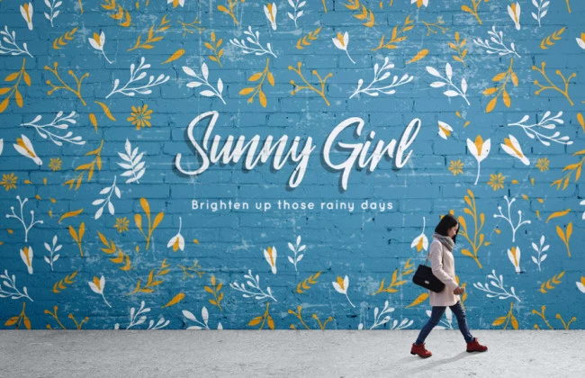
2. Sunny Girl by Elixir Design
Standout Features:
- Refreshing color palette
- Patterned icons in multiple colorways
- Clean and pristine typography
Sunny Girl exudes a refined yet vibrant and outgoing brand identity developed by Elixir Design — perfect for a menstrual product focused on women’s comfort. The choice of turquoise as the primary brand color sets Sunny Girl apart from typical deep, neutral-toned menstrual products. Paired with bright colors like white and yellow, it evokes the refreshing warmth of a sunny day.
The designers incorporated strips of patterned icons on the layout – great for adding variation to a plain and standard packaging design. Meanwhile, the repetitive vector illustrations of leaves, flowers, and plants help bring out the brand’s distinct summery vibe.
Lastly, a combination of handwritten and soft sans serif fonts gives the typography its neat and feminine touch. After all, good menstrual product branding should connect with women from the get-go, which Sunny Girl aced in this design!
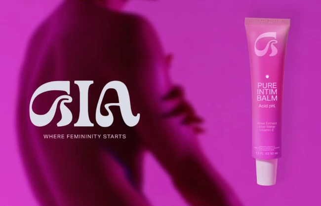
3. Gia by Stacy Saturday
Standout Features:
- A vibrant and cohesive color story
- Powerful and sensual women silhouettes
- A mix of a stylistic and straightforward typeface
Gia puts forth a strong message that women are empowered when they are free to embrace their femininity. With the tagline "Where Femininity Starts," the brand offers personal hygiene products free from clinical connotations.
With this brief, creative agency Stacy Saturday concocted a branding strategy that highlights Gia’s bold and revolutionary mission. The packaging features alluring silhouettes of naked women, reinforcing the brand’s fearless stance on self-expression and women embracing their sexuality.
A gradient color palette in vibrant pink enhances Gia’s feminine aesthetic. Even the logo subtly blends with the background color — subtle, yet visually cohesive and unmistakably Gia.
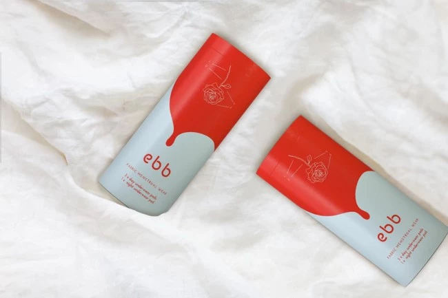
4. Ebb by Idea Dolls
Standout Features:
- Gender-inclusive visual identity
- Revolutionary brand messaging
- Bright red and white color combo
Ebb is the brainchild of brand development company Idea Dolls and award-winning charity Binti. The goal is to create a brand that makes reusable pads accessible to women in the UK, and the result is simply marvelous.
Idea Dolls chose a bold yet balanced red and white color palette, reflecting the brand’s key characteristics: modern, straightforward, and, most importantly, gender-inclusive. As their brand message states, “Not all those who menstruate are women, and not all women menstruate.”
Product labels further educate consumers about the overall menstrual experience. To break negative connotations about menstrual terminology such as “sanitary pads” or “feminine hygiene,” they embrace the straightforward and inclusive term menstrual wear.
5. Period by Brice Clain
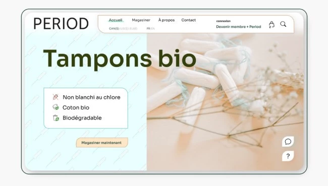
Standout Features:
- Fusion of light and dark themes
- Vector illustrations of tampons
- Neat and realistic product images
Women looking for safe and eco-friendly tampons will be drawn to Period’s straightforward yet approachable branding. All thanks to Brice Clain’s graphic design expertise!
From the get-go, women know they are making the right choice through transparency labels like “biodegradable,” “not bleached with chlorine,” and so on. Visually, the brand embraces a no-nonsense aesthetic, positioning itself as modern and inclusive.
Despite the usual clash of warm and cool tones, the designer somehow made it work for this product. A mix of blue-green and beige effectively evokes both comfort and a refined feminine essence.
6. Dans Ma Culotte by Chloe Camille
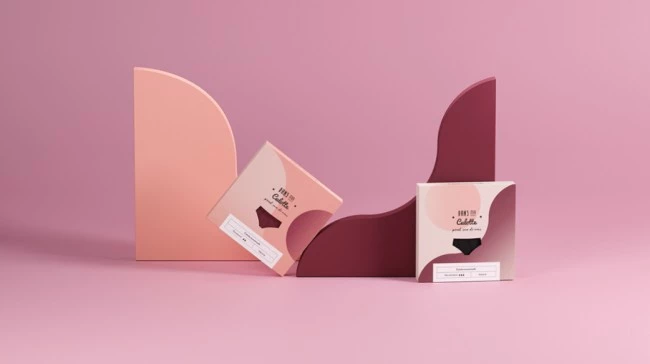
Standout Features:
- Spherical geometric shapes
- Chic and feminine shades
- Minimalist boxed packaging design
Dans Ma Culotte presents a modern alternative to the traditional menstrual experience, offering period products that are more respectful to the body and the environment. For their latest range of washable period panties, they tapped the packaging expertise of Chloe Camille, and the result is simply exquisite.
The products are housed in thin, sleek boxes that reflect the brand’s signature comfort and style. Circular gradient shapes in feminine hues like pink and magenta enhance the design aesthetically while symbolizing the physiological and hormonal fluctuations experienced during menstruation.
The designer employed a minimalist approach in typography, showcasing only the essential product labels to make it easier for consumers to interact with the design.
7. The Woman’s Company by Rang by Ayushi
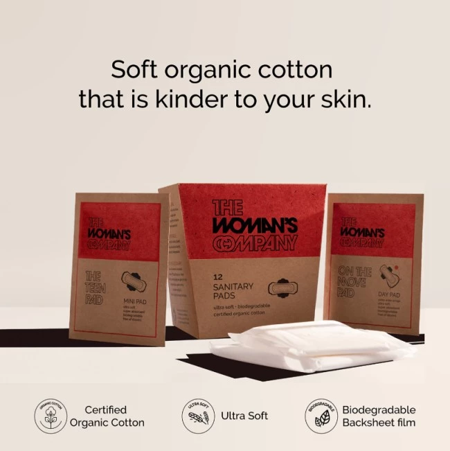
Standout Features:
- Bold color story and typography
- Eco-friendly and minimal packaging
- Flat icons and illustrations
The Woman’s Company (TWC) positions itself as an organic menstrual brand that is kind to women and the environment. Creative agency Rang by Ayushi brought this dual mission to life — and here’s the result.
TWC’s 100% biodegradable packaging instantly delivers on its promise to “do what’s best for you and the planet.” Its environment-focused social media campaign also reinforces this idea. They launched a series of informative posts about how harmful menstrual waste is detrimental to nature.
To separate itself from other eco-friendly options, TWC embraces a bold visual identity. Strong fonts, modern flat icons, and vibrant colors reflect the brand’s character: straightforward and revolutionary — fit for a modern woman!
Industry Trends Shaping Menstrual Products Branding
Modern menstrual product brands are reinventing their visual and communicative strategies to resonate with today’s diverse consumer base:
- Minimalist and aesthetic branding
- Bold and disruptive designs
- Personalization and customization
- Inclusive and diverse marketing
- Technology-driven branding
- Wellness and self-care messaging
- Unique menstrual packaging concepts
- Modern marketing and consumer engagement
- Carbon-neutral and ethical manufacturing
1. Minimalist and Aesthetic Branding
Brands are embracing clean, uncluttered designs that use soft pastels, muted tones, and minimal typography to evoke a premium, calming feel. For instance, companies adopt subtle color palettes and straightforward layouts to project simplicity and sophistication — helping consumers feel more at ease when choosing products for a personal, intimate need.
2. Bold and Disruptive Designs
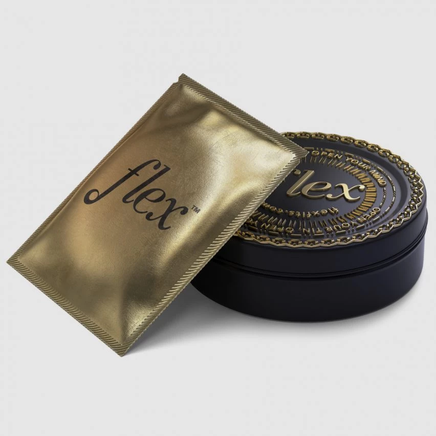
Some brands are taking a contrasting approach by using vivid, attention-grabbing colors and dynamic typography. This strategy is aimed at disrupting traditional norms and capturing consumer interest on crowded shelves. An example is Flex, which opts for bold accents and cursive fonts to signal elegance and luxury, creating a modern aesthetic that resonates with consumers seeking sophistication and innovation.
3. Personalization and Customization
Subscription services and direct-to-consumer brands are now offering tailored menstrual product kits. These personalized experiences can include customized product combinations, frequency of deliveries, and even tailored messaging based on individual cycle patterns.
Contemporary companies leverage customer data to provide a bespoke selection of pads, tampons, and liners that match a user’s lifestyle and preferences, thereby fostering a deeper connection with the consumer.
4. Inclusive and Diverse Marketing
Modern menstrual brands are expanding their messaging to include a broader spectrum of body types, genders, and cultural backgrounds. Campaigns now often feature models of diverse ethnicities and gender expressions, reflecting a more inclusive approach.
Thinx is one brand that has been recognized for its inclusive marketing, using imagery and language that resonate with a diverse consumer base, thereby building trust and relatability.
5. Technology-Driven Branding
Innovative brands like Ivonna are integrating digital tools into their packaging and marketing strategies. Features like QR codes or NFC tags embedded in the packaging can lead to augmented reality experiences or detailed educational content. For example, a brand might offer a QR code that links to a menstrual health tracker app or a series of wellness tips, seamlessly blending physical product design with digital engagement.
6. Wellness and Self-Care Messaging
Another growing trend is the emphasis on menstrual health as part of overall wellness and self-care. For example, Honey Pot Company crafts narratives that position menstruation as a natural, healthy, and empowering process. This approach is reflected in marketing materials that emphasize self-care routines, stress relief, and holistic health.
Brands often incorporate messages around self-love and wellness, helping to destigmatize menstrual cycles and encourage consumers to embrace their natural rhythms.
7. Unique Menstrual Packaging Concepts
Packaging is evolving from a mere container to an extension of the brand’s personality. Innovative packaging attracts attention and addresses consumer needs for discretion and convenience:
- ‘Chaos packaging’ trend: Unconventional packaging designs — such as tampon boxes resembling ice cream tubs — challenge traditional formats. This playful, unexpected twist helps brands stand out and appeal to younger consumers looking for a break from the norm.
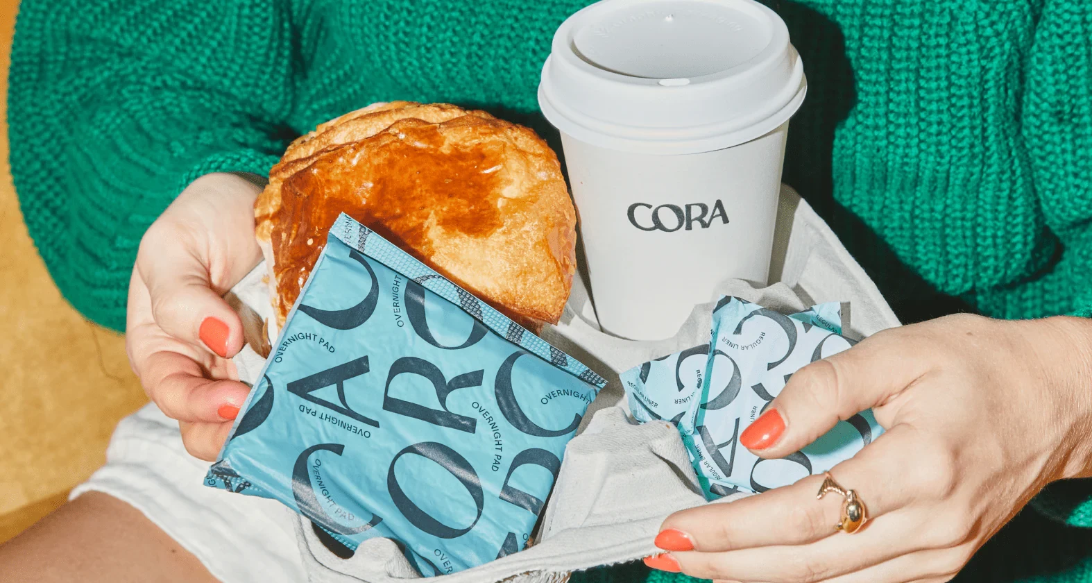
- Eco-friendly materials: Many brands are now utilizing recyclable materials to produce their packaging. Cora and similar brands are known for their commitment to eco-friendly practices, opting for plant-based inks and biodegradable plastics. This not only reduces environmental impact but also appeals to environmentally conscious consumers.
- Compact and travel-friendly designs: Recognizing the needs of active, on-the-go lifestyles, brands are designing products that are easy to pack and discreetly store. Refillable cases and foldable pads are examples of how packaging innovation meets modern mobility demands.
8. Modern Marketing and Consumer Engagement
View this post on Instagram
Beyond product design, leading brands are innovating in the way they communicate and engage with their audiences:
- Social media campaigns: Platforms like Instagram, TikTok, and YouTube have become vital channels for education and engagement. Brands like August use these platforms to demystify menstrual health, share user testimonials, and create relatable content that bridges the gap between product utility and lifestyle.
- Transparency and ingredient disclosure: Consumers are increasingly demanding clarity about what’s inside their products. In response some brands, for instance Aisle, now offer detailed labeling and transparent marketing that explains the materials and processes behind their products.
- Community engagement: Many brands, like Always, extend their influence beyond the marketplace by partnering with schools, non-profits, and health educators. These initiatives not only raise awareness about menstrual health but also build long-term trust and loyalty among consumers.
9. Carbon-Neutral & Ethical Manufacturing
Beyond the product itself, ethical manufacturing practices are coming to the forefront. Some brands are committed to carbon neutrality by offsetting their emissions and ensuring that their production processes adhere to ethical labor and sourcing practices.
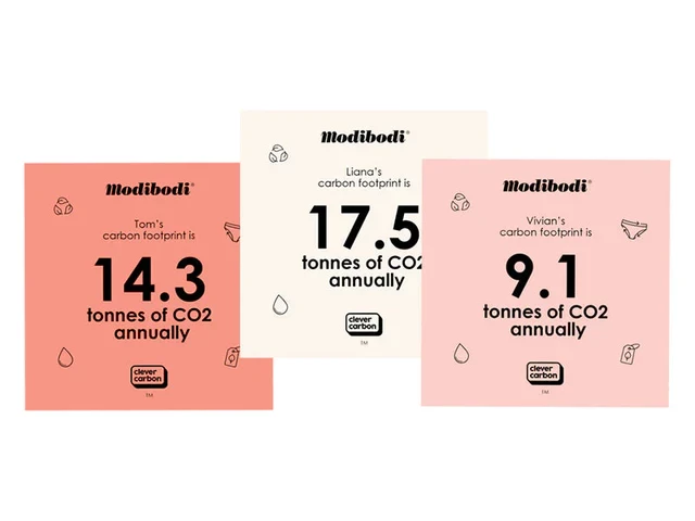
Modibodi is an example of a brand that not only focuses on sustainable materials but also invests in ethical manufacturing processes. Their transparent supply chains and commitment to reducing carbon footprints resonate strongly with ethically conscious consumers.
![]()
Our team ranks agencies worldwide to help you find a qualified partner to implement the latest AI solutions. Visit our Agency Directory for the Top Branding Agencies, as well as:
- Top Brand Positioning Firms
- Top Small Business Branding Agencies
- Top Product Design Companies
- Top Product Marketing Agencies
- Top Cincinnati Branding Agencies
And don’t miss our Awards section, where we showcase the top agencies recognized for exceptional creativity and impact.


-preview-webp.webp)