Branding is vital in communicating a brand’s identity in a heartbeat. It can influence the consumers' buying decisions by appealing to emotions first, followed by logic.
All too many brands make the mistake of relying solely on pushing their product and its presumed quality. Sure, that might still make you a quick buck. But how can your small business convert an occasional customer to a loyal, regular one? Here’s the secret: Branding and, by extension, working with specialized branding agencies (check out the guide to small business management)!
The best way to form an emotional connection with your target audience is by telling them a story about your brand. If your customers reflect the values associated with your brand, you’ll increase the likelihood of making them your ambassadors.
Not sure where to start? Get inspired by these examples of small business branding strategies done right!
1. NERO MEN by PeterBrand
Standout Features:
- The brand thrives on positive space
- Cyrillic alphabet glyph
- A premium design
NERO MEN is a skincare product for men ready to embrace self-care as a modern masculine trait. The brand is the brainchild of Florent, a Frenchman who moved to Bulgaria with his wife. Inspired by the country's natural wealth, he asked PeterBrand to help him develop an authentic branding experience.
This rebrand is inspired by the original branding, aiming to make it more applicable to the target audience by tweaking the original design into more contemporary artwork. The new logo leverages the positive space with a white logotype on a pitch-black square. (See more cool rebranding examples)
It depicts the nametag geometrically divided into two rows, the first showing "NE" and the second an inverted R (standard in Cyrillic alphabets, like the one used in Bulgaria). The bottom half also features a scaled-down "O" and "MEN" below it.
The black square and the inverted "R" pay homage to Bulgaria's culture and geography (The Black Sea) while respecting other fashionable skincare market designs.
2. O I O by Tiffany M. Wu
Standout Features:
- Minimalistic
- Diagonal symmetry
- Mysterious
O I O is an organically-formulated cosmetics brand. Its products are acquired from pure flora found in Sancti Spiritus, Cuba. Tiffany M. Wu developed a unique branding experience to help portray the brand's eloquence.
The brand's visuals are engulfed in mystery. O I O branding elaborates on purity and subtle passion, seen from the minimalistic two-folded packaging to the incredible simplicity of its diagonally symmetric logo design.
With just the two "O" s positioned one across the other and a colorful dividing line between them, O I O hints at nature's chaotic ways of helping us reach balance and exquisite beauty. Every glyph is stylized, with the upper left side of the "O" s bringing a simple black-and-white contrast and the "I" offering a stunning gradient.
3. Elle & Aimee Hair Salon by Emma Roxanne
Standout Features:
- Hippie typography
- Feminine traits
- Pastel color palette
Elle & Aimee Hair Salon is designated for relaxation and funky vibes after a long day. It’s reserved for glamour and beautification. Emma Roxanne encapsulated these traits of the salon through an impressive branding solution.
The gentle shade of purple immediately establishes a relaxed mood with an air of mystery, prompting the target audience to come to the salon and unravel the new hair possibilities. It’s contrasted with a bright orange known for portraying optimism and energy, balancing out the overall atmosphere.
The logo design conveys that this small business is built and led by people who love their work. The low-case initials are positioned diagonally, one above the other, with a cute connecting line that looks like a curl.
The typography choice combines the hippie-style headlines with the stable sans serif, in line with the brand’s hair freedom and experimentation story.
4. Dignified by RHYTHM INC.
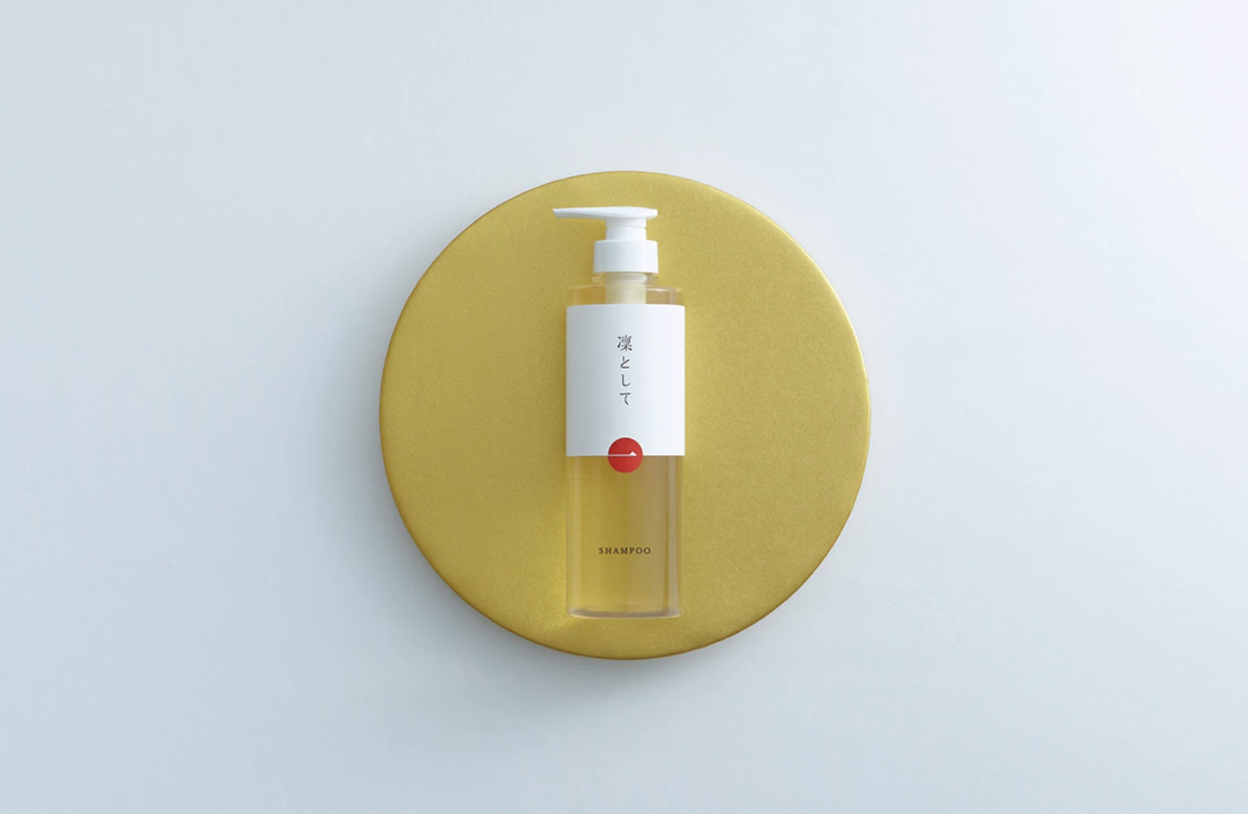
Standout Features:
- Clean, minimalistic design
- Product-oriented
- Symbols of Japan
Dignified is a soap-based shampoo based in Toyama, Japan. The omission of synthetic soaps and other chemical elements sets this brand apart from its competitors. RHYTHM INC. helped the brand build its image around distinctive all-natural ingredients.
The design’s clean presentation reaffirms the notion that there are no harmful additives in the product. The branding solution ensures to pay homage to the country it’s made in, so we see elements that resemble the Japanese flag, showcasing the pride behind its origin.
Another aspect of this minimalistic approach is that it brings attention to the product with the red circle, as red is known to be the most attention-grabbing color.
5. YAARI NATURAL PET FOODS by Straydog Branding
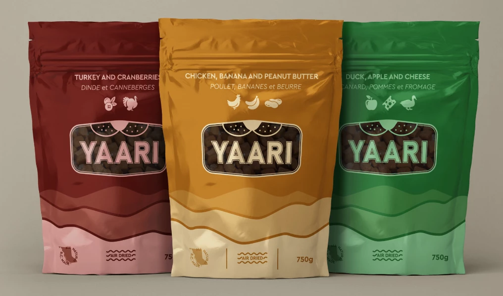
Standout Features:
- Simple logo design
- A one-color logo
- A pet-tag logo shape
YAARI NATURAL PET FOODS is a brand that sells pet food. The branding was built by Straydog Branding.
The logo design is simple and shaped like a feline friend’s nametag. The logo encapsulates the brand name in an all-capital sans serif-like font style. It’s also a transparent cut-out window that shows the product. Above the logotype, there’s a cute illustration of a snout and whiskers, reminding us who the consumer is.
The branding is friendly and playful, and the flavors are presented in color-coded gradients. The packaging features clear instructions with textual and visual ingredient representation.
6. Fabulous Farm by Revy Web Design
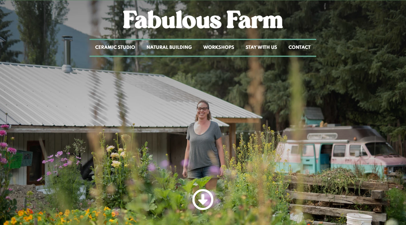
Standout Features:
- A welcoming, cozy atmosphere
- Hippie typography
- Do-it-yourself imagery
Fabulous Farm started by growing garlic, farming chickens, and selling eggs. Now, they build and design clay houses, make pottery, organize workshops, and offer farm stays. Revy Web Design embodied all this and much more into a beautiful Fabulous Farm web design.
This one-page layout website is easy to navigate, letting visitors peek into their world. The name is a stylistic feature as part of the branding process. The website is coated with coziness and a warm and fuzzy feeling of crafting something new yourself.
The stylish hippie, laid-back typography complements all the various comforting hobbies highlighted on the website. The design combines explanatory content blocks and real-life visuals that paint a picture of everyday life and work.
7. Snackrush by Memo Carcamo
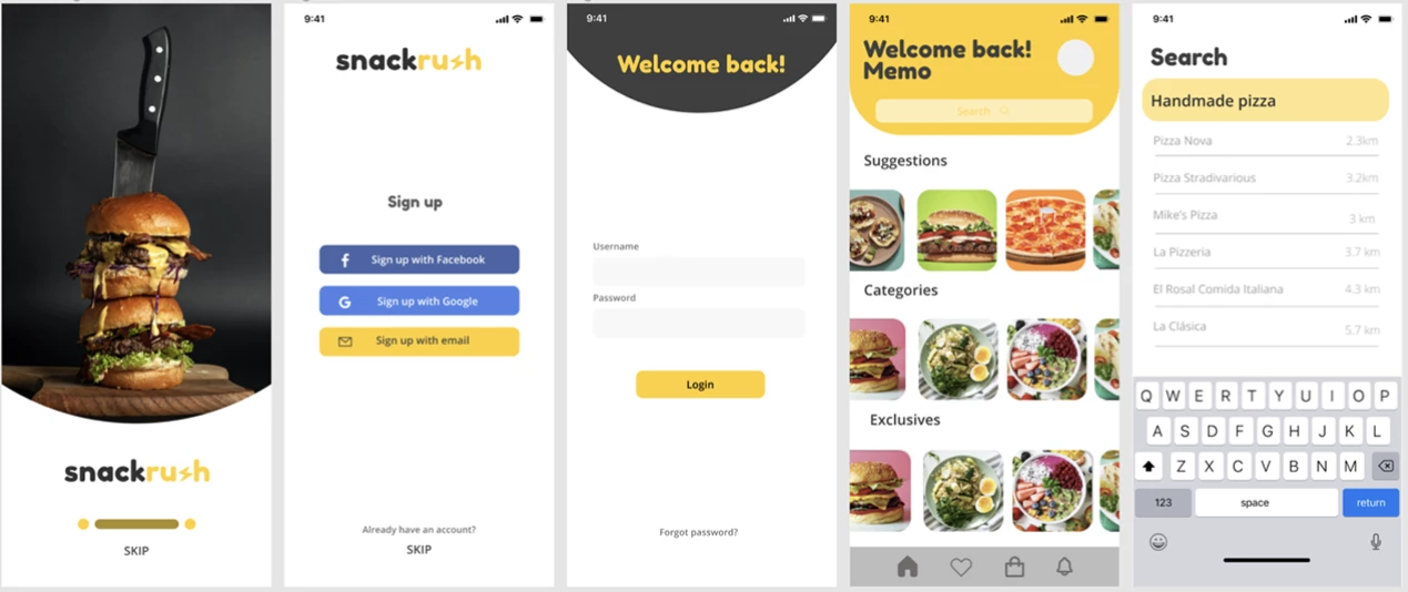
Standout Features:
- Rounded typography
- Quick as a flash
- Clean and intuitive
Snackrush is an eCommerce app that provides a wide array of snacks and beverages to the customers’ doorstep. Memo Carcamo did the branding through a polished app design.
This app is consistent in its simple navigation and ease of use. The user interface is easy to understand, and the rounded typography goes hand in hand with the app’s circular, color-coded visual elements. The screens are free of unnecessary details, allowing users to quickly focus and access any desired product.
Since most of the components from the style guide are rounded, the yellow lighting element becomes more prominent. It indicates the haste of the delivery, which is one of the leading brand properties.
8. The Beemine Lab by Gravita
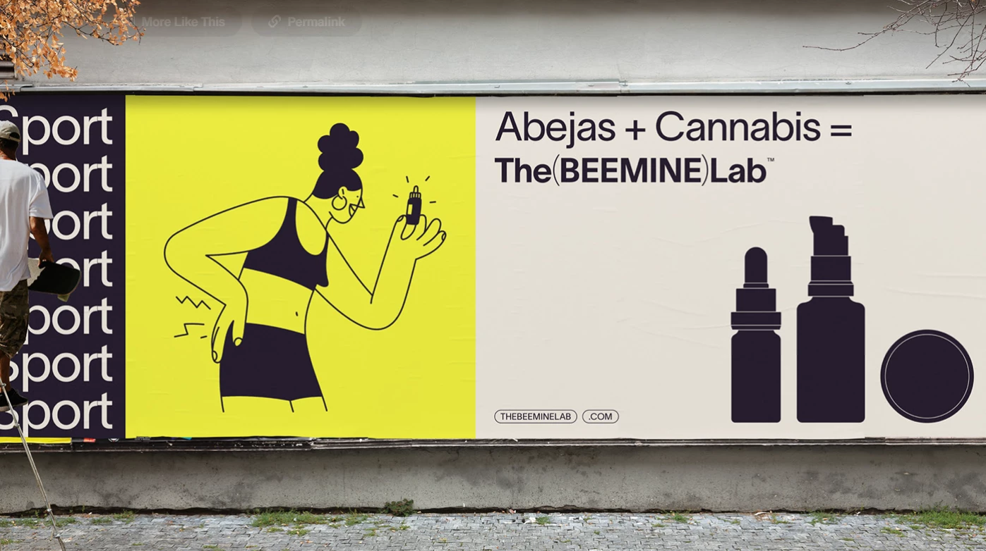
Standout Features:
- Empowering
- Inspires learning from nature
- Dual visual symbolism
The Beemine Lab combines the benefits of cannabis and beekeeping and unites them to create unique mental and physical health solutions. Gravita helped create a story for the organization that helped highlight the ‘nature is a teacher’s perspective, with a distinctive end result branding.
The Beemine Lab’s visual storytelling relies on the “Natural Science” concept. Scientifically accurate, aesthetically appealing, and modernly simplistic, the base of this notion is depicted by the “(B)” representation. It’s a dual symbol meant to portray fluttering wings and the honeycomb.
The brand doesn’t instruct but fuses nature’s lessons with ordinary people who care about sustainability and want to improve their life quality. The use of colors found in various natural environments further enhances this idea.
9. LAVO microsite by Evolut
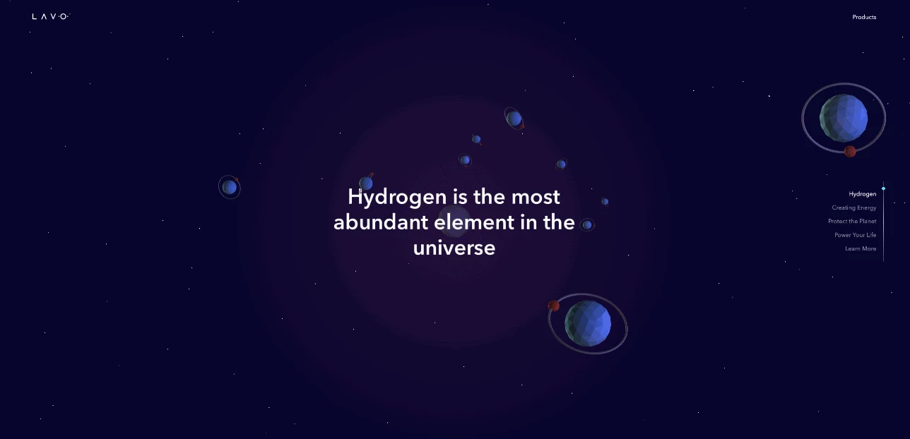
Standout Features:
- Educational
- Smooth and immersive
- Animated and fun
LAVO aims to help everyone embrace the change we are making regarding our energy perception and consumption. The LAVO microsite is an online educational platform built by Evolut. (Look for other cool educational website designs here)
LAVO believes that the future of energy is hydrogen. That's why the LAVO microsite aims to educate and inspire children, hoping to increase awareness and spread their views on why green hydrogen is the best energy source in the future.
Rather than a tedious ex-cathedra approach to learning, the mobile-optimized platform is full 3D animation with a fast load time. Evolut understood that the attention span of some children might be limited, so they created an immersive platform that would surprise and intrigue them continually.
The hard work resulted in a fascinating storytelling approach with a 3D 'fly-through' animated episode starting from outer space and traveling through Earth's atmosphere, the world's oceans, and finally, the molecular representation of hydrogen.
10. Tropics by PP Studio
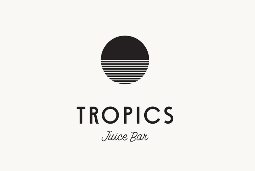
Standout Features:
- A retro vibe
- Vaporwave aesthetics
- A tropical story
Tropics is a juice bar located in Sao Paulo, Brazil. PP Studio ensured they reached new recognition level heights with an attractive branding solution.
The branding revolves around a central element – a circle divided into halves. The upper half is complete, while the bottom half is intercepted with slim horizontal cuts. This is also the brand's logo design. This circle can be found across different merchandise, including t-shirts, bags, and product packaging.
The circle may represent the beach view: the upper half is the sky, and the bottom half is the wavy sea. However, this element tickles the viewer's imagination, prompting them to reimagine its representation in many ways.
11. Amaria Hair Spa by Arcal Studio
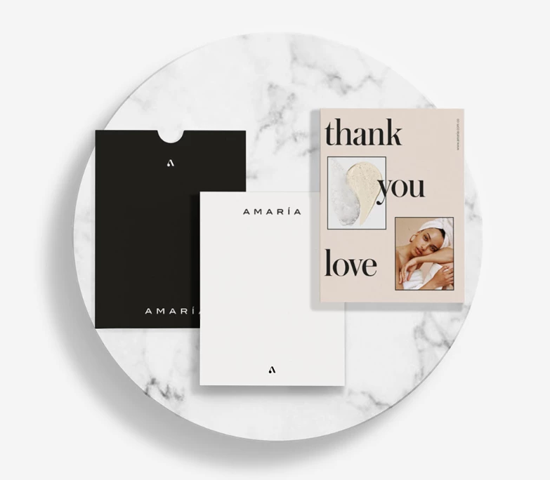
Standout Features:
- Feminine traits and energy
- A pastel color palette
- Serif typography
Colombia-based beauty brand Amaria Hair Spa offers a wide range of hair beauty services. Arcal Studio developed the rebranding solution for Amaria, helping the brand get a cleaner and more contemporary look.
The brand invites people to explore their beauty and experiment with Amaria to feel better about their hair. The pastel color palette denotes the brand’s approach to hair care – the products provide a sense of warmth and relaxation. The serif typography maintains consistency in the brand’s emphasis on feminine energy. The packaging design is simple and classy, with uplifting taglines decorating the brand’s tote bags. Together, these traits help elevate Amaria’s brand to the next level.
The rebranding helped position Amaria as a leader in the hair-care market by establishing it as a warm and welcoming brand that empowers its customers.
12. MOW by Azedos Design
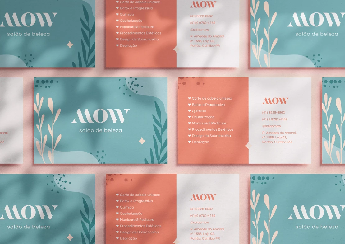
Standout Features:
- A mellow color palette
- An industry-inspired logo design
- Clean and minimalistic
MOW is a Brazilian beauty salon that offers hairdressing, manicures and pedicures, and many other beauty services. The salon’s astonishing brand story was created by Azedos Design.
The name is derived from the owner’s initials. When translated to English, MOW means to cut or trim, complementing the brand’s line of work. The logo design takes the acronym and presents it through several strands of hair in the stylized “M” and “W” glyphs. This logo design is an ambigram, giving it even more class.
The brand is all about the joy in the simplicity of making one’s day better by taking care of their looks. That’s why the mellow color palette perfectly relays the soothing, feminine effects of the treatments.
13. Levelz air Salon by Digital Purpose
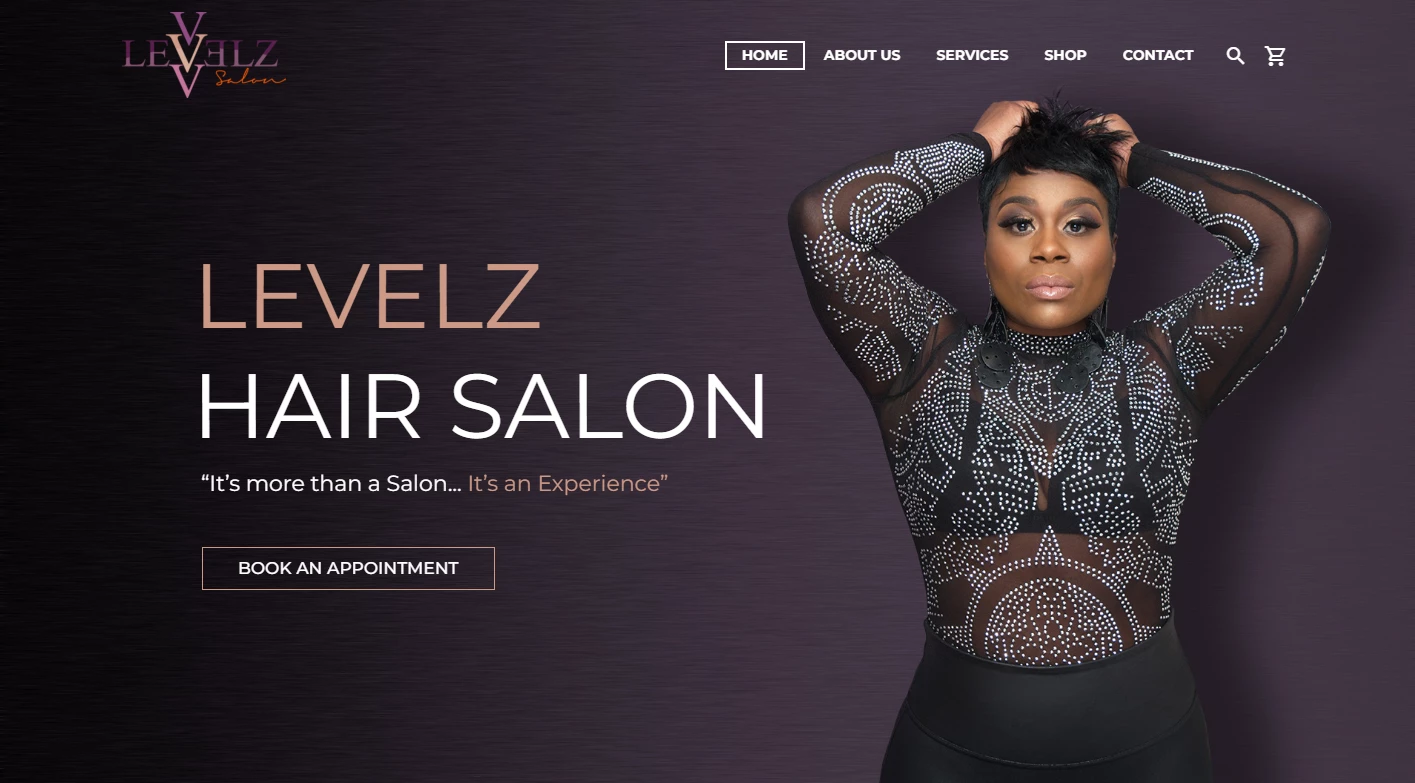
Standout Features:
- Black-and-purple gradient
- High-end
- Easy to navigate
Levelz Hair Salon is an exclusive beauty salon located in Chattanooga, Tennesse. The brand needed a refreshed web design to allow them to keep growing. Aside from the functionality aspect, the solution, developed by Digital Purpose, added an eCommerce and marketing platform for the owner’s newly developed hair and skincare products.
This WordPress website is a dashing example of what Levelz is all about. The homepage features the owner’s picture next to the hero text with an inviting quote. As you start scrolling, you’re met with a series of high-end chic haircuts that serve as an entrance for the team’s introductory section.
As you’ve met the team and seen part of the prominent portfolio, the layout shows a short, content-block-based menu of services. The navbar is fixed and compact, enabling quick and simple navigation through the website.
14. Chicago Bike Shop by Drice Roland
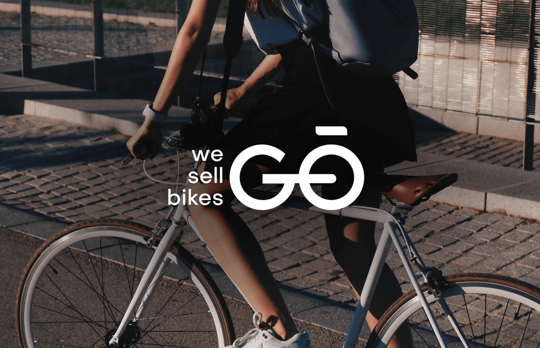
Standout Features:
- Timeless design
- Contemporary approach
- "Wheels" hidden in plain sight
Chicago Bike is an urban bike shop that offers a wide range of design and retro city bikes for purchase. Their new branding, courtesy of Drice Roland emphasizes every aspect of the business.
The new logo design is both contemporary and timeless but what stands out the most is the clever play on words - ChicaGO Bike. It's action-driven, it inspires and besides semantic symbolism, there's a visual aspect as two main letters immediately call to mind the wheels of the bicycle.
The rounded-up, on-brand font transcends its primary utility; it emanates a new, active lifestyle that is bound to inspire the Windy City's riders.
Our design experts recognize the most innovative and creative designs from across the globe. Visit Design Awards to see the:
- Best Logo Designs
- Best Website Designs
- Best Video Designs
- Best Print Designs
- Best Packaging Designs
- Best App Designs
Our team also ranks agencies worldwide to help you find a qualified agency partner. Visit our Agency Directory for the top Logo Design Companies, as well as:
- Top Web Design Agencies
- Top Video Production Companies
- Top Print Design Companies
- Top Packaging Design Companies
- Top Mobile App Development Companies


-preview-webp.webp)