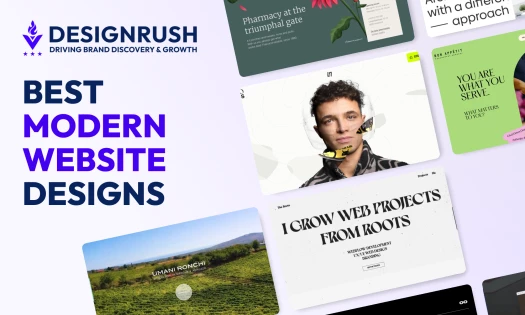
A website has about three seconds to tell you whether it's worth your time.
For educational institutions, those three seconds carry more weight than most: a parent deciding where to send their child, a student choosing where to study, a donor deciding where to give. The stakes are real.
These twelve websites don't waste those three seconds. Each one, built by top-rated website design companies, makes its case quickly and backs it up. Here's what they got right.
1. Civic Debate Academy by Quixta
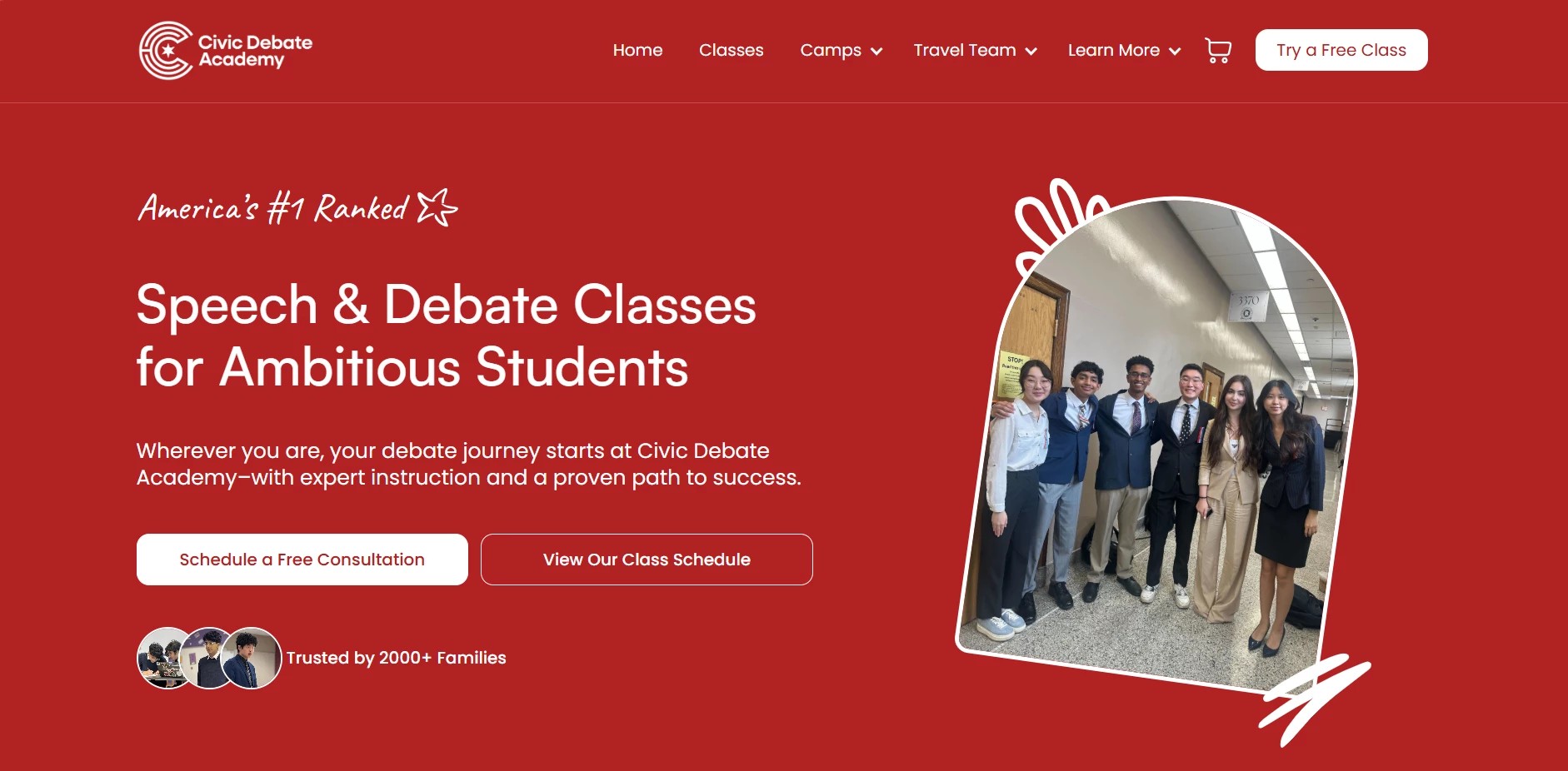
Standout Features:
- Bold, authoritative color palette
- Grade-based learning journey
- Trust-building social proof
Civic Debate Academy makes its case the moment you land on the page. Quixta built this Webflow site around a single, confident idea: red means business.
The deep crimson hero section paired with clean white typography sets an authoritative tone without tipping into intimidating, which is exactly the right balance for a platform selling parents on their kid's future.
The "Why are we #1?" section does the quiet work of converting skeptics. Rather than listing credentials in a wall of text, Quixta breaks the value proposition into scannable cards: faculty, critical thinking, Ivy League outcomes.
The university logos do most of the heavy lifting here. Penn, Harvard, Princeton, Dartmouth — you don't need to read the copy to get the point.
What keeps the site from feeling like a brochure is the learning journey selector. Parents pick their child's grade level and the platform maps out a specific path: where their kid would start, what comes next, and where it leads.
Most education sites tell you what they offer. This one shows you what it looks like for your child, which is the kind of detail that makes parents stop scrolling.
The testimonial section closes the loop. A single student review in a stacked card format, clean and uncluttered, letting the social proof breathe instead of drowning it in five-star ratings and generic quotes.
Throughout, the mobile-first build keeps everything tight. No element overstays its welcome, and the persistent "Try a Free Class" CTA in the nav means there's always a clear next step, wherever you are on the page.
2. Enkidu Linguist Solutions LLC by Negm Designs

Standout Features:
- Video hero section
- On-page animated counters
- Arch-shaped imagery containers
Negm Designs had a specific problem to solve with Enkidu Linguist Solutions: build a site for a language learning platform that feels immersive from the first second, without losing the credibility a professional service needs.
The full-width video hero handles the first part. Diverse learners, cultural landmarks, large white taglines over dark overlays. Before you've read anything about what Enkidu actually offers, you already have a sense of what it feels like to be a student there.
The animated counters just below do the second part. Four-plus years of experience, 150-plus happy clients, counting up as you scroll. It's a small detail that does double duty: gives you the numbers and makes the page feel alive. .
The arch-shaped image containers are the detail that ties it together. Cultural landmarks and student interactions are framed in the same distinctive shape throughout, giving the site a visual consistency that feels considered rather than templated. Real students in real moments. The imagery makes the platform feel lived-in rather than staged.
The site sits comfortably between professional and warm, which is exactly where a language learning platform needs to land. If you're looking for reference points, it holds up well among the best educational websites in its category.
3. Unity Environmental University by Digital Silk

Standout Features:
- Mission-aligned visual identity
- AI-powered live support
- Conversion-focused hero section
Unity Environmental University’s web design by Digital Silk tells you what the school stands for before you've read a word. The forest green palette, leaf silhouettes, and organic shapes do that work on their own.
The hero section doesn't feel like a sales pitch. It features a user-controlled background video and three CTAs in the header: Apply Now, Ask Una, Give. Three types of visitors, three immediate pathways. The kind of work you'd expect to find on the best portfolio websites in the industry.
The card layout puts the numbers front and center. Employment rates, enrollment figures, graduate outcomes, each paired with a one-liner that tells you what it actually means. You don't have to dig for it.
Ask Una is the detail that sticks. Light, approachable, always within reach. For prospective students who aren't ready to call, it's the right level of support at the right moment.
The typography earns its keep too. Academic serifs for weight, rounder styles to keep it from feeling stiff. While most university sites land on one side or the other, this one finds the middle.
4. Human Things by Nahuel Gerth

Standout Features:
- Visually stunning timeline of human history
- Each era has its own color
- Fun and engaging messaging
Nahuel Gerth built something genuinely hard to categorize with Human Things. It's an educational website that doubles as something you'd bookmark just to show people. It’s the kind of thing that's hard to explain until someone actually scrolls through it.
The timeline runs both horizontally and vertically, and it shouldn't work as well as it does. Each era has its own color and its own visual vocabulary borrowed from the period it represents. You don't need a header to tell you which century you're in. The design tells you.
The events inside each era sit behind horizontal buttons. Click one and an animation plays that traces the line from that moment back to the one before it. It makes the connections feel earned rather than listed.
The messaging throughout keeps things light without undercutting the subject. For a website covering 300,000 years of human history, keeping someone's attention is a challenge. It's what separates thoughtful website design companies from ones that just build pages.
5. The Quake by Yoni Kessler

Standout Features:
- Screen-splitting earthquake effect
- Data-driven visuals of tectonic activity
- Immersive full-screen photography
Two words. Brown background.
Then you scroll. The site's name starts to shake and splits the screen in two. No explanation needed. You already know what it's referencing.
The science comes next, wrapped in visuals that do the explaining. A rotating globe carved into tectonic plates, a world map with red alarm indicators, a Richter scale simulation. The visuals carry the technical content so copy doesn't have to.
Then the tone shifts. Full-screen photography takes over, showing the aftermath the data can't capture. Each image gets a short description that ties it back to science before pulling you toward the historical earthquake section.
The Quake’s website design by Yoni Kessler and Yehuda Bruck closes with five safety tips in a carousel, each paired with a bold illustration and a one-liner to remember in a crisis. A practical ending to a visceral experience.
The designers never let the design outrun the content. Every effect is in service of one thing: making earthquakes impossible to be indifferent about.
6. Planet Schule Klima Challenge by Netzbewegung
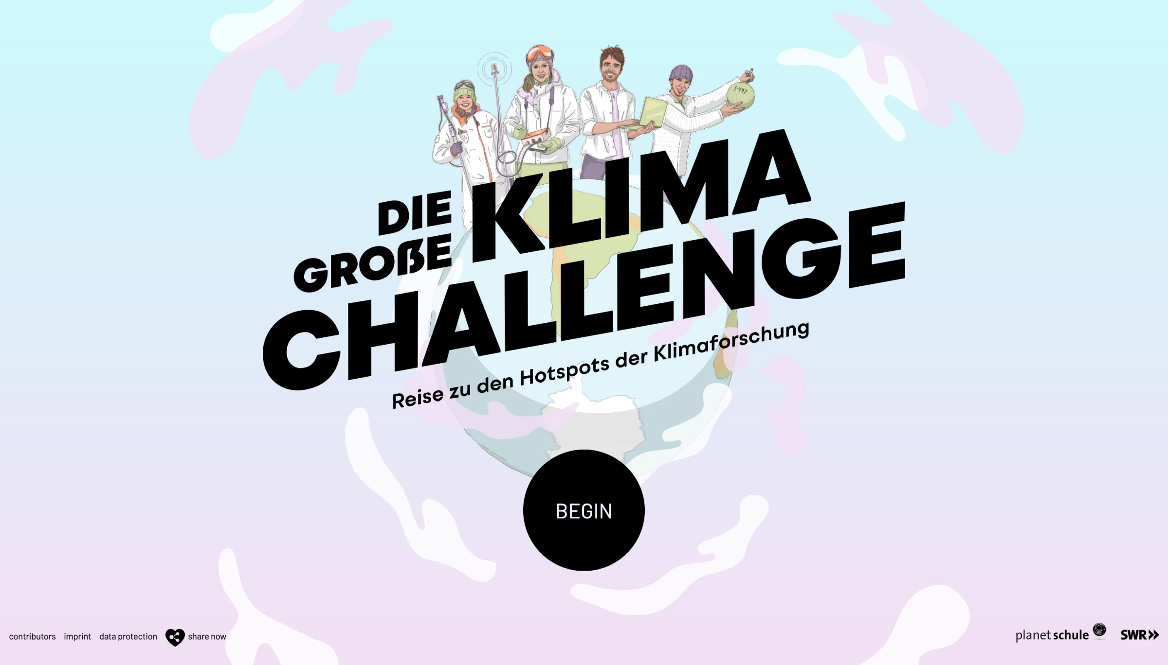
Standout Features:
- Immersive UX
- Engaging chat pop-ups
- Mesmerizing video content
Making it on our list of the best educational website designs is Planet Schule Klima Challenge. This incredible learning platform, developed by Netzbewegung, teaches you about the importance of our planet’s climate research in a modern, accessible way.
Rather than boring you with tons of uninterrupted text, the design mimics a chat app through an engaging and immersive UX that piques your curiosity.
You embark on a learning journey as you rotate the globe to enter one of the four areas. Once you choose an area, you’re faced with short video lessons that walk you through the intriguing facts about climate research.
Each video triggers a quiz that tests your new knowledge as you gather points and earn cool badges in this gamified experience.
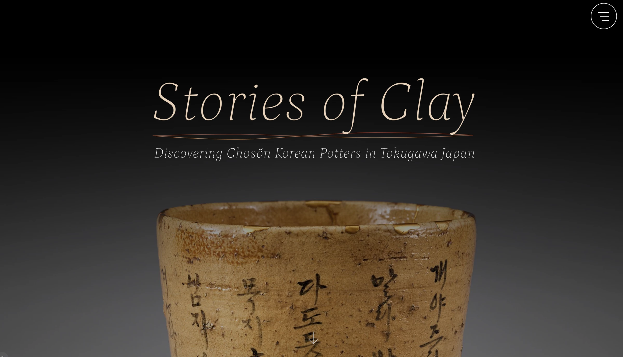
7. Stories of Clay by vueloIV
Standout Features:
- Fluid background colors
- Mysterious design
- Interactive map
Our next pick on the most intriguing educational website design list is Stories of Clay. This website was designed by vueloIV, and the agency captivates the browser's attention through a series of simple visual devices.
The landing page opens with a softly illuminated image of an ancient clay pot surrounded by a gray background, instantly setting the mood for this mysterious design. As you start scrolling, you submerge yourself in a historical story that relies on fluid background colors and font styles that remind us of something mythical and old.
As the background smoothly transitions from pitch-black to light hues, the content varies, presenting a balanced mixture of textual and visual content-oriented sections.
Aside from an enjoyable scrolling experience that goes from left to right, the design also entails an interactive map with clickable locations. Each location shows a pop-up that lets you learn about the pottery’s origins.
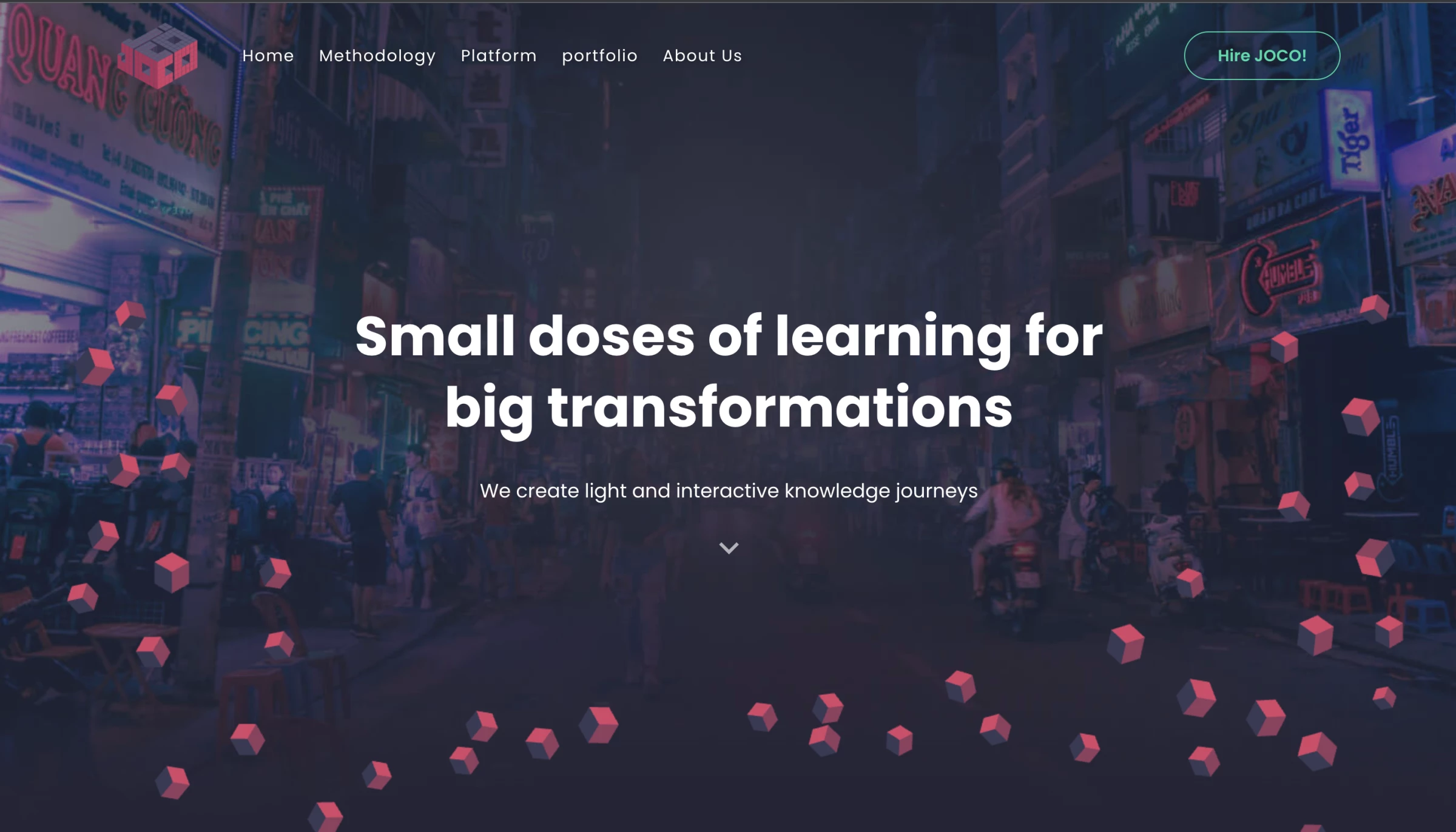
8. Joco by Other Digital
Standout Features:
- Original scrolling dynamic effect
- Fascinating cube dance
- Immersive portfolio highlighting
Other Digital’s web design for Joco is another digital artwork among our best educational website designs.
The company’s logo and its mission and vision are dissected into hundreds of identical cubes that constantly dance around. As you are introduced to the brand with a short statement, you can immediately interact with the hovering cubes embracing it.
These geometrical objects start to move around as you scroll, transforming into larger objects that introduce bits of relevant content. This original dynamic effect makes browsing incredibly entertaining as you wonder what the next image will be.
The formations include a frame for a picture, the logo itself, “constellations” of the brand’s services, and a singular growing cube that transforms into a full pink screen with featured projects from the portfolio.
9. Alfred Landecker Foundation By Output

Standout Features:
- Projects and missions featured in different colors
- Message-centric website
- User-friendly search engine
Alfred Landecker Foundation is an organization that combats all forms of discrimination, from antisemitism to sexism, and “promotes the development of democratic societies.”
Created by Output branding agency, the foundation’s website is very informative and messaging-oriented, which is quite sensible considering their mission and objectives. Although its nature is primarily educational, the website is still concise in the way it delivers written content, aided by custom visuals, emblems, and videos.
The website opens with a full-screen video message on the foundation’s latest initiatives. The hamburger menu icon to the right opens a neatly categorized navigation panel that explains the organization’s purpose and background.
Colorful blocks for each mission break the monotony of a generally low-key color scheme. The typography is a highly legible sans-serif type that helps with message delivery and retention. Hovering over the “What We Do” boxes creates a color contrast with the box’s original hues.
Individual articles and other pieces of written content have their own custom illustrations that follow a similar visual style. The foundation’s projects, from protecting minorities to strengthening democracy, have their own custom-colored panels to make it easy for visitors to differentiate them at a glance when looking for a specific project.
10. Youth Justice Network By Purple Bunny

Standout Features:
- Consistent color scheme
- Bite-sized messaging
- Sticky main navigation
Youth Justice Network is an organization dedicated to building a society that empowers young people of today to thrive in a just and fair environment. Their website is the work of the Purple Bunny web design agency.
Sporting a striking purple-yellow-white color palette, the website starts with a very in-depth homepage that takes the visitor on an educational journey. Purple-tinted images of young protestors introduce the network’s mission and the well-illustrated stats on the state of racial justice in the US.
The bite-sized messaging provides insight into the organization’s comprehensive support system, justice advocacy and methods for building young people’s independence. The call-to-action buttons next to these messages point to different areas of interest, from donating to the cause to getting involved with the project. The CTAs animate with a yellow sliding effect when a user hovers over them.
The main menu navigation is “sticky,” as per UX best practices. The links point to the main pages on the website and are arranged in a sequence that follows a natural user journey. The big yellow Donate button makes its appearance here as well.
On the website footer, the organization emphasizes the importance of staying connected and invites visitors to follow Youth Justice Network on their social media channels.
11. Palazzo Monti By Matteo Sacchi

Standout Features:
- Horizontal scrolling
- One-page concept
- Sticky CTAs
Palazzo Monti is a cultural center in Brescia, Italy. It hosts an exhibition space and a private art collection, encourages artistic collaboration and ignites inspiration in local artists with its extensive library of artifacts, artworks and books.
Matteo Sacchi is behind Palazzo’s striking website design that utilizes horizontal scrolling and a one-page concept to showcase the cultural center’s entire value proposition. This quite revolutionary and seldom-used layout begins with a brief description of the institution.
The “Palazzo Monti” name appears in massive letters the size of a screen. It begins where the website starts and ends where the website ends, appearing through the cracks made by the content elements. The white background and black fonts are an eye-pleasing setting for colorful photos that introduce the visual element of surprise as the visitor keeps scrolling.
Different site sections – About, Who, Press, Artists, and so on – transition seamlessly into one another. The user knows which section they’re at by looking at the bottom of the screen where section names are indicated.
With no main menu, the only navigational elements are the two sticky CTA buttons, Apply Now and Newsletter. They blend in with the rest of the surroundings with their rounded, white shape and clear text.
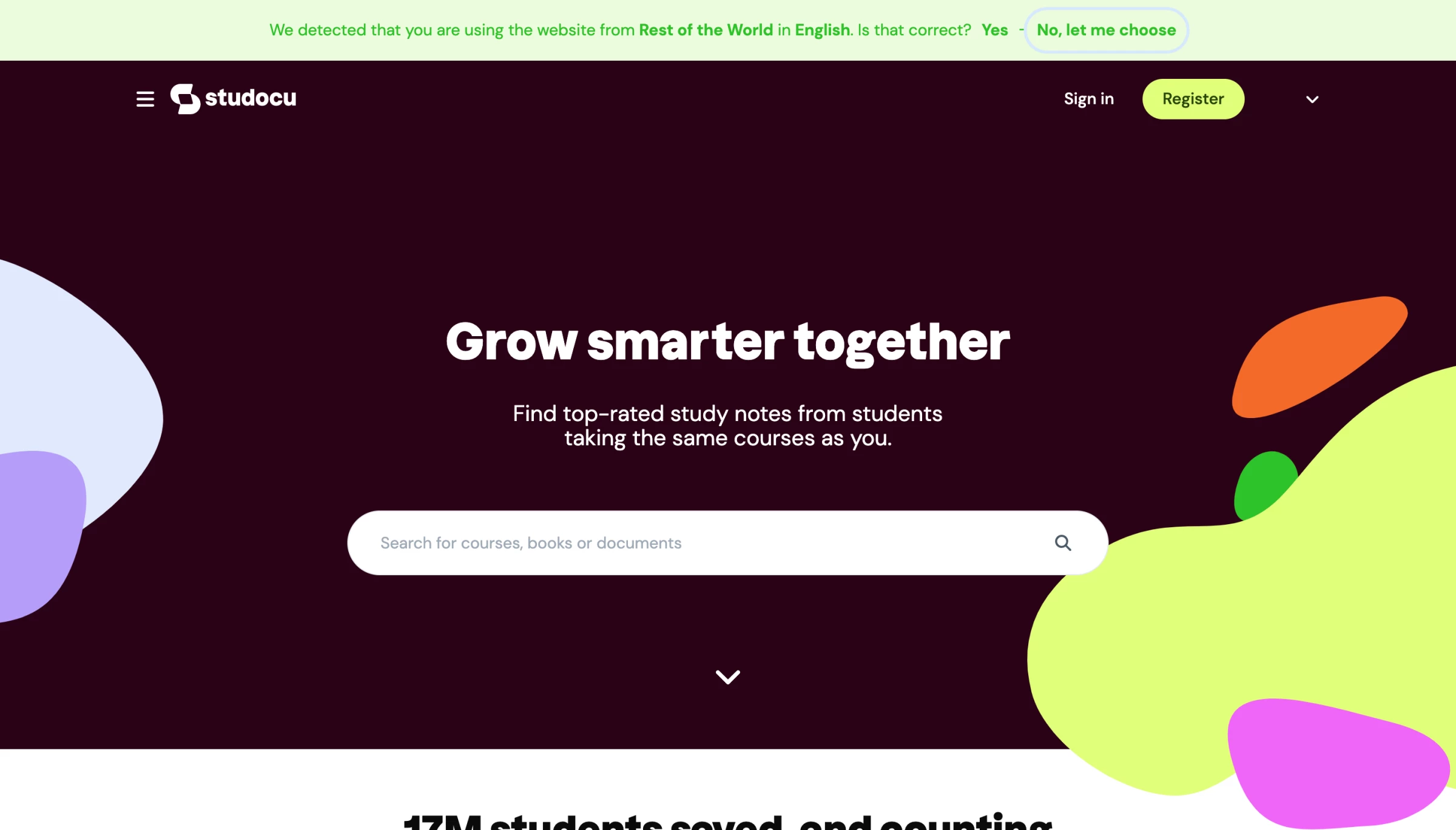
12. StuDocu
Standout Features:
- Bright and friendly design
- User-friendly search engine
- Sticky main navigation
StuDocu started as a workaround. Four students in 2013, sharing notes to get through exams. Twelve years later it's a platform with over 25 million users, which means the website had to grow up alongside it.
What it got right is knowing its audience. Students don't want to be impressed by a website. They want to find what they need and get back to studying. The bright, friendly design keeps things approachable without being distracting. The search engine is front and center because that's the whole point of being there. The sticky navigation means you're never more than a click away from wherever you need to go.
It's a site that respects the user's time, which for a platform built by students for students, is exactly the right instinct to have kept.
Our design experts recognize the most innovative and creative designs from across the globe. Visit Design Awards to see the:
- Best Logo Designs
- Best Website Designs
- Best Video Designs
- Best Print Designs
- Best Packaging Designs
- Best App Designs
Our team also ranks agencies worldwide to help you find a qualified agency partner. Visit our Agency Directory for the top Logo Design Companies, as well as:
- Top Web Design Agencies
- Top Video Production Companies
- Top Print Design Companies
- Top Packaging Design Companies
- Top Mobile App Development Companies


-preview-webp.webp)