
The best corporate branding examples showcase effective strategies that establish clear brand identities, differentiate brands from their competitors, and enable businesses to build strong connections with their target audiences.
We’ve listed some of the best examples of corporate branding on the market and analyzed what makes them stand out.
Key Takeaways
- Corporate branding involves building, growing, and promoting a corporate entity to the world and its employees.
- The best corporate branding examples demonstrate a brand’s values, mission, and vision, and attract their target audiences.
- Top branding agencies can help you create a distinct identity and develop strong connections with customers and employees.
1. Eminence by Brandwell
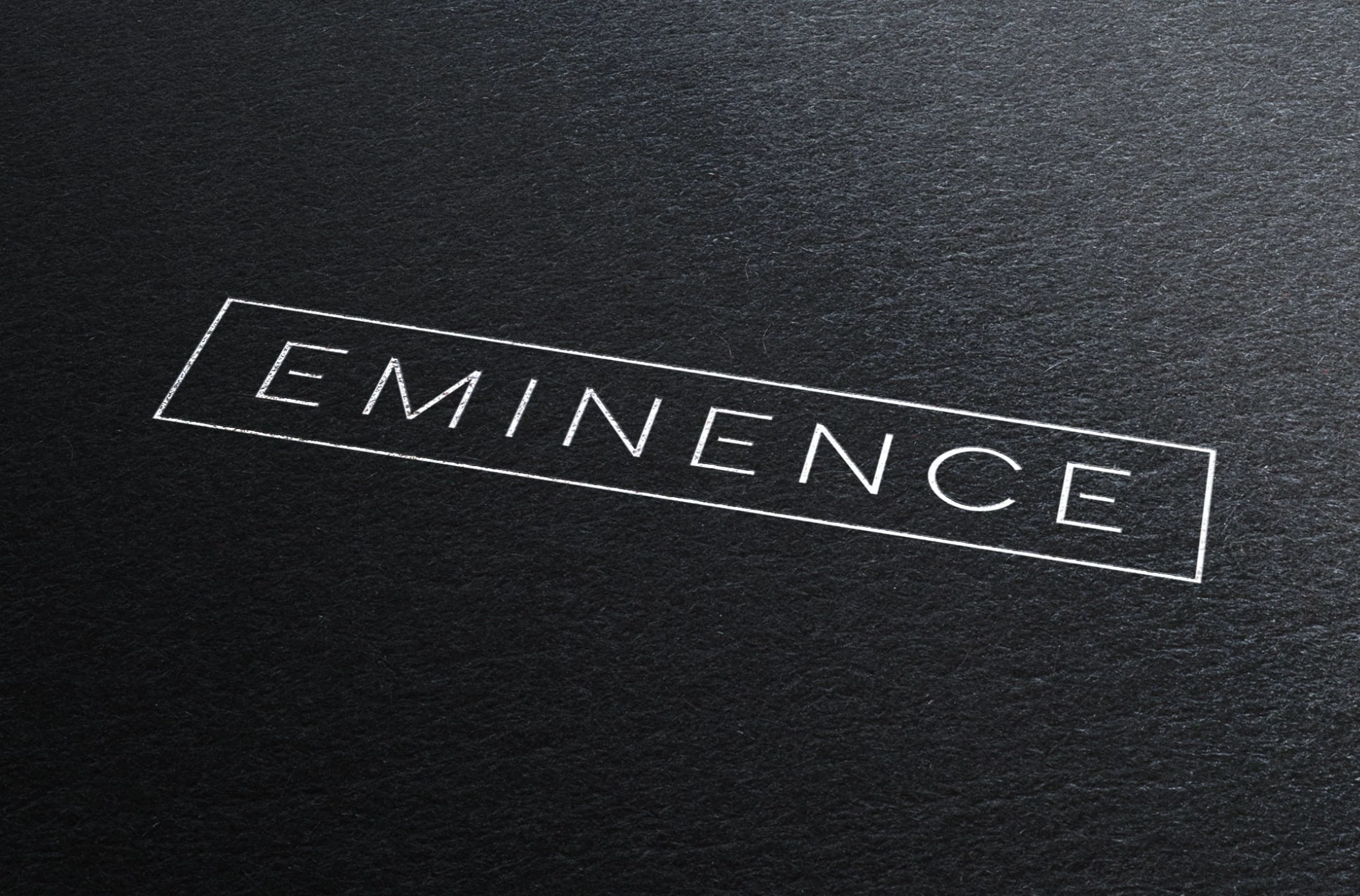
One of our favorite corporate brand examples is Eminence by Brandwell. The vision behind the project focused on sustainability, incorporating a minimalist color palette that reflects the environment.
Standout features:
- Emanates sophistication
- The subdued color palette mimics the location
- Geometric and minimal shapes
The icon and logo represent a contemporary development, with unique touches like a break in the “E” to appear like a section of a floor plan. The first letter was used as the leading brand mark for marketing collaterals.

Additionally, the color palette is layered to aesthetically mimic the environment: a bright blue on the top for the sky, black geometric silhouettes in the middle for the houses, and beige and green on the bottom for the roads and greenery.
Against the soft earth color palette, the bold black geometric shapes stand out in the design, effectively emphasizing its architectural design and establishing the brand’s industry and services.
2. Benefito Mobile by Brandfusion

Benefito Mobile’s rebranding by Brandfusion is one of the top examples of corporate branding. As a mobile virtual network operator (MVNO), Benefito Mobile aims to introduce an innovative blend of mobile telecommunications and retail to the Romanian market.
Standout features:
- Colorful and optimistic
- Innovative approach in both services and branding
- Customer-centric
Brandfusion adopted a “new rules to the old game” strategy when rebranding Benefito Mobile. The agency put the customer persona front and center, emphasizing how the consumer benefits if they sign up with the mobile operator.
The “Surprisingly different” tagline became the main vehicle for Benefito Mobile’s services. Coupled with an exciting, saturated color palette, the operator effectively stands out in a highly crowded market.
3. Gent Holding by JAAQOB Agency

Gent Holding’s branding, created by JAAQOB Agency, is another excellent case of corporate branding. It exudes a sophisticated and stern minimalism that feels timeless while still heavily grounding itself in trendy aesthetics.
Standout features:
- Monochromatic
- Classy serif typography
- Professional
Although a professional approach often limits creativity, Gent Holding’s branding successfully bridges that gap. It effortlessly exudes originality yet provides clarity into the brand’s priorities, which helps build trust in customers.
4. Coleman Group by GreyBox Creative
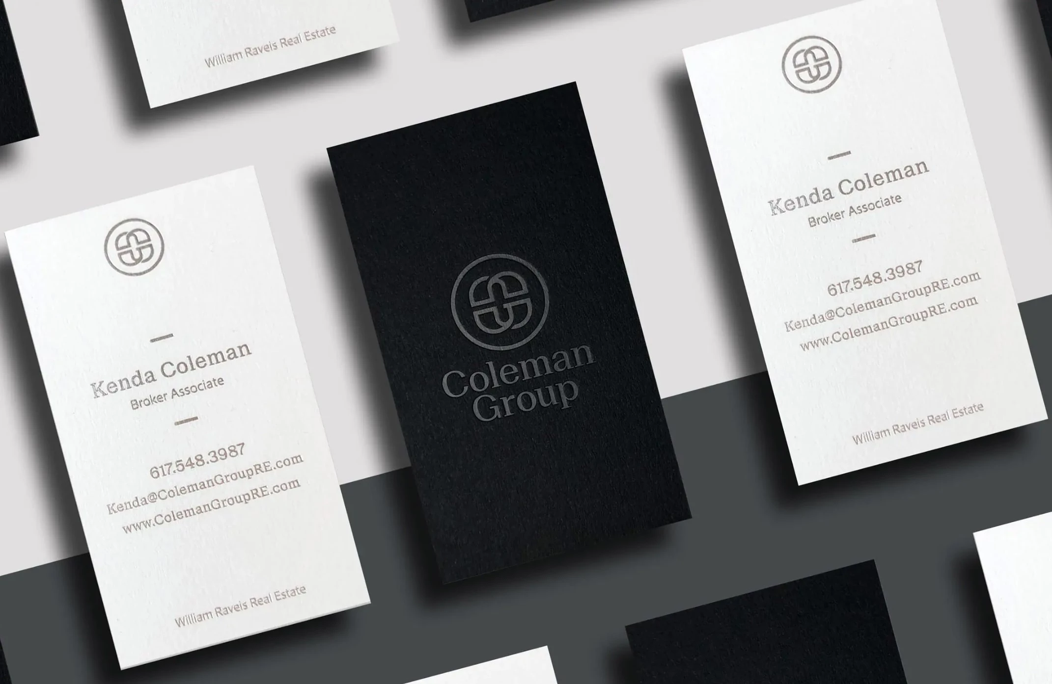
Another fantastic corporate branding example is the Coleman Group, a team of professional real estate agents operating in the metro Boston area. The company is well known for its vast experience in the industry, in-depth knowledge of the local market trends and a hands-on approach to helping clients find the right home for their needs.
Standout features:
- Subdued color scheme
- Stylish typography
- Client-centric
Starting with the highly sophisticated logo, GreyBox Creative designed a simple but robust “lockup” of the company initials but retained a soft, open, and approachable feeling. The overlapping elements symbolize the intricate interaction between agent and client, working together to reach a common goal.
The monochromatic color palette features simple and precise black tones, complemented by softer gray tones and subtle splashes of color. This emphasizes the company’s open, out-of-the-box approach. This design methodology is consistently implemented in all its marketing collateral and online platforms, including a fully responsive and professional website that streamlines user experience (UX).
5. Webfleet Solutions by Mucho
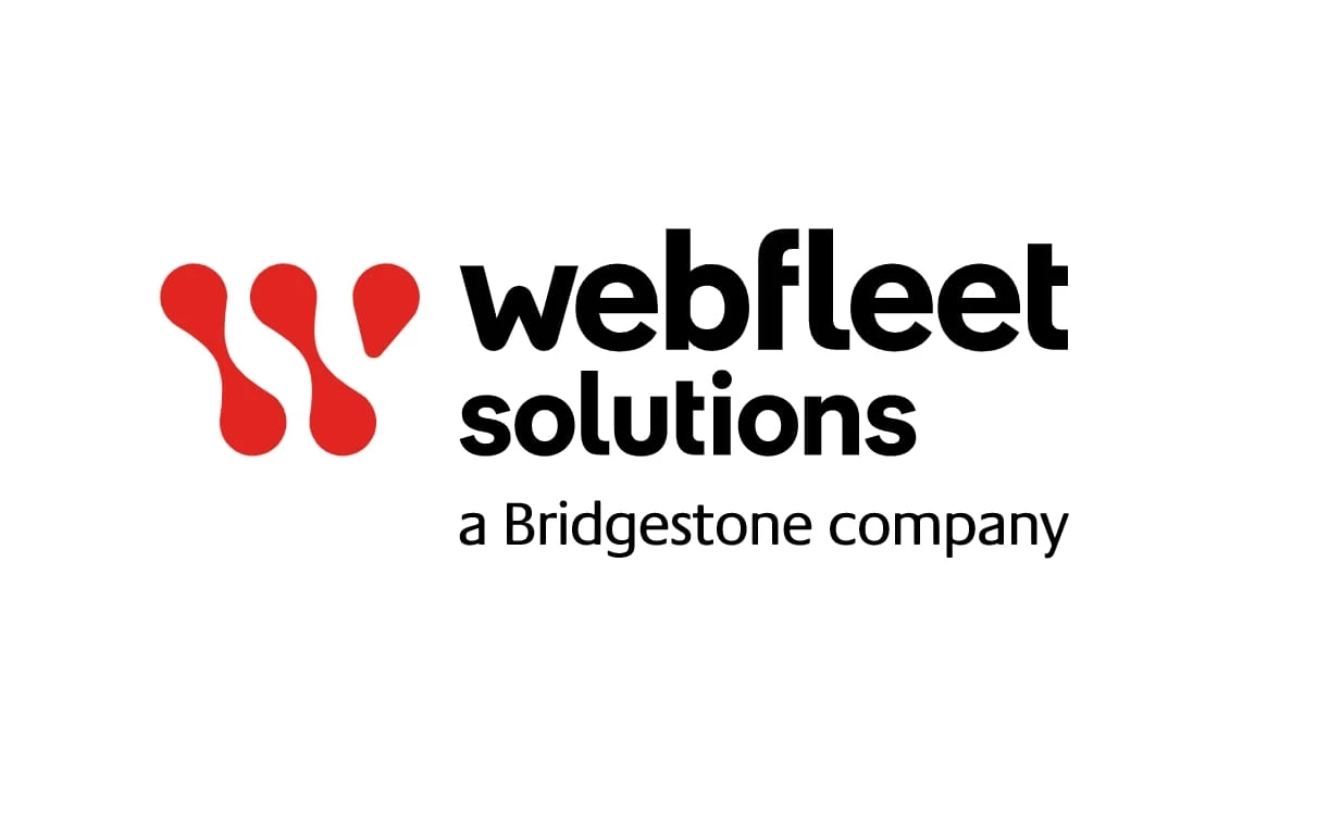
Another great corporate branding example is Tom Tom Telematics, a leading digital solutions provider for fleet management. Following its acquisition by Bridgestone, a multinational auto and truck parts manufacturer, the company embraced a new era. With its repositioning and the flagship product, Webfleet, it was time for a brand-new coat of paint (and much more than that).
Standout features:
- Symbolic logo
- Flowing typography
- Emphasized heritage and company’s experience
Tasked with this rebranding, Mucho opted to celebrate the new beginning with designs that emanate movement, strength, and integrity. These elements are easily identifiable and reinforce the importance of connection — linking fleet managers with drivers, data with performance, management with productivity, and traceability with efficiency.
Drawing from the company’s rich experience and focusing on its core mission, Mucho structured a solid brand narrative and aesthetic that suggests constant forward movement and interconnectedness (where the “dots” represent data in the world of telematics).
6. Joliark by BVD
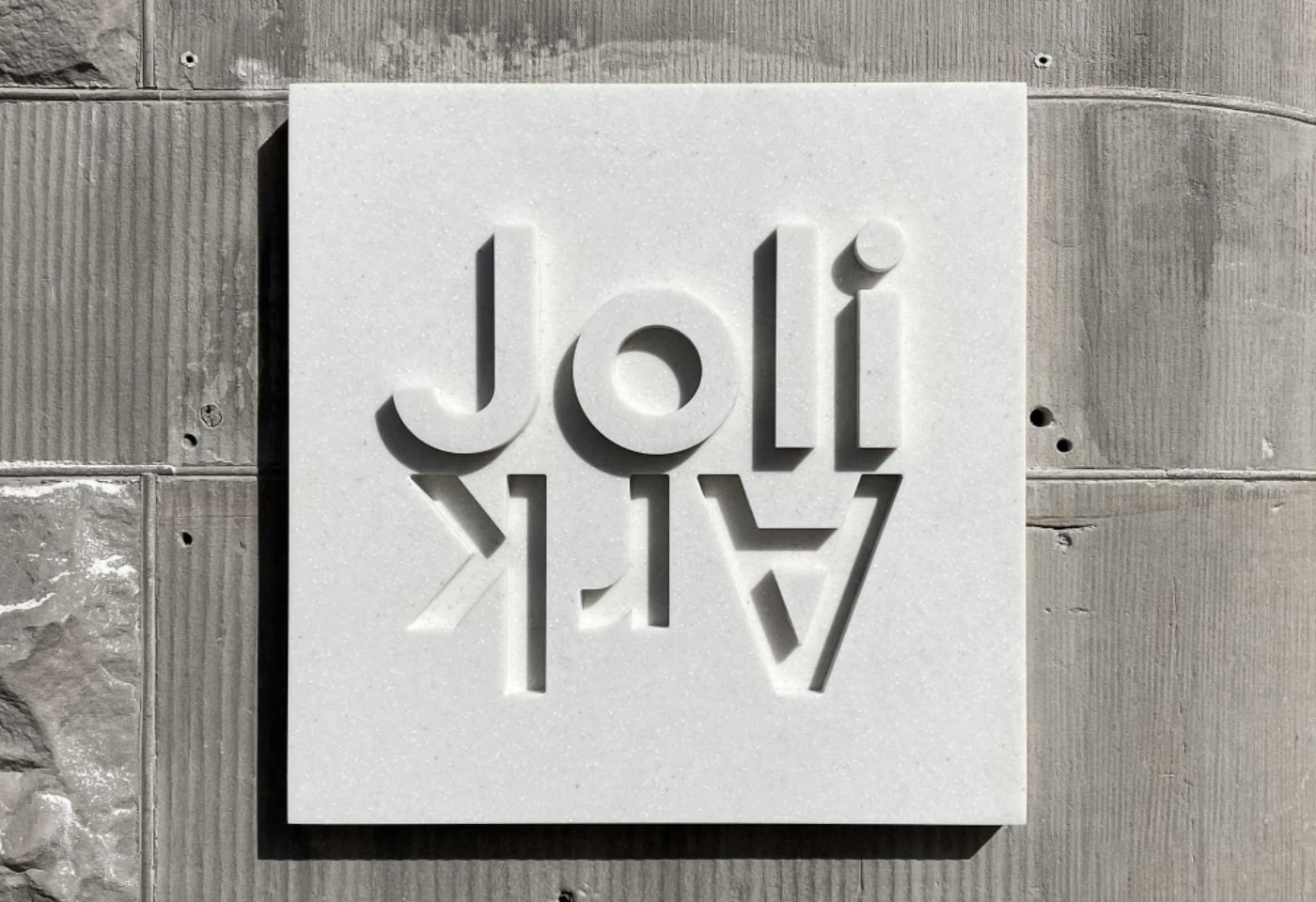
This outstanding example of corporate branding effectively captures Joliark’s aspirations to create architecture that sees the bigger picture.
Standout features:
- Innovative logo approach
- Dynamism reflective of the company’s goals
- Minimal
To showcase the company’s expertise and its ability to find innovative solutions by “zooming in and out of problems,” BVD created signage with changing dimensions and a dynamic, concise, and free-minded logotype. Combined with geometric typography, this approach evokes the essence of modern architecture with a (literal) twist.
Along with the logo that perfectly embodies Joliark’s spirit, BVD developed an intuitive brand strategy that captures its essence and serves as guidance for the future. The range of colors is evocative of the style and elegance expected from such an unconventional company. It’s simple, tactile, and in balance with the nature of the material.
7. Famatel by Nomon Design
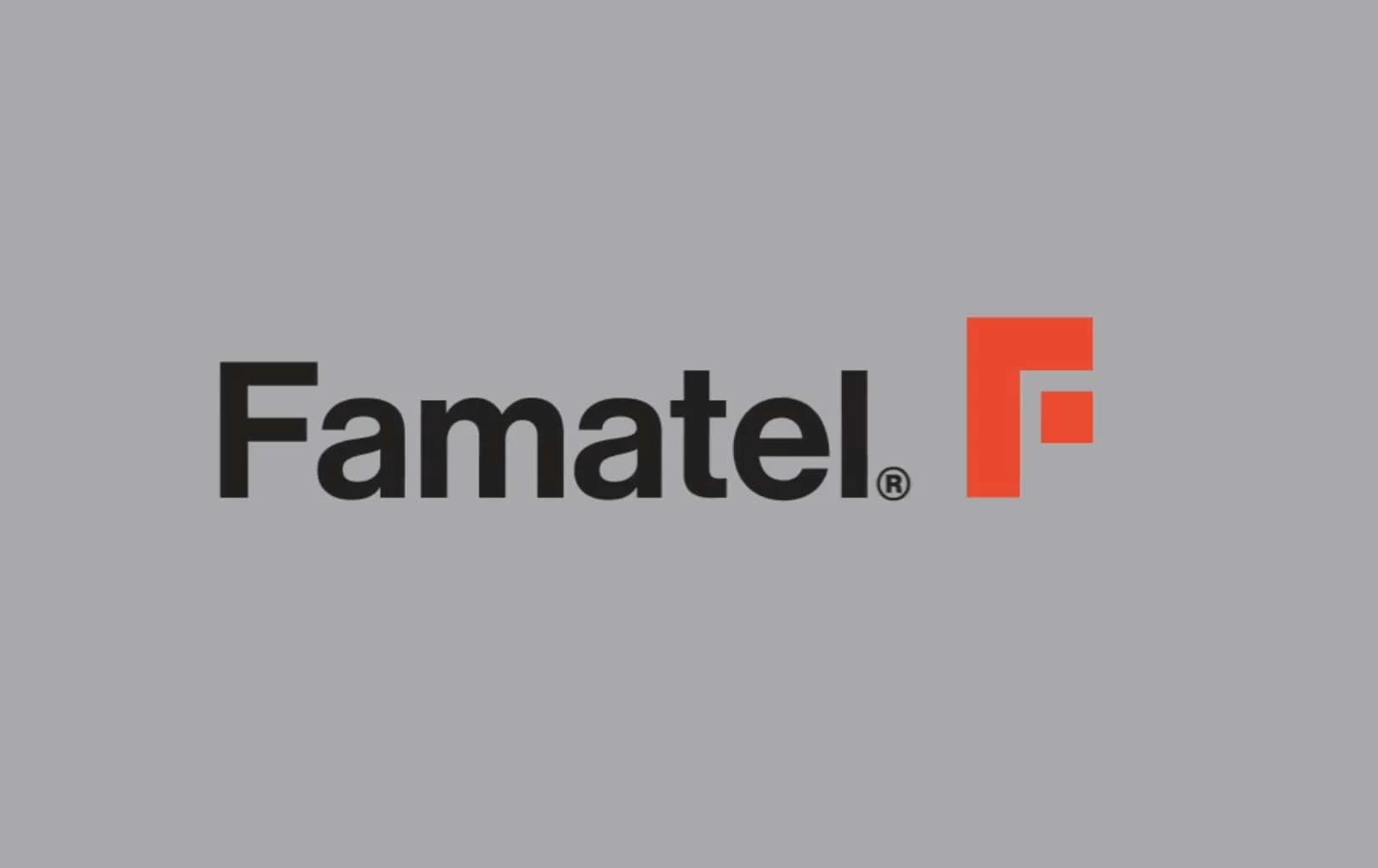
This eye-catching corporate branding example includes a striking chromatic palette. The combination of gray, white, and black signals the brand’s technical elements, while the fiery orange injects it with character and vitality.
Standout features:
- Striking color palette
- Reflects both the power of the sector and the company itself
- Robust market presence
With 25 years of experience, Famatel offers electrical solutions that add value and simplify the lives of professionals in 60 different countries. To strengthen its position, Nomon Design created branding elements with an electrifying and flexible graphic code. Using the Neue Haas Grotesk typeface, Nomon designed a consistent and architectural logo that represents the power of the sector and of Famatel itself.
Accompanying the logo is the isolated “F” with fittingly straight lines to emphasize the company’s robust character, but with a composition that is flexible in all its applications. The resulting logotype is an easily identifiable symbol that stands tall above competitors. Moreover, it works well on its own when used on digital channels and business collaterals.
8. STARC Systems by Visible Logic
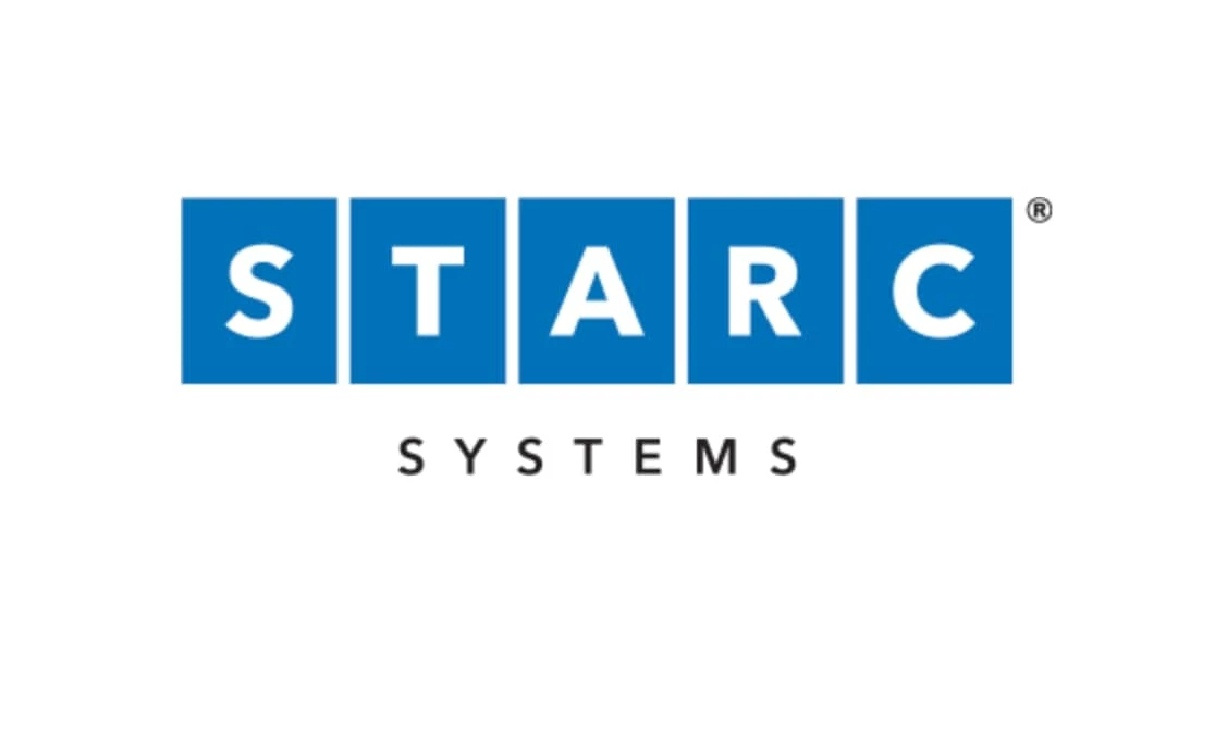
This impactful corporate branding example demonstrates how improved messaging and visuals can drive success. Visible Logic highlighted STARC’s innovative qualities and created informative brochures to boost sales.
Standout features:
- Clear, clean, and concise
- Prominent USP
- Blue color communicating highly professional service
The agency designed STARC Systems’ new logo to reflect the clean lines and ruggedness of the company's main product. The entire visual system has a clean, consistent look to mirror the growing portfolio of panel walls designed to blend in with their surroundings.
9. Cliona by Aarts Creative Consultancy
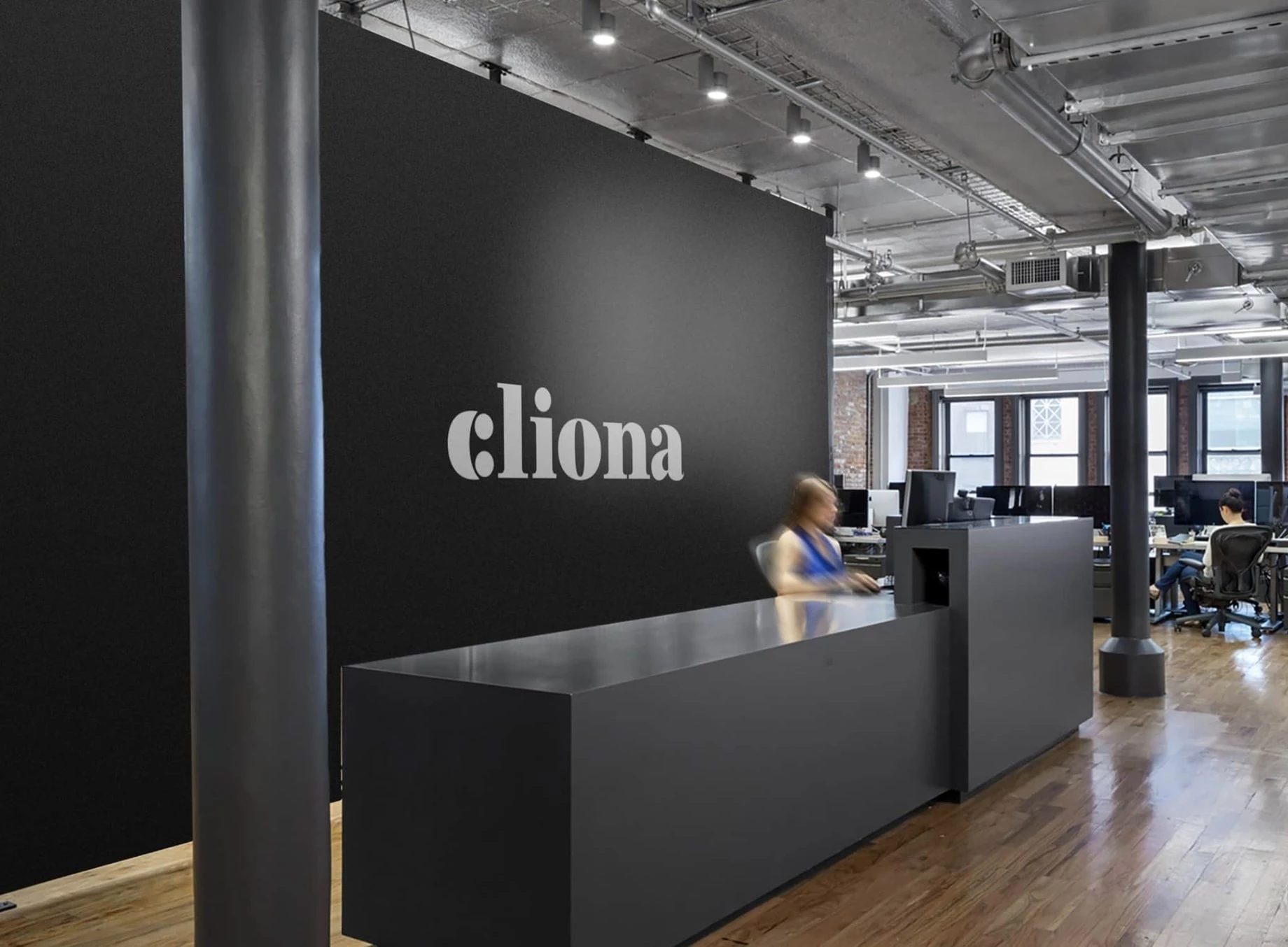
This is a great example of corporate branding following a major company shift. After changing the studio’s name to Cliona (from CARONA), which was also the founder’s name, Aarts Creative Consultancy infused the newly found identity with a genuine personality.
Standout features:
- Multilayered meaning behind the logo
- Serif font
- Amicability as the core value

Since “amicability” was established as the brand’s core value, it became central to the design. The design agency chose the Archaic Smile, a figure that shows a welcoming smile with a sincere and professional attitude. The smiling logomark (hidden in Cliona’s “C”) is clean, minimal, scalable, and most importantly, expresses the brand’s top values: Amicable, Sighted, and Exclusive.
10. Athos Capital Partners by WRK Partners
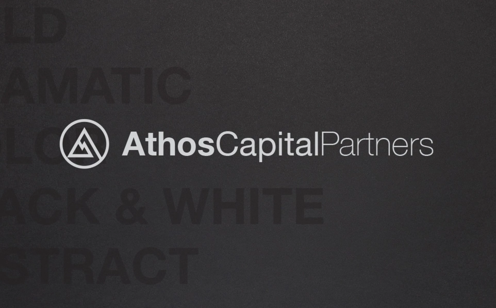
In this excellent corporate branding example, WRK Partners, the agency behind ACP’s visual identity, insisted on a dramatic mix of an abstract monogram and a black-and-white color combination.
Standout features:
- Abstract monogram
- Black & white
- Attention-grabbing
Athos Capital Partners is a private real estate investment partnership with offices in NYC and Coral Gables, Florida. The company's focus is on investing capital with institutional partners in highly differentiated developments in core urban and resort markets across North America, Hawaii, and the Caribbean.
The logo is the focal point of the branding. It has a decidedly modern look to it and is extremely conspicuous across a wide variety of settings and platforms. The sans-serif logo typography is simple and clean, grabbing attention with a gradual fade from bold to regular font.
11. WEINHEIMER LEDER by Rio Creativo
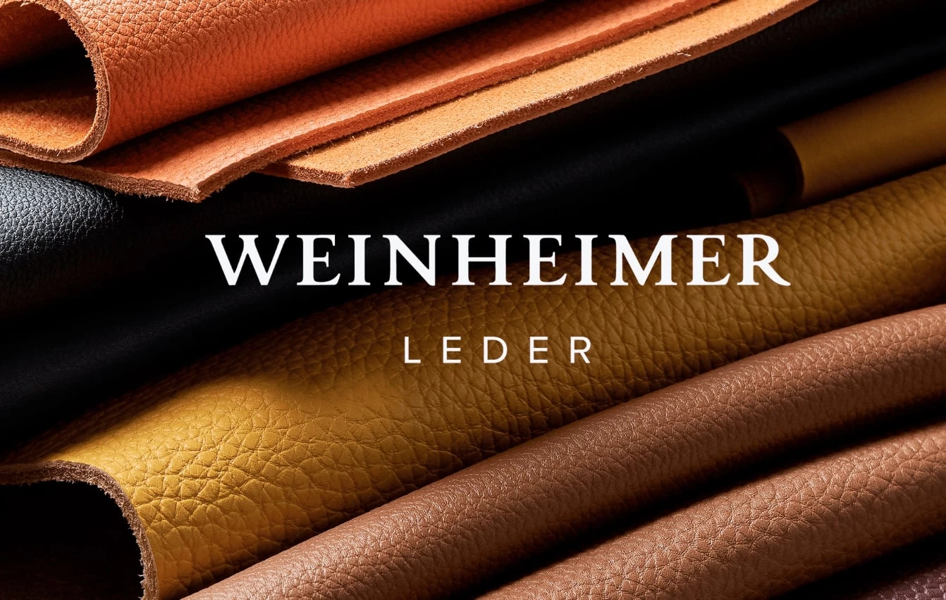
This is a top-notch corporate branding example by the agency Rio Creativo. It brought Weinheimer Leder’s century-and-a-half-long history into a new era with the slogan, “Tradition & Modernity united in perfection.”
Standout features:
- Quality-focused
- Classy, serif font
- A blend of traditional and contemporary
Weinheimer Leder is a manufacturer of calf leather of the highest standard, made of the best raw material. They are intended for high-quality brand footwear and leather goods.
Drawing from the company’s rich experience, the branding visuals are based on clear and simple aesthetics and carefully selected colors. It is elegant and tailored to the brand’s main values: class, transparency, quality, and attention to detail.
12. JT+Partners by IKTOMI

Another one of our favorite corporate branding examples is JT+Partners by IKTOMI. The agency was asked to revamp JT+Partners’ brand identity and ensure uniformity in visual communications across all client touchpoints.
Standout features:
- Symbolic “+” logo element
- Contemporary
- Future-proof
JT+Partners is an innovative architecture brand that delivers projects around the world, spanning commercial, hospitality, residential, mixed-use, and masterplan developments. This rebranding exercise sealed the firm’s transition from success to excellence. This is embodied in the iconic red “+” sign — a strong symbol representing the collaborative spirit of the JT+Partners team.
13. Gad Halperin & Co by Basman Tenenbaum

Another great corporate branding example is Gad Halperin & Co.’s by Basman Tenenbaum. The team formalized a concept that subtly frames the brand’s work in every element.
Standout features:
- Emphasized symmetry
- Eye-pleasing
- Minimal
STUDIO GAD is an interior and architectural design firm, specializing mainly in commercial projects, including hotelier spaces, recreation spaces, restaurants, medical centers, and cultural centers.
The logo is symmetrical and balanced, with the unique letter “H” seemingly the only thing out of the ordinary. This letter embodies architectural design by representing building blocks stacked on top of one another.
14. The Woodary by Brandy & Coco
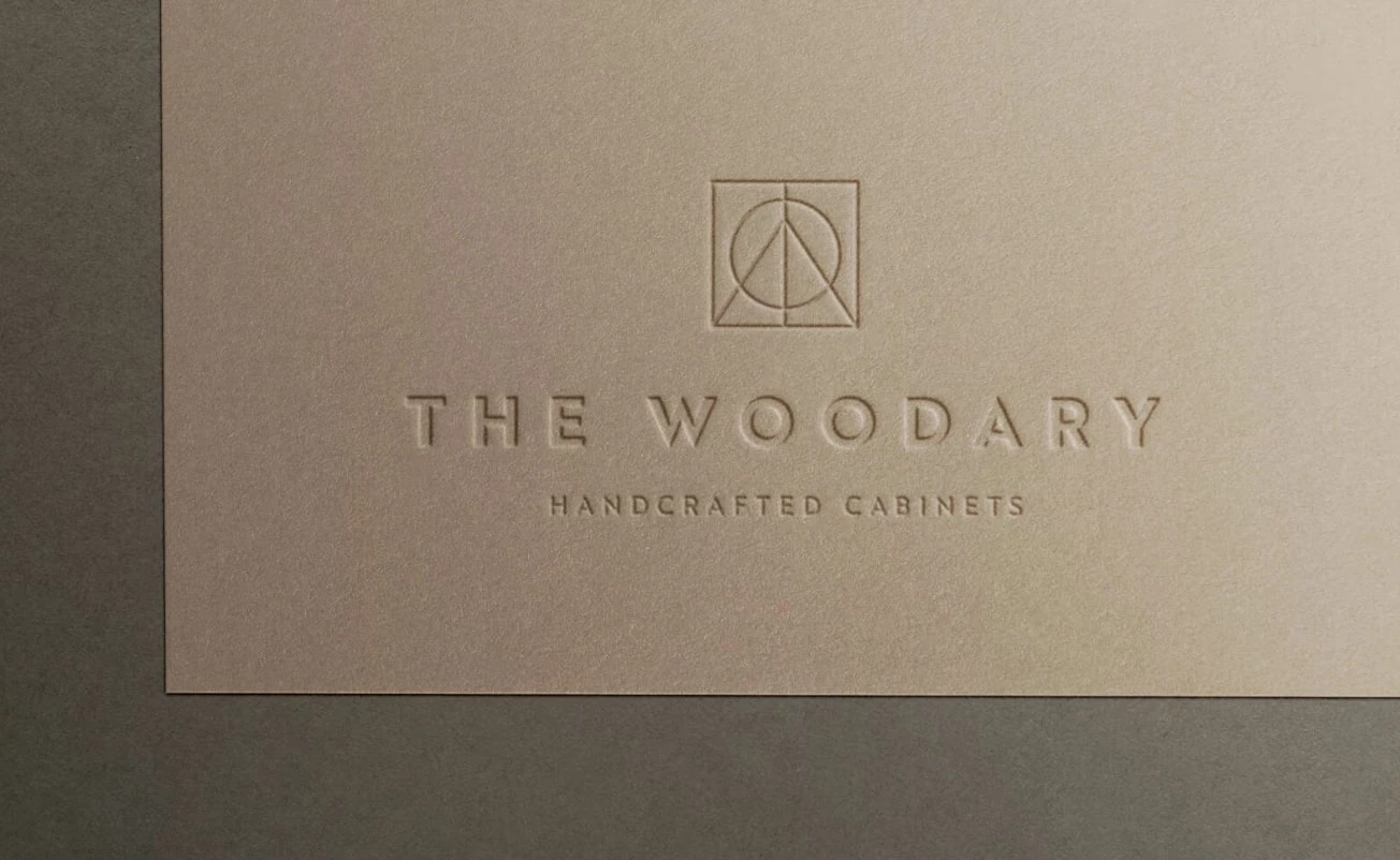
One of our favorite corporate branding examples is both highly contemporary and timeless. Without being unnecessarily flashy, it refreshes the eye with geometric design elements.
Standout features:
- Craftsmanship-worthy monogram
- Minimal
- Subtle and strong
The Woodary, an interior design and bespoke cabinetry company based in Australia, showcases a branding concept by Brandy & Coco that embodies both subtlety and strength. The agency aimed to create an original look that speaks volumes about quality and style, striking a balance between simplicity and sophistication.
The minimal logo features basic geometric shapes — circle, triangle, and rectangle — that come together to form a stylized tree. Paired with a clean sans-serif typeface, the design is rooted in consumers' psyche as a symbol of long-lasting, craftsmanship quality.
15. Wiley by Contrast & Co.
This is another fantastic corporate branding example that matches a company’s growth, effectively communicates its legacy, and embodies its vision for the future.
Standout features:
- Bold
- Streamlined monogram
- Saturated color palette
Having been at the forefront of defining the legal and regulatory frameworks for influential change-makers for nearly 40 years, Wiley has evolved beyond a traditional law firm. As the company entered a new decade, it sought fresh branding.
Contrast & Co. created a new, streamlined law firm logo, imagery, and a custom-tailored website. The new identity reflects Wiley’s unique structure and client-focused approach while clearly defining its elite collection of practices.
16. RewardOps by Brandlucent
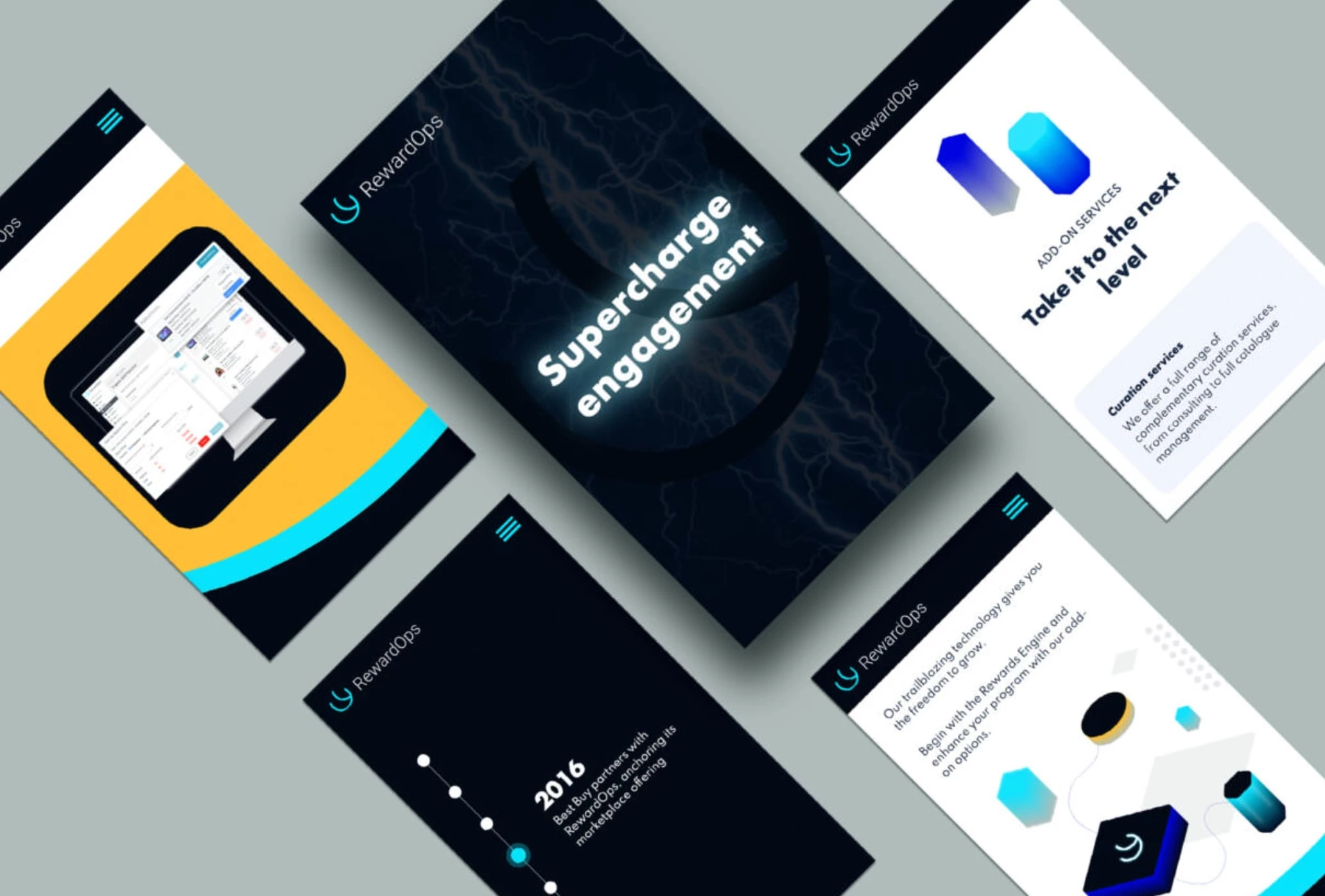
One of the best corporate brand examples is RewardOps, an ultra-modern brand that breaks down barriers and reflects its expanding future.
Standout features:
- Neon color palette
- Ultra-modern approach
- Engaging right from the get-go
RewardOps is a Toronto-based engagement commerce platform that creates positive disruption in the rewards space. Its cloud-hosted infrastructure, SaaS approach, and agile methodology set it apart from other companies in the loyalty industry.
Given the company’s energetic nature, Brandlucent came up with an electric brand messaging to match it. The visual identity, website experience, logo, and collateral designs are all charged with vibrancy and power.
17. Teal Tree by TC Creatives
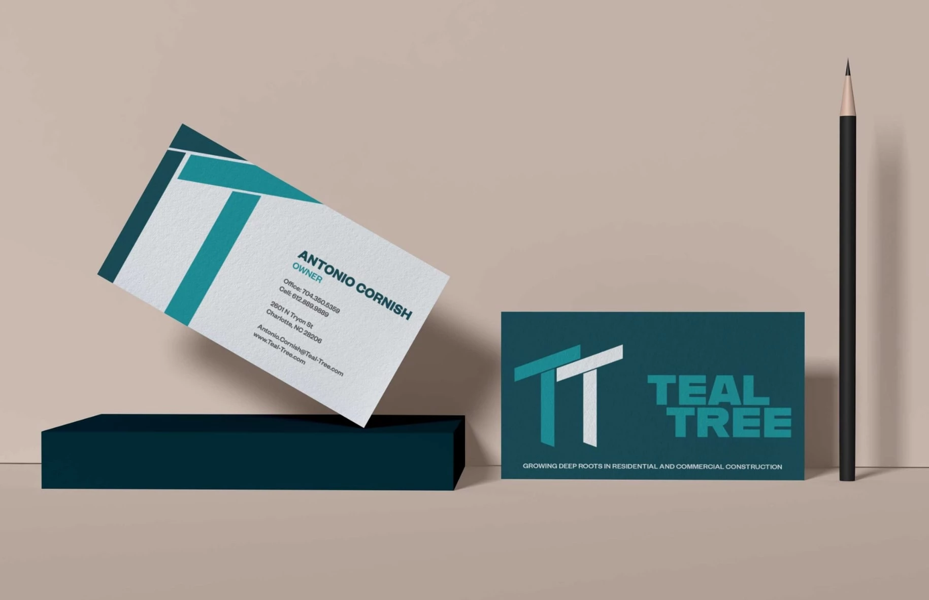
Teal Tree is a great example of corporate branding, featuring a simplistic, art deco-inspired logo that represents a prism and light and captures the essence of new technology.
Standout features:
- Art-deco style
- Calming the color palette reflects the company’s mission
- Captures the essence of luxurious skincare technology
To distinguish the Teal Tree brand in the oversaturated luxury brand marketplace, TC Creatives used the product’s unique light technology as the creative cornerstone for the motto, brand values, and color palette. The branding agency utilized charcoal with accents of gold and dusty rose to symbolize the purification and detoxification benefits of the products.
A modern sans-serif font is used for headers, complimented by a classic sans-serif for all other messaging.
18. SMP Pharmacy by Ghalya Lherisson

SMP Pharmacy is another great corporate branding example. It has a clean logo design and pastel color palette that creates a welcoming feel and inspires trustworthiness and professionalism.
Standout features:
- Pastel color palette
- Logo representing fertility, union, and growth
- Inspires trustworthiness
For more than two decades, SMP Pharmacy has curated custom solutions to ensure a one-of-a-kind experience for their patients.
While working as a part of The Brand Collective team, Ghalya Lherisson tackled this fairly sensitive task, designing the logo and revitalizing the brand. The new visual identity embodies the brand’s mission to deliver compassionate and complete patient care seamlessly and conveniently.
Takeaways on the Best Corporate Branding Examples
In today's global market, corporate branding is more important than ever. It encompasses not just a company's products or services, but its entire identity — from messaging to social impact.
By taking cues from the best corporate branding examples, businesses can leave a lasting impression on their customers and employees alike. Let the top performers listed above inspire you to elevate your brand to new heights and dominate the market.
![]()
Our team ranks agencies worldwide to help you find a qualified partner. Visit our Agency Directory for the Top Branding Agencies, as well as:
- Top Corporate Branding Agencies
- Top Brand Strategy Agencies
- Top Brand Positioning Firms
- Top B2B Branding Agencies
- Top Cincinnati Branding Agencies
And don’t miss our Awards section, where we showcase the top agencies recognized for exceptional creativity and impact.
Corporate Branding FAQs
1. What is corporate branding?
Corporate branding encompasses the identity and personality of an organization. It includes the values and beliefs that the business stands for, its tone of communication, and its message to target customers.
Creating a consistent and recognizable identity for an organization is a complex process. When done effectively, a strong corporate brand can set a business apart from its competitors and build loyalty with customers.
2. What is the goal of corporate branding?
Corporate branding is key to creating a distinct and cohesive identity throughout all communication channels. By molding the visual aesthetic (logo, typography, color palettes, etc.), establishing a consistent tone of voice, and imparting impeccable customer service, a company can convey a polished image that resonates with its clientele.
3. Why is corporate branding so important?
Having a solid approach to branding can help build a meaningful connection between a business and its customers. It allows consumers to easily recognize and trust a company's products without needing constant and costly marketing campaigns for each new offering. Establishing a solid brand image that resonates with consumers can boost customer loyalty and repeat purchases.


-preview-webp.webp)