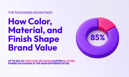
The key to making a product stand out on the market is in its branding. This is especially true for luxury labels. The best branding agencies manage to effectively capture the target audience’s imagination, and showcase high-end brands' class, elegance, sophistication, and exclusivity in all forms.
That’s why design plays a vital role here. When you look at luxury offerings – be it clothing, jewelry, cars, hotels, or estates – they are all design-driven.
It’s not just the product/service quality that luxury brands pay attention to. They also shift their focus to what truly matters: aesthetics that sell an idea, a lifestyle.
Needless to say, creating a gorgeous visual identity for your high-end product will seal your success. And to show you how it’s done, take a look at these 11 best luxury branding examples.
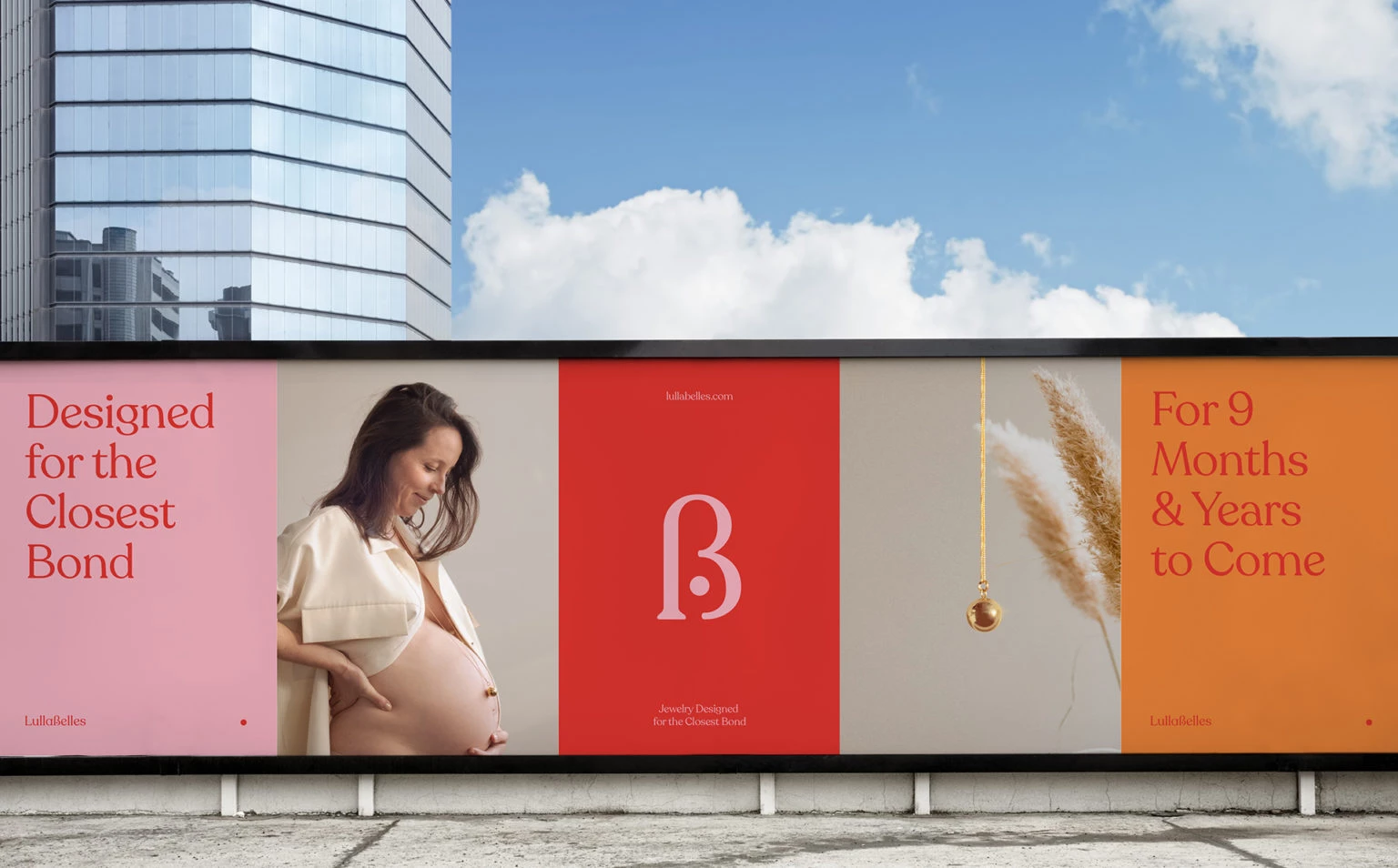
1. Lullabelles by Clara Ongil
Standout Features:
- Vibrant color palette
- Clean and minimalist imagery
- Simple typography
Lullabelles is a jewelry brand that targets a specific niche: moms-to-be. As such, its branding needs to be fresh, welcoming, and has that calming effect – something that Brooklyn-based Clara Ongil perfectly designed.
She used bright colors like reds, oranges, and pinks to showcase feminine elegance. They are fun and vibrant – perfect to get the brand’s message across. Plus, the colors are balanced out by clean and minimalist images putting women in the spotlight.
No crazy font combinations are used in this design, too. The main typography features an artsy and dynamic font that’s paired with a compelling copy, creating a perfect balance between simplicity and creativity.
All the images have plain backgrounds that highlight the models and the jewelry pieces better. The use of bold statements flashed in letter card-style layouts is also a fun way to introduce the brand identity to the target demographic.
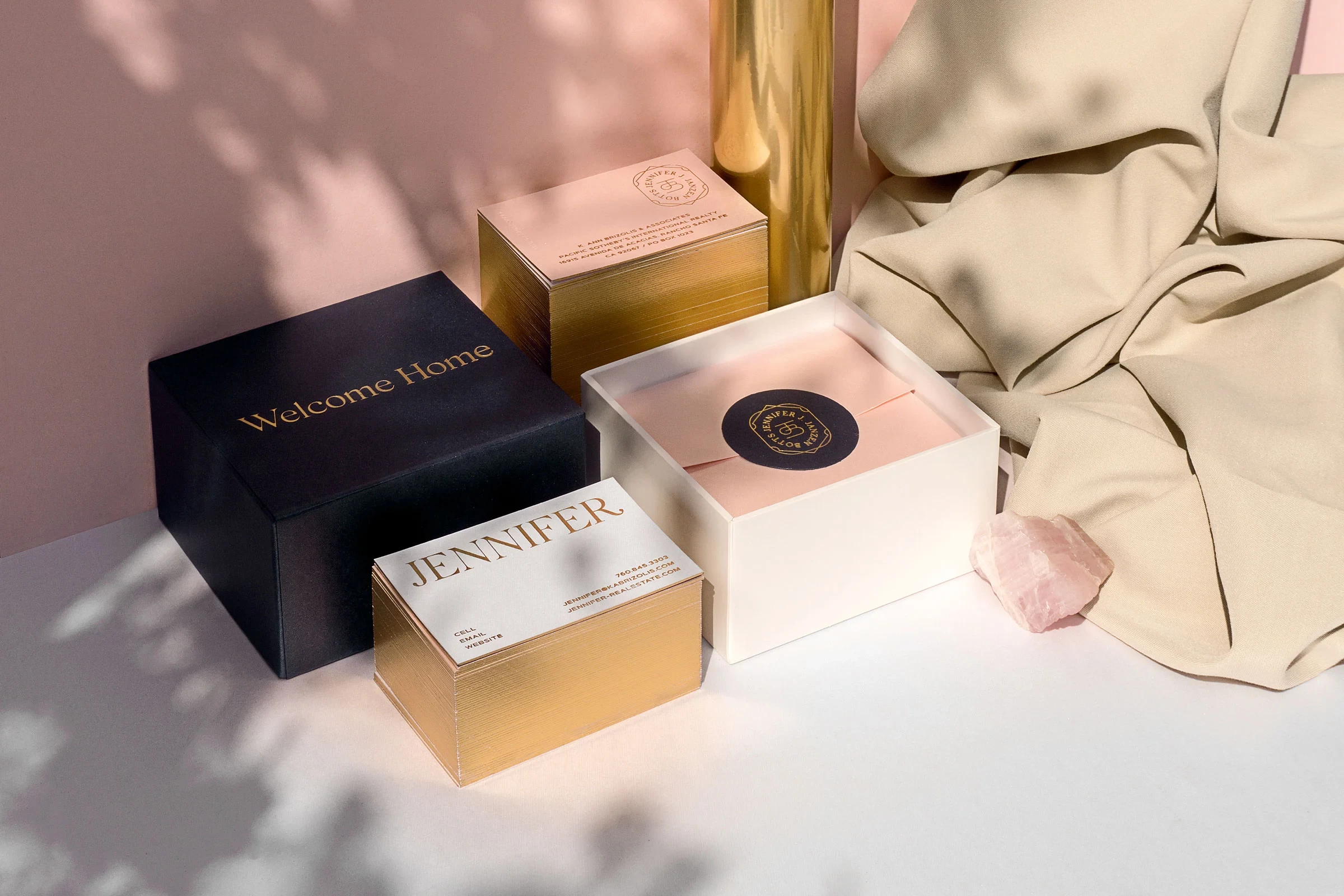
2. Jennifer J. Janzen-Botts by Workshop Built
Standout Features:
- Balanced use of bold and soft colors
- Scenic images of properties
- The logo resembles a gold seal
Workshop Built is dedicated to creating “bold and beautiful brands”, and their work for luxury residential real estate agent Jennifer J. Janzen Botts truly deserves praise. From rich color combinations to intricate design touches, they were able to create luxury branding visuals that represent her top-notch services.
First off, mixing four contrasting colors can be difficult to pull off, but the agency nailed it on this project. The use of bold colors like blue and gold effectively signifies excellence and competence. Meanwhile, the added touch of pink and white adds a more friendly and approachable feeling. And when put together, a match made in heaven!
The agency designed the brand's logo to look like a seal or a badge in gold. This, in itself, brings about a feeling of royalty and refinement – two characteristics rarely seen in realty branding.
Lastly, what better way to entice property buyers than beautifully-shot scenic pictures? Their esteemed branding stretched to their website. The agency made sure to display inviting images of houses, properties, and lifestyles being offered.
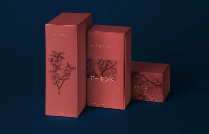
3. Olfatto Parfum by Jota Eslava
Standout Features:
- Warm color palette
- Great use of negative space
- Traditional and modern style
Offering a perfect blend of visual and sensory experience, Olfatto Parfum’s packaging design by Jota Eslava is a sight to behold. The designer is known for marrying traditional and digital graphic styles, and this project is a beautiful reflection of that.
The black and white stencil illustration of Japanese flora instantly evokes an ancestral and nature-inspired feeling. This illustration, against a warm color palette, highlights even the tiniest details of the image even more.
Such artistic choice gives off a certain mystical vibe, which captures the perfume’s scent profile and personality.
The box is painted in rosewood color, a perfect canvas for the high-contrast, monochrome illustration.
This is further complemented by the simple typography that pops – even in their small typeface. Although some text elements are scattered all over the design, they are completely legible and they stand out thanks to their light-yellow color.
The agency also leveraged the use of negative space between the visual and text contents. This helps the customer focus on specific elements and fully digest the design.
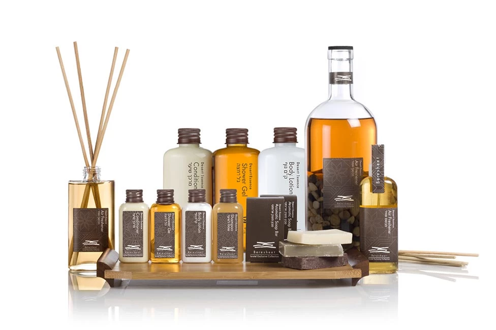
4. The Beresheet Hotel by Basman/Tenenbaum
Standout Features:
- Use of textured elements
- Memorable repeating patterns
- Earth-inspired visuals
Basman/Tenenbaum, an Israel-based design studio, has been in the industry for over 40 years and their work for The Beresheet Hotel is a testament to their branding expertise.
They took inspiration from the hotel’s magnificent location, which is a primeval landscape filled with towering cliffs. This is apparent in their use of earthy colors – mostly brown and beige – as draping for the different branding materials.
The logo offers a unique sense of abstraction through the use of freestyle penmanship. This icon is heavily influenced by the surrounding mountains of the hotel, which is a beautiful depiction of the location.
This style choice is consistent with their logo designs for the other partner estates. Cohesiveness in design builds strong recall among its existing patrons and potential customers.
Repeating patterns of natural elements are also present on packaging papers and other surfaces. They also added textured materials that reflect these patterns, adding an overall sophistication to the designs.
5. OBJKTS JEWELRY by Artgeneracia
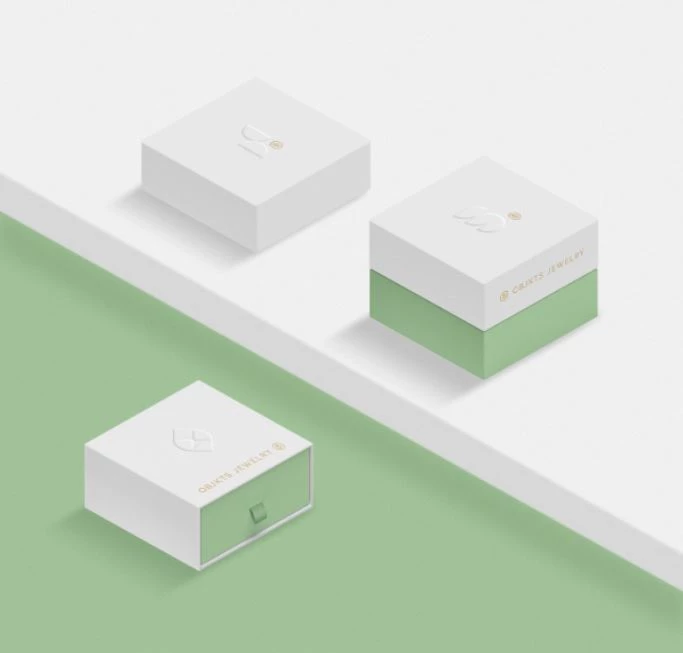
Standout Features:
- Refreshing color palette
- Evocative imagery
- Simple and clean layouts
OBJKTS JEWELRY focuses on classic and timeless styles with modern touches. These product signature styles are perfectly captured in their high-end branding strategy created by Artgeneracia.
For one, the blending of gold and mint green is a fun play on traditional and modern sensibilities. Muted colors like white and green are rarely used for jewelry brands, but it’s not an issue at all in this design. This palette is a fresh new take on this niche, and the branding firm made it work in their favor with A+ scores!
The use of dynamic and geometric shapes perfectly captures the name OBJKTS, and they represent the company’s unique jewelry pieces very well. The agency illustrated them through clean and minimalist layouts, with lots of space – allowing customers to focus on the objects being shown.
Aside from these icons and shapes, showing women of different backgrounds also effectively displays the versatility of each piece. The imagery has minimal styling – simply showcasing the jewelry worn by women on a plain background.
6. Holton Bespoke by Zeev Media
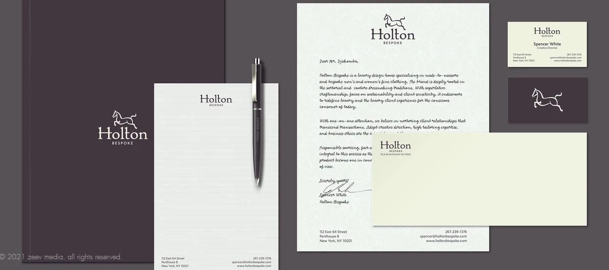
Standout Features:
- Elegant logo design
- Slick and sharp images
- Great contrast of light and dark theme
Zeev Media, an NYC-based design studio, gave Holton Bespoke a new dashing identity with a clean, cohesive, and luxury branding design.
The agency showcased the luxury clothing house’s sophisticated brand voice by designing a wordmark that looks super elegant. They also surrounded it with a good amount of free space, which adds an extra layer of focus to the sharp typography.
The logo encapsulates what the brand is about: high-level craftsmanship. The image is displayed on the brand’s official app icon, which is instantly recognizable and good for brand recall.
The use of gunmetal and alpine white as the standard color palette offers great aesthetics. This warm and cool-toned contrast is the recipe for simple sophistication. And overall, it just makes the clothing shine even more.
In addition, most of the branding materials are filled with images in high contrast as well. Aside from the eye candy, this also perfectly showcases the brand’s bespoke clothing catalog.
7. Nafeese Alavee by Zigma8
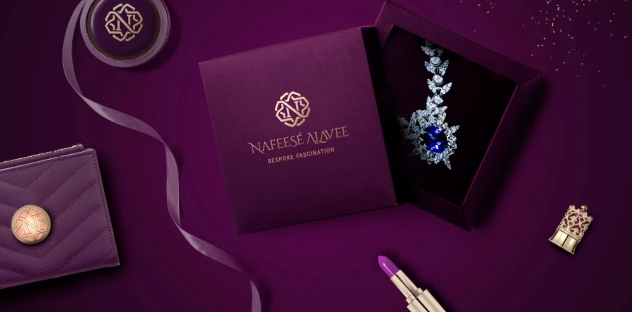
Standout Features:
- Abstract logo depiction
- Rich colorways
- Multiple logo and tagline variants
Nafeese Alavee is an Iranian designer who showcases her craft through bespoke jewelry. To highlight this, the designers from Zigma8 added personal touches and blended them with cultural elements for a rich, exotic look.
One of the most captivating elements is the logo. It’s a creative depiction of the designer’s identity, brand values, and cultural symbolism. The result is an intricate and abstract image that shows the brand’s sophisticated and luxurious nature – like a fine piece of jewel on its own.
Along with the logo is a statement that represents the carefully-crafted brand personality. It’s laced with romanticism, mysticism, and a distinct sense of the bespoke. The tagline, “bespoke fascination” delivers that opulence from the brand.
This is further enriched by the warm color palette in deep purple and gold. Nothing screams royalty more than this color combo. And it isn’t too heavy on the eyes, too. The occasional use of white on other materials balances everything out.
8. Sartoria Lamberti by rolling.design
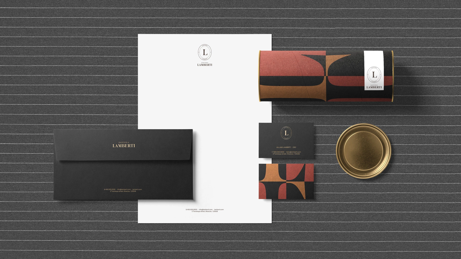
Standout Features:
- Industrial and modern visual system
- Combination of dark and light themes
- On-brand interior design elements
Sartoria Lamberti is a restaurant that’s greatly influenced by Neapolitan sewing workshops. Its branding agency, rolling.design, followed through by developing a visual system that translates the artistry behind this concept.
The brand’s logo takes the shape of the iconic Zinger sewing machine, with the brand’s initials stamped in the middle. The design is unmistakable, but it also resembles a plate, which is a great representation of the restaurant. Talk about hitting two birds with one stone.
To further highlight this theme, the agency added interior elements in the restaurant that add extra aesthetic value. Images of fabrics, accessories, patterns, spools, and sewing machines fill the area to keep things on-brand.
And finally, the use of bold and bright colors against a dark backdrop and vice versa, makes all the elements pop. They offer great contrast, too.
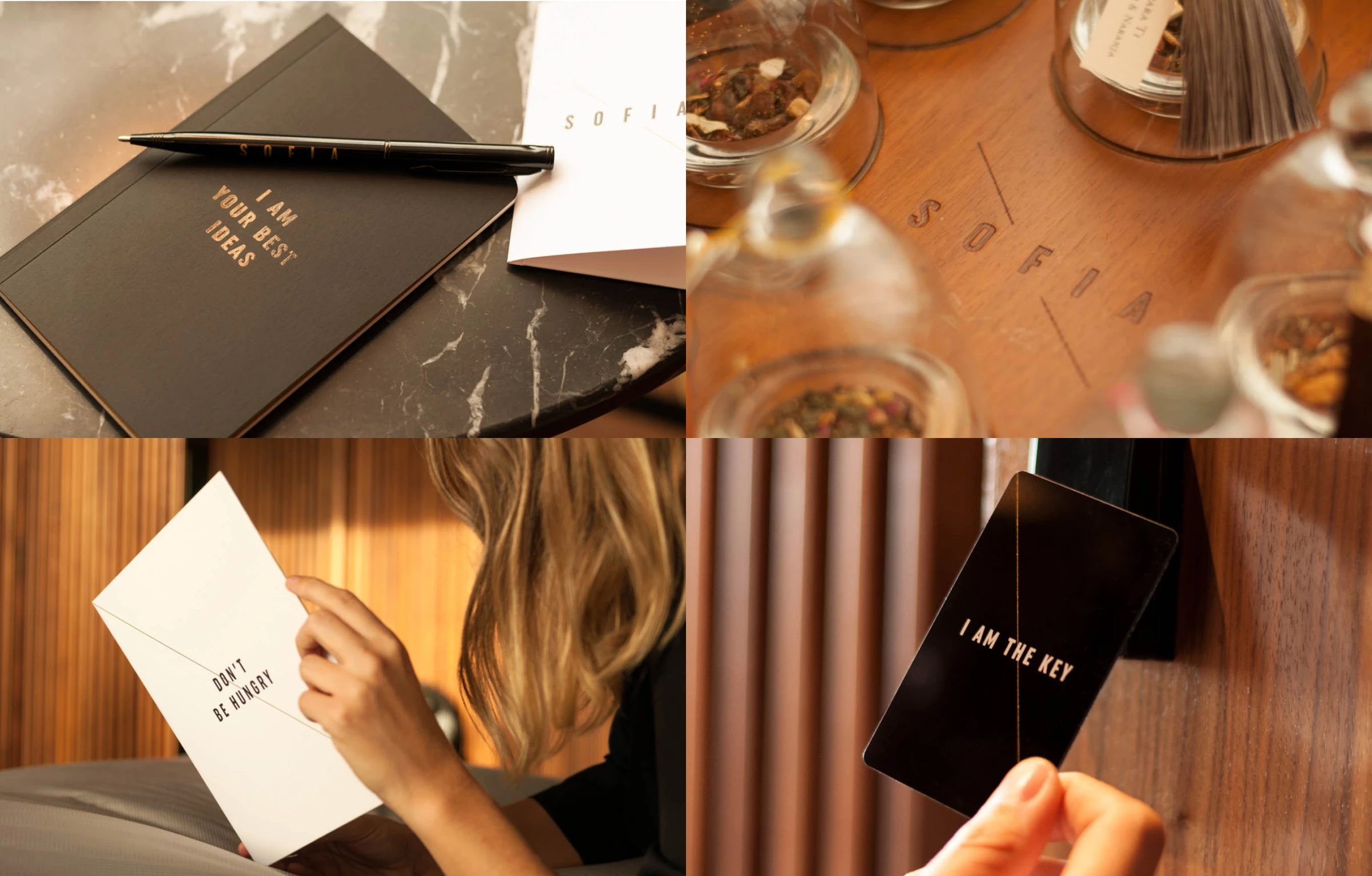
9. SOFIA Hotel by Morillas
Standout Features:
- Elegant color palette
- Snappy and bold statements
- High end branding
The SOFIA Hotel offers a luxurious getaway in Barcelona full of high-end options. The challenge for Morillas, its branding agency, is to create a fresh and modern identity despite the hotel being around for over 30 years. And clearly, they came through.
The brand is clad in white, black, and gold, which just screams elegance and sophistication. This is carried out through the hotel’s overall branding – from key cards to business cards to menus and so on.
The best part is that the branding materials aren’t designed heavily or adorned with lots of elements. Instead, they are stamped with one-line callouts like “Don’t Be Hungry” or “I Am the Key”. This adds to the brand’s fun and outgoing personality, which is what the brand aims to portray.
Unlike most hotels that showcase overly-produced photoshoots, the brand specialists opted to go for candid images. Showing people in action adds more realness to the experience, and it looks way more enticing.
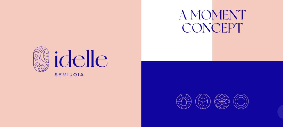
10. Idelle by Nil Brands
Standout Features:
- Powerful, evocative tagline
- Fun, youthful vibe
- Fresh color combination
Idelle is a Brazilian jewelry brand that’s aimed at giving customers the feeling of ultimate satisfaction and exclusivity. Nil Brands, its branding agency, created a visual identity that’s filled with a fun and youthful yet elegant personality.
The unusual combo of royal blue and beige captures the brand’s luxurious quality. This palette also showcases the perfect balance between strength and softness that the brand personifies. The contrast between the eccentric and straightforward typography adds extra aesthetic value.
The logo is composed of several visual elements without looking too busy. Blended icons of the sun, jewels, flowers, and leaves represent the brand’s geographical beauty.
And to bring it all together, the tagline “A Moment of Concept” encapsulates the brand message that when you buy an Idelle piece, you’re buying something unique and desired.
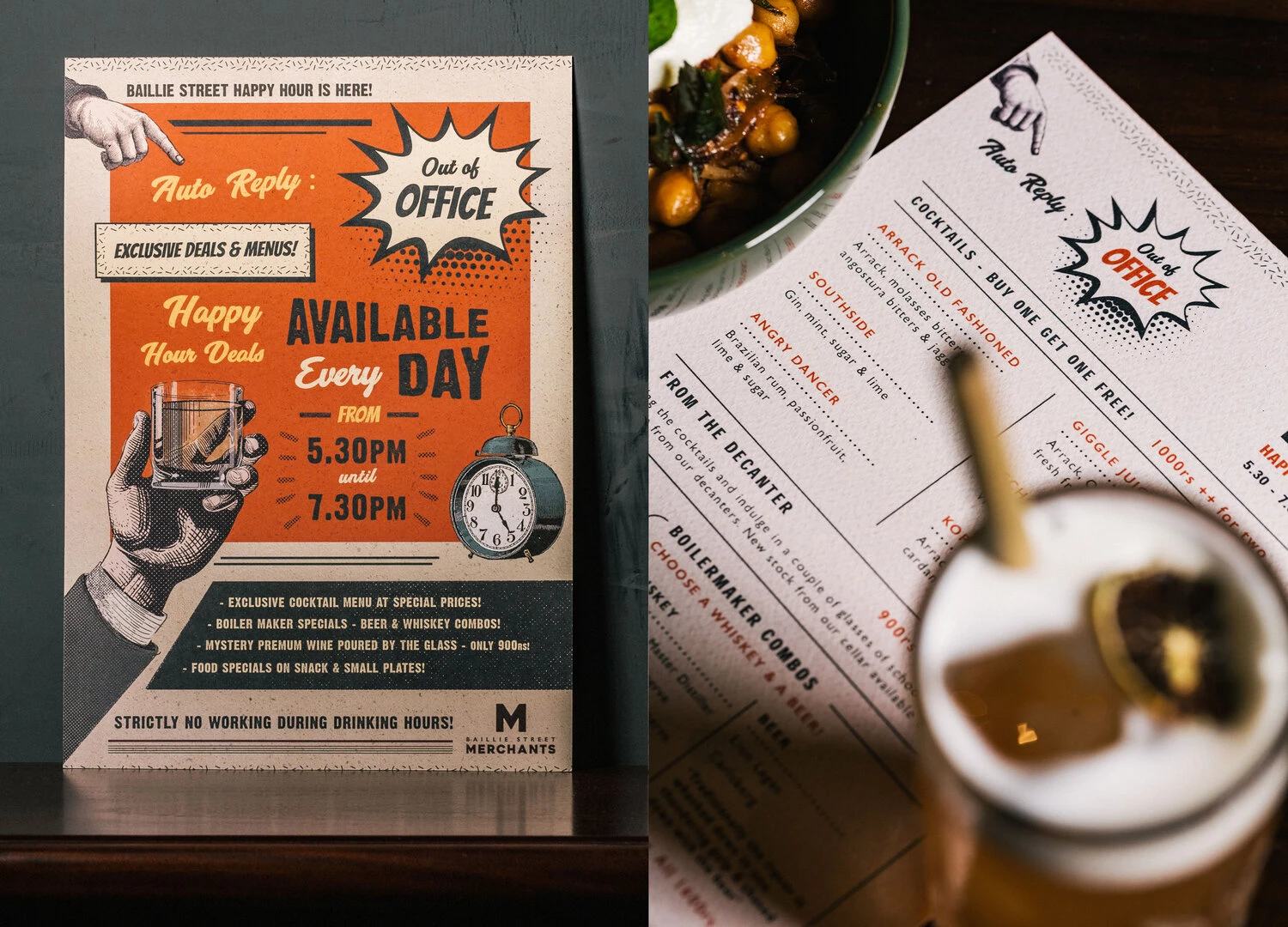
11. Baillie Street Merchants by Studio Nice One
Standout Features:
- Pop art-inspired layouts
- Doodle-style visuals
- Simple and clean typography
Baillie Street Merchants is a retro-style bar that is heavily inspired by the Old Colombo Fort. It’s situated in a historical location in Sri Lanka. That’s why it’s no surprise that Studio Nice One, a tropical design studio, nailed its branding strategy.
The designers went with doodle art and sketched figures to capture the brand’s vintage and rugged personality. These visuals are stamped across various branding materials – from menus and packaging to product illustrations.
Not to mention the pop art designs on their posters, promos, and bar announcements that fully give off that retro vibe. The agency also used actual vintage pictures of the bar’s location, which transports customers back to the 1600s. With all this, the brand stays in character at all times.
With this wealth of artsy visuals, it makes perfect sense that the agency used just one type of font to keep everything clean and streamlined.