In a world where first impressions are everything, your digital marketing agency logo is the face of your brand. The right logo speaks volumes about your business and the quality of your services and will leave a lasting impact on potential clients.
We’ve put together five stunning digital marketing agency logos that set the bar high and highlight the design trends that make them stand out. Read on to get inspired!
5 Effective Digital Marketing Agency Logo Designs
Thousands of digital marketing agencies worldwide generated $6.32 billion in 2024. Your logo is the most important element of your brand presence, as it sets your agency apart and captures potential clients' attention.
Take inspiration from these logo designs that look amazing and capture the essence of successful branding:
1. Flying V Group
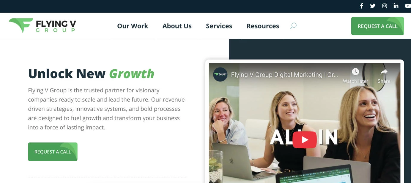
Standout Features:
- Tornado-like F
- Two shades of green
- Clean sans serif typography
Flying V Group is a digital agency powered by a talented and dedicated global team. Its logo design is simple yet striking, making an immediate impact.
The symbol’s form can be interpreted in several ways — it starts with a narrow stem and gradually widens upward. The most eye-catching element is the green “F”, which features two shades of green: a lighter tone that highlights the stylized letter and a darker tone that creates a shadow effect, adding depth. This bold, 3D-like design conveys structure and precision that reflects the agency’s strategic approach.
The typeface is arranged in two rows: the “FLYING V” is headlined in dark blue, while the “GROUP” matches the emblem’s green hue, increasing the character spacing for emphasis. The color choices are purposeful — green represents growth and prosperity, aligning with the agency’s mission to help clients succeed, while dark blue conveys professionalism, trust, and authority.
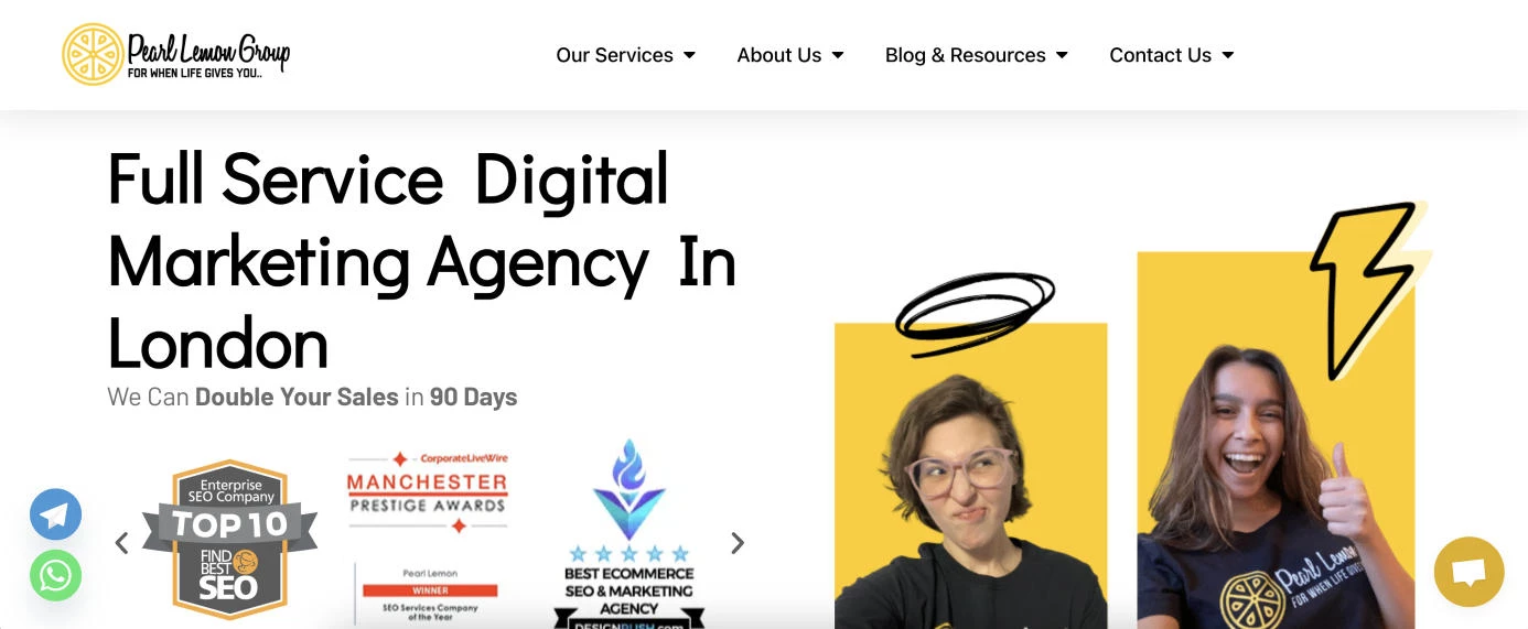
2. Pearl Lemon Group
Standout Features:
- Clever typography blend
- Cross-section view
- Fun cartoon symbol
Pearl Lemon is a London-based digital agency offering a range of digital marketing services to growing businesses. Its clever logo design features a vibrant yellow lemon illustration alongside a logotype and tagline.
The emblem showcases a symmetrical lemon cross-section with a circular outline and six identical segments. The bright yellow color immediately grabs attention, symbolizing energy, creativity, and freshness. This cross-section adds a visually engaging element, subtly hinting at innovation and the idea of looking deeper — just as digital marketing involves analyzing data and strategies to uncover insights.
For typography, the brand name is spelled out in an attractive cursive font, adding a personal, approachable touch and making it feel unique and human-centered. A modern sans serif font contrasts with the cursive lettering, giving the logo a balanced, professional look.
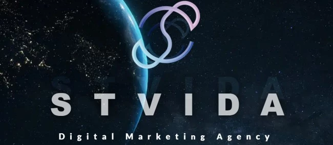
3. STVIDA Digital Marketing Agency
Standout Features:
- Blue-to-pink gradient
- Unique shape
- Inverted symmetry
STVIDA Agency is a company of young entrepreneurs that aims to help businesses grow in various ways. Its logo design is a perfect sample of its out-of-the-box thinking: the emblem features two halves of a circle, horizontally separated by white space. A long, curved S shape connects the upper and lower curves, symbolizing connection, flow, and integration — key elements of digital marketing, where different strategies must work together to create cohesive results.
The design features a gradient that transitions from sky blue at the bottom to light pink at the top, with darker shades of blue at the edges of the circular halves. This color scheme blends stability (blue) with creativity and innovation (pink), giving the logo a modern, dynamic feel. The combination makes the brand appear both reliable and forward-thinking, appealing to businesses seeking a professional yet innovative digital marketing partner.
4. Renaissance Digital Marketing
-content-large-webp.webp)
Standout Features:
- Fleur-de-lis imagery
- Script typography
- A seal
Renaissance Digital Marketing is an award-winning agency offering customized solutions for fast-growing brands. Its renaissance-inspired logo perfectly aligns with its name, visually representing the agency’s mission.
The most striking element is the fleur-de-lis, a symbol of sophistication, tradition, and excellence. It aligns with the concept of a renaissance — or a rebirth — in a business context. The red and white color scheme enhances the logo’s boldness and passion, qualities essential for a marketing agency that strives to make a strong, impactful statement.
Check out other red logo designs that leverage color psychology.
Additionally, the script font conveys a sense of elegance and artistic flair, reflecting an agency that combines creativity with high-end, personalized service. The flowing, connected nature of script typography suggests cohesion and expertise, signaling that Renaissance Digital Marketing delivers seamless, tailored digital solutions.
5. Merge Studio
-content-large-webp.webp)
Standout Features:
- Striking color palette
- “Merge” symbol
- Memorable typography
Merge Studio combines a passion for digital marketing with a commitment to amplify the work of nonprofits and purpose-driven organizations. Its logo exemplifies its commitment to sustainability and social justice.
The color palette reinforces these values: green symbolizes sustainability and renewal, while blue conveys trust and professionalism. The merging of these colors represents collaboration, unity, and growth, reinforcing the agency’s role in bringing together ideas, resources, and strategies to drive meaningful impact.
The serif typography complements the clean design of the logo, enhancing the overall sense of professionalism and approachability. It reflects the agency’s contemporary, forward-thinking approach, one that balances innovation with clarity.
4 Logo Design Trends for Digital Marketing Agencies
These logo design trends are making waves in the industry, helping agencies stand out and make a lasting impression:
- Minimalism: Clean, simple designs are all the rage, focusing on strong typography and subtle, impactful elements. This trend ensures your logo is memorable and versatile, working across any platform or size.
- Geometric shapes: They're bold and modern, making your logo visually striking and easy to recognize. These shapes convey precision and strategy, perfect for an agency that offers organized and effective solutions.
- Gradients: A smooth gradient or vibrant color scheme adds depth and energy to a logo. It’s a great way to demonstrate creativity and innovation while still keeping the design professional and modern.
- Bold typography: Strong, custom fonts communicate confidence and grab attention. They make your agency name the focal point and ensure it’s easy to read in any context.
6 Tips & Best Practices for Effective Logo Design
Designing or redesigning your agency logo is an exciting opportunity to define your brand identity and set yourself apart from the competition. Whether you’re starting from scratch or updating your existing logo, these tips help you create one that resonates with your target audience:
- Use timeless design elements: Choose design elements that'll stand the test of time and continue to represent your agency’s values long into the future.
- Focus on versatility: Your logo will appear in many different places, from websites and social media to print materials. Ensure it works well in black and white and is adaptable to different backgrounds.
- Make it scalable: Your design should look just as good on a business card as it does on a billboard. Ensure it’s legible and visually appealing at any size.
- Avoid overused designs: Your logo should reflect what makes your agency stand out. Prioritize uniqueness and find a way to showcase your brand personality.
- Keep it simple: The best logos are clean and uncomplicated. Focus on one or two key elements and avoid unnecessary details that can distract from your core message.
- Get feedback: Before finalizing your logo, solicit feedback from clients or colleagues who represent your target audience. Their insights will help you ensure your logo communicates the right message.
Digital Marketing Logo Design: What Not To Do
Your logo will leave a lasting impression on potential clients. To ensure it resonates positively, be aware of common pitfalls and key mistakes to avoid during the design phase:
1. Overcomplicated Design
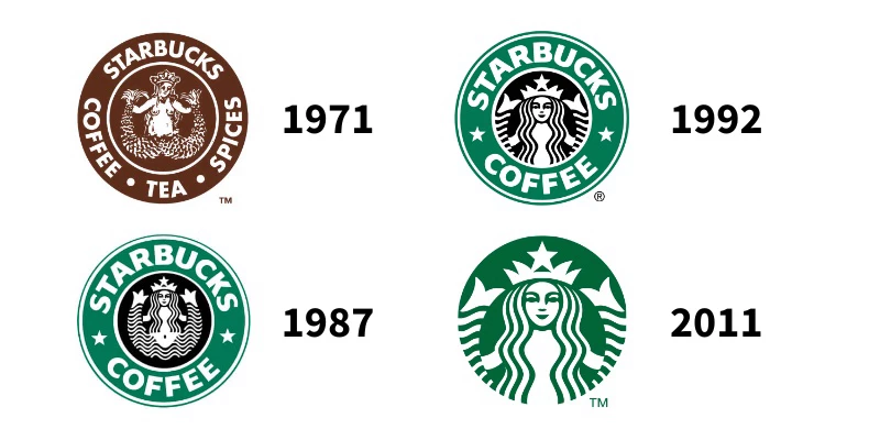
Overcomplicating your agency logo design can make it confusing and harder for people to remember. Look at Starbucks’ original 1971 logo: it had a highly detailed, twin-tailed siren surrounded by intricate text and a busy circular design. While it looked impressive at the time, the complexity made it hard to recognize at smaller sizes. It was also less versatile across different mediums.
The lesson: Keep it simple. Focus on one or two key elements that clearly represent your brand. A cluttered design may overwhelm your audience; a simple, well-crafted one will be more memorable and adaptable.
2. Lack of Scalability
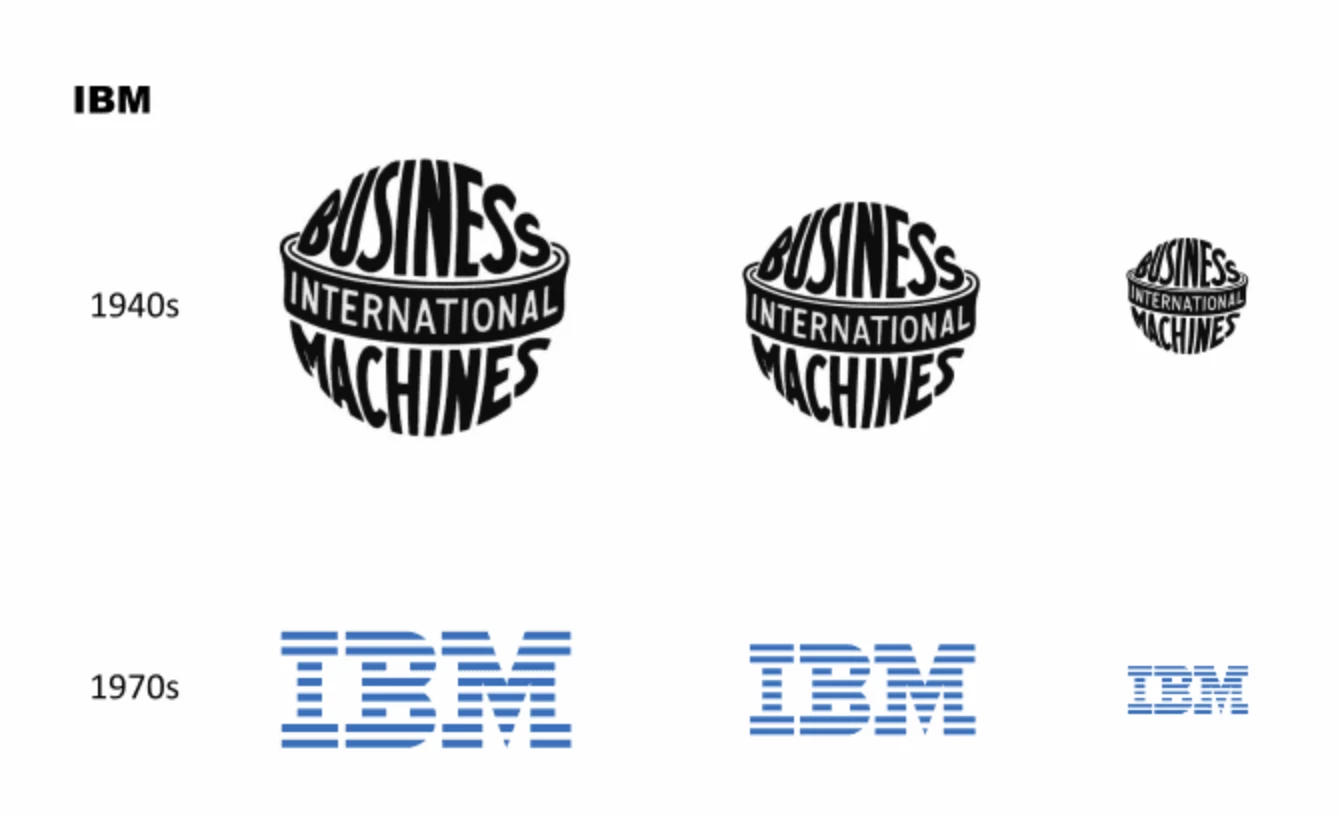
If your logo doesn’t look good at every size, it can lose its impact and fail to make a lasting impression. Take IBM’s original globe logo from the 1940s as an example. While the shape was a bold symbol, it was incredibly detailed, making it difficult to scale down without losing clarity. The intricacies of the design became blurry or hard to recognize.
The lesson: Create a design that remains clear and legible at any size to ensure maximum effectiveness across all platforms. With billions of users browsing on mobile, it’s more important than ever to keep scalability and versatility in mind.
3. Generic Elements
Overused symbols, clipart, or fonts can make your logo look unoriginal and fail to capture your agency’s unique essence. For instance, many logos in the digital marketing world rely on generic elements like a globe, a “connectivity” icon, or standard typography, which fail to communicate what makes your agency special.
The lesson: Strive for a logo that reflects your agency’s personality and approach. Think about what makes you unique and use design elements that genuinely represent your brand values and mission. A custom, creative logo will help you stand out in a crowded market and make a lasting impression on potential clients.
Digital Marketing Agency Logo Designs: Key Takeaways
By following the latest design trends and best practices, you can create or redesign a logo that represents your agency effectively and helps you stand out in a competitive market. Keep these principles in mind to create an impactful design that elevates your agency’s image.
Our design experts recognize the most innovative and creative designs from across the globe. Visit Design Awards to see the:
- Best Logo Designs
- Best Website Designs
- Best Video Designs
- Best Print Designs
- Best Packaging Designs
- Best App Designs
Our team also ranks agencies worldwide to help you find a qualified agency partner. Visit our Agency Directory for the top Logo Design Companies, as well as:
- Top Web Design Agencies
- Top Video Production Companies
- Top Print Design Companies
- Top Packaging Design Companies
- Top Mobile App Development Companies
Digital Marketing Agency Logo Designs FAQs
1. How can color impact my digital marketing agency logo?
Color plays a significant role in conveying the mood, tone, and values of your agency. For example, blue can suggest trust, while green symbolizes growth. Choose colors that reflect your brand’s personality but avoid using too many colors that may overwhelm the design.
2. How do I choose the right font for my digital marketing agency logo?
You might want a modern, clean font to suggest professionalism and innovation. Avoid overly decorative or hard-to-read fonts. Make sure your typography is legible at all sizes and complements the other design elements.
3. How do I test my digital marketing agency logo for effectiveness?
You can test your logo by getting feedback from your target audience or colleagues. Ask whether they find it memorable, recognizable, and aligned with your brand. You can also see how it looks on different platforms like your website, social media accounts, business cards, and flyers.