
Open five apps in the same category and see how long it takes to tell them apart. The answer keeps getting shorter.
AI design tools, mature component libraries, and a decade of shared conventions have made clean, competent interfaces easy to build. That's good for users. For product teams, it raises the bar. When every app looks polished, polish stops being a competitive advantage.
These 10 product design trends show how teams are creating products people remember, with real examples and a practical look at where each trend works and where it falls short.
Product Design Trends: Key Findings
- Stop competing on polish, because you'll lose. Put your effort into the things a component library can't reproduce: a point of view, a voice, and choices made for a specific audience.
- Products that get personalization right adapt what they show while keeping the structure fixed, so users feel understood instead of lost.
- More than 1 in 4 U.S. adults report a disability, and the design choices that serve them make the product faster and clearer for everyone.
The Real Problem: When Everything Looks the Same, Usable Isn't Enough
Digital products are converging on the same look: rounded cards, tidy dashboards, familiar onboarding flows, and predictable navigation.
The pull toward sameness reaches past the screen, too, as connected devices, kiosks, and the apps wrapped around physical products increasingly draw from the same handful of patterns.
The issue isn't quality. Most products are better designed than they were a decade ago. AI-powered design tools, component libraries, and established UX patterns have made good design far more accessible. But it isn’t enough to stand out anymore.
What people remember are the choices that can't be copied from a component library: a distinct point of view, a recognizable personality, and an interface built around a specific audience instead of a generic user.
That holds whether someone is tapping through an app, talking to a device, or following a product into the physical world.
The trends below show how design teams are creating that differentiation without sacrificing usability.
When AI Can Ship a Polished Interface in Minutes, Sameness Is the Real Risk
By early 2026, more than 74% of new web pages contained AI-generated content, and every major tool drew from the same training data.
This means a competent interface is now the default rather than a distinction. The three trends in this cluster all push against that convergence.
Each trades a safe, expected choice for something a competitor can't reproduce by copying your component library.
- AI-native interfaces: Designing around intent, not navigation
- Expressive product design: Personality competitors can’t copy
- Spatial & AR/VR design: When the product leaves the flat screen
1. AI-Native Interfaces: Designing Around Intent, Not Navigation
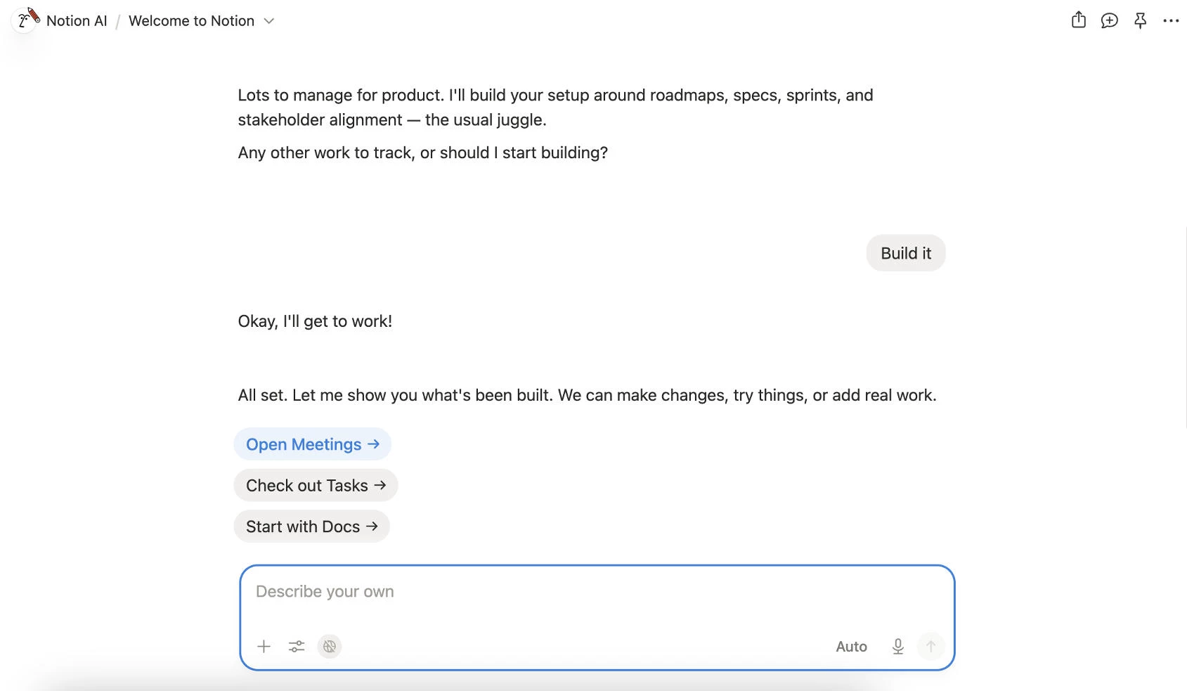
For years, AI lived inside products as an add-on: a chatbot in the corner, a writing assistant in a menu, a feature users had to discover.
Many products now put AI at the center of the experience. Instead of navigating menus, users describe what they want and let the product determine the steps.
That shortens the gap between intent and action. A single prompt can replace multiple screens, settings, and workflows.
The strongest AI-native products solve this with examples, suggested actions, and lightweight constraints that show what's possible without limiting flexibility.
How to Build AI-Native Interfaces
- Provide example prompts and suggested actions so users can start immediately.
- Keep traditional controls for common or high-frequency tasks. Typing a prompt should not replace actions that work better as a button.
- Make AI behavior visible. When the model makes a mistake, show users what happened and give them a clear path to correct it.
Where it works best: Research tools, knowledge management platforms, developer tools, and products with highly variable user goals.
Where to avoid it: Checkout flows, banking transfers, and other repeatable tasks where speed and predictability matter more than flexibility.
Real-World Example: How Notion Folded AI Into the Product Instead of Bolting It On
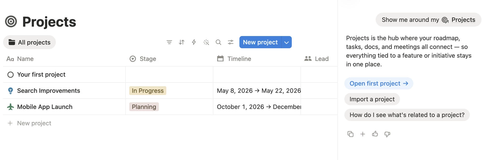
Notion adopted AI without rebuilding its product around a chatbot. Pages, databases, and blocks remain the foundation of the experience. AI sits inside those workflows instead of replacing them.
Users can access Notion AI through a chat interface, a dedicated workspace, or directly inside a page while writing. Pressing space on an empty line opens a prompt exactly where work is already happening.
When answering questions, Notion can search pages, databases, and connected apps, then return responses with cited sources. The interface makes it clear where information came from and gives users a way to verify results.
2. Expressive Product Design: Personality Competitors Can't Copy
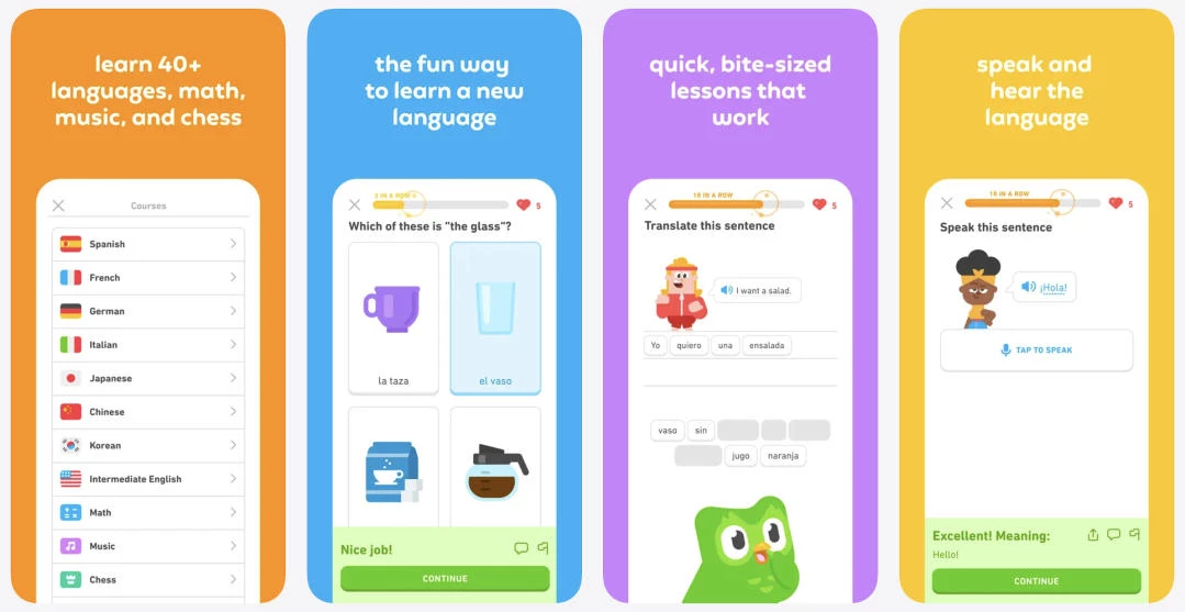
Expressive UI gives a product a recognizable personality. Instead of relying on the same components and design patterns as everyone else, it uses typography, color, illustration, motion, and writing to create an experience people remember.
As AI design tools and component libraries make polished interfaces easier to build, visual consistency has become the default. Personality is becoming the differentiator.
The strongest products don't add character as a finishing touch. Their visual style reflects the product itself, whether that's a founder's perspective, a brand's voice, or a clear opinion about how the experience should feel.
How to Add Personality Without Hurting Usability
- Use your boldest design choices where users are exploring, not completing important tasks.
- Core workflows should stay simple, predictable, and easy to use.
- Always test accessibility. If expressive colors or layouts reduce readability, usability should win.
Where it works best: Consumer apps, creative software, direct-to-consumer brands, and products people choose as much for the experience as the features.
Where to avoid it: Enterprise software, healthcare, finance, and other products where familiarity and clarity build trust.
Real-World Example: How Gumroad Made a Payments Tool Feel Distinctive
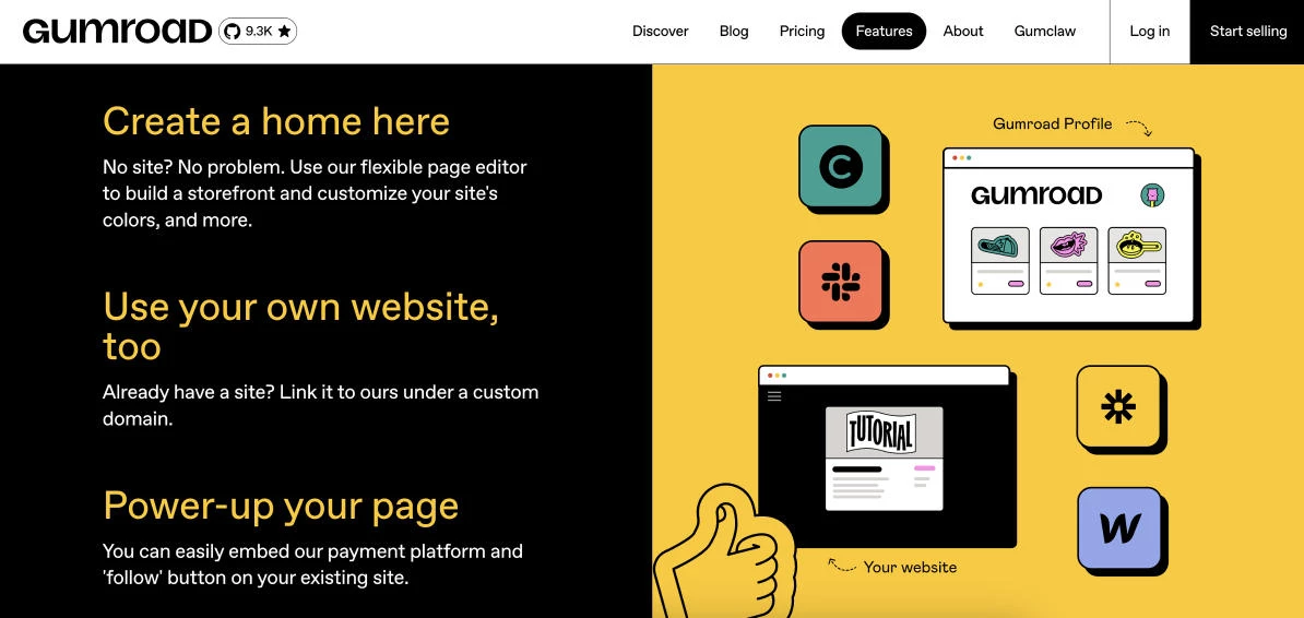
Selling digital downloads isn't an obvious place to build a memorable brand, but Gumroad avoids the polished corporate look common among payment platforms. Bold typography, flat illustrations, and its signature mascot give the product a distinct identity that reflects its audience of independent creators.
The personality stays where it adds value: marketing pages, onboarding, and brand moments. The checkout flow and product management screens remain clean and straightforward.
3. Spatial & AR/VR Design: When the Product Leaves the Flat Screen
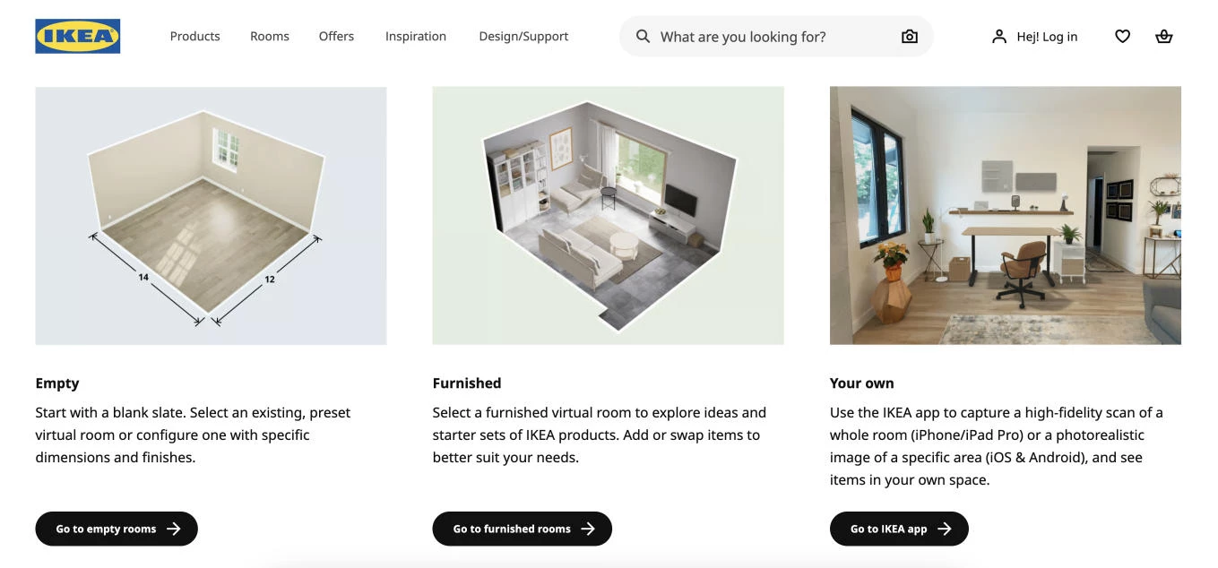
Spatial design places digital content in three-dimensional space instead of confining it to a screen. It includes augmented reality (AR), which layers digital objects onto the physical world, and virtual reality (VR), which creates fully immersive environments.
As AR and VR hardware becomes more capable, designers have a practical reason to build for spatial computing. Some tasks are easier to understand in three dimensions than on a flat display.
Assembly instructions, product visualization, room planning, equipment training, and physical repairs all involve depth, scale, and orientation. An interactive 3D model often communicates those relationships more clearly than static diagrams or written instructions.
How to Design Effective Spatial Experiences
- Start with problems that are inherently spatial. If a video or checklist communicates the task just as well, a 3D experience adds complexity without adding value.
- Let the model do the teaching. Controls, labels, and interface elements should stay out of the way until they're needed.
- Design a complete mobile or desktop experience. Most users will encounter your product on a conventional screen first.
Where it works best: Assembly and repair guides, furniture and home visualization, industrial training, retail try-before-you-buy, and products that help users understand physical objects.
Where to avoid it: Text-heavy content, transactional workflows, and audiences without reliable access to AR or VR hardware.
Real-World Example: How ANML Reimagined BILT's Assembly Experience

BILT helps brands replace printed assembly manuals with interactive 3D instructions. Design studio ANML redesigned the consumer app and built a publishing platform that makes those experiences easier to create and maintain.
Instead of forcing users to flip through static diagrams, the interface stays minimal while the model guides each step. Controls and supporting information appear only when they're needed, keeping the focus on the build itself.
View this post on Instagram
ANML carried the same approach to Apple Vision Pro, allowing users to place a 3D model alongside the physical product and follow instructions in context rather than on a separate screen.
Behind the scenes, ANML also rebuilt BILT's publishing portal. Brands can update instructions, manage content, and track product performance through a shared design system that keeps the authoring tools and consumer experience consistent.
Experts at ANML draw a clear line around when the extra effort is worth it:
“Spatial earns its place when the task is inherently about physical space or three-dimensional understanding: assembly, training on real equipment, or anything where a flat diagram forces you to do the 3D translation in your head. That’s exactly where BILT fits.”
The redesign improved both sides of the platform, giving customers a more intuitive assembly experience while making it easier for brands to maintain high-quality instructions.
Results:
- 654,000+ app downloads
- 16,000+ new user registrations
- 79.4 Net Promoter Score
- 107,000+ app ratings
Users Now Expect the Product to Meet Them Halfway, and Punish the Ones That Don't
McKinsey research finds that 71% of consumers expect companies to deliver personalized interactions, and 76% get frustrated when that doesn't happen.
Each trend here adds complexity a simpler product could skip, so each earns its place only when the payoff for the user outweighs the cost of building and maintaining it.
- Adaptive & personalized interfaces: The product that reshapes itself for each user
- Multimodal input: Letting users point, speak, and show instead of type
- Purposeful micro-interactions & motion: Movement that does a job
4. Adaptive & Personalized Interfaces: The Product That Reshapes Itself for Each User
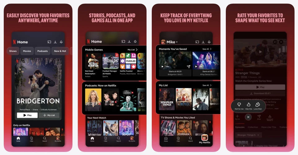
Adaptive interfaces adjust to each user instead of presenting the same experience to everyone. Content, recommendations, and featured actions change based on behavior, preferences, and context, while the product's core structure stays familiar.
Personalization has become an expected part of digital products. Users assume their favorite shows, frequently used features, or relevant products will appear first. Interfaces that never adapt can feel generic, especially in products people use every day.
How to Design Adaptive Interfaces Without Disorienting Users
- Keep navigation and core workflows consistent. Personalize content, recommendations, and secondary actions instead.
- Explain why users are seeing recommendations and give them control to refine or reset them.
- Leave room for discovery. Showing only familiar content limits exploration and eventually weakens the recommendations themselves.
Where it works best: Streaming platforms, eCommerce, news, social media, and products with enough behavioral data to personalize accurately.
Where to avoid it: Productivity tools that rely on consistent layouts, or early-stage products without enough user data to personalize well.
Real-World Example: How Spotify Turns Listening Data Into an Interface That Follows You
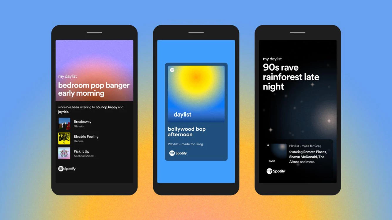
Spotify's “daylist” playlist updates as many as six times a day, combining listening history with time of day to match changing moods and routines. Morning playlists often look very different from those that appear late at night.
Spotify has also made personalization more collaborative. The Prompted Playlist beta lets users describe the music they want in plain language, then generates a playlist from their listening history and Spotify's catalog.
5. Multimodal Interfaces: Letting Users Point, Speak, and Show Instead of Type
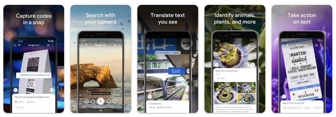
Multimodal input lets users interact through voice, images, documents, or gestures instead of relying on a keyboard alone. The best products choose the input that fits the task rather than forcing everything into a text box.
Many problems are easier to show than describe. A photo of a math problem, a damaged appliance, or a plant communicates more than a written explanation, and matching the input to the task removes friction and gets users to an answer faster.
How to Design Multimodal Experiences Without Frustrating Users
- Offer the input that matches the task, using cameras for visual problems, voice when hands are busy, and text when precision matters.
- Preview what the system recognized before acting, so users can catch mistakes early.
- Introduce new input methods in context instead of hiding them behind menus or settings.
Where it works best: Shopping, translation, education, accessibility, troubleshooting, and products where showing something is easier than describing it.
Where to avoid it: Precise text entry, noisy public environments, and tasks where typing is faster and more reliable.
Real-World Example: How Edubrain Removes the Need to Type Homework
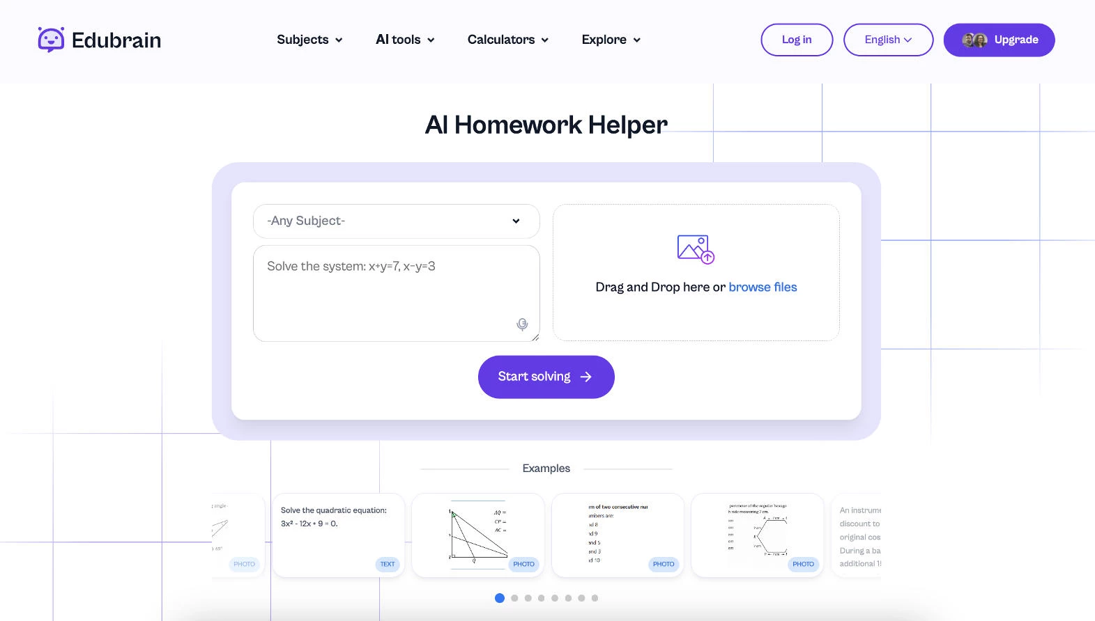
Edubrain removes one of the biggest points of friction in homework help: typing the question. Students can upload a photo, scan a worksheet, attach a PDF, or record a voice question instead of transcribing equations or long word problems.
Students can also choose how they want the solution presented and ask follow-up questions if the first interpretation misses something, so the product meets them in the format they're already using.
6. Purposeful Motion: Animation That Improves the Experience
Micro-interactions are the small moments of feedback that make an interface feel responsive: a button press, a menu opening, or a form confirming an action. Purposeful motion extends that idea by giving every animation a clear job.
Good motion answers questions users already have. Did my click register? Where did this panel come from? What changed? Animation that doesn't improve understanding only slows people down.
Performance matters just as much as visual polish. Animating the wrong properties can make an interface feel sluggish, especially on older devices. The best products pair thoughtful motion with efficient implementation.
How to Use Motion that Engages Users
- Animate with purpose, using motion to confirm actions, maintain context, or guide attention.
- Keep animations brief, so users notice the feedback rather than wait for it.
- Give users a way to reduce or turn off non-essential motion, since some people experience dizziness or discomfort from it.
Where it works best: Product marketing pages, onboarding, feature demos, and interfaces where visual feedback builds confidence.
Where to avoid it: Repetitive workflows, high-speed data entry, or any interaction where animation delays the next action.
Real-World Example: What Strava's Celebration Animations Reveal About Motion
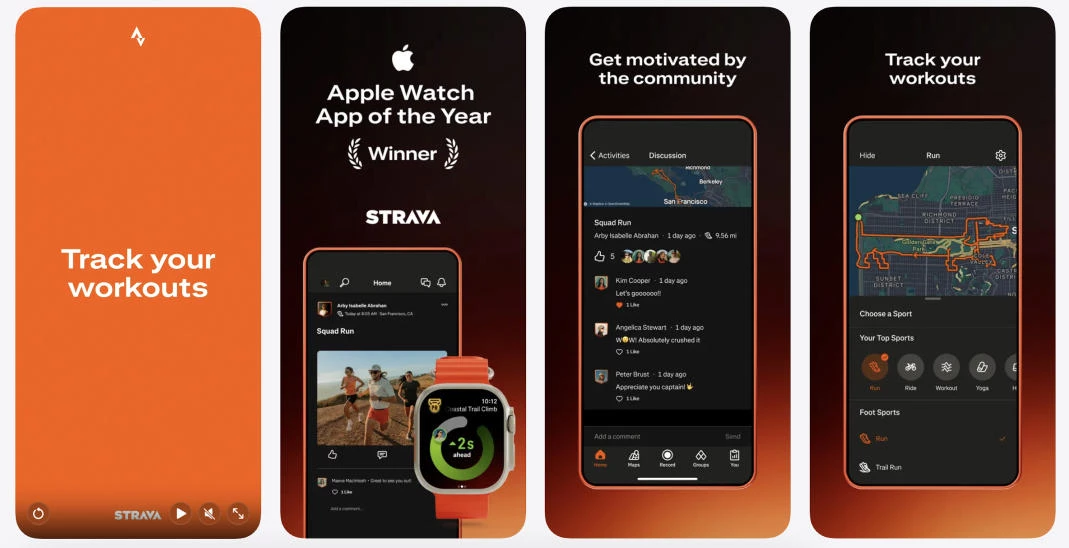
Strava rewards activity with animated moments, like the celebratory Kudos and end-of-activity sequences that mark a completed workout. The intent fits the brand: finishing a ride or run should feel like an achievement, and motion is a natural way to signal that.
Used this way, motion reinforces what the product is about, which is effort and achievement, instead of decorating screens where users just want to move quickly. The lesson is that motion lands hardest when it's tied to a moment that already matters to the user.
The Product Design Trends Nobody Notices Until They're Missing
Fast, accessible interfaces don't attract attention because they're supposed to disappear. When they fall short, though, users notice immediately.
- Performance-first design: Speed users can feel
- Accessibility first: Designing for everyone by default
7. Performance-First Design: Speed Users Can Feel
Performance-first design treats speed as part of the user experience, not something engineers optimize after launch. Every interaction, from opening a screen to tapping a button, should feel immediate and responsive.
A slow interface feels unreliable, even when every feature works correctly. Fast products build trust because they let people stay focused on their task instead of waiting for the interface to catch up.
Showing content progressively, responding instantly to user input, and keeping animations smooth all make an interface feel faster, even when work continues in the background.
How to Design for Performance
- Prioritize the interactions users repeat most often. Small delays add up quickly in everyday workflows.
- Load only what's needed first, then fetch additional content in the background.
- Measure real user performance, not just lab tests. A product that feels fast on a flagship device may struggle on older phones or slower networks.
Where it works best: Consumer apps, eCommerce, productivity tools, social platforms, and products people use frequently throughout the day.
Where to avoid it: Nowhere. Every product benefits from better performance, though optimization efforts should focus on the experiences users rely on most.
Real-World Example: How Instagram Makes the App Feel Faster Than It Is
Instagram rarely asks users to wait on blank screens. Images begin loading before they're fully visible, interface elements respond immediately to taps, and placeholder content fills the screen while photos and videos continue loading in the background.
Many interactions are designed around perceived performance as much as raw speed. Users receive immediate feedback even when network requests are still in progress, making the app feel responsive instead of stalled.
8. Accessibility First: Designing for Everyone by Default
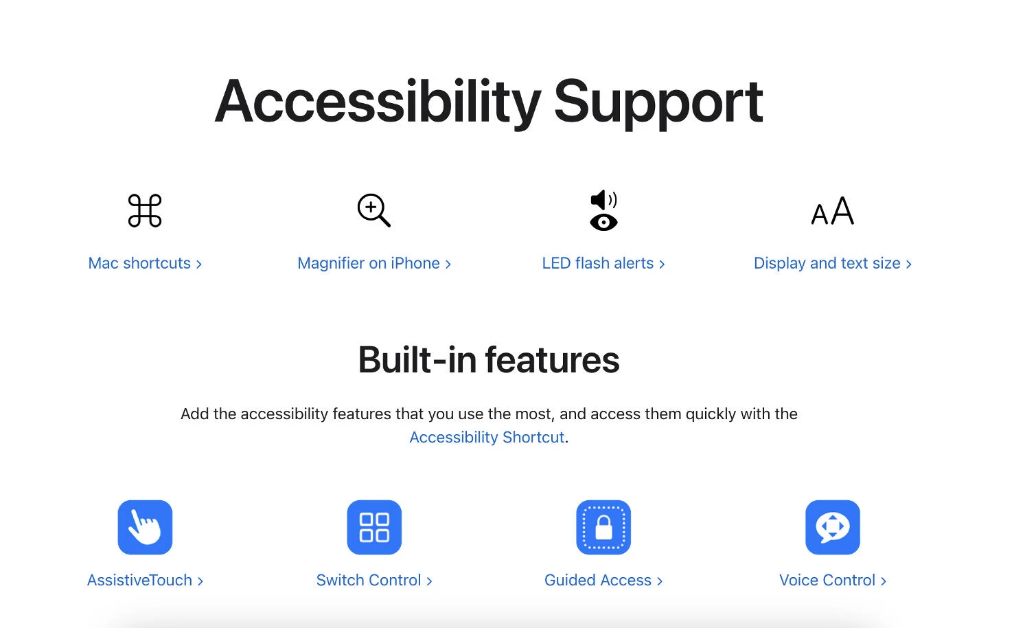
Accessibility-first design removes barriers before users encounter them. Instead of treating accessibility as a final review or compliance requirement, it shapes decisions about navigation, typography, color, motion, and interaction from the beginning.
The audience is larger than most teams assume: CDC data shows that more than 1 in 4 U.S. adults, over 70 million people, report having a disability.
Many accessibility improvements benefit everyone, not just people with permanent disabilities.
Larger touch targets reduce missed taps. High-contrast text improves readability outdoors. Captions help users watching videos without sound. Products designed for a wider range of abilities often become easier for everyone to use.
Accessibility also becomes harder to retrofit as products grow. Building accessible patterns into a design system makes every new feature more consistent and less expensive to maintain.
How to Design Accessible Products
- Design with sufficient color contrast, readable typography, and touch targets that are easy to tap across devices.
- Support multiple ways to interact with the product, including keyboard navigation, screen readers, captions, and reduced-motion preferences.
- Test with real users and assistive technologies instead of relying on automated accessibility checks alone.
Where it works best: Every digital product, especially public-facing websites, mobile apps, enterprise software, education, healthcare, and government services.
Where to avoid it: Nowhere. Accessibility is a foundation of usable product design.
Real-World Example: How Apple Builds Accessibility Into Every Product
Apple treats accessibility as part of the core product experience rather than a separate mode users have to enable. Features like VoiceOver, Live Captions, Assistive Access, Dynamic Type, and system-wide Reduced Motion are integrated across iPhone, iPad, Mac, and Apple Watch.
These features improve everyday usability beyond their original purpose. Dynamic Type helps users read comfortably across screen sizes, Reduced Motion creates a calmer interface for users sensitive to animation, and Live Captions make videos easier to follow.
As Products Collect More and Decide More, Trust Becomes Part of the Interface
As products become more intelligent and collect more personal data, trust has become part of the user experience.
The best interfaces make their decisions visible, respect user choice, and avoid design patterns that prioritize short-term conversions over long-term confidence.
9. Privacy-First Design: Making Data Collection Visible
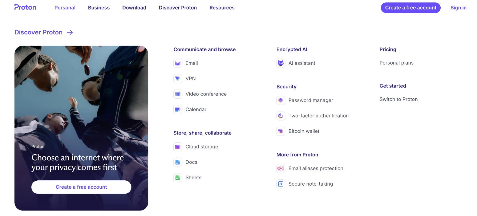
Privacy-first design treats data collection as part of the user experience, not something buried in a legal document. Users should know what information a product collects, why it needs it, and how to change those choices at any time.
As AI products become more personalized, they rely on larger amounts of user data. That exchange works best when it's transparent.
People are more willing to share information when they understand the benefit, receive permission requests at the right moment, and can easily review or revoke access later.
How to Design for Privacy
- Ask for permissions when they're needed and explain how the data improves the experience.
- Replace legal jargon with plain language people can understand in seconds.
- Keep privacy settings easy to find so users can update or withdraw consent whenever they choose.
Where it works best: Consumer apps, AI products, healthcare, finance, social platforms, and any service that collects personal or behavioral data.
Where to avoid it: Nowhere. Clear privacy controls improve trust in every product.
Real-World Example: How Signal Builds Trust Through Minimal Data Collection
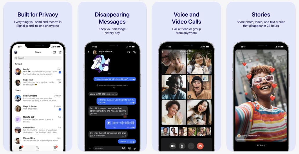
Signal collects as little personal information as possible. The messaging app doesn't store contact lists, conversation history, profile details, or metadata that could reveal who users communicate with.
Many features work without requiring additional personal data, reinforcing privacy through the product itself instead of lengthy policies.
10. Honest UX: Designing Without Dark Patterns
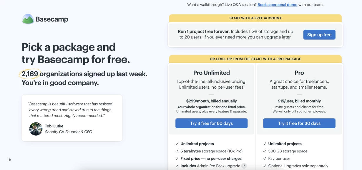
Honest UX helps people make informed decisions without relying on pressure or confusion. Clear pricing, straightforward language, and reversible choices reduce friction while giving users confidence that the product is acting in their interests.
As dark patterns become easier to recognize, transparency has become a competitive advantage. Products that respect users' time and attention often see stronger retention because people are more likely to return to services they trust.
How to Design Honest Experiences
- Present every option with equal clarity instead of hiding alternatives behind misleading labels, visual hierarchy, or unnecessary steps.
- Make canceling a subscription, deleting an account, or changing a plan as simple as signing up.
- Explain costs, renewals, and feature limits in plain language instead of relying on urgency, guilt, or confusing copy.
Where it works best: Subscription services, eCommerce, SaaS platforms, fintech, and any product that manages purchases, memberships, or recurring payments.
Where to avoid it: Nowhere. Clear, transparent interfaces improve every digital experience.
Real-World Example: Basecamp's Straightforward Product Design
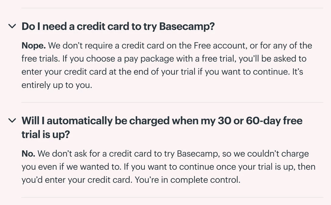
Basecamp has long favored plain language over persuasive copy. Pricing is easy to understand, feature descriptions explain exactly what's included, and account settings remain simple to navigate.
The company also avoids aggressive upgrade prompts and promotional pop-ups that interrupt everyday work.
Removing unnecessary friction and presenting choices honestly creates a better experience while giving customers more confidence in the product.
Which Product Design Trends Should You Prioritize?
The right mix depends on two factors: your industry and your audience.
Your industry sets the expectations users bring to the product, while your audience determines which experiences feel intuitive and which create friction.
By Industry
Your category decides which trends read as smart and which read as reckless. The same expressive interface that wins a consumer app can cost a fintech product the trust it depends on.
1. eCommerce and Retail: Speed and Discovery Do the Heavy Lifting
Performance has the biggest impact because every extra second can reduce conversions. Pair fast experiences with adaptive personalization to improve product discovery, multimodal search for visual shopping, and spatial previews where customers benefit from seeing products in context.
Clear pricing and friction-free checkout also matter because confusing purchase flows drive abandonment.
2. SaaS and Productivity Tools: Intelligence and Restraint Together
AI features now feel expected, so success depends on how naturally they're integrated into everyday work.
Adaptive interfaces help frequent tasks stay within reach, while subtle motion provides feedback without interrupting experienced users. Keep visual personality restrained since people spend hours inside these products.
3. Healthcare, Finance, and Professional Services: Trust Is the Whole Job
These products succeed by reducing uncertainty.
Accessibility, fast performance, privacy-first design, and honest UX should take priority because users are sharing sensitive information or making important decisions. Decorative motion and playful interfaces can distract from that goal.
4. Consumer, Lifestyle, and Creative Products: Personality Has Room to Breathe
Products in these categories have more room for personality.
Expressive interfaces, bold visuals, and thoughtful motion help brands stand out, while personalization keeps experiences relevant over time. Strong accessibility practices ensure creative choices don't reduce usability.
5. Developer Tools and Technical Products: Craft Signals Competence
Technical audiences notice craftsmanship. Performance, AI-native workflows, and purposeful interactions all matter, but every feature should solve a real problem. Design flourishes feel authentic only when they support the workflow instead of decorating it.
By Audience
Industry sets the boundaries. Your audience tells you what resonates inside them.
- Creative professionals, designers, and developers often appreciate distinctive interfaces, polished motion, and AI features that improve their workflow without adding unnecessary complexity.
- Mainstream consumers usually value speed, simplicity, and personalization over visual experimentation. Products that feel effortless tend to outperform those packed with extra effects.
- Enterprise users expect predictability. Accessibility, privacy, transparent account management, and responsive performance create confidence long before advanced features do.
- Younger audiences generally adopt new interaction patterns quickly, making expressive design, multimodal input, and personalization natural additions.
- Older users and people with accessibility needs benefit most from readable interfaces, consistent navigation, and dependable performance.
Product Design Trends: Final Thoughts
The right trends depend entirely on who you're building for and what you need them to do. A fintech product and a consumer app can share almost none of this list and both be right.
The products people remember in 2026 won't be the most polished, because polish is free. They'll be the ones that feel like a specific team made deliberate choices for a specific person, and then backed those choices with speed, access, and honesty.

Our team ranks agencies worldwide to help you find a qualified partner. Visit our Agency Directory for the Top Product Design Companies, as well as:
- Top UI/UX Design Agencies
- Top Product Prototype Companies
- Top Design Agencies
- Top Digital Design Agencies
- Top Packaging Design Companies
And don’t miss our Awards section, where we celebrate the most innovative projects in design, from logo and app design to print and packaging.
Product Design Trends FAQs
1. What's the difference between UX design and product design?
UX design focuses on how an experience flows for the user, while product design usually spans a wider remit: the user experience plus business goals, technical constraints, and how the product evolves over time.
In many teams the titles overlap, but product design tends to own the "why build this" alongside the "how it works."
2. How do I convince stakeholders to invest in accessibility or performance?
Frame them as reach and retention rather than compliance. Accessibility widens your addressable audience, and speed maps directly to conversion and engagement metrics leadership already tracks. Both are also far cheaper to build in early than to retrofit once the product has scaled.
3. What tools do product designers use to build these experiences in 2026?
Common categories include interface design tools like Figma, prototyping and motion tools, design-system platforms for consistency, and AI-assisted design features now built into most major tools.
The specific tool matters less than having a shared design system that keeps decisions consistent as the product grows.
4. Isn't AI-generated design the reason everything looks the same? Why use AI at all?
AI accelerates whatever a team already has. Point it at a product with a clear point of view, and it scales that distinctiveness quickly. Point it at a vague brand and it produces more sameness. The tool isn't the problem; the absence of a deliberate direction is.
5. How do I measure whether a design trend is working?
Tie each trend to the outcome it's supposed to affect. Personalization should move retention and engagement, performance should move bounce and conversion, and honest UX should show up in reduced support tickets and fewer angry cancellations.
6. What's the most common mistake teams make when adopting new trends?
Adopting the visual signal without the reason behind it. Copying a bento grid, a bold typeface, or an AI chat input because competitors have them produces the exact sameness the trend was meant to escape. The trends that work start from a real user problem, not from a screenshot.
7. Is expressive, personality-driven design risky for a serious product?
It depends on the category and where you apply it. In healthcare or finance, heavy personality can undercut trust. Even in expressive-friendly categories, the safest pattern is to concentrate personality in exploratory moments like landing pages and empty states, and keep the core task flow calm and predictable.
8. Which trend should a small team with limited resources prioritize first?
Performance and accessibility, in most cases. They benefit every user, rarely go out of style, and are cheapest to build in early. They also create the stable foundation that makes the more ambitious trends, like personalization or spatial design, safe to add later.