Receive our NewsletterJoin over 70,000 B2B decision-makers growing their brands
Web Design Trends
Learn about the latest insights and forecasts that highlight the future of web design here on DesignRush. Be it guides, inspiration, or web design tools and elements, you’ll find all the resources you need in our comprehensive collection of carefully crafted blogs.

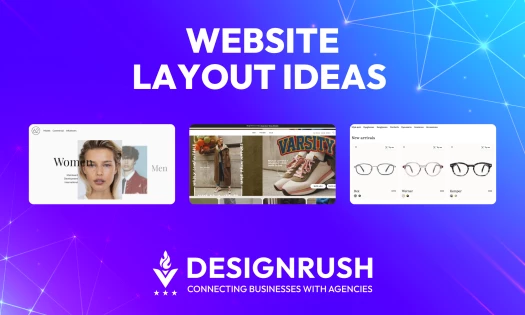
Website Layout Ideas for 2026 That Will Transform Your Digital Presence
| 5 months ago | 11 min read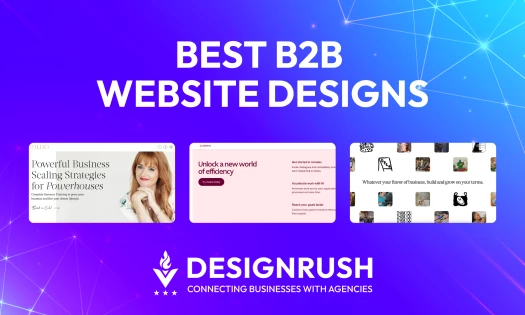
7 Best B2B Website Designs and What We Can Learn From Them (2026)
| 5 months ago | 7 min read
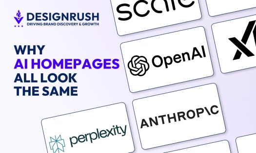
15 Website Design Trends Proving That Polished Is the New Generic
| 1 day ago | 26 min read
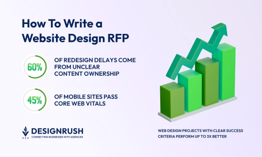
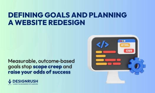
Website Redesign: Full Workflow for Enhancing SEO, UX, and Conversions
| 7 months ago | 9 min read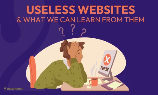
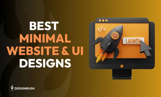
11 Best Minimal Website UI Design Examples & Tips (+Why They’re Effective)
| 7 months ago | 11 min read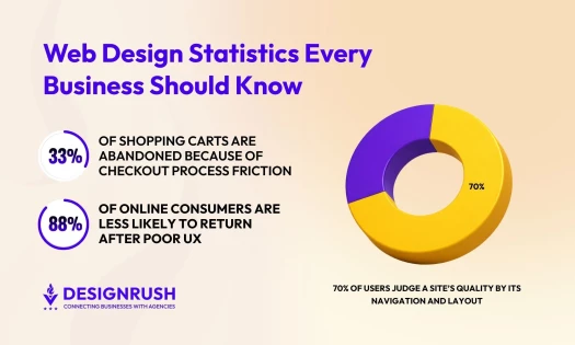
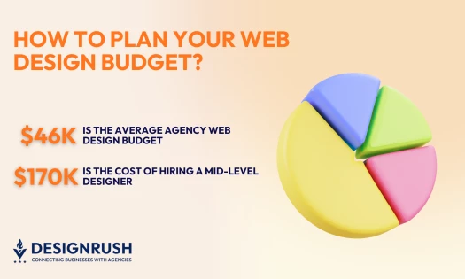
50 Essential Web Design Statistics Every Business Needs To Know in 2026
| 5 months ago | 13 min read
Receive our NewsletterJoin over 70,000 B2B decision-makers growing their brands