Cloud 9 App Design Elevates the Online Dating Sector to its Namesake Heights
The number of dating app users grew to a whopping 323 million in 2021 which shows that the need for genuine human contact grew exponentially in the post-pandemic year.
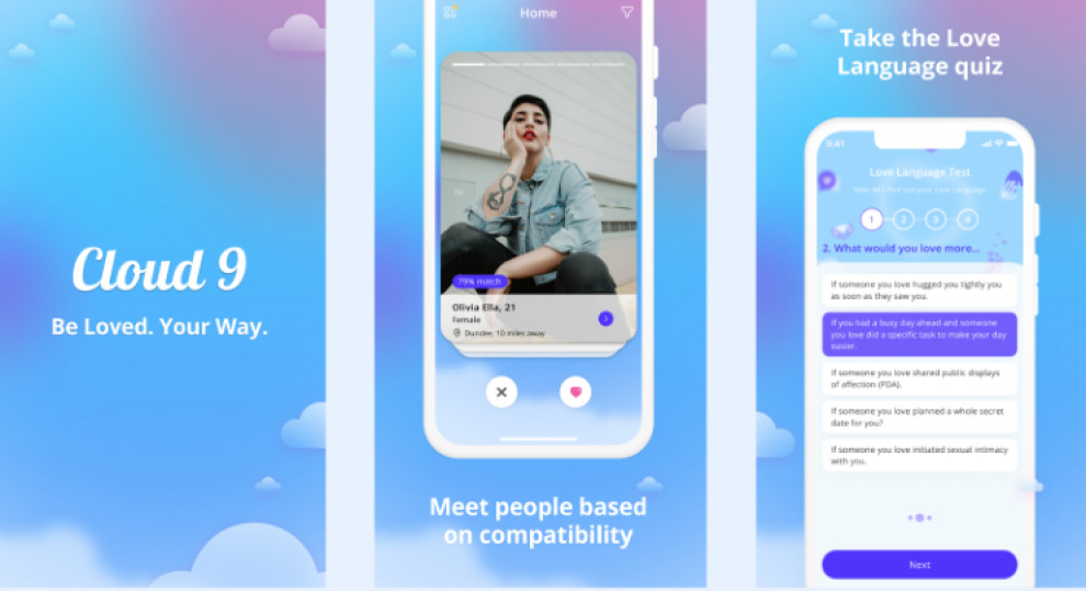
When it comes to Cloud 9 app design, courtesy of Zudu, the word “genuine” is taken very seriously as it aims to connect people through shared interests, temperament, hobbies and values.
Love is serious; however, it is also playful which is why Cloud 9 introduced a unique “Love Language” quiz to determine matches. The gaming aspect doesn’t end here as users will have a set amount of time to message their top matches before they expire and a new set of 9 top matches will be made available to them.
They can also swipe Yes or No on people with a lower percentage match and see the results of others’ quizzes to establish the best possible connections.
Collaborating with game app developers will be useful in projects like these, so you get an expert idea of how to make your platform engaging.
Cloud 9's Familiar Font Facilitates Quick Skimming and Legibility
The introductory (logo) typeface, inspired by American retro sports graphics, gives the whole app a highly evocative tone.
While Zudu did not specify which font they've used as the primary typography for the app’s content, the rudimentary sans-serif font is extremely simple and easy on the eyes.
Similar to the soft colors, the font’s main purpose is also to facilitate the use of the app, besides delivering the main messaging and information to the user.
The font is large enough, it's crisp and it enables users to find exactly what they were looking for quite easily.
Cloud 9’s Design and Color Palette Indicate the App’s Focus on Making Your Dreams a Reality
While dating apps are usually not that complex, they need to be on point. Alas, the heart wants what it wants, anything shorter than that is pointless.
Cloud 9’s got the precision covered by (its) design, so Zudu focused their efforts on decluttering the UI and creating a pleasant UX without those pesky ad interruptions or overwhelming amounts of information on every other screen.
This approach is just a continuation of the initial philosophy – streamlining the connection between users, which is why user-friendliness and accessibility were of the utmost importance to pretty much every professional app developer.
The clarity and openness are perfectly painted with the app’s dream-like color scheme. The hazy blues and purples emanate tranquility and calmness, making users feel as if they’re truly dating on cloud nine.