Qantas, an Australian airline, wanted to bring their magazine to customers no matter where they were. Using beautiful photos, in-depth articles, and city guides written by local experts, Qantas Magazine is something you can enjoy—even if you aren’t sitting on the plane waiting to take off.

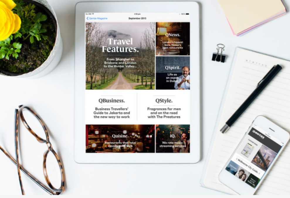
The Qantas Magazine user experience is very intuitive. Large photos with bold titles are placed throughout the main page for users to quickly browse. It’s easy to find something that interests you, no matter where your destination is or what your interests are. Unlike other digital magazines, users don’t have to wait for content to download. Qantas Magazine isupdated regularly, and the articles are ready to view immediately.

Photography is clearly the focal point on every page of the app. Qantas uses beautiful images to capture the eye and the imagination of readers. Of course, many articles also help users on their travels. City guides feature photos that readers can reference when they visit that area. The text within each article is easy to read, with clean, black typography on a white background. It’s like reading a regular magazine that always updates itself with new content.
Qantas recognized the value in being able to interact with customers beyond the flying experience. The Qantas Magazine app is a beautiful example of how an app can both engage users and offer value, only helping to build the existing brand in a positive way.
Qantas Magazine is an intuitive app design in the entertainment and travel industries.


