
The Infatuation's Mobile App Incorporates Thorough Reviews That Add Authority
The Infatuation is a brand dedicated to providing users with quality, truthful and well-rounded restaurant reviews in cities across the world. Founded in 2009, the brand has grown exponentially in the decade since its conception, continuing its passion for authenticity and value.
It’s an app that promotes this dedication in its comprehensive and informative offering, providing app users with a straightforward interface that answers all of their foodie questions.
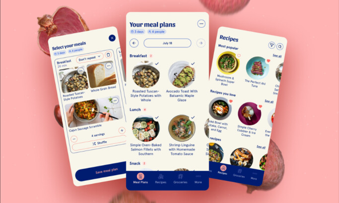
This app is a delightful platform that makes it easy to find local restaurants and get the informative reviews that can help you make your decision. But the main focal point of this design is the cohesive review system that lives inside.
Each restaurant page features all the information a user would want to know when making a dining selection. The average review is prominently displayed, along with a link to the website and a click to call link.
Users also have the option to add the restaurant to their hit list for future reference. Reviews are populated with useful tags that also provide pathways to further content exploration. Each review has an author, so users know who’s writing it.
The reviews themselves are incredibly thorough, especially for an app. There’s an overview of the restaurant, and recommendations on why it’s worth a visit, plus a rundown of the food itself.
And that’s because the brand itself is passionate about keeping things honest and transparent. This is their review process:
Our team always dines anonymously under excellent aliases, like Angus Rymer or Christabel Champagne. Well, we clearly can’t use those names anymore, but you get the point. We never accept free meals, reservations, compensation, or special treatment of any kind from any restaurants. Everything is paid for via our very own pockets.After a few visits, we’ll write up our thoughts in the form of a review, guide, or listing. Our goal is always to be honest at all costs, and to help you make good decisions about where to spend your money.The team members here understand the importance of honesty and trustworthiness — and they refuse to compromise integrity for a free meal.
And the clean and clever integration of these reviews in this app, putting the focus on these honest comments, helps to give the brand an authority and the app a usefulness.

Simple Navigation Tools Makes It Easy For Users To Find The Restaurants They Want In Real Life
The Infatuation is an app designed to help users find restaurants they’ll love wherever they are.
Upon launching the app, the user can pick from a list of Infatuation cities. Once a choice is made, a content list is populated. This list includes Infatuation guides, such as “The NYC Bar Hit List” for example, as well as reviews for individual restaurants.
Restaurant reviews are designated with a large rating score in a green circle that overlays the restaurant image. This helps users pick reviews out of the list when scrolling quickly.
CTAs are bold and easy to find, making it easy for users to learn more about a given restaurant and find what they’re looking for with ease and with a residual feeling of satisfaction.
Restaurants and cities are listed in a block-like grid with options lining the interface vertically. Each listing comes with a name and an image. But it’s not just the listing layout that makes navigation seamless.
Intuitive filter and sorting options make it an even simpler process to find the restaurants, cuisines and areas that best fit your needs.
And a handy, helpful map is there to help provide even further context to the search process, condensing a large quantity of information into an easy-to-digest format.
Not only are these listing laid out beautifully, but the content within each restaurant listing is equally comprehensive, cohesive and streamlined. All your questions are answered but there isn’t an overwhelming aspect of the process in the least.
This is thanks to the clean, bright white interface, the bright pops of exciting color and the simple typography that makes the experience and unique and serene one.
The map shows users where exactly restaurants are with bright, colorful and interactive pins to help guide users intuitively along their journey.
Especially in big cities, finding a reputable restaurant can be difficult with all of the available options. But this clean, comprehensive and sophisticated platform makes it easier than ever before.
The Infatuation’s Modern Aesthetic & App Branding Resonates With Users
It may be surprising in a mobile landscape already crammed with restaurant review apps that you would need to download yet another one, but The Infatuation makes itself necessary through a delightful design and solid content curation.
The Infatuation app has a playful, quirky design aesthetic that makes using it a memorable experience. The logo is a hambone shaped like a megaphone, and on loading the app, it’s animated to entertain the user while content is populated. Small details like this one -- not to mention the depth of content -- make the app stand out from the crowd.
There's a simplicity and an elegance to this design. But there is also a light, bubbly air that instantly captivates. It’s creative yet clean. It’s bold yet refined. There are a number of counterintuitive elements at play but that only makes it that much more exciting and that much more memorable to interact with.
This app brings with it a fresh and exciting personality. It has the authority and integrity that a review platform needs to have. Consumers need to trust it and believe its truthful. But it doesn’t sacrifice its lively persona in order to sound corporate.
It still wants to engage with consumers. It still wants to be approachable and friendly. And these subtle elements and creative images add that playfulness that the brand needs to succeed.

What Is The Infatuation?
Have you ever found yourself scrolling through Yelp or Google for a good restaurant to enjoy a nice romantic meal? What about a hot place for happy hour? Or even the best Pho in town?
You’re not alone. And The Infatuation team has been there too — they saw this problem and devised a way to fix it.
The Infatuation is a New York-based restaurant recommendation platform available in an app and on desktop. The service was created in 2009 by two former music industry executive Chris Stang and Andrew Steinthal.
The two came together to create a platform that offered honest, comprehensive restaurant reviews. And they do so without an invitation from restaurants and without announcing their presence when there.
In 2014 and 2015 the brand underwent a few rounds of funding, acquiring the necessary funds to keep growing the brand in order to launch their app interface. And in 2018, the brand acquired Zagat which is a restaurant rating aggregator previously owned by Google.
This acquisition will continue to propel the brand into future success, expanding their authority and knowledge across the country.
Currently, The Infatuation operates in London, New York, Sydney, San Francisco, Hong Kong, Paris, Denver, Mexico City, Chicago, Barcelona, Seattle, Washington DC, Austin, Cape Town, Los Angeles, Rome, Miami and Tokyo. And it plans to expand going forward.
The Infatuation considers itself, “your restaurant decider,” whose mission is, “to bring you the most honest and trustworthy opinions on where to eat around the world.”
And this dedication is obvious throughout its digital presence — in its website, in its social media and especially in its app design.

The Infatuation App's Creativity And Ingenuity
The Infatuation app is so successful for a number of different reasons. Firstly, it solves an integral problem in the industry, bringing to the table a solid answer that gets results.
A team of dedicated and passionate foodies go out in these cities and use their experiences to write up solid, reputable and informative reviews that give users immediate and authentic access to insight knowledge.
With a clean interface, smooth navigation tools and an in-depth review system, The Infatuation is a leader in its niche, transforming the way review-based apps operate and function.
And the clever infusion of its hearty personality makes this app one that is actually engaging and fun to interact with. It’s not just a corporate app full of jumbled information — its a serene and exciting, user-friendly design built with its audience in mind.
It’s a fascinating interface that shows growth and passion — and it’s a brand that continues to grow, adding more to its arsenal to create an even more well-rounded user experience that answers all the questions about dining that consumers might have.
And it stands out from all the other restaurant rating and review apps in a dynamic way.
Create a captivating app of your own with the help of these app design and development agencies!


-preview.jpg)


-preview.jpg)

