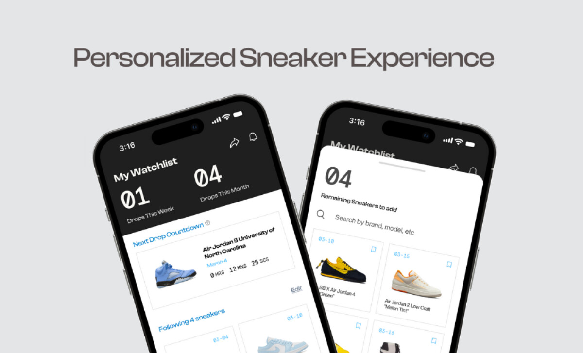
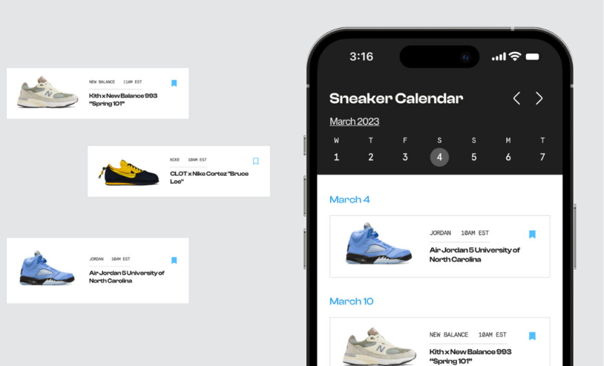
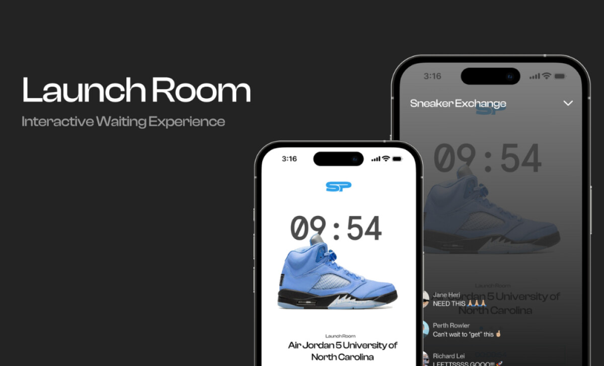
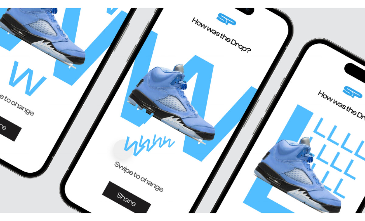
The Sneakpeak app, designed by Andre Magracia, delivers a sleek and focused experience for sneaker enthusiasts. From its minimalist interface to its real-time countdown features, Sneakpeak offers a handy companion for sneakerheads who want to stay ahead of releases without the distractions common in many retail apps.
Key Insights for Brands
- Use a minimalist interface with bold accents to enhance impact
- Design countdown-focused layouts to build excitement
- Combine clean typography and sharp product imagery to entice users
Sneakpeak’s Clean UI with Bold Accents Creates Visual Clarity
Sneakpeak’s design interface is dominated by a black-and-white foundation that gives the app a premium, editorial feel. This minimalism creates space for each design element to shine and guides user attention precisely where it’s needed.
Against this monochromatic backdrop, bold app colors and high-resolution sneaker images stand out. The soft blues or interactive highlights add just enough flair without compromising clarity.
For an audience that’s used to navigating visually crowded platforms, this clean and focused style is a breath of fresh air.
The use of contrast here supports function as much as form. It improves readability, supports hierarchy, and reinforces the importance of each drop.
It makes Sneakpeak feel polished while still grounded in the sneakers or streetwear aesthetic its users know and love.
Explore how other apps use backgrounds to elevate UX, guide navigation, and build visual identity.
Countdown-Centered Layouts Build Anticipation

Sneakpeak’s design centers the countdown experience, placing drop times prominently instead of hiding them behind tabs or menus.
The timeline of upcoming releases is laid out with clarity, so users can scan what’s next. The countdown acts as a visual rhythm that drives engagement and keeps anticipation high.
It’s a smart design choice because it reflects the urgency and hype of sneaker culture. Each second ticking down adds to the anticipation, which creates an experience that mirrors real-life release day energy.
With this approach, the app becomes part of the ritual. Users log in to check the time left, connect in countdown rooms, and prepare for action.
By giving elements like this such visual priority, the UI maintains ease of use and avoids feature overload. It keeps the journey fast, responsive, and satisfying – exactly what users need in a space where every second counts.
Clean Typography Simplifies the User Journey

Sneakpeak uses typography to guide attention and maintain a sleek, functional aesthetic.
Bold headers clearly separate sections, while compact labels and ample spacing support fast scanning. Font choices are also modern and legible, contributing to a design that feels both current and confident.
The rhythm created by consistent typography allows users to move quickly through alerts, calendar views, and countdowns without confusion. This is especially important for time-sensitive drops.
According to a StudySmarter, users process content faster when presented with clean, hierarchical typography compared to dense or decorative layouts.
By eliminating clutter and focusing on readability, Sneakpeak ensures users can process information at a glance and act without hesitation.
High-Quality Sneaker Imagery Drives User Engagement

Visual presentation is a major strength of the Sneakpeak app. Each sneaker is displayed using high-resolution imagery that captures the product from the best angles.
The best part? There’s no clutter or distracting overlays, which is a technique that great app designers maximize. Fans want to see details up close: materials, stitching, colorways, and silhouettes. The design honors that expectation.
Combined with the strategic use of white space and sharp details, these images feel more like exclusive features than catalog listings. Ultimately, this retail app design delivers a premium presentation style that respects the taste of its user base.
With its strong visuals, typography, and drop-first layout, Sneakpeak offers more than just utility. It delivers an experience.
The app successfully turns product tracking into something cultural, community-driven, and design-forward. These qualities make it a deserving winner of the Design Awards.


