Talent App Design Is Custom-Tailored to Those Aiming to Evolve from Tenacious Aspirant to Prospective Candidate
Applicants, hopefuls, job suitors, job hunters, auditioners, petitioners... there are many terms describing individuals seeking to elevate their personal growth with a suitable work opportunity, yet, somehow, we seem to lack enough synonyms for the “job” itself.
Although the recent global developments drastically shifted that, dare we say, unjust equilibrium, the rift between prospective talent and desired office position still demands a running jump. Fortunately, those offering to springboard that distance are emerging. One of the leading ones is Talent.com with their recently released Talent app, courtesy of Orizon.
Talent app design came as a crowning jewel of an extensive rebranding effort. Starting as a Neuvoo, with over 30 million jobs available in more than 75 countries, the company established itself as the go-to provider and one of the largest sources of employment worldwide. Its mission is to centralize available jobs in one easy-to-use platform for potential employees, recruiters and staffing firms.
Morphing Neuvoo to a much more approachable Talent.com, Orizon laid the perfect foundation for an app that users deem “by far the best app to use for job search.” The agency merged proven expertise with a new identity to create the most streamlined search experience to satisfy its millions of users.

Talent’s Job Marketplace Design Is a Thing of Beauty Providing a Convenient Staffing/Job Seeking Journey
Excellent mobile app developers create platforms that simplify the user experience in any industry. Whether it’s finding quality jobs or sourcing quality talent is a breeze on this app. It is as easy as counting to three.
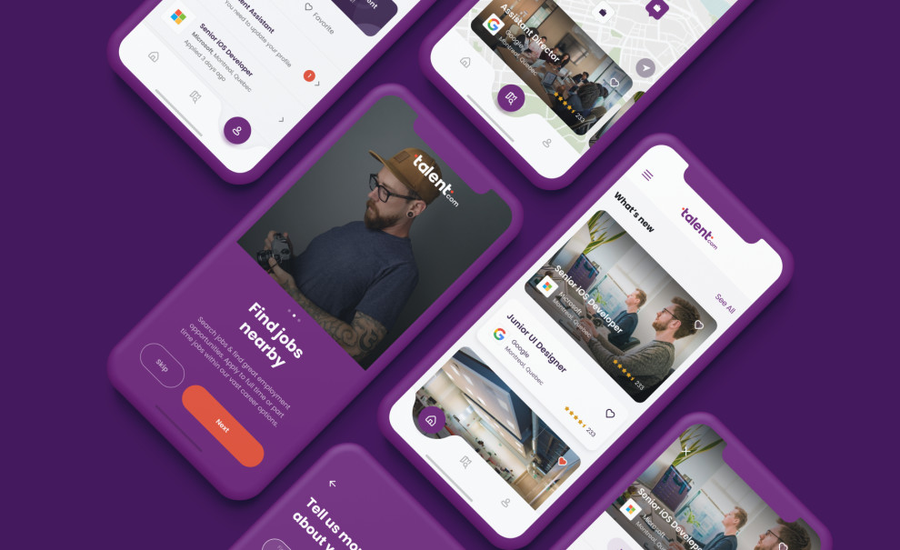
Similar to employers, they can set specific parameters for their job search. At the career-seekers end, the app displays a rundown containing essential details about the job they’re interested in. That includes the job title, job type, company, date posted, salary, duration of the shift, location and more for the most optimal results.
You need only:
- Create your job feed, see new opportunities as they come and apply first.
- Use the map to find job openings in your neighborhood, city, or anywhere.
- Apply or not apply? With salary information for every position, you’ll make the right decision.
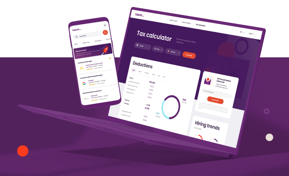
The result? 28 million unique visitors each month choose Talent.com to find new opportunities, apply in seconds, receive personalized job alerts and use career management tools like Salary Estimates and Tax Calculator.
With the app, you can:
- Apply directly from the job posting
- Send your application in seconds with the Quick Apply feature.
- Create your profile to save your information and time.
- Save your favorite jobs when you can’t apply right away.
- Read full job descriptions on your mobile device.
- Know when companies are urgently hiring.
Vibrant Color Scheme and Memorable Typography Translate to a Better User Experience
For an app that merged streamlined UI with a complex mission, a brand management agency would suggest the usual design route would be to either use an array of different colors (to represent variety) or go monochromatic. Talent app design took a third route. Instead, they used a vibrant, simple color story to keep things clean and cohesive.
An uncommon purple and orange gradient offers a refreshing experience that’s rarely used in the workforce niche. In fact, it is a step away from the usual palette(s) we associate with corporate and industrial designs.
The purple color signals that the Talent app is part of the royalty, i.e., the best in the industry. Color psychology also tells us that shades of purple represent wealth, creativity, independence and, most notably, talent acquisition – ambition! On the other hand, orange (primarily present in CTAs and accents) is typically associated with success, encouragement, change and determination. We’ll let you finish the picture.
The choice of typography elevates the user experience even further. The Avenir Roman sans-serif font is a great choice to increase legibility and prominence. Although the typeface is traditional, it is widely used to emphasize quality and forward-thinking ideas/projects.
New Identity and the Best New App Design on the Market for a Standout Experience
It is evident that Orizon studied and analyzed Neuvoo’s or Talent.com’s competitors to truly innovate and revolutionize, resulting in an app interface and user experience that’s one-of-a-kind.
Juggling the rebranding with the app development was the name of the game, and the agency showed its versatility masterfully, infusing the brand’s initial core values of optimism, transparency and approachability in every asset, visual or functional.
Talent.com easily transitioned to its new brand identity, and more importantly, its user base loved it. Job click rates increased by 9%, resulting in an 11% revenue increase. Conversion rates from visitors to users increased by 8%. ‘Nuff said.
If you’re looking to find a job as a designer, we would recommend the Talent app hands down, but first, CLICK HERE for our guide on how to land the best one out there.