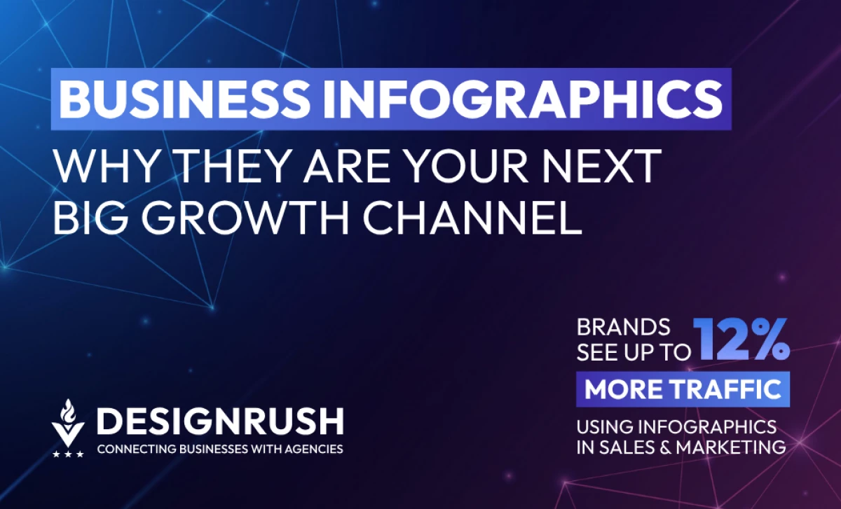
Business Infographics: Key Points
- Visual-first strategies drive measurable gains: Businesses using infographics in marketing and sales see up to 12% more traffic.
- Infographics outperform text across decision environments: With visuals processed 60,000x faster than text and generating 84% higher brand recall, they’re essential for C-suite communication, sales enablement, and stakeholder reporting.
- High-performing brands are monetizing infographic content: Companies like Visa, Mint.com, and Visual Capitalist use infographics not just for visibility, but for strategic storytelling, investor education, and partner alignment.
- Agencies can productize infographic services for scale: From executive branding kits to SEO-ready carousels, modular infographic systems create repeatable revenue streams without increasing production complexity.
- Platform-optimized infographics boost multi-channel ROI: TikTok stat reels, LinkedIn carousels, and gated content visuals expand reach while compressing key messages, making them ideal for campaigns, launches, and evergreen content alike.
Listen on the go: How business infographics became scalable assets—backed by stats, use cases, and agency monetization plays.
Forget generic data visuals. The best business infographics today are engineered for precision, distribution, and decision-making.
As attention spans shrink and clients demand performance proof over pretty pictures, smart agencies are turning infographics into high-retention, ROI-driven service offerings.
From policy briefs to LinkedIn carousels, these assets are no longer confined to whitepapers and reports, they’re showing up in sales decks, social media, and investor updates.
The key? Purpose-built design backed by behavioral science, platform fluency, and repeatable formatting.
This article breaks down business infographic strategies that:
- Translate dense data into compelling visual insights for decision-makers
- Amplify brand authority through platform-optimized content
- Accelerate lead generation, reporting, and stakeholder buy-in
- Add scalable, high-margin assets to agency service lines
- Improve internal clarity across marketing, sales, and executive teams
17 Real-World Standout Business Infographics
1. Visa Small Business Snapshot
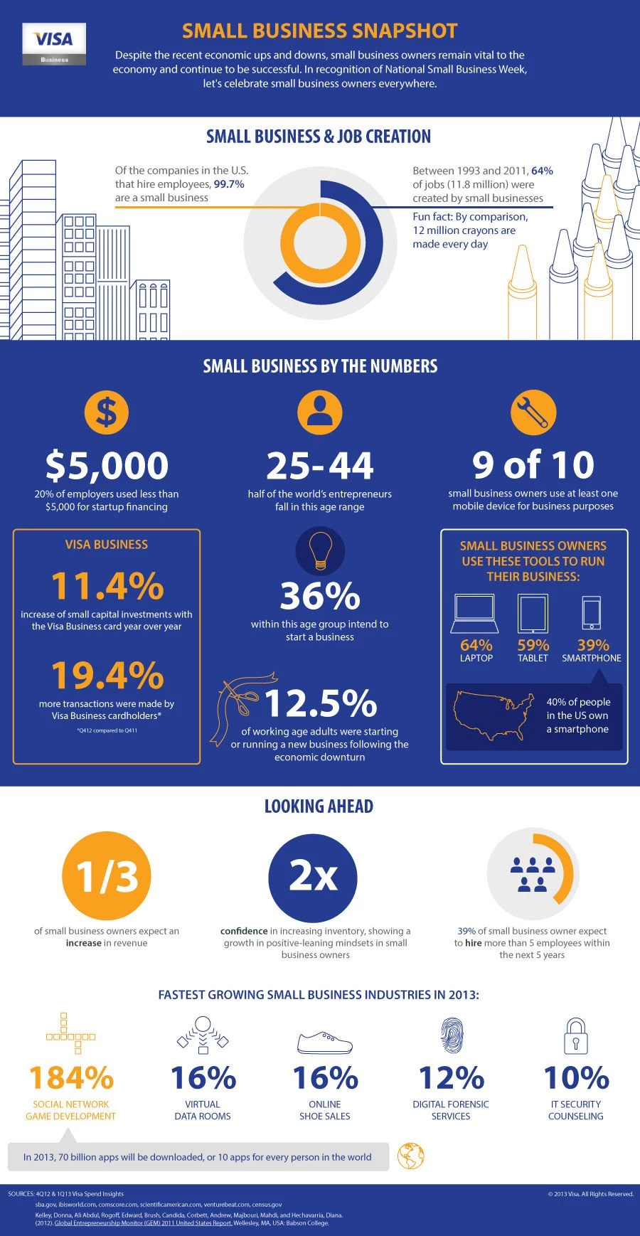
Commissioned by Visa, this infographic distills SMB sentiment, digital adoption, and growth outlooks into a tight, icon-rich summary. The clean visuals support financial storytelling, while the stat-focused layout makes it perfect for slide decks, PR assets, or quick-share content on LinkedIn.
Design Strengths: Built with presentation in mind, its slide-friendly layout and consistent icon set make complex financial sentiment feel immediately clear. Designed for easy repurposing across channels, from LinkedIn carousels to investor decks, without redesign overhead.
Best Use Case: Small business market briefs or fintech partner reports.
2. BusinessWorld's Shadow Economy Infographic
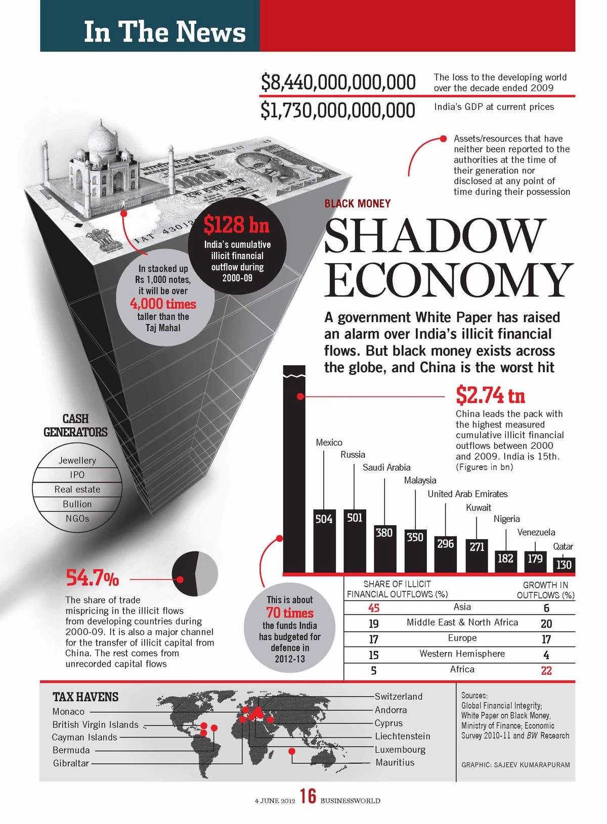
This infographic tackles the elusive concept of the “shadow economy” by visualizing India’s unregulated market scale with familiar metaphors like the Taj Mahal and overlays tied to GDP. Published by BusinessWorld, it combines fiscal depth with visual storytelling to make hidden economic dynamics tangible and urgent for policymakers, analysts, and the public.
Design Strengths: Uses national landmarks and layered economic symbols to ground abstract concepts in cultural familiarity. The stacked visuals create a sense of urgency while offering a mental model for policymakers navigating informal sectors.
Best Use Case: Policy reform campaigns or financial compliance reports aimed at simplifying macroeconomic complexity.
3. Fork It Over Infographic
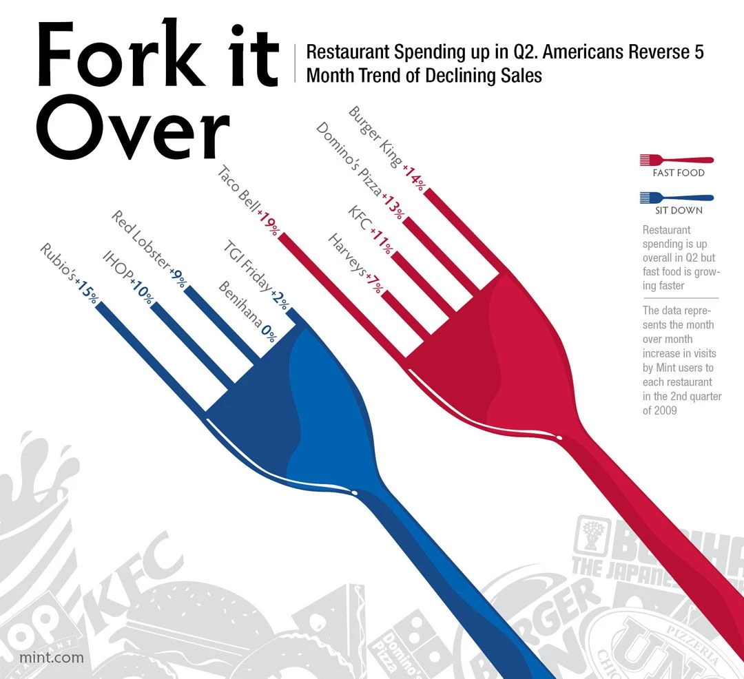
“Fork It Over” breaks down food costs between dining in and eating out, using literal forks of varying lengths to represent price disparities. It’s a humorous yet data-driven approach that connects personal finance to everyday choices. Created by Mint.com, it leverages novelty to engage users with financial data that would otherwise be overlooked.
Design Strengths: Literal object-as-data metaphor (forks) reinforces message clarity through visual punning. High novelty value makes the infographic stick, improving retention even for casual viewers in financial or lifestyle spaces.
Best Use Case: Consumer education in personal finance, nutrition, or food delivery startups.
4. Valuable Brands 2024
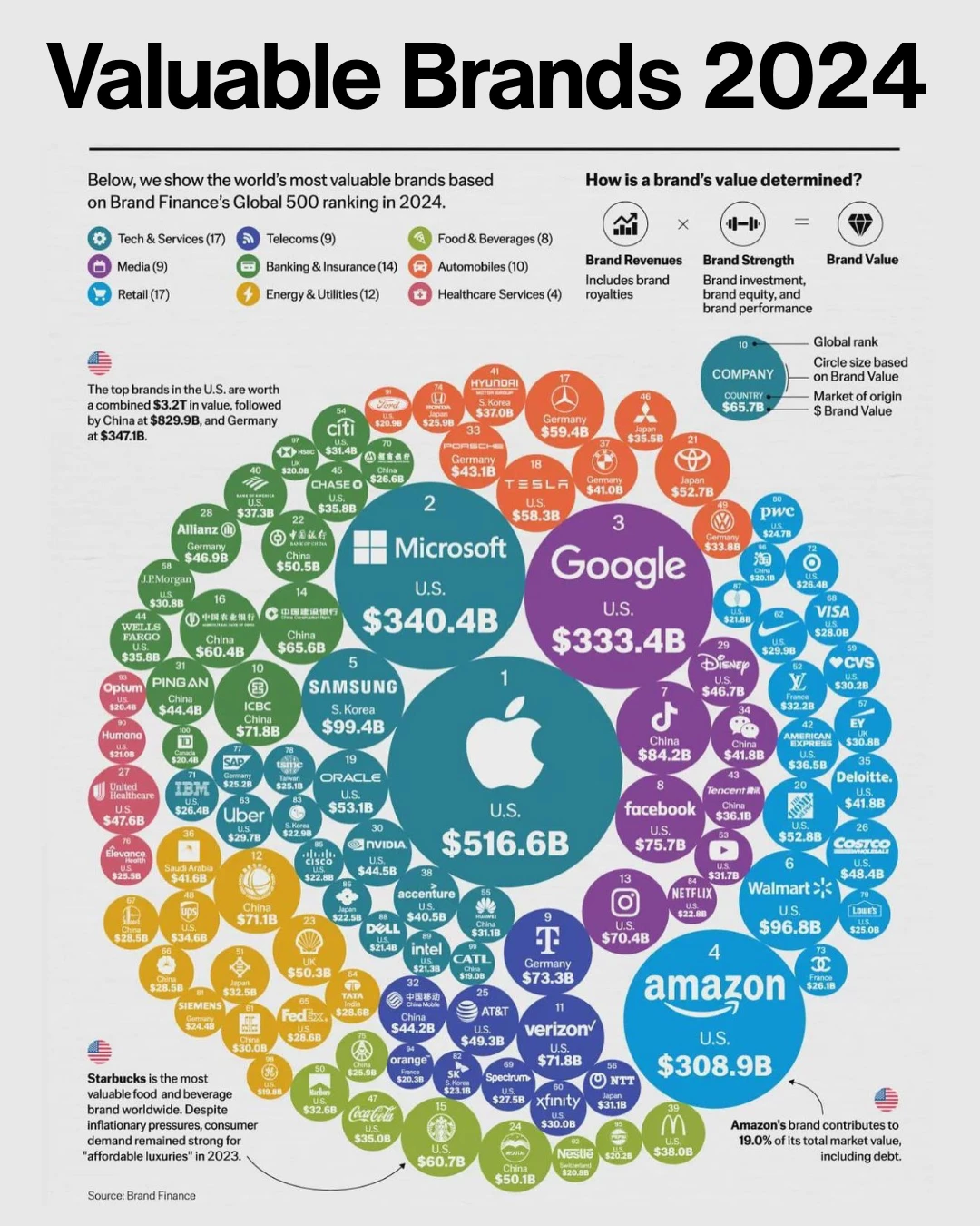
This bubble-based infographic visualizes global brand value across sectors. Color-coded categories and proportional bubble sizing make it easy to compare tech, retail, automotive, and more at a glance. Originally built for investor audiences, it performs equally well in thought leadership posts and corporate brand audits.
Design Strengths: Bubble scale mirrors brand value, while color-coded sectors provide quick segmentation by industry. The visual logic reduces interpretation time, making it pitch-ready for execs and analysts alike.
Best Use Case: Competitor benchmarking or sector dominance reports.
5. Gold Exploration
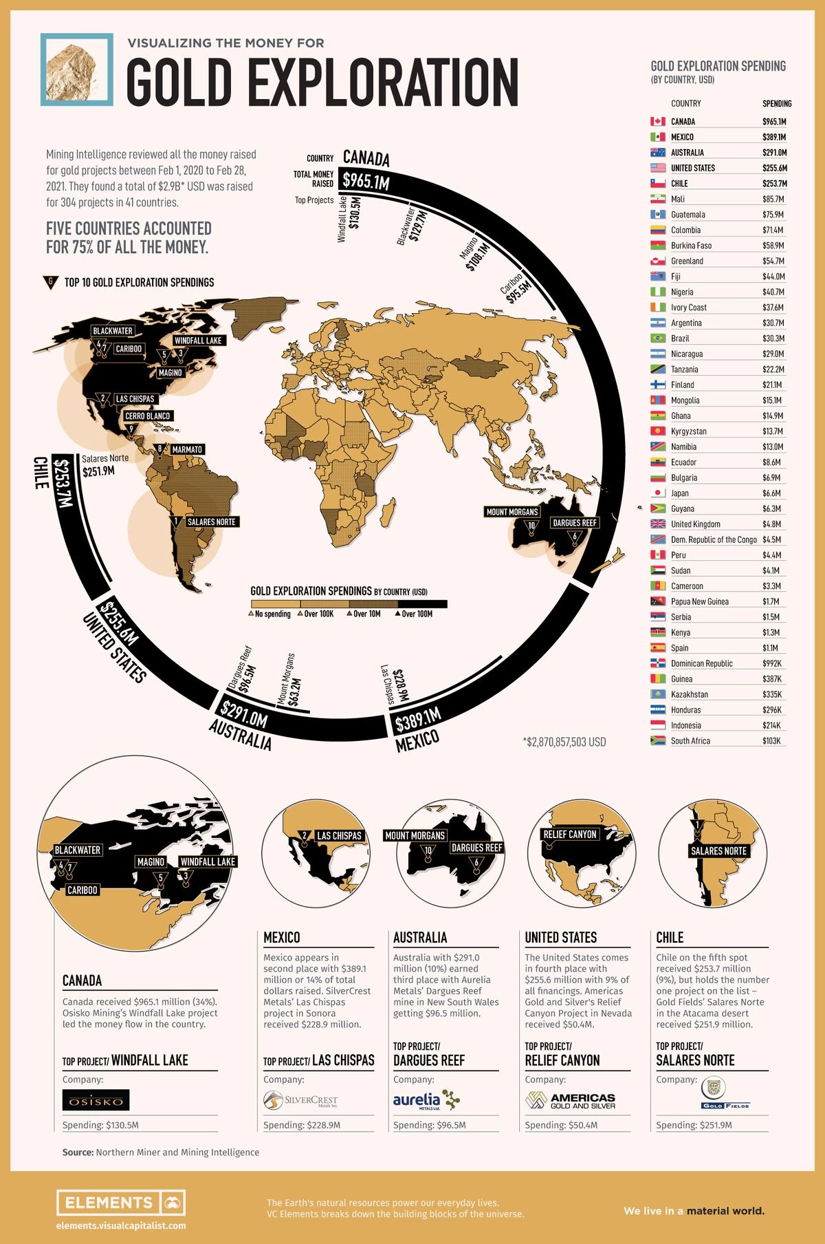
Visual Capitalist maps out gold production and reserve data by geography using clean visuals, hierarchy, and proportional comparison. Each region’s data is scaled and color-coded, delivering immediate clarity to investors, policymakers, and analysts tracking commodity flow. The layout facilitates comparison without overwhelming, making it ideal for print or carousel adaptation.
Design Strengths: Combines geography, production, and economic scale in a single glance using proportional scaling and clean layout. Visual hierarchy minimizes overload while surfacing key regional insights instantly.
Best Use Case: Global economic or commodities-related content needing geographic context.
6. Mobile Market Snapshot
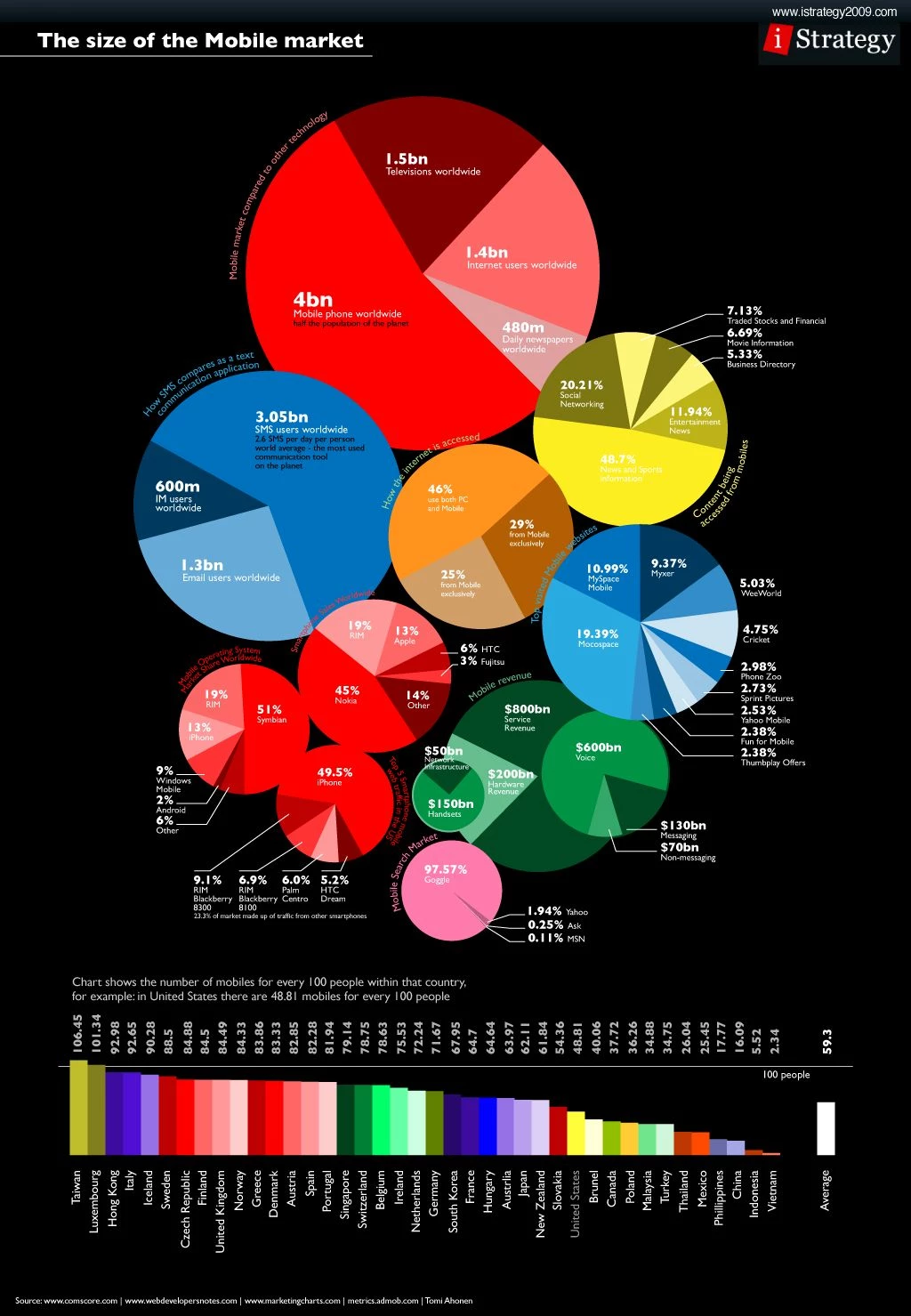
This infographic tackles the layered complexity of the mobile app market—downloads, revenue share, OS breakdowns—using concentric visuals and nested clusters. Designed for mobile-first viewing, the structure allows for zoom-in storytelling while keeping macro context intact. It’s a masterclass in simplifying data overload into digestible chunks.
Design Strengths: Uses concentric clusters and nested visuals to unpack layered mobile metrics (downloads, OS share, revenue) without losing narrative coherence. Optimized for mobile-first reading, it allows zoom-in storytelling while preserving macro context.
Best Use Case: Mobile growth decks, app ecosystem analysis, investor onboarding.
7. What Is the World Bank Funding?
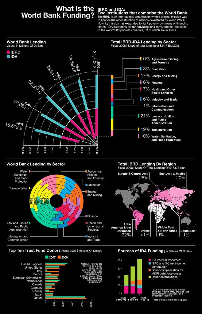
This infographic distills the complex ecosystem of World Bank-funded projects into a structured, visually layered format. Organized by region and sector (education, infrastructure, energy, etc.), it uses icons, maps, and proportional bars to explain where billions of dollars are allocated and why.
It succeeds by answering a deceptively broad question: "Where does the money go?" with precision and visual logic, making it ideal for both public transparency and donor communication.
Design Strengths: Blends iconography, maps, and proportional bars to visualize fund allocation by region and sector. It answers a broad question through a layered, logical layout ideal for both public-facing and donor reporting.
Best Use Case: Development finance briefings, grant impact reports, or donor-facing updates.
8. GE's Middle Market by the Numbers
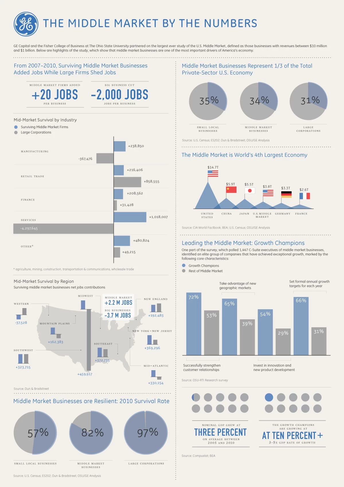
GE and OSU’s infographic explains why U.S. middle market businesses matter, linking job creation, economic resilience, and sector performance in one comprehensive view. It includes pie charts, bar graphs, and a national map to reinforce regional trends.
Design Strengths: Combines bar charts, pie graphs, and U.S. maps to tie regional economic performance to national outcomes. Multi-format blend increases accessibility for executives and stakeholders with different data preferences.
Best Use Case: Investor decks or advocacy whitepapers.
9. Who’s Winning the AI Race?
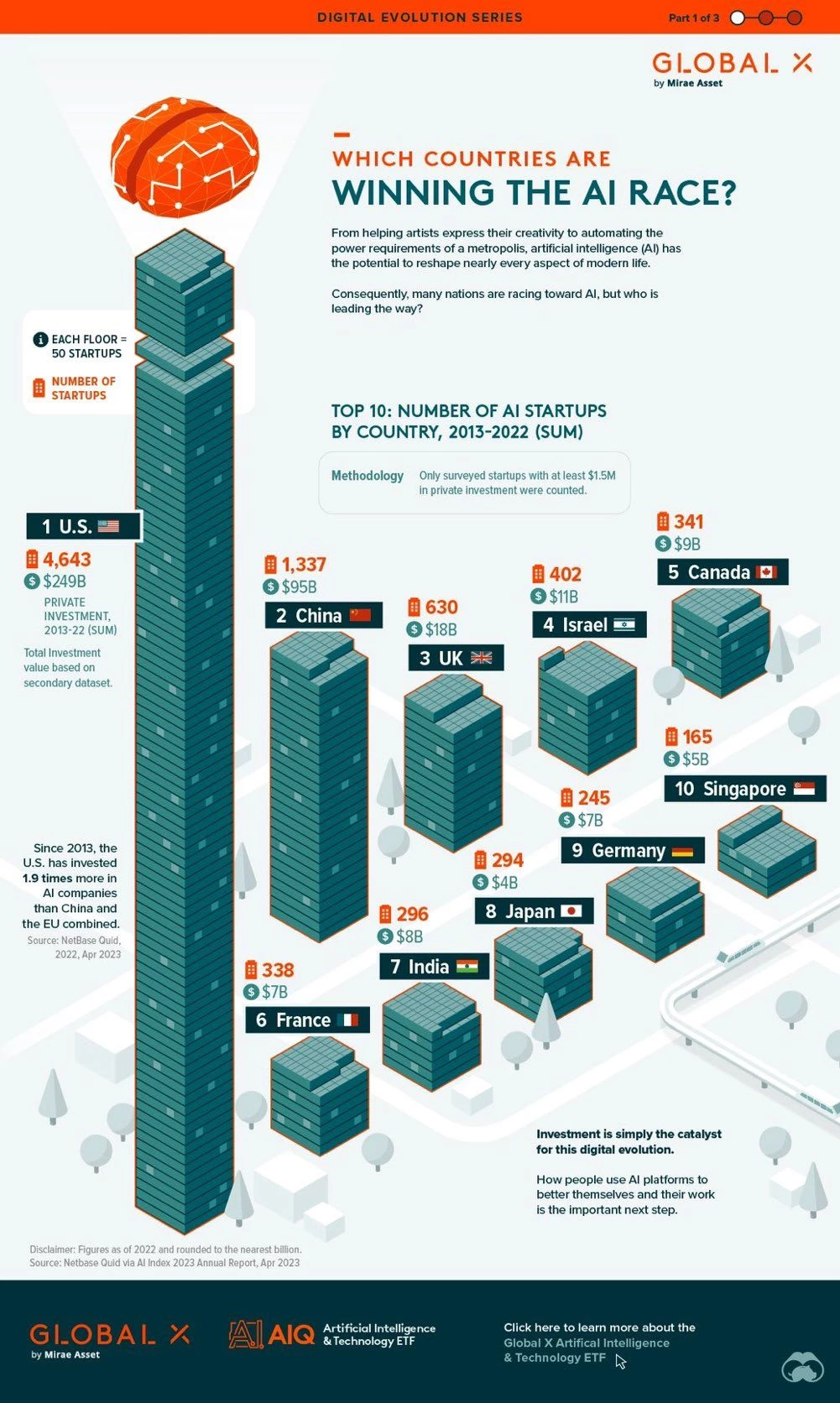
Global X visualizes the global AI startup landscape using stacked skyscraper metaphors, each floor representing 50 startups. It shows the U.S. leading in both count and capital, positioning investment scale as the key competitive differentiator.
Design Strengths: A skyscraper-style metaphor uses scale and elevation to represent investment and startup volume by region. Overlaying capital data adds economic context, giving the viewer both narrative and quantitative insight at once.
Best Use Case: Sector growth maps or innovation policy pitches.
10. Property Market Index
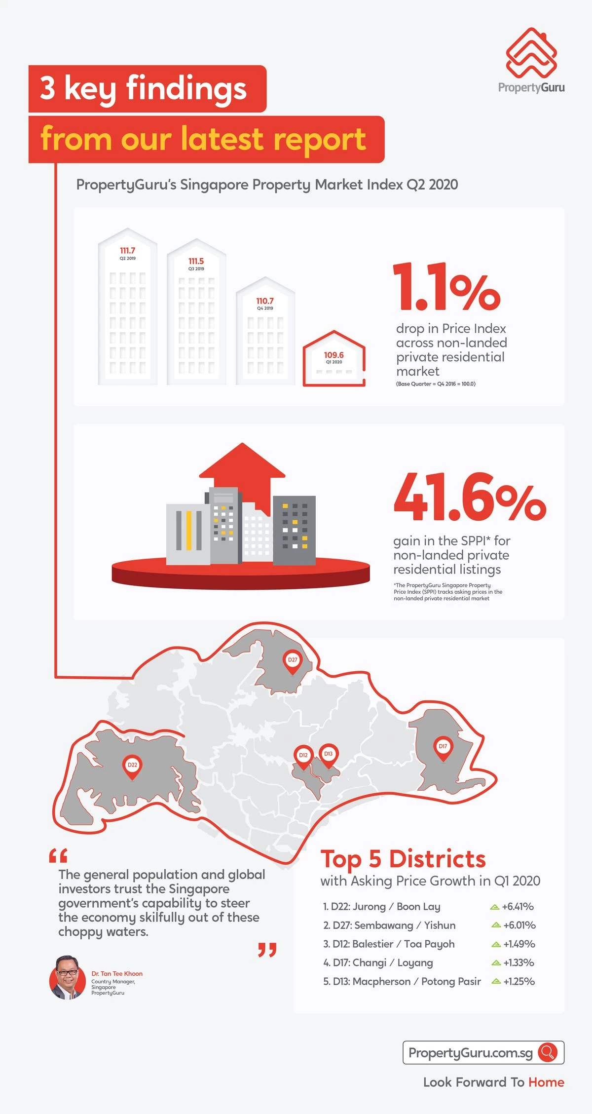
Source: PropertyGuru
This infographic distills Singapore’s property trends into three stat-led visuals: quarterly price dips, long-term gains, and top districts for price growth. It combines index data with district maps to localize insight.
Design Strengths: Three stat-led visuals (index shifts, long-term trends, and top-performing districts) distill real estate data into an at-a-glance view. District maps bring geographic relevance, enhancing localization and immediate utility.
Best Use Case: Real estate trend summaries.
11. Nvidia Company Profile
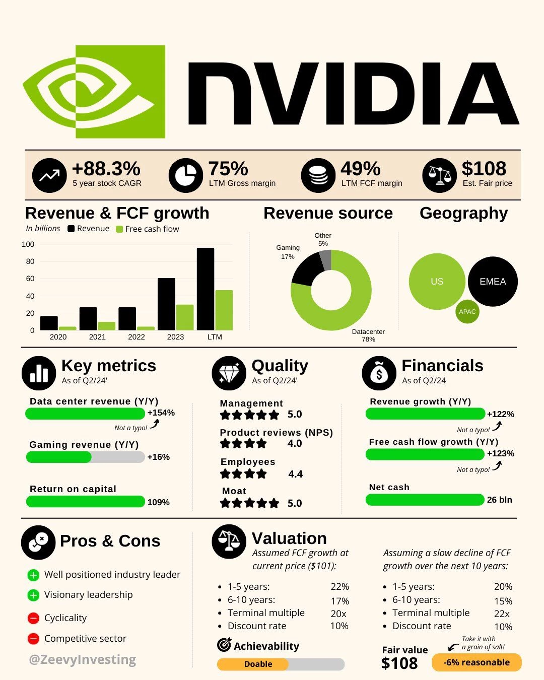
This all-in-one infographic compresses Nvidia’s financial metrics, valuation assumptions, revenue split, and leadership quality into a one-screen cheat sheet. Designed for stock traders, it prioritizes CAGR, free cash flow, and market spread.
Design Strengths: Condenses deep financial metrics and business structure into a single-screen layout. Prioritizes clarity and data hierarchy, helping traders or investors parse growth potential without scrolling or digging.
Best Use Case: Equity pitch slides or investment teasers.
12. About Company Infographic
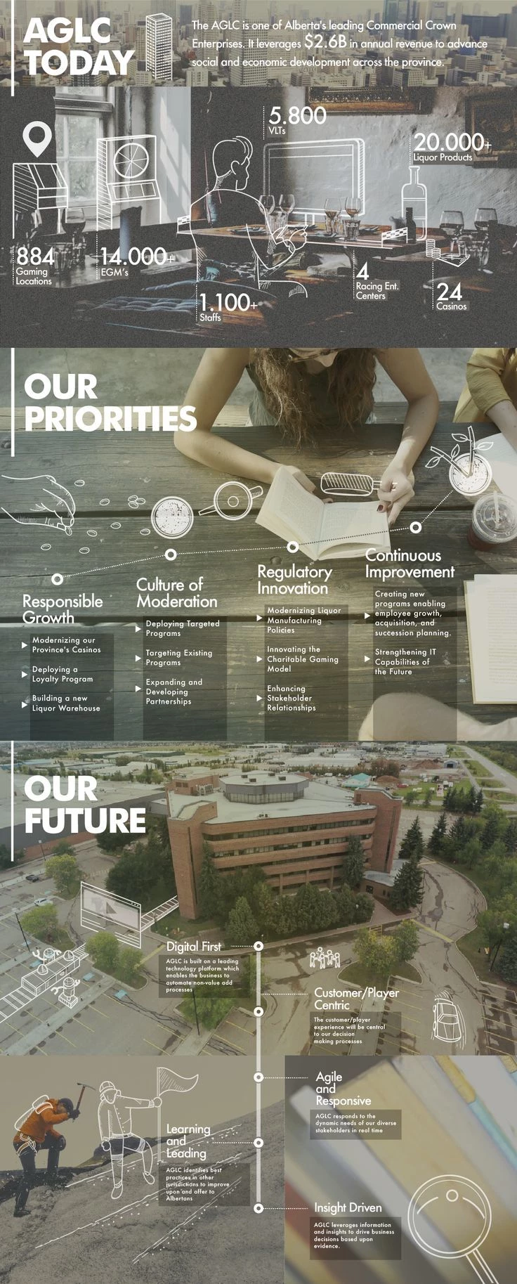
AGLC’s About Company infographic turns a corporate snapshot into a lively one-pager featuring mission statements, employee stats, and social impact metrics. Instead of relying on dense paragraphs, it uses bold icons, chart bursts, and quick-hit values to convey trust, scale, and corporate ethos; all in under 10 seconds of scan time.
Design Strengths: Lays out company ethos, people stats, and impact in a visual grid, using icons and bursts of data to create quick-scan trust signals. One-scroll UX boosts engagement during onboarding or partner discovery.
Best Use Case: About one-pager, onboarding portals, or stakeholder decks.
13. Ahold Delhaize Annual Report Infographic
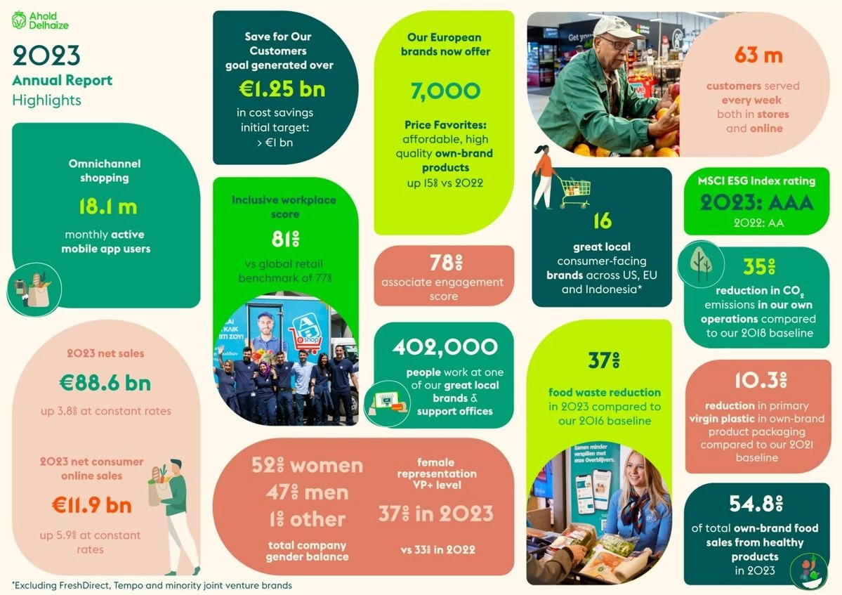
Designed as a visual companion to the annual report, this infographic summarizes key financials (sales, net profit, store count) while reinforcing brand ethics and supply chain initiatives. It integrates branded color schemes with infographic bars and icon-stats for fast board-level consumption.
Design Strengths: Merges branded visuals with financial KPIs, ESG highlights, and operational metrics in a compact report companion. Designed for C-suite review, it packages data in a way that accelerates decision-readiness.
Best Use Case: Executive reports and stakeholder summaries.
14. India Budget Allocation 2023
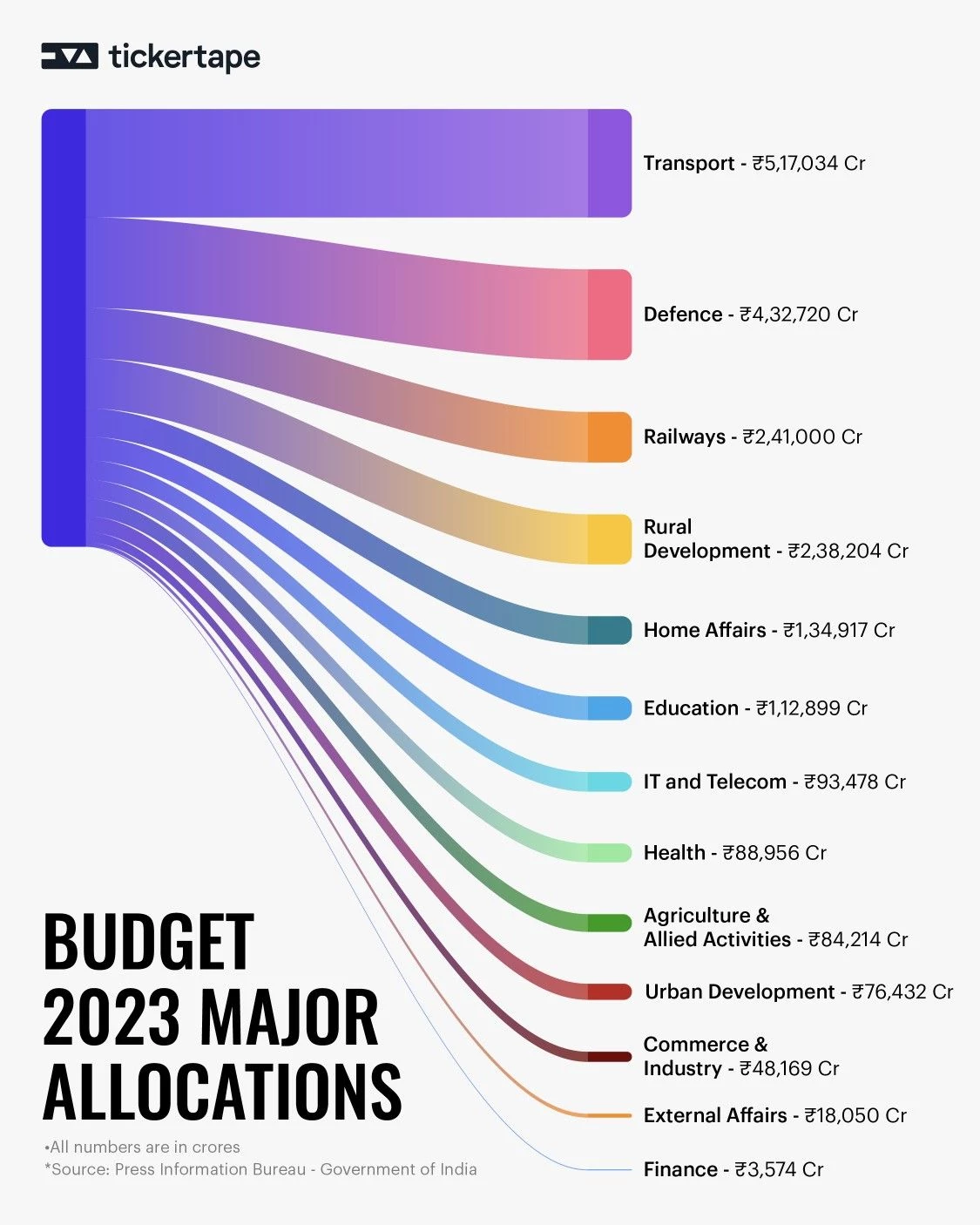
With a ribbon-inspired design, this Sankey-style infographic breaks down India's sectoral budget flows for 2023. It simplifies public finance by showing which ministries get what portion (education, defense, healthcare) and does so using proportional, color-coded flows that highlight shifts in priorities year-over-year.
Design Strengths: Applies Sankey-style flows to show scale and sector allocation, supported by consistent color logic. Its ribbon-like layout simplifies year-over-year budget comparisons, making it effective for civic education and media use.
Best Use Case: Policy explainers, civic advocacy, or educational campaigns.
15. Airbnb Business Model Infographic
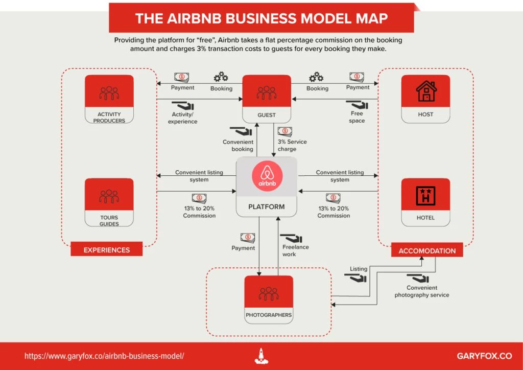
This visual maps Airbnb’s business flywheel: supply creation, demand generation, monetization, and reinvestment. By turning strategy into a circular model with feedback loops, it helps stakeholders quickly understand platform dynamics, investor logic, and network effect levers.
Design Strengths: Uses a circular flywheel structure to illustrate Airbnb’s growth mechanics. Each loop is tied to core platform levers. The format simplifies complex strategy into a continuous, logical ecosystem.
Best Use Case: Platform-based startups, pitch decks.
16. Nike Employee Onboarding Infographic
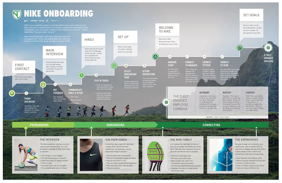
Nike’s onboarding infographic distills values, expectations, and culture pillars into a branded, icon-led summary. It doubles as a motivational poster and process explainer, using the brand’s voice and ethos to anchor employee alignment from day one.
Design Strengths: Applies brand voice through icons, typography, and color while structuring cultural values into digestible blocks. The layout encourages scanning and recall, making it both a visual primer and morale-builder for new employees.
Best Use Case: HR or client onboarding packets or intranet dashboards.
17. Optus Case Study Infographic
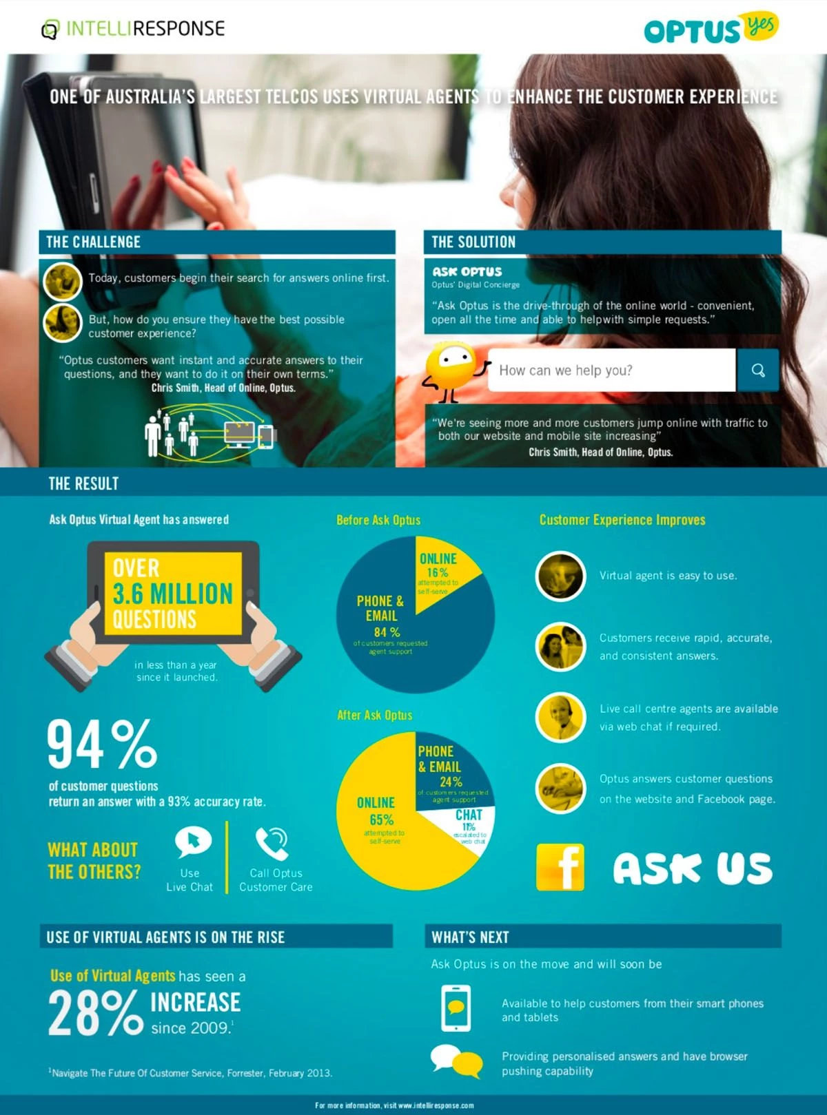
This case study graphic shows how Optus streamlined CX through new infrastructure. It visualizes the problem, solution, and outcome with a start-to-finish timeline that anchors results in real metrics, wait time reduction, service expansion, and user satisfaction uplift.
Design Strengths: Organizes the customer experience overhaul into a clear before/after sequence. Anchored by quantifiable metrics, the timeline design reinforces progress and outcome, making it ideal for validation in B2B sales or enterprise transformation narratives.
Best Use Case: Client wins, sales pitches, or tech product validation.
Why Infographics Still Outperform Text
Executives don’t read. They scan. A 2020 study found that visuals boost retention to 95%, compared to just 10% for text. In feed environments, visual-first assets win every time:
- 60,000x faster processing for visuals vs. text
- The use of color and visual content increases reader attention spans and enhances reading comprehension by up to 82%
- Infographics are 30x more likely to be read than text-only content
In short: infographics make information more memorable, more scannable, and more shareable. That makes them an ideal format for C-suite messaging, sales enablement, and campaign amplification.
How Agencies Can Productize Infographics
Agencies often think of infographics as one-off visual assets. But when built into packages, they become recurring revenue streams:
1. Monthly Drops in Retainers
- Offer clients 3–5 infographics per month tied to campaign cycles or thought leadership themes
- Format for LinkedIn, Instagram, TikTok, and reports
2. Executive Branding and Ghost Publishing
- Visual insights for founders or CMOs on LinkedIn and newsletters
- C-suite stat cards as part of personal brand development packages
3. SEO, PR & Pitch Deck Bundles
- Infographics as supporting proof for gated content, reports, or PR campaigns
- Use data visualization to boost time-on-page, link-backs, and conversions
4. Platform-Specific Templates
- TikTok vertical stat reels
- LinkedIn single-stat carousels
- Instagram swipeable explainers
Why Business Infographics Matter to Your Role

Infographics have evolved from visual aids into functional assets tailored to decision-making. For business leaders and agency teams, they serve distinct roles; supporting communication, accelerating insight, and amplifying value across the organization.
Here's how they deliver impact based on who’s using them:
For C-Suite Executives (CMOs & CFOs)
- Make performance data visual for stakeholders, boards, and investor updates
- Simplify cross-departmental reporting with visual KPIs and growth snapshots
- Establish thought leadership through stat-led LinkedIn content and digital PR
For Business Owners (SMBs to Enterprise)
- Clarify product-market fit, value propositions, or budget impact at a glance
- Support customer education, retention, and upselling through visual journeys
- Reuse across pitch decks, partner meetings, or social media with minimal effort
For Agency Owners & Consultants
- Package infographics into scalable service lines (e.g., LinkedIn carousels, GTM visual briefs)
- Improve client deliverables by layering design onto complex strategy docs or audits
- Increase perceived value and justify higher retainers through executive-facing assets
For Brand Managers & Marketing Teams
- Turn campaign stats into shareable assets that boost visibility and conversion
- Drive better internal alignment with visual roadmaps, personas, or timelines
- Create evergreen visuals for SEO content, email campaigns, and social channels
Business Infographics: The Bottom Line
It’s time you stop thinking of infographics as mere add-ons. They’re part of the infrastructure.
For agencies, they function as repeatable, high-leverage content formats that power thought leadership, reinforce brand positioning, and compress complex narratives into digestible assets.
The real advantage?They scale. When built into campaign workflows or executive content packages, they increase creative output without ballooning cost.
If your agency isn't treating infographics as core IP, you just might be leaving value on the table.
![]()
In today’s competitive landscape, business infographics do more than explain, they convert, retain, and differentiate. From pitch decks to product launches, they accelerate communication and strengthen brand authority.
That’s why forward-looking agencies and brand teams rely on design partners who combine creative execution with business fluency.
Need a partner who gets the strategy behind the visuals?
Visit our Agency Directory to find the top-rated:
1. Best Graphic Design Agencies
You can also explore our Awards section and check out the Best Print Designs to see what’s driving results right now.
Business Infographics: FAQs
1. What are business infographics used for?
Business infographics are used to simplify complex data, communicate strategic insights, and drive engagement across marketing, sales, and executive channels. They’re especially useful in pitch decks, annual reports, campaign summaries, and social content.
2. How do business infographics help with lead generation?
Infographics boost lead-gen performance by increasing content shareability, improving time-on-page, and enhancing SEO. Visual summaries often outperform text in gated content, driving higher form conversions and newsletter signups.
3. What makes a good business infographic design?
Effective business infographics align with brand messaging, follow a clear data hierarchy, and are tailored to the platform, whether it’s for LinkedIn, a client presentation, or a landing page. The best designs use data storytelling to support a business objective, not just visual flair.