Map infographics are powerful tools for transforming complex geographic data into engaging visual stories. They help audiences make sense of intricate information about locations, trends, and spatial relationships by presenting it in an intuitive and visually appealing way.
By combining maps with interactive features, these infographics enable users to explore data meaningfully, from tracking global trends to analyzing localized patterns. Let's highlight eight innovative map infographic examples that showcase their versatility and effectiveness in delivering clear, actionable insights.
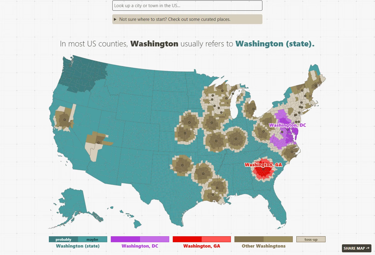
1. A Map of Places in the US with the Same Name by The Pudding
Standout Features:
- Seamless color-coded navigation
- Integrated informative table
- Engaging hover effects
A Map of Places in the US with the Same Name, an interactive infographic map crafted by The Pudding, creatively visualizes how location names across the United States overlap and vary by region. The designers achieve this by employing a minimal website UI design with a clear color-coded system.
The design uses vibrant hues to highlight regions with strong name correlations and muted tones for less common associations, such as blue for a place someone is most likely referring to, purple for the second, red for the third, and grey for others.
Users can interact with the map by hovering over states to see which country or state is most associated with a particular name, while the ranked table below provides additional information. Another integrated search option complements this, enabling users to explore how terms relate to different states or countries. This multifaceted approach ensures that the design is highly functional and immersive, delivering insights in a user-friendly format.
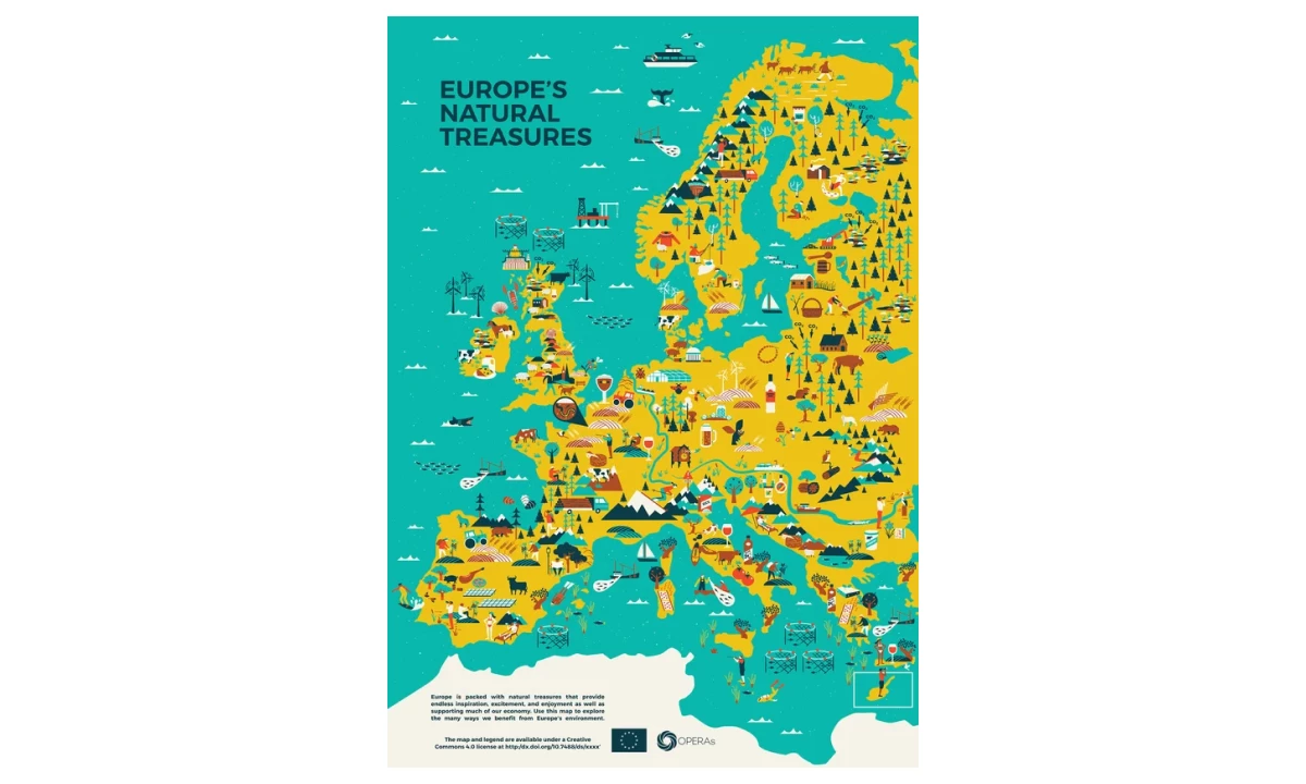
2. Europe's Natural Treasures by Scriberia
Standout Features:
- Charming 2D illustrations
- Inviting color palette
- Organized content layout
Sciberia’s Europe's Natural Treasures map infographic beautifully illustrates the continent's ecosystem through a visually rich and educational design. The map uses charming 2D illustrations to depict various natural benefits, from clean water sources to biodiversity hotspots, creating an informative and emotionally engaging resource. Each illustration is thoughtfully placed, encouraging viewers to explore the environmental contributions of different regions.
The inviting color palette enhances the map’s accessibility. This thoughtful choice ensures the map remains fun to navigate, drawing attention to details while maintaining clarity.
Furthermore, the design utilizes an organized layout for legends and descriptions for various ecosystem services, making the information easily digestible. Whether used for educational purposes or as an illustrative resource, this infographic map leaves a lasting impression on its audience.
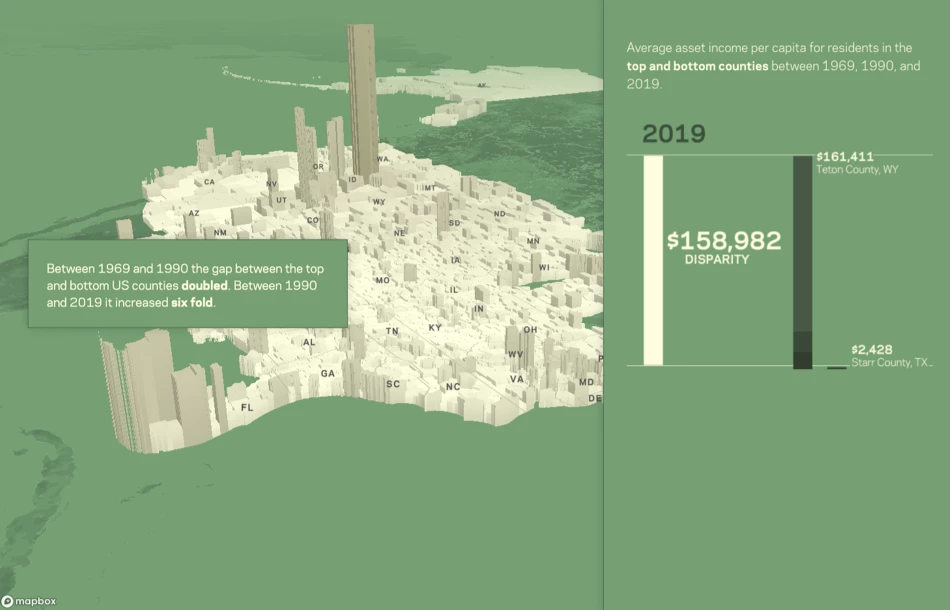
3. Wealth Map by Periscopic
Standout Features:
- Streamlined scroll-controlled navigation
- Engaging animated charts
- Interactive 3D map feature
Periscopic’s Literal Wealth Map is an innovative map infographic that visualizes the growing disparities in asset wealth across U.S. counties and regions through an engaging and interactive design.
The streamlined, scroll-controlled navigation takes viewers on a journey, revealing key insights as they progress. As users scroll, the map dynamically pans and zooms, uncovering the wealth distribution landscape with seamless transitions. Supporting details are accessible through interaction, offering a narrative-driven exploration.
Moreover, animated charts are introduced at pivotal moments, showcasing per capita income from assets across three critical years of the analysis. These animations effectively emphasize trends and changes over time, making complex data easier to comprehend.
Once users complete the guided narrative, they are presented with an interactive 3D map feature. This tool allows for further exploration, enabling users to dive into individual county-level data and conduct their own analyses.
4. Literal World Map by NeoMam Studios
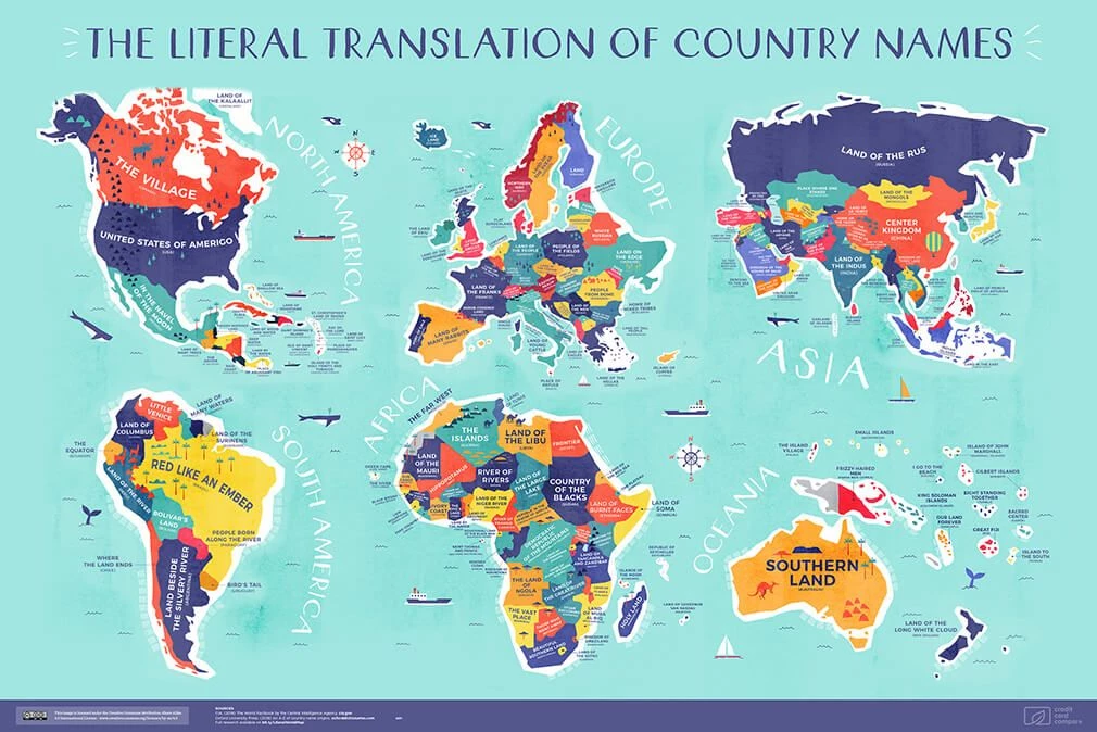
Standout Feature:
- Cheerful pastel color palette
- Bold sans-serif typography
- Simple, inviting illustrations
NeoMam Studios’ Literal World Map brings a playful and engaging twist to traditional cartography, transforming geography into an accessible and visually delightful experience. The cheerful pastel color palette highlights country boundaries, ensuring easy navigation while adding a fun, vibrant charm to the map.
The map’s bold, sans-serif typography enhances its usability by ensuring that country names are legible. This practical choice supports accessibility while maintaining the modern and inviting tone of the design.
To further engage viewers, the map includes charming illustrations, such as whales, boats, trees, and mountains scattered thoughtfully across regions. These elements add warmth, making the map feel approachable and engaging for audiences of all ages.
By combining an inviting design with functional clarity, NeoMam Studios’ Literal World Map succeeds as an educational tool and an artistic piece. It simplifies geography while sparking curiosity, offering a visually captivating way to explore the world.
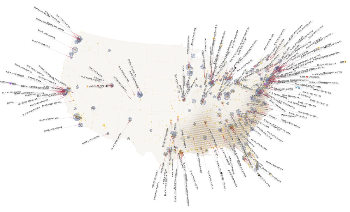
5. Black Lives Matter Street Mural Map by Kim Albrecht
Standout Features:
- User-friendly Map/Text navigation
- Extensive search feature
- Additional map markers and insight
The Black Lives Matter Street Mural Map is a powerful visual representation created by Kim Albrecht. This infographic map example documents street murals to honor Black artists, explore the viral spread of these artworks, and encourage communities toward meaningful change.
The map’s user-friendly navigation allows viewers to explore murals by their geographic location or text-based search. Clicking on a mural text or location reveals detailed information about the art and the artist behind it, adding depth and appreciation to the experience. An extensive search feature with four filters and a free-search area enables users to tailor their exploration and discover murals that resonate with their interests.
The map also incorporates markers to highlight significant data points, such as fatal encounters, protest locations, and the percentage of Black and Afro-American citizens in various areas. These markers, which users can toggle on and off, position the map as a visual storyteller of notable societal and historical movements. Below the map, insightful stories and findings offer a deeper dive into the theme, solidifying its role as an educational and inspirational resource.
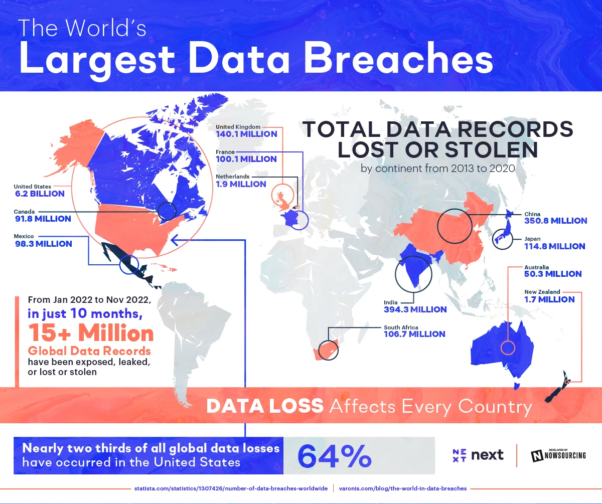
6. The World’s Largest Data Breaches by NowSourcing
Standout features:
- Organized, accessible layout
- Number and color-coded maps
- Creative out-of-the-box history section
The World’s Largest Data Breaches infographic map, crafted by NowSourcing, presents a compelling visualization of data loss across countries and U.S. states. The design begins with a global map highlighting the scale of breaches worldwide, narrowing down to the United States.
Following this, the infographic transitions seamlessly into detailed sections covering major causes of data breaches, the most affected industries, and country-specific statistics. The narrative concludes with a creative historical overview of three major data breaches, recalculated into modern gigabyte equivalents, adding a fascinating layer of depth and intrigue that draws viewers in.
The infographic’s organized and accessible layout ensures that even with its extensive information, viewers can navigate effortlessly. The maps employ number and color-coded systems, allowing viewers to quickly identify countries and reinforce the infographic’s usability.
Overall, the combination of compelling visuals, intuitive organization, and unique storytelling makes it one of the exquisite visual communication examples that blend engaging and highly informative content.
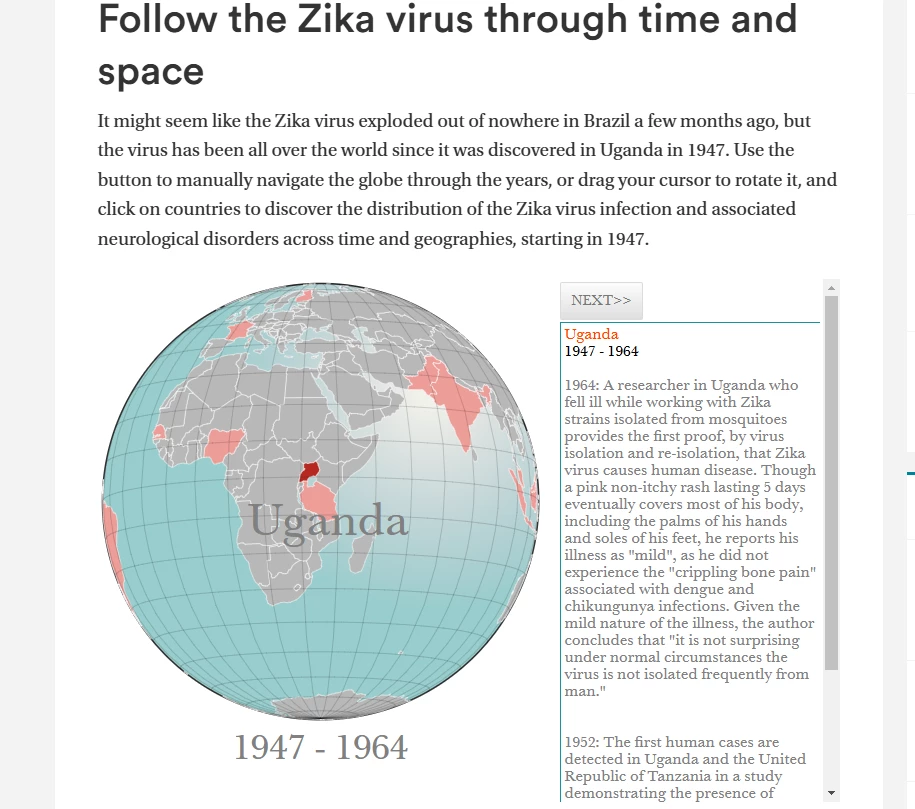
7. Follow the Zika Virus Through Time and Space by Insightful Interaction
Standout Features:
- Prominent red highlights
- User-friendly dual navigation
- Accessible, scrollable text box
The Follow the Zika Virus Through Time and Space by Insightful Interaction is an excellent infographic map example that offers an engaging and informative exploration of the Zika virus' spread over decades. Users can manually navigate the interactive globe using buttons or by dragging their cursor to rotate and zoom in on specific countries.
By clicking on regions, users uncover detailed information about infection rates and neurological disorders linked to the virus, effectively combining geography with critical medical data. This dynamic presentation makes it easy to trace the virus' historical trajectory and understand its global impact.
The design employs a straightforward yet impactful red color to highlight regions with outbreaks, simplifying navigation and drawing immediate attention to affected areas. Moreover, a scrollable text box delivers in-depth information clearly and professionally. This dual-layered approach ensures that users can access comprehensive insights without cluttering the globe’s visuals, maintaining an intuitive and seamless exploration experience.
8. Climate-Conflict-Vulnerability Index by Truth & Beauty
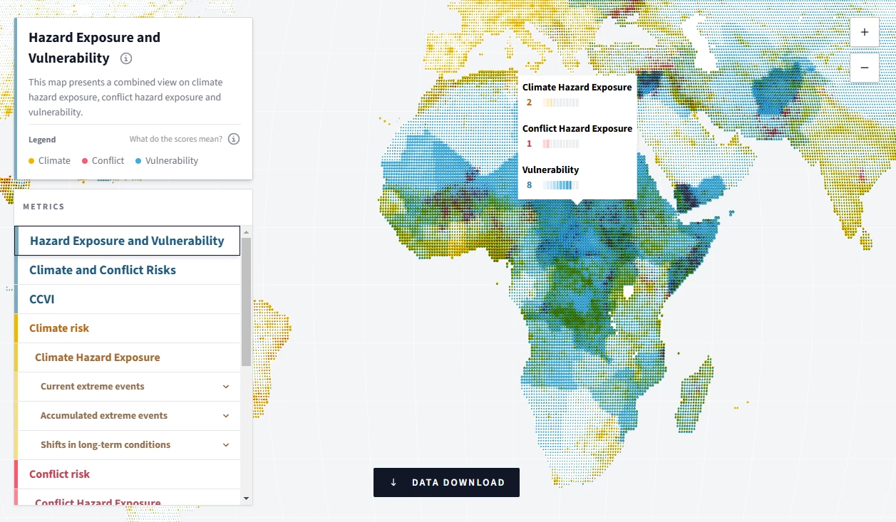
Standout Features:
- Informative hover-activated boxes
- Color-coded map navigation
- Organized metrics menu
The Climate-Conflict-Vulnerability Index (CCVI) interactive infographic map, crafted by Truth & Beauty, provides a comprehensive view of the interconnected risks of climate change, conflict, and local vulnerabilities worldwide.
One of the design's standout features is the well-structured metrics menu, allowing users to easily filter the specific data they want to explore. Whether focusing on climate hazards, conflict risks, or regional vulnerabilities, users can seamlessly toggle between metrics for a customized experience.
The map itself employs a color-coded navigation system, with hues and intensity levels clearly explained in the accompanying legend. This thoughtful design choice ensures users can quickly identify and interpret data points, enhancing accessibility and engagement.
Hover-activated informational boxes further elevate the user experience by delivering precise metric scores in a clean, professional format. These pop-ups provide detailed insights without cluttering the map, maintaining a visually polished interface while ensuring data remains digestible.
Benefits of Map Infographics
Map infographics are visual communication tools that simplify complex geographical data into clear, interactive visuals, making trends and patterns easy to grasp. With features like zoomable views and real-time updates, they enhance spatial analysis for businesses, educators, and researchers. By integrating interactivity, these tools transform data into engaging, insightful presentations that improve understanding and decision-making.
Let’s explore the key advantages that make infographic maps an essential tool for modern data presentation.
1. Simplified Geographical Data Visualization
Map infographics make it easy to visualize geographical data. Uploading datasets with latitude, longitude, or address-based information is straightforward, and these points are automatically plotted on a map. This offers a clear, organized view of data distribution across regions or specific locations, reducing the complexity of interpreting raw data.
Maps can showcase everything from weather patterns to economic activity, allowing users to grasp trends and patterns effortlessly. The visual representation not only enhances comprehension but also fosters a deeper understanding of geographic relationships.
2. Location-Based Analysis for Smarter Insights
Interactive maps are ideal for performing location-based analysis. By overlaying data on specific regions, users can identify spatial patterns, trends, and connections that would otherwise remain hidden.
For instance, mapping sales performance by region can highlight areas of strong performance or reveal opportunities for improvement. This method enables businesses to make data-driven decisions, optimize resources, and tailor strategies to specific geographic areas.
4. Enhanced Storytelling
Maps elevate storytelling by visualizing journeys, illustrating impacts, and providing spatial context. They’re particularly effective in creating compelling narratives that resonate with audiences.
For example, a travel infographic can use maps to chart visited destinations and showcase routes, giving viewers a clear picture of the journey. This visual approach adds depth to the story, making it informative and memorable.
5. Interactive Engagement Through Dynamic Features
Interactive maps encourage audience engagement by allowing users to explore content in unique ways. Features like clickable regions, tooltips with additional information, and zoomable maps create an immersive experience.
By enabling users to interact with the data, these maps foster curiosity and help audiences uncover insights at their own pace. This interactivity not only enhances comprehension but also keeps users engaged for longer periods.
6. Versatility and Customization
Map infographics can be seamlessly integrated with other visualization methods to offer a comprehensive data view. The possibilities are endless, from combining maps with charts to customizing colors, legends, and labels.
These features ensure that the infographic aligns with branding and design preferences while catering to different learning styles. The result is a versatile tool that appeals to diverse audiences and elevates the overall impact of the presentation.
Map Infographic Ideas: The Bottom Line
Map infographics are essential for modern storytelling, enabling designers to communicate complex geographic data effectively. These tools captivate audiences and deliver meaningful insights for educational purposes, marketing strategies, business analytics, and more. By utilizing map infographics, brands can present ideas in engaging and memorable ways, offering unique and unforgettable experiences to their target audience.
Map Infographic FAQs
1. What industries benefit from map infographics?
Industries like education, marketing, urban planning, logistics, and tourism use map infographics for data visualization, storytelling, and analysis.
2. What tools can I use to create map infographics?
Infogram, Tableau, and Mapbox are popular tools for designing interactive map infographics with customizable features.
3. What makes a good map infographic?
A good infographic map combines clear visuals, interactivity, and accurate data to engage users and effectively communicate information.
4. What are the challenges of creating map infographics?
The main challenges include ensuring data accuracy, balancing aesthetics with functionality, and optimizing for different devices.