A $113.5 billion market cap. 99,000 employees. 55,000+ products.
Welcome to 3M.
3M is a global science company with products ranging from adhesives, abrasives, and laminates to electronic materials and medical devices.
3M was once known as the “the Minnesota Mining and Manufacturing Co.”
The year was 1977. The company evolved into a commercial and consumer manufacturing juggernaut. Relentless innovation leads to new frontiers. And new identities. How?
A complete logo metamorphosis.
Siegel+Gale won the bid. The word “Company” was vanquished from the logo.
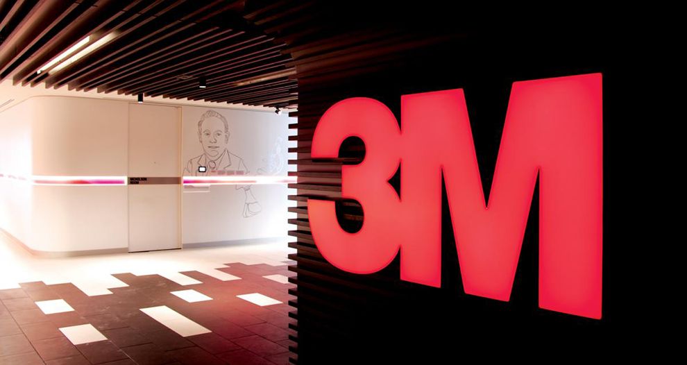
“3” and “M” font lettering became bolstered in extra-bold and splattered with a vibrant red that ravaged the blighted and worn-out blue.
The result? The brand’s blistering new red color caught fire like napalm.

How good is this logo?
40 years have passed. The red looks so hot off the press that if one picked up a physical logo they would have to double check their hands for red paint.
The red still sticks. The logo is tenacious, modern and mint.
The type face of the 3 and M nestle next to each other like soulmates. Thank you, Helvetica Neue Condensed family of fonts.
Placed next to any modern brand logo, this wide and compact font is undaunted. Indomitable.

It’s fire-eating.
The lettering will take your lunch money and not even give you the apple that came on the side.
We can already hear the General Electrics logo's tummy rumbling. “Mom!”
Momentous logos marry mouthwatering and brilliant colors with macrocosmic typefaces that the commandeer consumer attention.
In the minds of consumers, mediocre logos are abandoned.
Brand logos like 3M, however, stay in our minds forever.
3M is a great logo design in the manufacturing industry.


