-account-photo_listing.jpg)
-account-photo_listing.jpg)


Our Jury has worked with Prada, Nike, Chanel, Google, and Apple.
Best Manufacturing Logo Designs of 2026
View the Top Manufacturing Logo Designs Below
Best Manufacturing Logo Designs of 2026
4,200+ Submitted Designs
- Advertising
- Agriculture
- AI
- Airline
- Alcohol
- App Company Logo
- Architecture
- Arts & Recreation
- Automotive
- Banking & Finance
- Beer
- Church
- Clothing Brand
- Coffee
- Content & News
- Distribution
- E-Commerce & Retail
- Education
- Engineering
- Entertainment
- eSports
- Farm
- Fashion & Beauty
- Food & Beverage
- Government
- Health & Wellness
- Hospitality
- Legal & Insurance
- Luxury
- Manufacturing
- Non-Profit
- Photography
- Professional Services
- Real Estate
- Restaurant
- Restuarants
- SEO Agencies
- Shoe Brand
- Small Business
- Software
- Sports & Leisure
- Startup
- Technology
- Travel
- Video Companies
- Weed/Cannabis
- Abstract
- Animated
- Artistic
- Bakery
- Black
- Black & Yellow
- Blue
- Bold Logo
- Brand
- British
- Business
- Circle
- Creative Name
- Dental Office
- Done by Freelancers
- Emblem
- Floral
- Geometric
- Glow
- Gradient
- Gym
- Icon
- Illustration
- Lettermark
- Logo symbols
- Makeup Brand
- Marathon
- Minimal
- Modern
- Monogram
- Multicolored
- Nature
- Negative Space
- Rebranding
- Red
- Redesign
- Simple
- Starting With the Letter S
- Successful
- Sunshine
- Trendy
- TV Channel
- Typography
- Unisex Salon
- Vintage
- Water
- Watercolor
- Wordmark
 Winner
★8.8/10
 AO 10.00
 BS 9.50
 KS 6.00
 KT 10.00
 LB 8.50
View Design
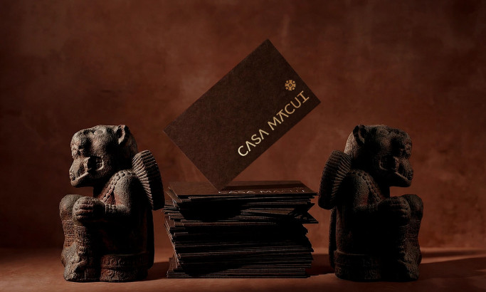
Casa Macui
byFugitiva
View Design
Kensing
View Design
Castil
byHONDO
View Design
Palantir Logo
View Design
Johnson & Johnson Logo

View Design
Intel

View Design
IBM

View Design
Home Depot

View Design
Merck & Co
Get Connected
With The Right Agency Partner
& Receive Proposals For FREE

View Design
General Electric Logo
-preview.jpg)
View Design
ExxonMobil Logo
View Design
Microsoft Logo

View Design
Cisco
View Design
Chevron Logo

View Design
Procter & Gamble

View Design
Caterpillar Logo
Ready to elevate your designs?