Acqualina’s Logo Design Takes Luxury To The Next Level
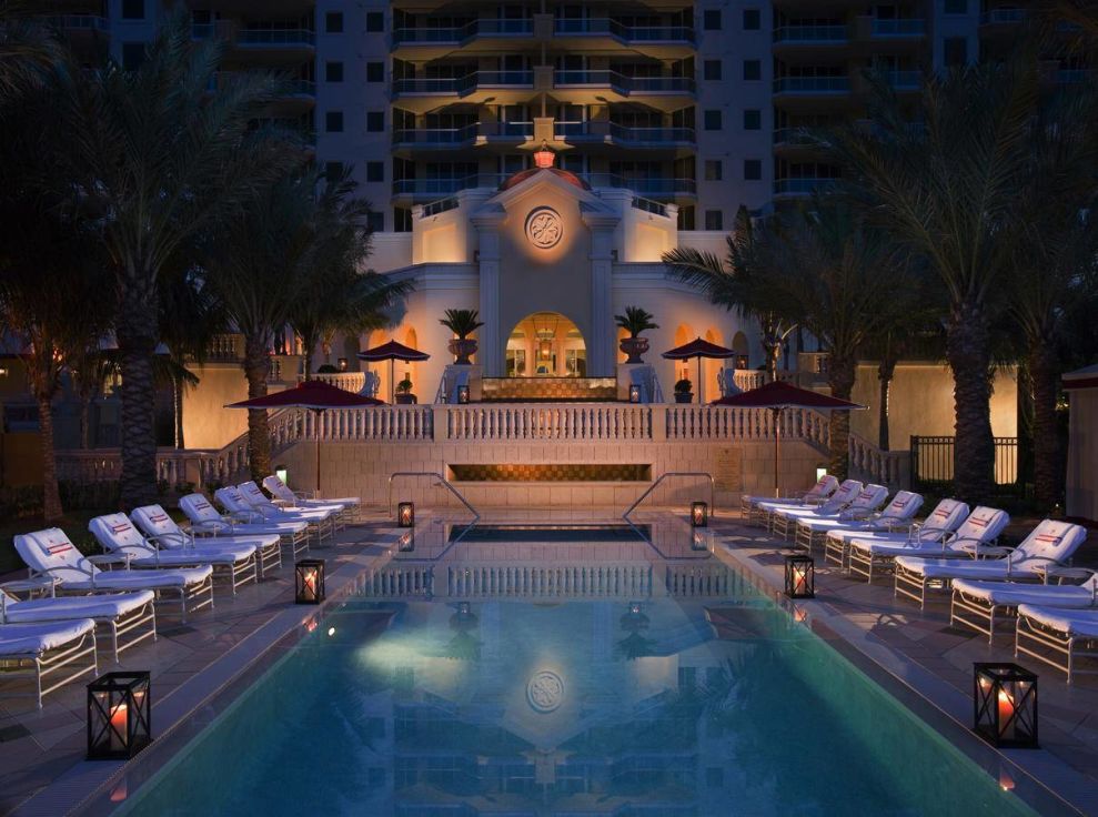
Acqualina is a high-end beach resort in South Florida. It’s inspired by Mediterranean elements and the coastal way of life. It’s Florida’s only five-star hotel, so the brand does everything it can to distinguish itself as a leader of excellence and splendor. This resort exudes and exudes sophistication, class and authority.
This coastal paradise puts leisure first, in both its design and its style. Located on Sunny Isles Beach in Florida, this resort sits like an old-world fortress. It stands tall and strong and elegant. There’s no denying the luxury that this resort exudes.
It spans 4.5 acres and comprises 98 guest rooms and 108 residences. This lavish resort sits directly on the beach, with views of the Atlantic Ocean that go on for miles. Relax by the pool, take a dip in the ocean, or enjoy a variety of leisure activities that emphasize a stress-free environment.
The grandeur of this resort is well known too — it’s won two awards: the Forbes Travel Guide Five-Star Award and the AAA Five Diamond Award.
According to the website:
Acqualina invites you to step into a world of luxury with unprecedented accommodations and service, world-class dining destinations, including Il Mulino New York and AQ Chop House by Il Mulino, three oceanfront swimming pools, spacious meeting rooms, and an innovative marine biology-based children’s program. A variety of lavish interior and exterior venues provide an ideal background for opulent weddings and memorable events on the lush property grounds boasting 400 feet of stunning Atlantic coastline. Acqualina Spa by ESPA, the first ESPA-branded spa in the United States, provides guests with an exquisite 20,000-square-foot, two-story tranquil sanctuary of excellence and relaxation set in a class of its own offering eleven multi-functional treatment rooms, and an extravagant private spa suite for two, along with the opportunity to enjoy the beautiful outdoor terrace complete with a spa pool, heated jet pool, and Roman waterfall – all set against the gorgeous backdrop of the Atlantic Ocean.That’s quite the setup, if we do say so ourselves. And to accompany such a lavish and royal resort, the team at Acqualina knew they needed a logo that matched that royalty, honor and excellence with its design elements.
The Acqualina Logo Uses Bold Colors To Stand Resolute And Regal
Crimson is a bold and brash color. It emphasizes strength and resilience. It shows power and authority. And that’s exactly what this logo does — using crimson as its main color choice.
This deep red is the accent color used by the resort itself. You can see it on banners, on beach chairs and on merchandise. But in the logo, it truly stands out.
During the Elizabethan era, wearing the color crimson meant you had class and authority. It signified your place in the world. If you could afford to wear crimson, you were urged to. Crimson also has biblical implications as well — showing truth, honesty and dignity.
Crimson is a powerful color with prestige and heritage.
It’s no surprise, then, that the logo designers at Acqualina chose crimson as their main color. And they complemented it with a strong and grandiose gold that is the epitome of wealth and sophistication.
These vivid colors make the logo stand out. And stand out it does — strong, powerful, engaging and compelling. You can’t look away. And you instantly know that this logo means business — you know that this logo means luxury, refinement and standing.
It makes you want to book a night just to get a taste of royalty.
Acqualina’s Logo Design Radiates Exquisite Charm With Royal Design Elements
The shape of this logo resembles a club — that of a deck of cards. It's elegant and royal. It combines old-world elements that add a sophistication and grandeur. It’s authoritative and reliable. It exudes class and importance.
The royalty can be felt — like this emblem belongs on a knights shield or on a banner during a Shakespearean brawl.
Within the logo is a gold A in cursive font. This typography and color choice shows a majesty and a nobility that can’t be ignored. This logo further reminds you that it means business. This resort is all about luxury, and this logo is certainly luxurious.
This logo belongs in another time and in another place. A time of kings and queens and knights and dragons. The colors gold and crimson signify wealth and excellence and the shapes used to tell you that this brand is loyal and true.
Acqualina’s Logo Design Solidifies Its Place As A Loyal And Sophisticated Resort
The Acqualina Resort & Spa logo is a class act. It’s powerful and strong and dynamic. It’s emotionally, physically and mentally engaging.
From the deep crimson and gold coloring to the regal shape and design — this logo makes sure you know that it reinforces excellence and sophistication. This logo isn’t representing a three-star resort — oh no. This majestic logo is only reserved for the best.
And it lets consumers know that they deserve the best too. One look at this logo and you're more than ready to book your stay.