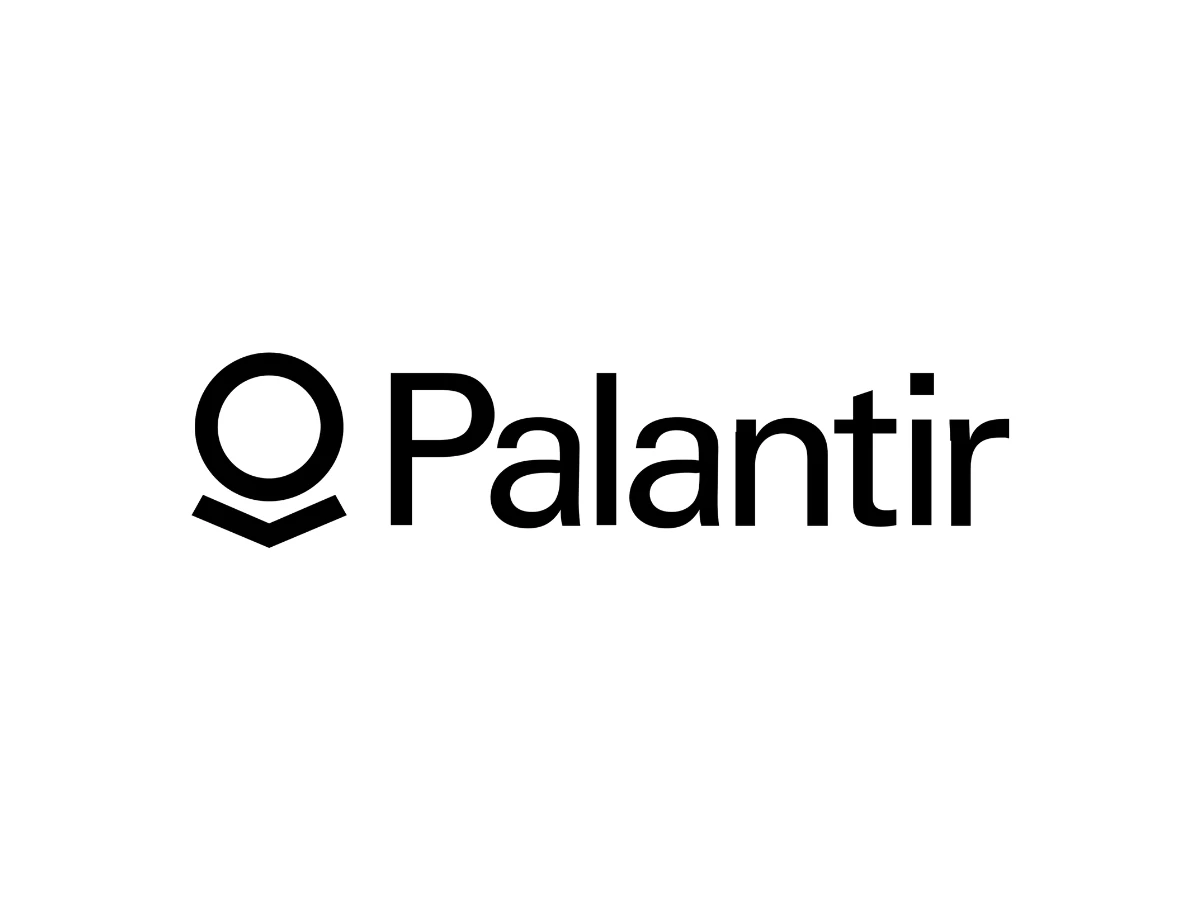

Stare at the Palantir logo long enough and it flips on you. One moment it is a dark orb balanced on a stand, a seeing-stone lifted straight out of The Lord of the Rings. The next it is a person hunched over an open book, lost in a page. Neither reading is an accident.
That optical double-take is the most deliberate thing about one of tech's most understated marks. The Palantir logo belongs to one of the most powerful and most divisive software companies in the world, and its designer folded the company's entire worldview into a black wordmark and a symbol smaller than a postage stamp. The Palantir logo design has barely changed in close to twenty years, which for a technology brand is almost unheard of.
The company behind the Palantir logo
Palantir Technologies is an American software company founded in 2003 by Peter Thiel, Alex Karp, Stephen Cohen, Joe Lonsdale, and Nathan Gettings. It builds data-integration and analytics software used by government agencies and large commercial clients.
Palantir has outgrown the two-product setup it was once known for, Metropolis for finance and Gotham for government. The company now runs four platforms: Gotham for defense and intelligence work, Foundry for commercial data operations, Apollo for continuous software delivery, and its Artificial Intelligence Platform (AIP), which wires large language models into the other three.
It is also no longer the secretive private contractor it used to be. Palantir made its stock-market debut in 2020, listing on the New York Stock Exchange under the ticker PLTR before later moving to the Nasdaq. Since then it has pushed hard into commercial markets, put AIP at the center of its sales pitch during the enterprise AI boom, and reported more than $4 billion in revenue in 2025. The mark that once labeled a niche government vendor now fronts a publicly traded AI company.
Palantir's public face has always been Peter Thiel, a deeply divisive figure. He co-founded PayPal, was Facebook's first outside investor, and belongs to the group of PayPal alumni often called the PayPal Mafia. He is also known for secretly financing Hulk Hogan's privacy lawsuit against Gawker Media, which drove the publisher into bankruptcy in 2016, and for a loud, polarizing role in conservative politics (NPR, Forbes). Chief executive Alex Karp frames the company's mission as giving Western governments an edge, a stance that pulls strong support and strong opposition.
Where the Palantir name comes from
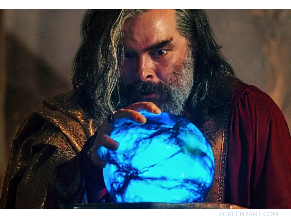
Palantir takes its name from The Lord of the Rings, and a popular claim about that name is wrong. The word does not come from Latin, and it does not mean "openness." Palantír is Quenya, one of the Elvish languages Tolkien invented, built from palan ("far") and tir ("watch over"). It means far-seeing, and the plural is palantíri.
The lore is worth getting right, because it changes how the mark reads. In Tolkien's writing the palantíri are seeing-stones that let a viewer look across great distances and speak with whoever holds another stone. They do not simply foretell the future, contrary to the usual shorthand. They show real images, but a stronger will on the other end can steer what a viewer sees. Sauron used a captured stone to feed the steward Denethor and the wizard Saruman true but partial visions, and both were led to ruin by trusting what the stone let them see. The object is a warning about mistaking a curated view for the whole truth, which hands the company a namesake with far more edge than a plain crystal ball.
How Garry Tan designed the Palantir logo
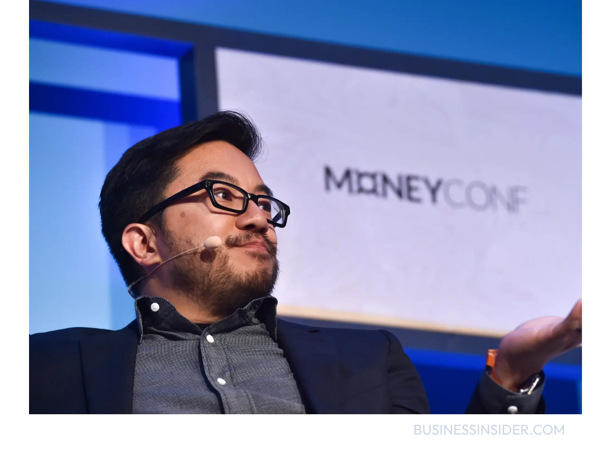
The mark was created by Garry Tan, who joined Palantir as its 10th employee and worked there as a lead engineer and designer before co-founding Posterous and, later, running Y Combinator. The Palantir logo design came together slowly. In Tan's own account, posted on Quora and shared again on his X account, he worked on it with founder Stephen Cohen and chief executive Alex Karp, and the team cycled through "around five dozen iterations" before locking the final version. That is roughly sixty rounds, not the handful sometimes reported.
Tan has said little publicly about what the rejected directions looked like, and Palantir has never released them, so any blow-by-blow of the discarded versions would be invention. What he has described is the target: a mark that stayed simple and iconic while still saying something about the company. The version they kept shrinks cleanly to a favicon and holds up inside dense software interfaces, which is exactly what a product that lives on data-heavy screens needs.
What the Palantir logo means
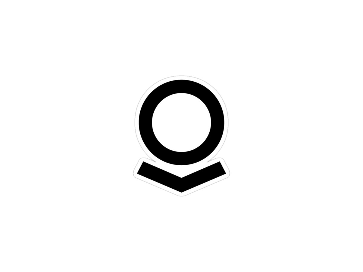
The symbol rewards a second look. The filled circle and the two angled strokes under it form an orb balanced on a stand, the seeing-stone the company is named for. Shift your eye and the same shapes become a person in profile: the circle is a bowed head, and the form below is the open book they lean over. Tan has summed up the two readings as an orb on a pedestal and a human being reading a book.
Packing both pictures into one mark is a tight way to state what Palantir claims to do. The orb is about reach, about finding patterns across enormous data sets. The reader is about human analysis and the slow work of understanding. Together they spell out what Tan calls human-computer symbiosis, software built to extend an analyst rather than replace one.
Typography and color
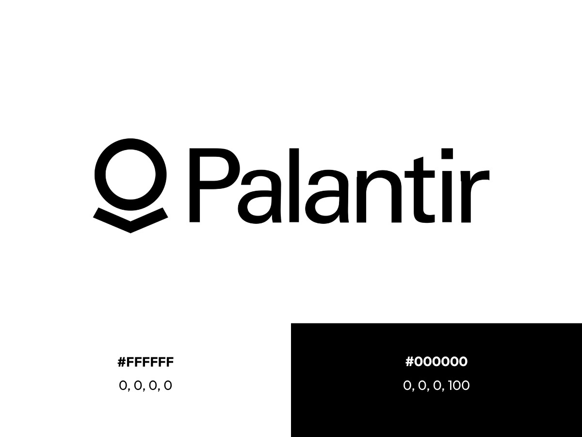
The wordmark sits in a semibold sans-serif with the letter spacing opened up a touch, which keeps it legible as the logo shrinks. The capitalization stays calm, an uppercase P into lowercase letters, so it reads as composed rather than loud.
Color is where the identity says the most by saying almost nothing. The mark is black on white, with no accent hue anywhere in the core system. Black reads as authoritative and serious, and it stays neutral across the government, defense, and corporate rooms where the logo turns up. A brighter palette would fight the subject matter. For a company whose software sits close to surveillance and national security, plain black is sober by design.
A logo that has stayed put
Most technology companies redraw their logos every few years. Palantir has not. The mark Tan designed in the company's earliest days is, in structure, the same one on Foundry dashboards and PLTR investor filings today, a rare run of continuity in software branding. That refusal to chase redesign trends is a brand decision in itself. In defense, finance, and government infrastructure, consistency signals that a supplier will still be standing in a decade, and a logo that never moves makes that promise without a word.
An outside read on the design
Designer Bogdan Sandu, writing about the mark, notes that among designers Palantir's identity gets cited as a case study in minimalist discipline, and that the severity of the wordmark matches the gravity of the company's work. His larger point: the restraint helps Palantir. A playful, trend-driven logo would feel wrong for a firm whose software shows up in reporting on ICE contracts and military AI. The mark does not try to explain the company or dress it up. It labels it, and does so with total confidence.
The Palantir logo and a contested reputation
An honest look at the Palantir logo has to reckon with the reputation it now carries. Palantir is among the most scrutinized technology companies on the planet. Its tools have long been linked to government surveillance, and in 2025 the company signed a $30 million contract to build an immigration-enforcement platform for U.S. Immigration and Customs Enforcement, work that drew lawsuits and sharp criticism from organizations including the American Civil Liberties Union and Amnesty International. Palantir has publicly disputed several of those accounts.
The mark carries that weight rather than ducking it. Palantir leans on its Tolkien theme well past the logo. Staff wear shirts and clip on badges printed with "Save the Shire," often called the company's motto, though it works more as an internal cultural tagline than a formal brand line. It shows up on merchandise and in recruiting, and it was documented years ago by CNBC. Chief technology officer Shyam Sankar has explained it as shorthand for protecting the world "from terrorists, fraudsters, cyber spies" through the company's software. Critics hear something darker in the same three words, given who the software watches. The logo sits right in the middle of that fight, and its calm, bookish symbolism is what makes the tension land: a mark about human learning fronting a company defined by machine surveillance.
Why the Palantir logo works
The Palantir logo earns its place among the strongest technology marks because it pulls off a hard trick simply. It compresses the company's whole thesis, human judgment amplified by machine reach, into a shape you can read two ways in under a second, and it has held that shape without a single redesign for close to twenty years.
The takeaway for anyone building a brand: a logo does not have to look like its industry to belong to it. Palantir skipped the glowing gradients and abstract swooshes of default tech branding for a dark orb, a stand, and a book, then let the meaning carry the load. Whether that meaning reassures you or unsettles you comes down less to the design than to what you make of the company behind it, which might be the most honest thing a logo can do. For more marks that treat restraint as a strategy, see DesignRush's best logo designs and its roundup of best AI logo designs.
Our team ranks agencies worldwide to help you find a qualified partner. Visit our Agency Directory for the Top Logo Design Companies as well as: