Last Updated: 07/02/2024
The NASA logo, with its striking red chevron and prominent white typeface, is instantly recognizable and deeply ingrained in popular culture. This design, synonymous with space exploration and scientific discovery, has transcended its governmental origins to become a symbol of human achievement and ambition.
To find the answer to what makes this logo so engaging and impactful we will analyze the meaning, design, and evolution of the NASA emblem as well as the ways it permeated various facets of popular culture, solidifying its place as a design icon.
NASA's Evolution and Iconic Logo Origins
NASA was founded in 1958 in response to the Soviet Union's launch of Sputnik, the world's first artificial satellite. The agency was established to oversee the United States civilian space program and conduct space and aeronautics research. NASA was formed by merging the National Advisory Committee for Aeronautics (NACA) with other related organizations. The first NASA administrator was T. Keith Glennan, who played a crucial role in shaping the agency's early years.
NASA's iconic logo, known as the NASA insignia (or "meatball"), was designed by James Modarelli in 1958. The insignia features the company’s name in white capital letters on a round solid blue background, with red strokes in the shape of a horizontally oriented “V” next to it. This symbolizes the agency's focus on space exploration and its connection to the United States.
Over the years, the logo underwent several changes, with the most significant being the introduction of the NASA logotype (or "worm") in 1975. Designed by Richard Danne of Danne & Blackburn, the worm logo was a stripped-down version of the meatball and was used until 1992 and then again from 2020 to this day.

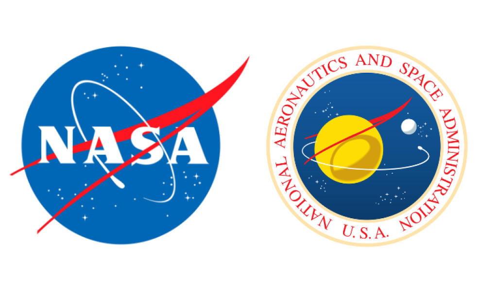
The NASA seal features a circular lettering with the agency's full name and an illustration containing all the elements of the Meatball logo, updated with a yellow planet placed to appear nearby, and a white one in the distance. This version of the logo is used for presentations and ceremonies.
The meatball logo, reintroduced in 1992, remains the official NASA insignia. This move reflects the agency's commitment to innovation and its ability to adapt to changing times while maintaining its iconic identity.
NASA’s Legacy Has Proven To Be Invincible in the Modern Space Age
It's surprising to see NASA in our roster of Best Designs since it's a government organization. Still, no other government institution can be more iconic than them. NASA logo design is so emblematic it was even featured in many films, television shows, comic books, and other merchandise.
When someone sees a picture of red triangles and white ovals, everyone would think that it’s NASA, even without the name emblazoned on it. Such iconic imagery not only solidifies their brand identity but also enhances their SEO presence, ensuring easy recognition and recall across digital platforms. For more options, discover our top SEO agencies at the moment.
Even Buzz Lightyear from the Toy Story series has the NASA logo on his chest to signify his occupation as an astronaut. It also appeared in films such as the Academy Awards winner Gravity with Sandra Bullock. These appearances, among many others, have raised NASA’s brand awareness and recognition, helping them send the messages they want to preach worldwide.
NASA has always been a part of world history as it bore witness to many astronomical firsts:
- The men on the moon
- Exploring other planets
- Seeing potential life on another planet
The NASA logo also appeared several times on social media when people uploaded their tickets to Mars exploration, where the NASA logo is prominently displayed. Lastly, some of the best logo design apps have the NASA logo template available for users to recreate, proving how it became an example of cool logo design. Believe it or not, NASA has been a massive part of popular culture, and its logo design is no exception.
Evolution of the NASA logo
The History Behind NASA Logo Design Sparks Deeper Understanding
Back then, people relied on outdated books and century-old research from scholars about what lies beyond the planet Earth. It was proven inaccurate since some sources are from ancient Greek philosophers and Renaissance astronomers such as Galileo and Copernicus. Thus, when the United States saw an opportunity to raise awareness of the planets in the solar system, it did so with much aplomb.
The NASA symbol was designed by James Modarelli, an employee of the government’s newly formed space agency, and instantly was named “Meatball” by the staff. He wanted to capture the essence of exploration in a single image he created. It showcased a blue circle, which symbolized the sky, with white stars, and a red V-shaped wave or ribbon, representing the wings of a mythical bird soaring through the sky.
The symbol was meant to represent The United States' mission of exploring space and discovering new planets. The emblem has since become iconic among the public. Many believe it symbolizes America’s desire for exploration and scientific progress.
It has been embroidered on every American astronaut’s uniform and prominently featured in their rocket ships. When Neil Armstrong and his team of NASA astronauts landed on the moon, everyone saw the NASA logo emblazoned on their space suits. This has heightened people’s attention to NASA.
Soon after, all NASA activities were under the public eye, even the disastrous accident with Challenger in the 90s. Nevertheless, the NASA logo has always been known as one symbol of authority in outer space. It is not a business brand, but its prominence laid the ground for any best brand logos list that might have existed.
The Symbolism in the NASA Logo Design Hails From Historic Beginnings
According to the original designer of the NASA logo, the red triangles symbolize a mythical bird spreading its wings wide. For some, it might be an irrelevant detail, but upon a closer look, it means something more. The ancient Greeks believed the bird soaring through the sky represented a bridge between heaven and Earth. At the same time, other cultures saw it as a sign of new beginnings, luck, and strength.
All these meanings have been integrated into the now-iconic NASA logo, which reflects its mission to explore the unknown and make bold discoveries in space. The circular orbit around the wings is also symbolic. It reflects the cyclical nature of space exploration, where one mission leads to another, and knowledge is continuously built upon until something remarkable happens.
It is also an intelligent nod to Nicolaus Copernicus’ heliocentric theory, which has been one of the most widely accepted facts about the solar system. These meaningful references are a fitting salute to the forerunners of astronomy and the study of planets and galaxies. This also teaches us one crucial rule in logo design: do not be afraid to use symbols as long as they are relevant to the image we want to portray.
NASA logo design teaches us that symbolisms work if we know when and how to use them effectively without distracting from the main idea.
The Simple Typography Sets the Space NASA Logo Apart
Aside from the iconic symbols, there is something special about the NASA logo – its straightforward typography. The lettering features a bold serif type where each letter is capitalized, standing out and creating an immediate impression. It’s easy to read and is modern yet timeless. The design also gives off a sense of unity as all letters are connected to the red swoosh, symbolizing NASA’s mission to explore space.
The NASA logo is an example of a well-crafted and practical design that conveys a powerful message in a few brush strokes – boldness, unity, and exploration. It’s no wonder why this classic has continued to grow and thrive until now. This is where the “less is more” aesthetic comes in. Once you have done enough in other visual elements, you must trim a little on different aspects to hit the balance.
Had NASA chosen to use a fancy font style or swirly typography about the planets revolving around the sun, it would have been too much for the average viewer to digest. It would look like a joke logo made for a fictional organization, which loses its credibility as a legitimate government institution and a forerunner in space explorations. Check out some of the best government website designs here.
NASA Logo Design’s Color Story Is Symbolic and Smart
One last thing to note about the iconic NASA logo design is its color story. Though there are a few variations, the core colors remain: red, white, and blue. These colors have been chosen to represent the American values of courage, justice, and strength focused on in the space exploration mission. Additionally, these hues are symbolic in their own right —red stands for the vastness of space, blue for the Earthly view, and white symbolizes the unity between them.
It can be remembered that NASA was established at the height of the Cold War to promote peace and progress through space exploration. In that context, the colors can also be seen as a symbol of hope in humanity finding common ground amid political strife.
Every NASA exploration or expedition in outer space during the early years of the Cold War was seen as a source of pride and joy to many Americans. Seeing the patriotic colors blended into the national flag representing the nation’s commitment to the advancement of space exploration is something to be proud of.
Today, NASA’s iconic logo reminds us of our relentless desire for progress and exploration that continues to soar beyond what we thought was possible. Its colors remain a powerful symbol of optimism and hope in times of challenge and change. Lastly, using the colors associated with the American flag has succeeded in its goal of rallying the American population in whatever space endeavors they do.
NASA Maintains Its High Status in the Age of Space Exploration
After NASA's milestone successes, many Western countries and rising economies such as China and India have worked on creating similar government agencies focusing on the astronomical side of things. Some have done it to further existing research but others, in contrast, have done it to stake their claims on other planets or heavenly bodies that the United States has yet to step foot on.
NASA does not compete with countries in the Space Age anymore, as it is one of the founding members of the International Space Station, and it continues to make strides in other aspects of space exploration. NASA carried out many ambitious projects, such as sending the first people to Mars and creating the James Webb Space Telescope, which can see further into deep space than any telescope before.
The agency also works on new ways to reach farther reaches of our universe, such as developing new propulsion systems and studying alternative forms of energy. NASA continually looks to the future, pushing the boundaries of human exploration further than ever before. It utilizes technology and creativity to find new ways to explore our universe, whether by discovering other planets or uncovering groundbreaking scientific discoveries.
NASA is a pioneer, but it does not hesitate to give a helping hand, as it has been involved in many international collaborations with countries and organizations worldwide. It serves as a beacon of hope for humanity's investigations and is unrivaled in its achievements. The agency continues to provide humanity with new knowledge about our universe and furthers the possibilities for future generations.
No matter how many countries join the race, NASA stands at the helm of space exploration and continues to inspire people from all corners of the globe with its incredible feats. It stands as an example of what humans can accomplish when they set their minds to it, and its legacy will never be forgotten.