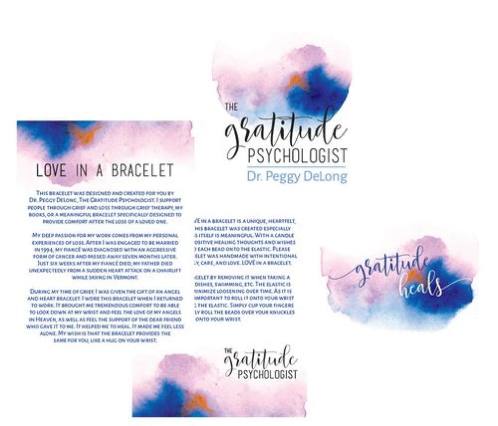
- Home
- Best Designs
- Best Logo Designs
- The Gratitude Psychologist
- Advertising
- Aerospace
- Agriculture
- Architecture
- Arts & Recreation
- Automotive
- Banking & Finance
- Content & News
- Distribution
- E-Commerce & Retail
- Education
- Engineering
- Entertainment
- Fashion & Beauty
- Food & Beverage
- Government
- Health & Wellness
- Hospitality
- Legal & Insurance
- Luxury
- Manufacturing
- Medical & Pharmacy
- Non-Profit
- Professional Services
- Real Estate
- Sports & Leisure
- Technology
- Travel
The Gratitude Psychologist
- Logo designed by Second Nature Studio
- 57
- View Site
Standout Features:
- Dreamy
- Prominent color palette
- Cursive typeface
The Gratitude Psychologist’s emblem delivers an atmosphere of understanding and kindness, thanks to its dreamy design created by Second Nature Studio.
The watercolor visual enhances the dreamy atmosphere by blending cool and warm colors. Pink and blue shades dominate, while a hint of orange catches the eye in the spacing between the two words.
The cursive typeface features an imaginative font style that plays into a watercolor abstract background surrounding it. When the emblem is presented in the two-lined quote “Gratitude Heals,” the first letter (G) and the last letter (S) are extended to their respective sides via thin lines.
Get a chance to become the next Design Award winner.
SUBMIT YOUR DESIGN- Logo designed by Second Nature Studio
- 57
- View Site
- Industries:Health & Wellness
More Best Health & Wellness Logo Designs
Sign Up for Our Newsletter
Receive the Latest Digital Trends &