The Atlanta Braves are one of Major League Baseball’s most storied franchises, with a history stretching over a century. Their logo, like their legacy, has seen a remarkable evolution.
Their identity has been rewritten 29 times, a staggering number that few franchises in any sport can match. With each redesign, the team hasn’t just updated its look — it has reflected shifting cultural tides, ownership philosophies, and the business of baseball itself.
The Atlanta Braves logo sees itself shifting from wordmark to ornate lettering to Native American iconography to the sleek, modern tomahawk emblem we know today. Let's take a journey through all 29 logo iterations.
Atlanta Braves Logo Design Details
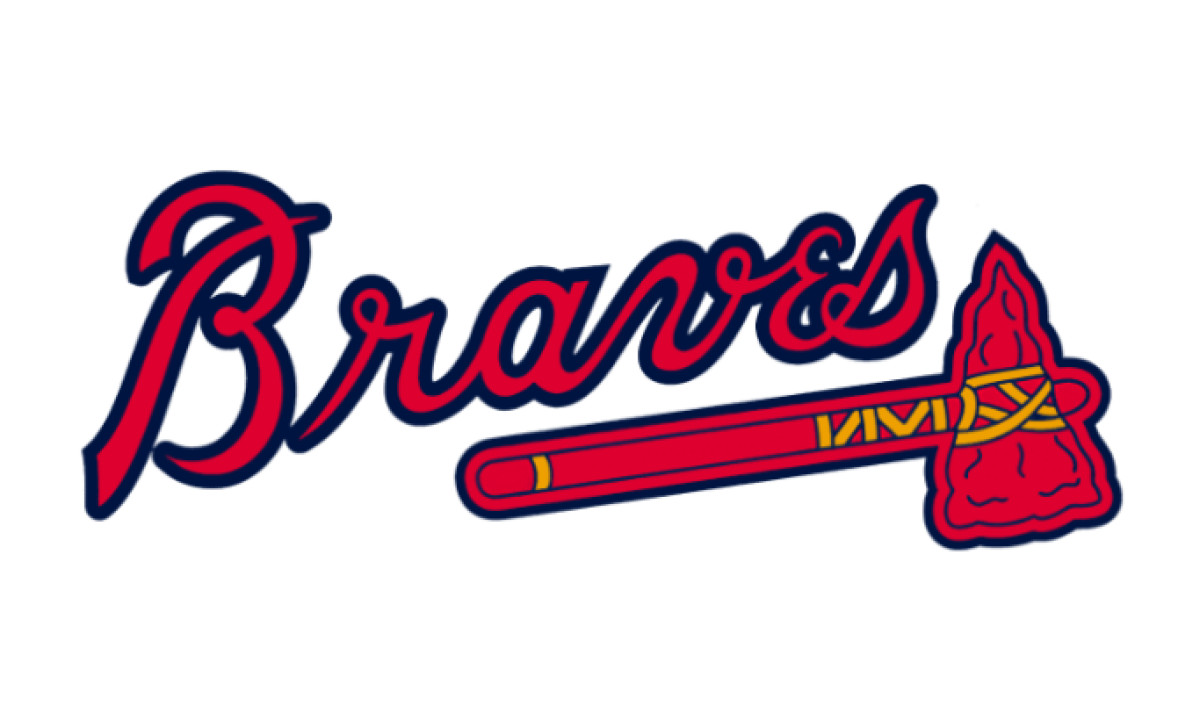
The modern Atlanta Braves logo prominently features a stylized, flowing script with a tomahawk placed below the wordmark.
The red, navy blue, and gold color palette reinforces the team’s strong branding identity. The tomahawk, an integral element of the design, symbolizes power and resilience, aligning with the competitive spirit of the franchise.
The current Atlanta Braves symbol keeps its traditional roots while still being modern: The script’s smooth curves evoke a sense of history, while the tomahawk maintains a connection to past iterations of the logo. This makes it one of the most iconic and recognizable logos in professional sports.
Atlanta Braves Logo History
The evolution of the Atlanta Braves logo spans over a century, marked by multiple rebrands, relocations, and cultural shifts. Each change reflects strategic decisions to modernize the team’s image while staying connected to its storied history.
1883 –1896: The Boston Beaneaters Era

In the early years of baseball, team identities were often closely tied to the cities they represented. The team's name, initially known as the Boston Beaneaters, was a tribute to a classic regional dish.
Branding was still in its infancy during this era and the logos they chose were often minimalistic. The Beaneaters’ emblem was no exception — simple, unembellished, and serving more as a practical marker of the city’s team rather than a sophisticated brand identity.
With growing competition and evolving aesthetics, the team replaced its red-lettered identity with a dark blue shade. This color, often linked to wisdom and sophistication, hinted at a team refining its approach, not just on the field but in how it positioned itself within the baseball world.
Branding was also becoming more intentional, and this deliberate color transition was one of the first signs of a growing awareness of sports marketing.
1897–1911: The Monogram Era
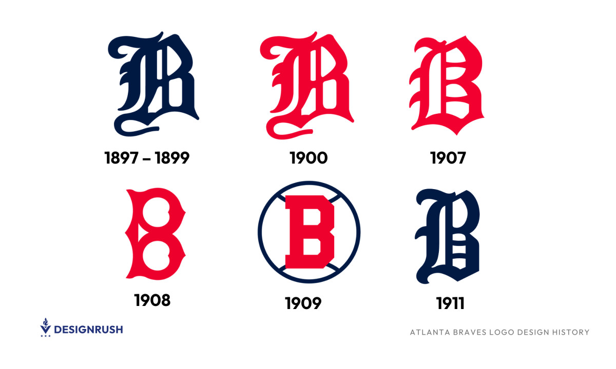
In 1879, the team introduced a stylized 'B' monogram, reflecting the common design trends of the late 19th century. This variation signified a shift toward team identity through typography, rather than full team names.
Between 1907 and 1911, the team experimented with a series of bold visual shifts that gradually shaped its identity. In 1907, they introduced a red Old English 'B', a move that brought more weight and presence to the brand while keeping it grounded in Boston’s baseball tradition.
Just two years later, in 1909, they pushed the design further with a creative twist: a stacked, double 'B' in the same vivid red, styled with curving lines that gave it both structure and flair.
That same year, they explored a different route altogether, enclosing a single red 'B' in a navy blue circle that mimicked a baseball. This not only added balance to the composition but hinted at a growing awareness of how logos could function in an increasingly commercialized sports world.
By 1911, the team had rebranded as the Boston Rustlers and unveiled another version of the Old English 'B', but this time in dark blue, more refined and formal. The updated color and font reflected a more mature tone, reinforcing the team’s Boston roots while adopting a visual identity that felt more poised and deliberate. Together, these years told the story of a franchise learning to express itself with both tradition and intention.
Note: For five years (from 1901-1906), the club intentionally revisited its roots by reintroducing the 1889 logo featuring the blue "Boston" name as a tribute to the team's historical connection with the city and its dedicated fanbase.
1912–1920: The Boston Braves’ Indigenous Iconography
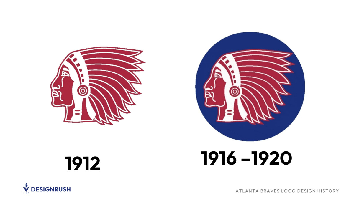
From 1912 to the early 1920s, the newly renamed Boston Braves introduced and gradually refined a logo centered around a red profile of a Native American wearing a feathered headdress. The original 1912 version was straightforward in its intent. It used a bold red palette with white accents to heighten contrast and visibility.
As the decade progressed, the team updated the design by placing the figure within a deep blue circle, which gave the logo a more cohesive and composed structure. The darker background made the red figure stand out more sharply, and the added detail in the feathers and facial contours gave the emblem a more expressive feel.
1921–1924: The Stylized 'B' Monogram
-desktop.jpg)
The 1921 redesign brought in a bold, dark blue 'B' with a distinctive, rounded structure. This version featured curved indentations within the letter, creating a unique and memorable aesthetic. The monogram’s intricate detailing set it apart, making it one of the most visually striking and recognizable logos of the era.
1929–1935: The Colorful Indigenous Symbol
-desktop.jpg)
The 1929 redesign campaign reintroduced a Native American profile, but this time with vibrant colors and a more stylized, cartoonish aesthetic. Featuring bronze skin, black hair, and a striking feathered headdress in red, green, yellow, and blue, this version added expressiveness compared to previous iterations.
1936–1938: The Boston Bees' Bright Identity

In 1936, the team rebranded as the Boston Bees, and with the new name came a refreshed visual identity. The logo brought back the familiar wishbone-style 'B' from the 1925 era but gave it a new voice: its body now filled with a sharp lime-yellow hue and framed by a thick, vivid blue outline. It was a deliberate choice, pairing an unusual color palette with a bold, recognizable form to mark a new chapter in the team’s story.
Two years later, the design was refined again. The colors stayed almost the same, but the letter’s shape evolved into something cleaner and more geometric. The 'B' featured subtle curves on its top and bottom, drawing the eye inward, and the blue outline was slimmed down just enough to let the yellow breathe. It wasn’t a dramatic transformation, but the result was brighter, tighter, and more confident, an emblem that looked forward while nodding to where it came from.
1939: A Shift to Red
-desktop.jpg)
In 1939, the Boston Bees adjusted their color scheme, replacing the yellow 'B' with red, while adding a dark blue outline for contrast. This move gave the logo a bolder, more aggressive look.
1940: A Return to Tradition
-desktop.jpg)
The final logo of the Boston Bees era introduced an Old English 'B' in dark blue, a departure from the previous modernized block lettering. This design conveyed historical depth and tradition, while the dark blue hue gave the logo a timeless, authoritative presence.
1941–1944: Font Experiments in Boston Braves' Return
-desktop.jpg)
As the team reverted to the Boston Braves name, it continued experimenting with dark blue typography, refining the letter 'B' in different styles, and playing with the sharpness, thickness, and spacing of the lettering.
1945 –1952: The Return of Native American Imagery
-desktop.jpg)
The post-war era saw the Boston Braves reintroduce a Native American profile as their primary emblem. This decision aligned with a cultural push to reconnect with heritage and tradition during a time of national rebuilding.
The logo featured a bronze-skinned Native American profile. The dark hair and red feathers demonstrate strength and courage, qualities essential to both the Braves' identity and competitive spirit. A bold black outline provided clarity and sharpness, ensuring the emblem stood out with a strong, defined presence.
Note: The team relocated to Milwaukee within the 1953-1955 seasons, but the logo remained unchanged and kept the 1945 Native American emblem intact.
1957–1971: The Smiling Brave
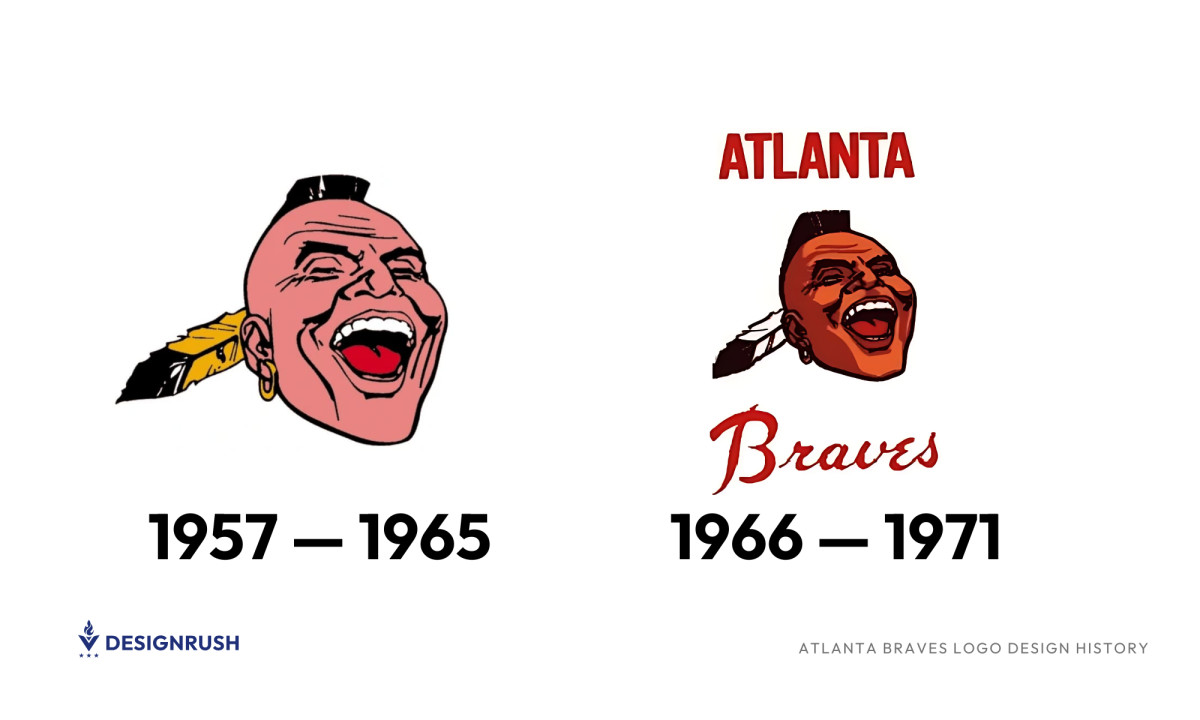
In 1957, the Braves unveiled what would become one of the most recognizable (and controversial) logos in baseball history. It featured a stylized portrait of a laughing Native American man, captured mid-shout with his head tilted back, mouth open wide, and eyes squeezed shut in exuberance.
A gold hoop earring dangled from his ear, while a single yellow-and-black feather jutted from the side of his mohawk-like hairstyle. The design was bold, expressive, and unmistakably loud. It meant to capture attention and convey a spirit of defiance and pride.
When the team moved to Atlanta in 1966, the logo came along, albeit with a few thoughtful updates. The design kept the familiar laughing face, but refined its details to better suit a new era and audience. The skin tone shifted from bright pink to a warmer brown, giving the portrait a more grounded feel, while the feather in the hair changed from yellow to a more neutral black and white.
The updated logo also introduced typography for the first time: “ATLANTA” appeared in compact, rounded sans-serif capitals above the portrait, while “Braves” was written below in bold, flowing red script. The changes didn’t reinvent the identity but added a new layer of clarity and pride to the team’s next chapter.
1972–1989: A Bold New Direction
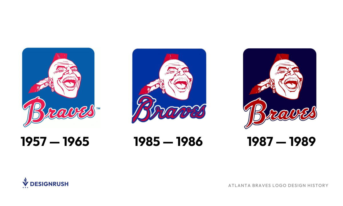
The 1972 redesign marked a turning point in the Braves’ visual identity. The familiar laughing portrait was redrawn in crisp red and white, placed against a bright blue square with rounded edges. “Atlanta” was dropped from the logo, leaving only “Braves” in a bold, red script that overlapped the square, now outlined with fine white and blue lines. This version struck a balance between playfulness and confidence, streamlining the emblem for a new generation of fans.
In 1984, the design saw subtle yet deliberate refinements. The background blue deepened, giving the logo a richer tone, while the “Braves” lettering became smoother and more polished — less rough around the edges, more self-assured. Though this version lasted just a single season, it stood out for its clarity and control.
By 1987, the blue grew darker still, and the logo’s contrast sharpened. The facial illustration looked more current, less like a sketch, and more like a brand symbol. The wordmark was adjusted once more — this time with slightly shorter but wider letters, and an increased use of white in the outline, bringing better legibility and a bolder presence overall.
Each tweak was quiet, but together they told a story of a franchise steadily sharpening its image.
1990–Present: The Wordmark Era and the Iconic Tomahawk
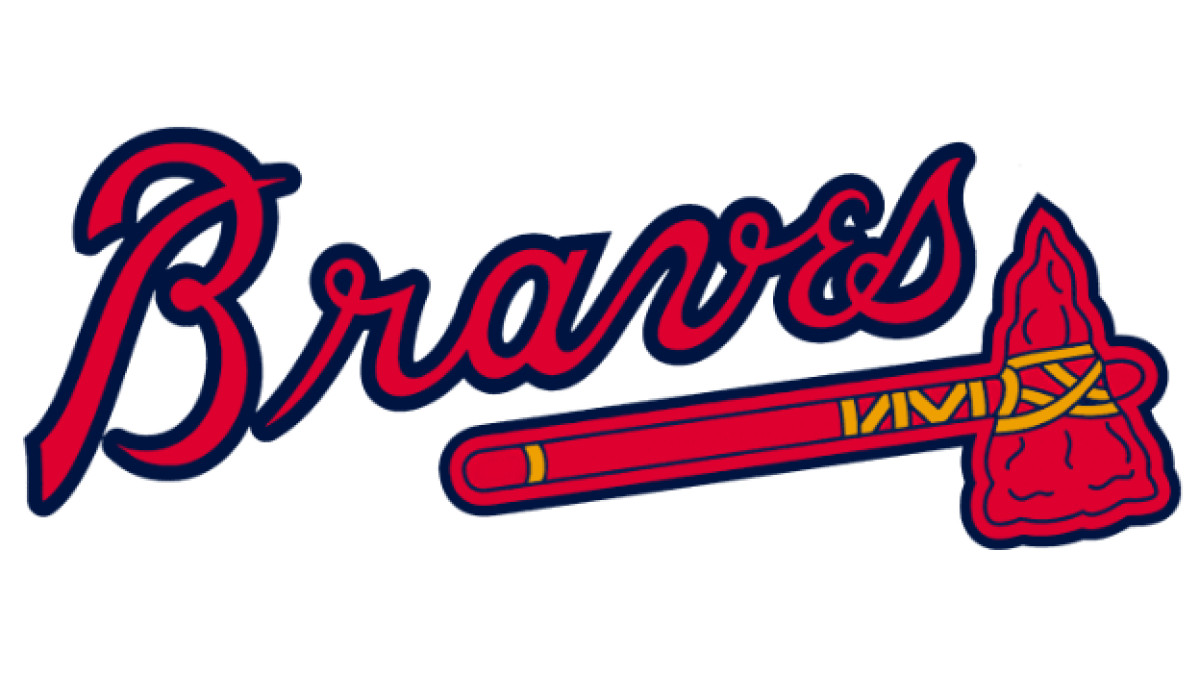
In 1990, the Atlanta Braves made a deliberate shift in how they presented themselves. They moved away from Native American imagery and focused on a cleaner, more focused visual identity. The new logo featured the word “Braves” in bold red script, outlined in dark blue and tilted slightly upward, which is a subtle gesture that hinted at forward movement. Just below the lettering, a red tomahawk with yellow accents anchored the design, introducing a new visual symbol that honored the team’s past without relying on caricature.
This design has remained largely intact for over three decades. In 2018, the logo was refined, not reinvented. The lettering became sharper and the outlines more precise, but the spirit stayed the same: strong, simple, and unmistakably Braves. The tomahawk, now a permanent fixture in the team’s branding, continues to symbolize grit and tradition.
The color choices weren’t accidental either. Red brought energy and presence, blue offered a sense of trust and consistency, and yellow added a quiet optimism. Together, they created a logo that felt both grounded and aspirational. It is a fitting reflection of a franchise that values where it came from as much as where it’s going.
Atlanta Braves Logo: A Legacy Etched in Baseball History
From its humble monograms in Boston to its bold Native American imagery and finally, to its sleek, modern tomahawk design, the Braves' logo history is a fascinating study in branding evolution.
The current logo strikes the perfect balance between heritage and modern branding best practices, maintaining its storied past while embracing a clean, professional aesthetic. As the Braves continue their dominance in baseball, their logo remains one of the most iconic symbols in Major League Baseball.