The Logo Design Embodies Bee Dub Move’s Goal of Providing an Enjoyable Fitness Journey
Bee Dub Move is one of the newest kids on the block regarding fitness and health. Founder Ben Walker believes in his three E's: ethics, energy and enthusiasm.
These three E's influence most of the company's decisions and are at the core of its mission. Bee Dub Move is serious about helping people achieve their health goals ethically and enjoyably.
The company strives to create a meaningful, motivational and productive fitness journey.
They want to use a logo design that exemplifies those pillars of the brand without looking too mainstream. That's why they entrusted PLUK Studio to handle the task. And the agency did not disappoint.

PLUK Studios Embodied Bee Dub Move’s Values With Movement-Inspired Design Concept
Most fitness and sports brands portray physical activity with images of people, animals or action scenes. Bee Dub Move chose a different approach by using a simple icon that is easily recognizable and impactful.
Upon closer look, they utilized an excellent combination of fonts and colors in bold sizes to signify their willingness to become a significant player in the industry.
The agency took notes from big brands like Nike and Adidas, which often rely on simple designs to render maximum retention on their audiences.
The Bee Dub Move logo design is consistent with its mission when placed alongside competing brands.
It still stands out as a unique entity that effectively conveys the company's three Es.
In addition, one can quickly be energized by looking at the logo. Experts call this the “invisible gym,” which perfectly encapsulates what Bee Dub Move is all about.
This mindset conditions one's brain to feel energized and inspired to do such activity, as though they are already in the gym working out. Explore the best gym logo designs.
Indeed, this approach has done wonders for the Bee Dub Move brand. It has successfully established a presence in the fitness industry and continues to inspire others to adopt a healthier lifestyle.

The Bee Dub Move Logo Design Motivates Health Enthusiasts Even More Through Complementing Color Story
PLUK Studio used neon green, white and black with splashes of gray on the side as the primary colors for the Bee Dub Move logo design.
One important color to focus on is neon green. Neon colors have been favorites in the sports and fitness industry for the past few decades, and this is Bee Dub Move’s way of taking inspiration from the giants in the field.
Neon green is a very energizing color evoking excitement and life. It's also strongly associated with nature and growth, which are vital to any fitness program.
On the other hand, neutral colors complement neon green and give the logo a modern and sincere look, reinforcing the idea of striving for fitness excellence.
When seen together, these colors create a unique yet professional look that is easy to recognize.
The Bee Dub Move logo design perfectly balances humor, energy and professionalism. It shows how logo design professionals play with color to create a specific tone and convey brand personality.
Bee Dub Move Invites Target Audience To Stay Active With Motion-Themed Typography
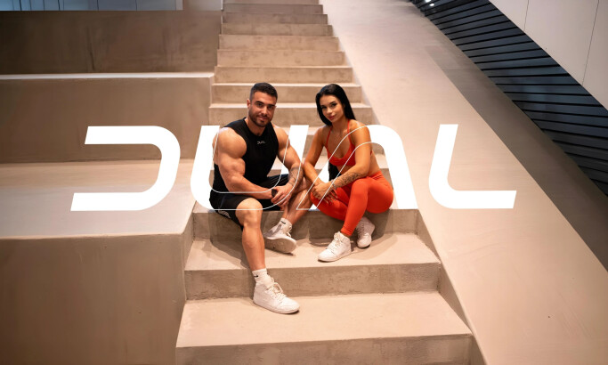
Another remarkable feature of the Bee Dub Move logo design is the combination of bold fonts and a noticeably different hand-painted font.
Best branding firms often utilize hand-painted font creates an impression of movement and energy, as it looks like someone is continuously drawing and designing the letters in real time. This adds to the overall energizing effect of looking at the logo. It is also strategically placed at the center, showing that energy and activity are the brand's primary focus.
The logo design blends these varied font styles and gives a sense of strength and power, perfectly matching the brand’s values.
At first glance, one can quickly tell that the Bee Dub Move logo design is serious about its mission to inspire people to get active.
Design experts have said a thousand times that font choices matter when sending your message. Read this post about font choices for more.

Harmony in Logo Design: Why This Matters in Branding Identity
Most people believe you must use the same font and color to establish harmony in design.
But for the Bee Dub Move logo design, this isn’t necessarily true. The harmonious effect is achieved by combining different fonts and colors, making recognizing and remembering the brand’s identity easier.
The key here is to be mindful of how each element works together to create a unified whole.
By understanding design principles, PLUK Studio created a distinct logo that stands out from the competition.
The wise combination of these fonts and colors has created an image of activity and energy perfectly aligned with the three E's.
This is a perfect example of a responsive logo, as it inspires people to take action. This guide about responsive logos will tell you more.
Indeed, logo designers should be confident to step out of their comfort zones and mix and match various design elements to create stunning results. Read more about the importance of logos here.
PLUK Studio reaped terrific results after that leap of faith, and so should you.


