Philadelphia Eagles: Key Points
- A Logo Refresh Fueled a Billion-Dollar Franchise Valuation: The 1996 eagle head redesign aligned with digital media trends and merchandise scalability, contributing to the Eagles' $8.3 billion valuation in 2024 and record fan engagement across platforms and retail channels.
- Legacy Colors and Minimalism Drive Merch ROI: The 2023 return of the "Kelly Green" uniforms ranked #4 by The Score reignited merchandise sales and nostalgia marketing, proving that visual continuity and historic logos generate revenue through emotional brand equity.
- Visual Identity as Sponsorship Currency: The Eagles' 2025 partnership with Liquid Death demonstrated how a logo with high local and cultural equity opens doors to cross-industry collaborations, driving both shelf impact and market relevance.
The Philadelphia Eagles are one of the NFL’s most storied franchises, and their logo history is just as dynamic as their gameplay. Designed originally in the spirit of American resilience, the most recent iteration marked a digital-forward shift that elevated the team’s brand visibility and market appeal.
The Modern Philadelphia Eagles Logo: Structure, Symbolism & ROI
The current eagle-head logo features bold lines, aggressive angles, and a distinctive left-facing posture, symbolizing forward momentum and digital readiness. This redesign drove commercial growth:
- Merchandise Appeal: Bold, streamlined designs spark greater sales. Since the redesign, the Eagles have seen consistent record merchandise demand, with 69,878 average attendance across eight 2023 home games, each amplifying brand visibility through apparel and gear.
- Franchise Valuation Growth: In December 2024, owner Jeffrey Lurie sold an 8% stake at an $8.3 billion valuation, up significantly from earlier valuations. This demonstrates how a powerful logo supports tangible brand equity.
Reader Takeaway: A logo overhaul that aligns design with brand identity can unlock new revenue streams, like licensed gear and extracellular valuation, as loyal fans show up on game days and partner interest grows.
Philadelphia Eagles Logo History
1930s – 1940s: Patriotic Foundations & the Green Identity Emerges

The Eagles’ earliest emblem (1933–1935) drew direct inspiration from the National Recovery Administration’s Blue Eagle — a symbol of post-Depression unity and American industrial recovery.
Rendered in blue, the eagle clutches a football mid-dive — merging national strength with the sport’s grit.
In 1936, the logo shifted from blue to green, marking the beginning of the Eagles’ long-term visual identity. Though the pose and detailing remained similar, this move toward a franchise-specific color showed early awareness of brand differentiation in professional sports.
1943 – 1947: The Wartime “Steagles” Experiment
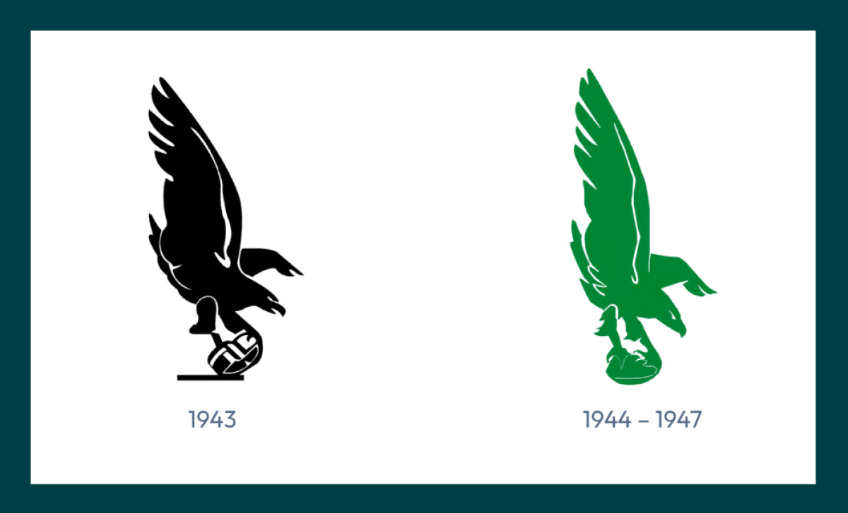
With WWII depleting NFL rosters, the Eagles merged temporarily with the Pittsburgh Steelers to form the “Steagles.” This one-year identity featured a bold black eagle in a vertical dive, clutching a leather helmet.
The emblem was stark and silhouette-based — foreshadowing modern minimalist design trends while adapting to wartime resource constraints.
The Eagles later introduced a green, angular silhouette (1944–1947).
1948 – 1972: Streamlined Strength & Horizontal Momentum
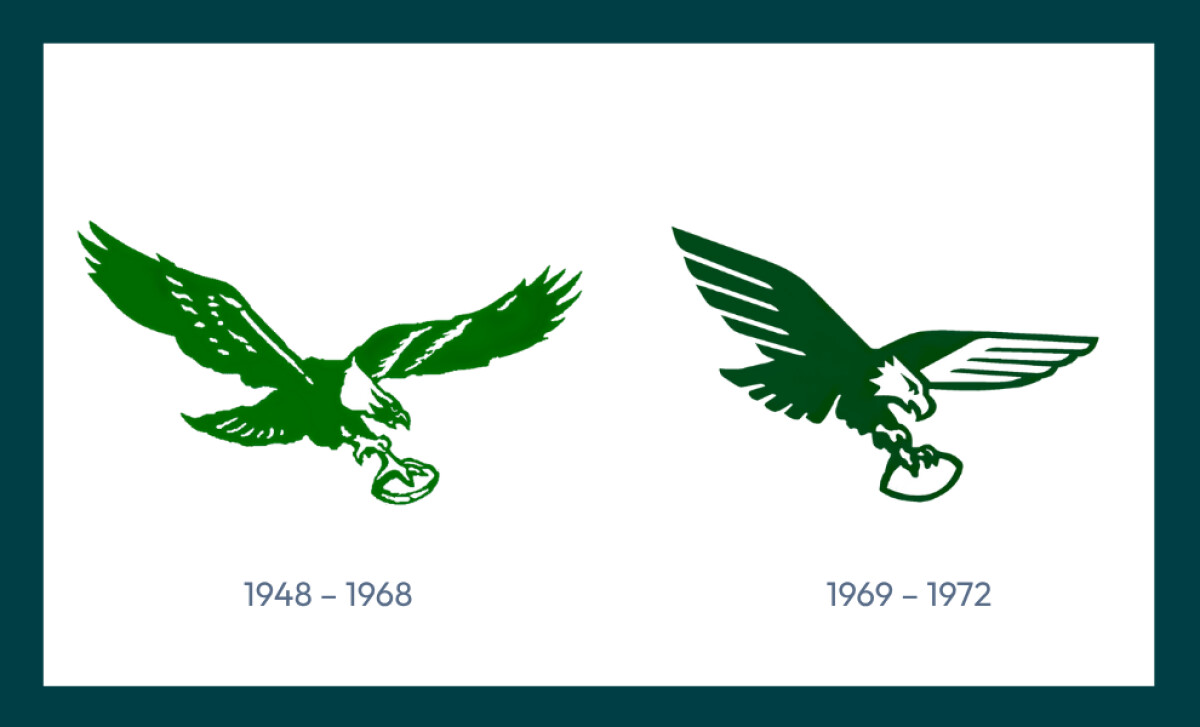
Returning from the Steagles period, the Eagles brought in a new iteration with a horizontal eagle, now in mid-flight with talons gripping a football, cemented the attack-forward visual style fans would associate with the team for decades.
Later, in 1969, the team introduced a redesig that marked a shift toward abstract simplification. The eagle became boxier, with tighter symmetry and stylized wings — a nod to mid-century modernism and rising print standardization.
This version improved scaling across small media formats like trading cards and promotional materials — aligning with growing fan merchandising and the early emergence of televised sports branding.
Strategic Insight:The gliding eagle of this era enhanced on-field branding and was among the first NFL logos to adopt a horizontal layout. This orientation aligned better with uniforms, end-zone stenciling, and print media.
1973–1986: From Logo to Helmet Identity
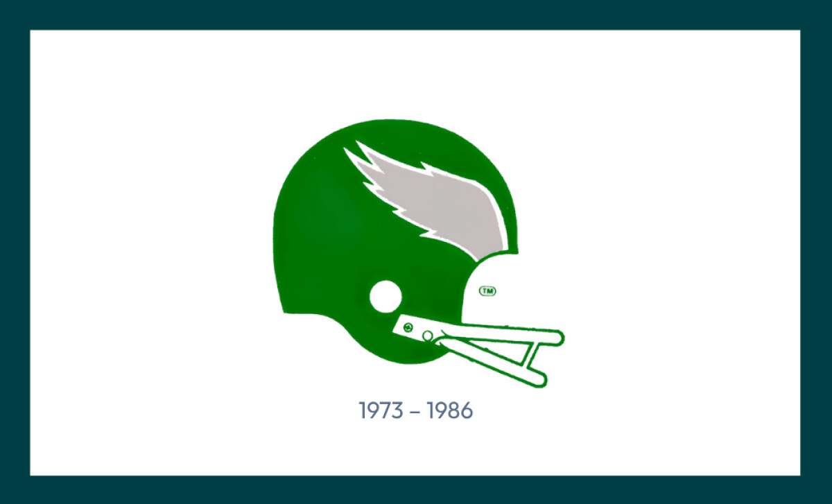
Abandoning a traditional standalone logo, the Eagles emphasized helmet branding from 1973 to 1986. The silver wing decal on a green helmet became an icon in itself — recognizable from televised games, merchandise, and team promotions.
Strategic Insight: Helmet-based identity helped the franchise adapt to the rising importance of televised visuals in the NFL. The silver wing quickly became synonymous with speed, energy, and Philadelphia’s brand DNA.
1987–1995: From Detail to Digital Dominance
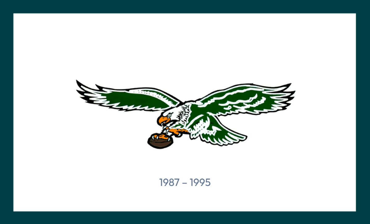
Between 1987 and 1995, the Eagles revived the horizontal eagle design with added realism — introducing white feather details, orange talons and beak, and a color-rich football. While the logo evoked physical intensity, it also pushed the limits of scalable design, especially as merchandising and television production evolved.
In 2023, the team resurrected its iconic "Kelly Green" throwback uniforms, earning the No. 4 spot on The Score’s ranking of NFL alternate jerseys (The Score). The fan-favorite look — rooted in the 1980s-90s design era — sparked major buzz and merchandise sales.
Strategic Insight: Legacy colors and logos continue to deliver ROI in the form of nostalgia-fueled merchandise cycles and visual storytelling. In fact, the Eagles' Kelly Green mark ranked #3 in the NFL's official "Best Old School Logos" list (NFL.com) — reinforcing its emotional and historical value to fans.
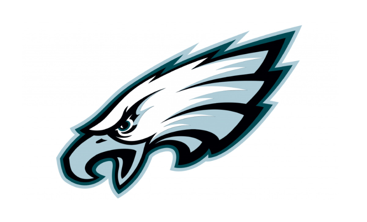
1996 – Present: Driving Brand Velocity
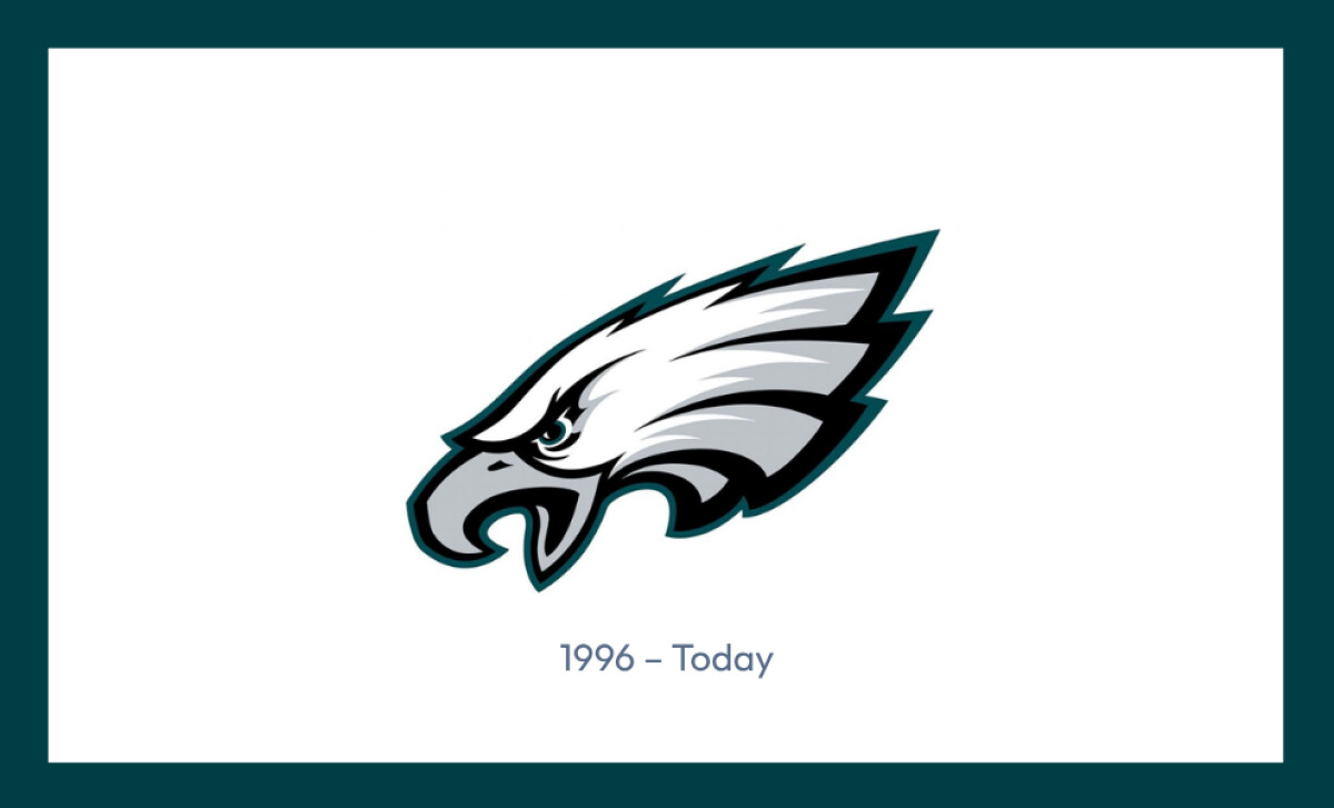
In 1996, the franchise introduced its now-iconic, left-facing eagle head — aggressive, sharp, and forward-driven. The design holds symbolic power (the only NFL logo that faces left), while maintaining optimal legibility across helmets, broadcast, print, and digital channels.
Despite being nearly three decades old, the Eagles' current logo still ranks high in brand recognition. In 2024, Yahoo Sports named it the 9th best NFL team logo out of 32, citing its aggressive silhouette, clean application, and iconic helmet presence.
“We love that it’s Philly, and it’s the Eagles,” said Cessario, who has personal ties to the city. “But more importantly, we see this as an opportunity to introduce our product to a massive, passionate audience.”
Liquid Death’s founder and CEO, Mike Cessario
In April 2025, the Eagles announced a high-profile promotional partnership with Liquid Death, the edgy canned water brand known for turning irreverent design into cultural currency.
The partnership, which includes limited-edition cans featuring Eagles branding, wasn’t just about hydration — it was a clear endorsement of the franchise’s logo equity.
Liquid Death’s marketing thrives on bold visuals and viral packaging, and the Eagles’ left-facing eagle was strong enough to anchor that narrative.
Strategic Insight:This collaboration confirms what brand strategists already know: a logo isn’t just decoration — it’s a licensing asset.
When your mark is visually iconic and flexible, it opens doors to high-ROI partnerships and unconventional brand activations. The Eagles' ability to pair with a countercultural brand like Liquid Death signals cross-market relevance, especially with Gen Z and millennial fans.
For brand managers and marketers, it’s a reminder that a well-designed logo with deep local equity can create real-world lift far beyond traditional sports sponsorship.
The Wrap-Up: Build a Logo That Powers Value, Not Just Brand
The Eagles didn’t build a billion-dollar brand by chasing trends. They built it by committing to an identity that performs across generations, platforms, and products.
From early patriotic emblems to today’s sharp, digital-native eagle head, Philadelphia’s logo evolution shows that great branding isn’t reactive. It’s engineered for scale, relevance, and fan connection.
And it pays.
The franchise’s $8.3 billion valuation in 2024 wasn’t just a product of on-field performance, it reflected merchandising velocity, sponsor appeal, and visual consistency that extended from helmets to hydration deals.
The Eagles’ recent Liquid Death partnership proves that their logo doesn’t just live in stadiums; it drives retail placement, shelf impact, and cultural relevance in local markets.
Final Notes:
- Design for Scalability, Not Just Style: The eagle head logo has held its own from print to pixels to promotional cans. That’s the mark of an identity built for omnichannel utility, not aesthetic mood boards.
- Consistency Builds Equity: Each era of the Eagles’ branding has retained core symbolism (forward motion, sharp energy, timeless strength). That continuity has created deep recognition and fan buy-in, critical drivers for long-term monetization.
- Visual Identity as Growth Infrastructure: When your logo moves from a helmet to a Wawa endcap and still commands attention, you’re not managing a symbol — you’re managing a revenue stream.
Great logos don’t just reflect a team. They scale it, sell it, and solidify it. The Eagles’ visual legacy shows exactly how.