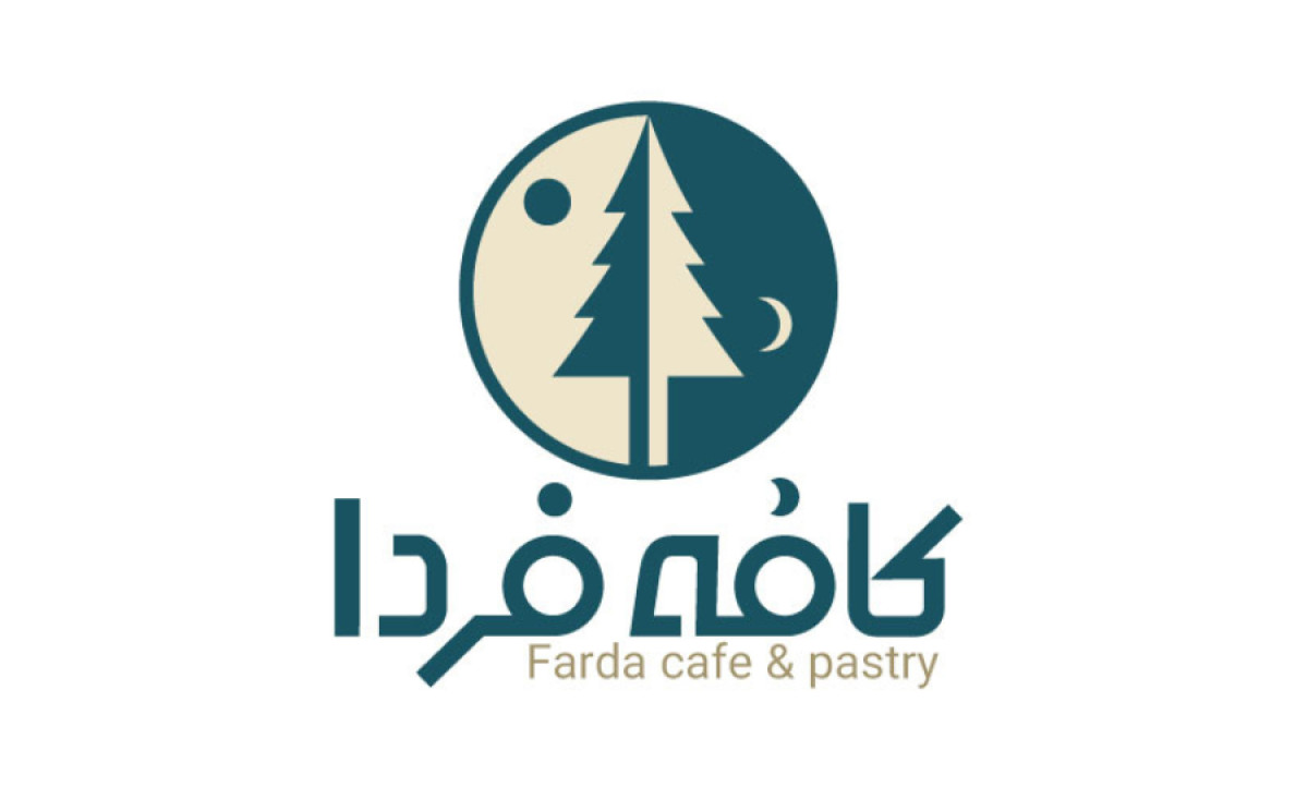
Standout Features:
- Sun and moon icons
- Central pine tree symbol
- Bilingual typography
Horafic Design Studio is a team of freelance creative designers approached by Cafe Farda & Pastry to create a logo that captures their unique ethos of optimism and renewal.
The term "Farda" means "tomorrow" in Farsi. The logo designer's challenge was to convey this concept visually in a simple yet impactful presentation that would resonate with Farda's clientele.
The result? An integrated sun and moon within a circular frame illustrate the passage of time from day to night. This reflects the brand name and subtly conveys the idea of continuity and new beginnings.
A stylized evergreen tree is prominently featured in the center, adding a modern touch through its simplified form. This element signals hope and resilience, qualities that align with the brand's key message. It also suggests that the cafe is not just a place to grab a quick bite but also a haven where customers can find solace and rejuvenation.
Lastly, the logo is rounded with the café's name in Farsi and English – a thoughtful addition that enhances the brand's accessibility and broadens its appeal to a diverse audience. By including both languages, the logo honors cultural heritage and positions Cafe Farda as an inclusive and welcoming establishment.