Juice Generation is New York’s premier juice bar. They have been independently owned and operated since 1999. The main staple of Juice Generation are juices and smoothies and fresh ready-to-go meals that enable people to live a healthy lifestyle.
The logo has staples of best logo design practices ranging from simplicity to relevance and company history.
Simplicity. The logo features three distinct elements: cursive, black and white color, and a juice cup. Instantly, people recognize what the company is about and their core product.
Cursive. Having the word “juice” in lowercase cursive gives an individual and unique feel to the logo. The ingredients at Juice Generation are fresh and the juices are custom made from scratch, much like the custom detailed effort used when writing cursive lettering. It takes time and care for quality to shine.
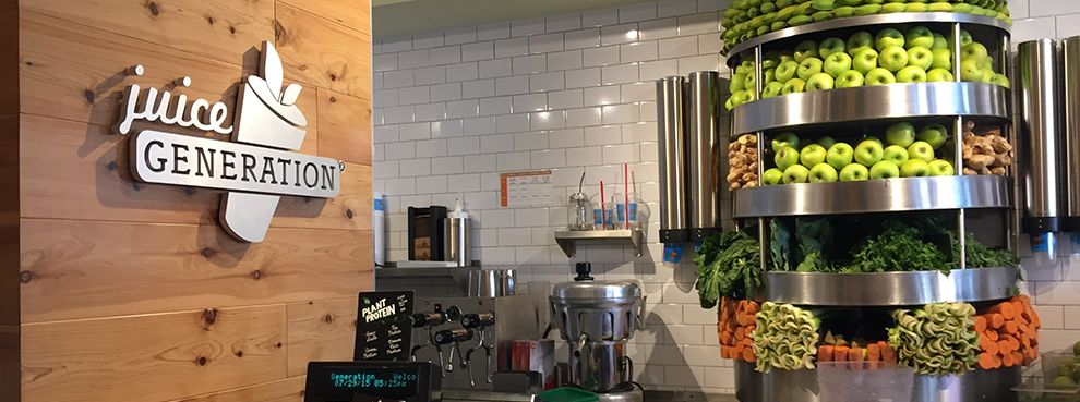
Relevance. The best logo designs are relevant to the company. For a company about juicing, this could not be clearer in this logo. Relevance eliminates customer confusion and pinpoints the company’s product like an expert marksman striking a bullseye.

The juice cup is also a great use of an iconic symbol. The cup features two leaves on top which represents the leaves from fresh fruit. Juice Generation uses the freshest ingredients and fruits and the two leaves illustrate this by being very large.
Juice Generation has a logo that is clear, consistent, relevant, and unique. From the cursive lettering to the wonderful juice cup with two leaves, this is an example of best logo design through sheer simplicity.
Juice Generation is great logo design in the Food & Beverage industry.