Standout Features:
- Simple, unassuming sans-serif wordmark
- Abstract vine motifs as brand signature
- Minimalist layout with high contrast
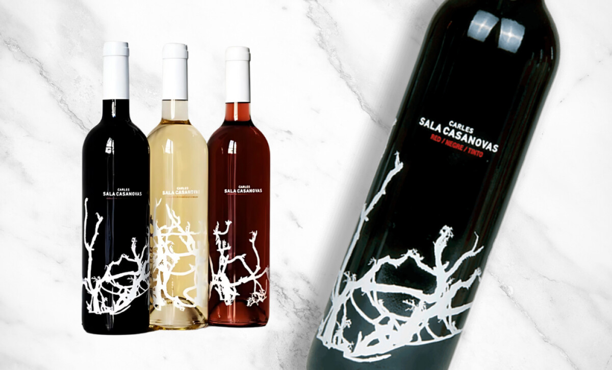
No storytelling copy. No ornate crest. Just a stark vine, a name, and glass. The Carles Sala Casanovas logo design strips wine branding down to its most elemental parts and in doing so, says more than most labels ever could. It’s a study in how visual restraint, when executed with clarity, can become a powerful identity system. The logo itself is nothing more than a typographic mark: CARLES SALA CASANOVAS set in bold, uppercase sans-serif, typically rendered in white for maximum contrast against dark or tinted glass. It’s not expressive, and that’s the point. The simplicity gives it the flexibility to sit quietly on bottles without disrupting the artful vine illustrations or the bottle’s visual flow.
That restraint allows the surrounding design, particularly the skeletal white vine graphics wrapping around the base, to carry the aesthetic weight. These hand-drawn vines differ per varietal, creating subtle variation without losing cohesion. The logo, by contrast, stays static and grounded, offering visual stability in a system designed to feel organic and freeform.
This visual identity’s balance of bold typography and negative space turns the bottle into the canvas, making the Carles Sala Casanovas logo design feel less like a decorative element and more like a signature. The absence of embellishment or storytelling text isn’t a lack, but a deliberate decision to let the product speak for itself.
By choosing to keep the logo minimal and let the bottle art lead, the Carles Sala Casanovas logo design becomes a great example of design restraint. It proves that even the simplest typography, when part of a well-composed system, can anchor a brand visually and conceptually, earning its spot among the best wine bottle logo designs for modern, minimalist aesthetics.